

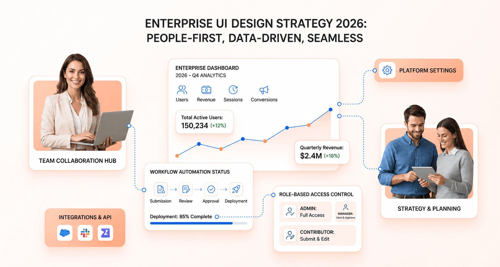
Enterprise applications run the day-to-day work of large organisations, and a poorly designed interface slows down every team that depends on it. Good enterprise UI design principles help you build interfaces that handle complex workflows and still feel straightforward in daily use.
We cover the operational and financial consequences of this in detail in our 2026 Enterprise UX Modernisation Report.
This guide is for product managers, UI/UX designers, and development teams building internal tools and business applications. Whether you're creating admin dashboards, customer relationship management systems, or workflow automation tools, these principles will help you design interfaces that employees actually want to use.
We explain what enterprise UI design is, how it differs from consumer UI and from enterprise UX, and the principles that make enterprise interfaces work, from scalability and security to accessibility. We also cover enterprise design systems, when low-code platforms help, and the trends shaping enterprise software in 2026.
By the end, you'll have a clear framework for creating user-friendly enterprise applications that boost productivity instead of slowing teams down.
What Is Enterprise UI Design?
Quick answer: Enterprise UI design is the design of the screens, components and interactions in software that organisations use to run their work, such as ERP, CRM, admin and analytics tools. It differs from consumer UI because it serves many roles with different permissions, dense data and long workflows, and must meet security, compliance and accessibility requirements at scale.
Defining enterprise UI for large organizations and teams
Enterprise UI (User Interface) refers to the design and layout of software built for large businesses, teams, and organizations. Unlike consumer applications that focus on individual user engagement and purchasing behaviors, enterprise UI design centers on helping employees perform their jobs efficiently and effectively. These interfaces serve as the critical bridge between complex business systems and the users who depend on them daily to execute workflows, manage data, and collaborate across departments.
Enterprise user interface design encompasses everything from administrative dashboards and data management tools to workflow automation systems and internal communication platforms.
These applications must support diverse user roles, handle massive datasets, and integrate with existing business systems while meeting security and compliance requirements.
How enterprise UI differs from consumer applications
The fundamental differences between enterprise UI and consumer UI stem from their distinct goals, user bases, and operational requirements. The table below summarises them.
Aspect | Enterprise UI | Consumer UI |
|---|---|---|
User base | Employees, IT teams, analysts | General consumers, end users |
Complexity | Adapts to many user roles and access levels | The same experience for every user |
Aesthetics | Prioritizes efficiency, usability, and scalability | Prioritizes visual appeal and brand identity |
Performance focus | Handles massive data, real-time processing, multi-user collaboration | Focuses on quick load times and smooth transitions |
User base considerations represent one of the most significant distinctions. Enterprise UI serves employees, specialists, and teams within business settings, typically supporting different roles and permissions such as administrators, managers, and standard employees. Each role requires tailored access to specific features and data sets. Consumer UI, conversely, is built for the general public with usually no role-based control, where everyone receives the same user experience.
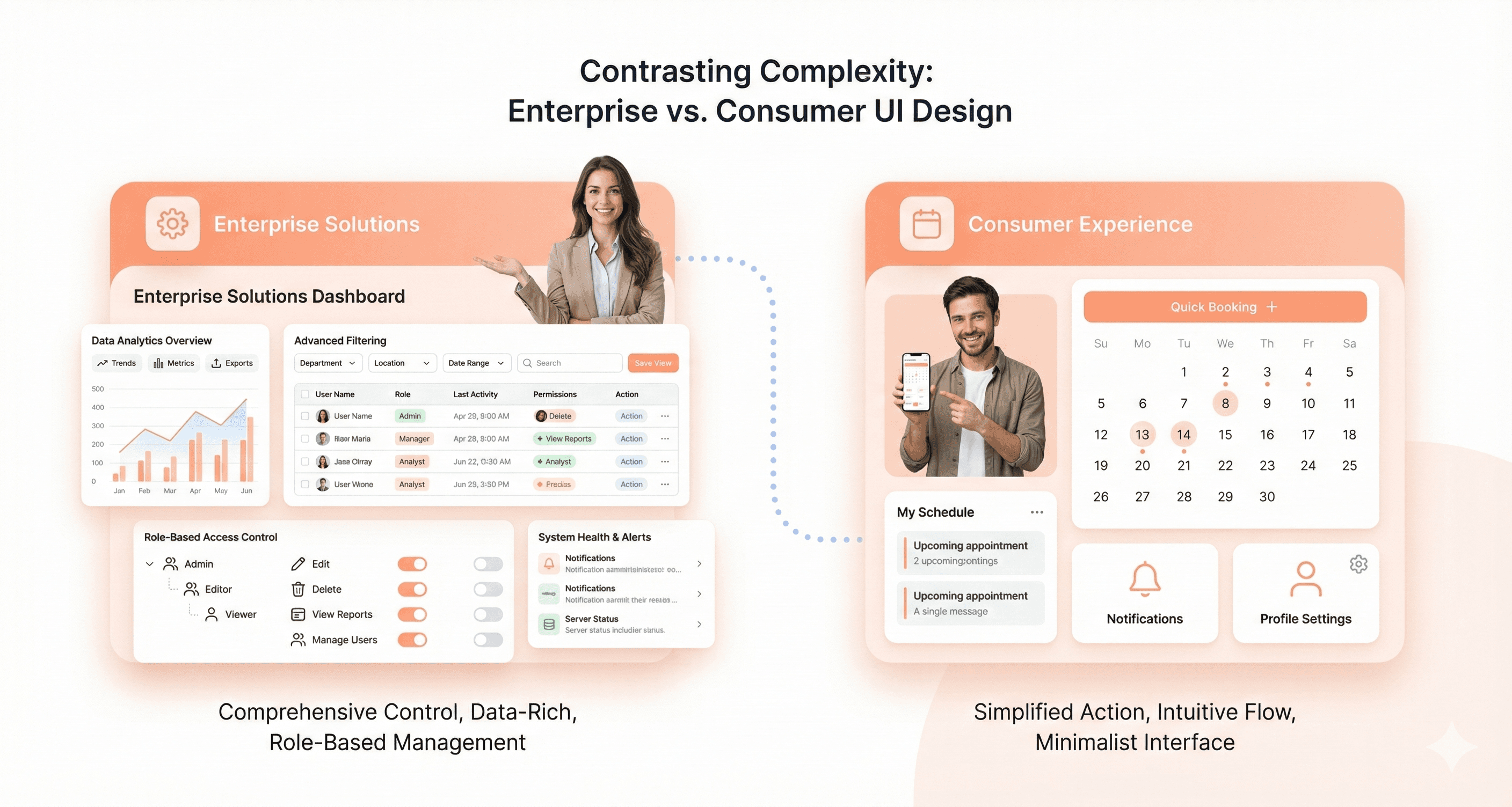
Complexity management differs dramatically between these two approaches. Consumer UI design emphasizes simplicity and intuitive navigation for broad audiences: think of applications like Instagram or Spotify that serve single purposes with easy-to-navigate, visually engaging interfaces. Enterprise UI must handle complex workflows, deep data layers, and multiple user roles without overwhelming users, requiring sophisticated information architecture and interaction design.
Aesthetic priorities also diverge significantly. Consumer UI often prioritizes visual appeal and brand identity through smooth animations, eye-catching design elements, and minimal clutter. Enterprise UI prioritizes efficiency, usability, and scalability above pure aesthetics. While dashboards may not be traditionally "beautiful," they need to help users process data, make informed decisions, and take action quickly.
Performance demands create another key differentiation. While consumer apps focus on quick load times and smooth animations to enhance user satisfaction, enterprise UI needs to handle massive datasets, real-time processing capabilities, and multi-user collaboration scenarios without compromising system stability or user productivity.
Why enterprise UI directly affects productivity and profitability
A well-designed enterprise UI improves productivity, operational efficiency and, in the end, profitability. That makes enterprise UX design a business investment, not only a technical task.
Productivity enhancement occurs through several mechanisms. Good enterprise UX design helps businesses increase operational efficiency by simplifying workflow execution, reducing the cognitive load on users, and minimizing the time required to complete routine tasks. When employees can navigate systems intuitively and access information quickly, they spend less time on tedious administrative work and more time on value-generating activities.
This is especially critical in enterprise learning platforms where EdTech UI UX services help organizations build scalable LMS dashboards, student analytics tools, and internal training workflows that support educators and administrators at scale.
Training cost reduction represents another substantial business impact. Enterprise UX can help businesses reduce the time needed for new users to become proficient with applications, thus reducing the overall cost of training new users. Whether onboarding new employees or training existing staff on updated systems, intuitive interface design significantly shortens the learning curve.
Support cost optimization occurs naturally when enterprise UI prioritizes usability and accessibility. Designs that focus on users' actual needs rather than assumptions about user behavior result in fewer support tickets, reduced help desk burden, and lower ongoing maintenance costs. Users become more self-sufficient when they can solve problems themselves through well-designed interfaces. The Silver Oak Wealth Advisors example later in this guide shows the effect on UI-related support tickets.
Business growth support comes from creating modular, API-driven UIs that evolve with enterprise needs. Scalable enterprise UI design enables organizations to adapt quickly to changing business requirements, support increasing user bases, and integrate new technologies without complete system overhauls. This flexibility directly contributes to competitive advantage and revenue growth potential.
The return is easiest to prove when you measure it. Record a baseline for task time, error rate, support tickets and training time on the workflows that matter most, then track the same numbers after each release. Nielsen Norman Group's UX Metrics and ROI report collects 44 real-life case studies of teams using UX metrics this way.
Enterprise UX vs Enterprise UI: What Is the Difference?
Enterprise UX design (enterprise user experience) covers the whole experience of getting work done: research with the people who use the tool, workflow and task analysis, information architecture, permissions, onboarding and how the product fits with the other systems in a team's day. Enterprise UI design is the visible layer of that experience: layouts, components, typography, colour, states and interaction patterns.
In practice the two cannot be separated. A clean data table does not help if the workflow forces an analyst to export to a spreadsheet to finish the job, and a well-mapped workflow still fails if the table cannot be scanned, filtered or used with a keyboard.
Aspect | Enterprise UX | Enterprise UI |
|---|---|---|
Main question | Can people complete their work quickly and correctly? | Can people see, understand and operate each screen? |
Typical outputs | Research findings, workflow maps, information architecture, task flows | Wireframes, high-fidelity screens, components, design tokens, interaction specs |
Methods | Contextual interviews, task analysis, usability testing, analytics review | Visual hierarchy, layout grids, component states, accessibility checks |
Success measures | Task success rate, time on task, error rate, support tickets, training time | Consistency, readability, WCAG conformance, component reuse |
Usual owners | UX researchers, product designers, product managers | UI designers, the design system team, frontend engineers |
If your product already has a UI kit but people still rely on workarounds, the gap is usually in the UX. Our SaaS UI/UX modernisation services cover both layers, starting with how the work actually gets done.
Five Essential Principles for Effective Enterprise UI Design
Use this checklist as a quick reference. The five core principles are covered in detail below, and consistency is covered in the design systems section.
Principle | What it means | Example |
|---|---|---|
Scalability and performance | Screens stay fast with large datasets and many concurrent users | A virtualised table that renders only the visible rows of a 100,000-row list |
Role-based access | Each role sees only the data and actions it needs | Finance approvers see an "Approve" button; analysts get read-only reports |
Efficiency for experts | Frequent tasks take few steps, and power users get shortcuts | Bulk edit, keyboard shortcuts and a command palette |
Accessibility | Keyboard, screen reader and low-vision users can do the whole job; target WCAG 2.2 AA | Keyboard focus is never hidden behind a sticky header or side panel |
Data clarity | Dashboards lead with the decision, then allow drill-down | KPI cards at the top, filters and detail tables below |
Integration | The UI works with existing systems through stable APIs | One customer view that combines CRM and billing data |
Consistency | Components, patterns and wording behave the same everywhere | One shared date picker and one save pattern across every module |
Feedback and recovery | Every action is confirmed, and errors explain how to fix them | "Invoice not saved: the VAT number is missing", with the field highlighted |
A. Building scalable interfaces that handle massive data and user loads
Enterprise applications face unique performance challenges that consumer apps rarely encounter. These systems must support thousands of employees simultaneously while processing massive datasets without compromising user experience. Effective enterprise UI design requires careful consideration of scalability from the ground up.
Handling large data sets efficiently is crucial for maintaining responsive interfaces. Instead of loading massive tables that can freeze the UI, smart enterprise design employs virtualized tables and lazy loading to render only what's visible on the screen. This approach prevents overwhelming the browser while ensuring users can access the data they need quickly.
Optimized dashboards and reports rely on strategic caching of frequently accessed data to reduce redundant queries. Interactive filtering capabilities allow users to explore data without waiting for full-page reloads, significantly improving the overall user experience. These techniques ensure that even complex analytics remain responsive under heavy usage.
Navigation and search that scales becomes essential as enterprise systems grow. A search-first approach with typeahead suggestions enables users to jump directly to specific sections, documents, or customer records without endless clicking through hierarchical menus.
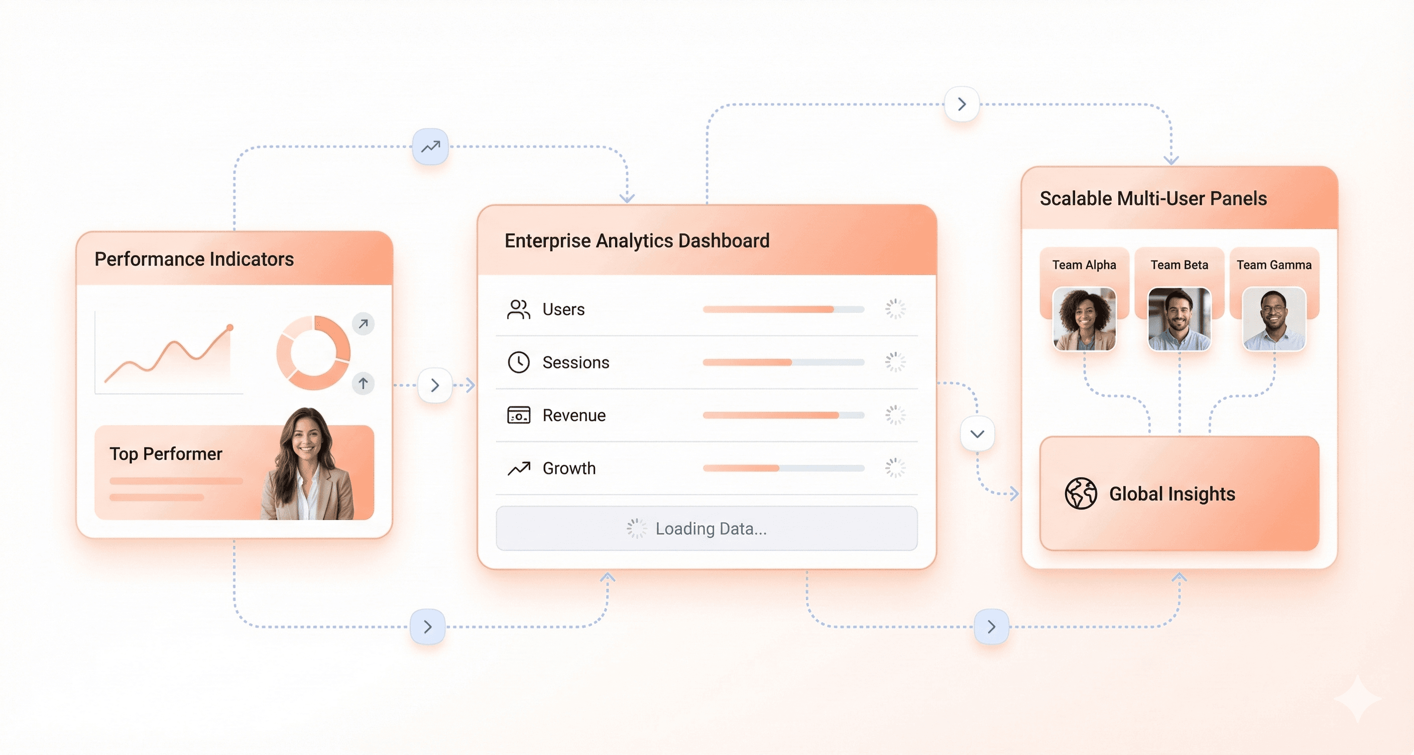
Many low-code platforms include lazy loading and caching, and splitting a large admin application into separate pages keeps each screen fast and reduces cognitive load.
B. Creating usable and accessible experiences for all employees
Enterprise UX best practices focus on minimising friction while ensuring universal accessibility across diverse user groups. Good usability centers on making interfaces efficient and intuitive for employees with varying technical expertise and accessibility needs.
Efficient interactions form the foundation of usable enterprise interfaces. This involves reducing unnecessary clicks, automating repetitive actions, and making common tasks as effortless as possible. Using familiar design patterns ensures users don't need to learn new interaction models unnecessarily, leveraging their existing knowledge of enterprise software conventions.
Supporting power users requires thoughtful implementation of features like keyboard shortcuts, bulk actions, and command palettes. These tools enable experienced users to work more efficiently while not overwhelming novice users with complexity.
Accessibility considerations ensure that all employees can interact effectively with enterprise software. This includes supporting keyboard navigation, maintaining high contrast between text and backgrounds, and writing clear, concise UI copy that's easily understood. Screen readers and other assistive technologies must be able to read and operate every control.
Many low-code platforms and component libraries include ARIA attributes and keyboard support in their pre-built components, which reduces effort. They do not guarantee conformance on their own, so test complete workflows as well as individual components.
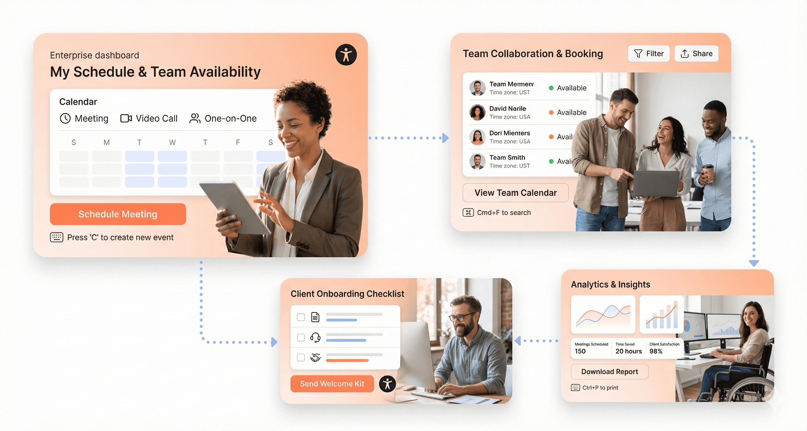
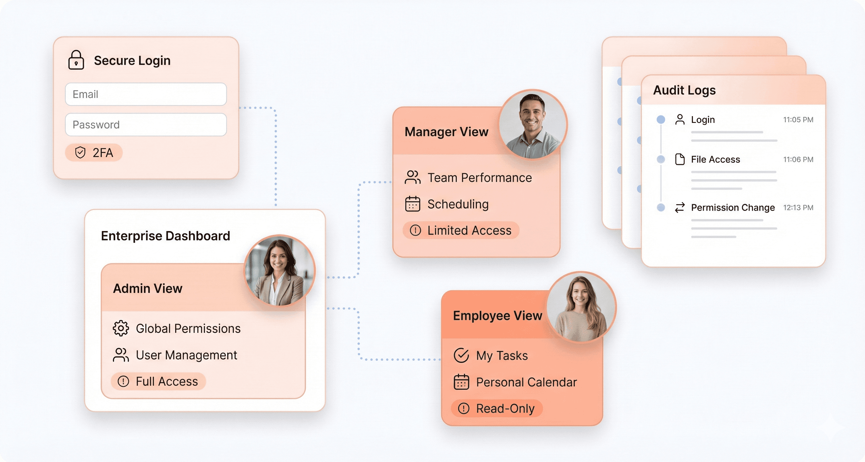
C. Implementing role-based access controls and security measures
Security in enterprise UI design goes far beyond simple login screens. Modern enterprise applications require sophisticated access control systems that balance security with usability, ensuring the right people have appropriate access to necessary information and functions.
Authentication integration serves as the first security layer, with enterprise identity provider (IdP) integration enabling centralized access control. Single sign-on (SSO) capabilities reduce password fatigue while maintaining security standards across the organization.
Role-based access control (RBAC) implementation requires granular permission systems that go beyond basic "Admin vs. User" models. Effective RBAC allows for fine-tuned control with permissions like "Can view financial reports" versus "Can edit financial data," ensuring users access only what they need for their specific roles.
Dynamic UI adaptation based on user permissions creates personalized experiences while maintaining security. Components can be shown or hidden based on user roles, and app behavior adjusts automatically to match access levels. This approach prevents unauthorized access attempts while streamlining the user experience.
Audit logging capabilities track user activity comprehensively, helping organizations maintain compliance and security oversight. Every user action should be logged with sufficient detail for security analysis and regulatory requirements. Similar compliance-driven enterprise platforms such as LegalTech products rely on LegalTech UI UX services to design case management dashboards, audit trails, and regulatory documentation workflows used across legal operations teams.
Low-code platforms significantly reduce the engineering effort required to implement these security features, providing built-in RBAC, authentication handling, and comprehensive audit logging as standard platform capabilities.
D. Designing effective data visualization and insights dashboards
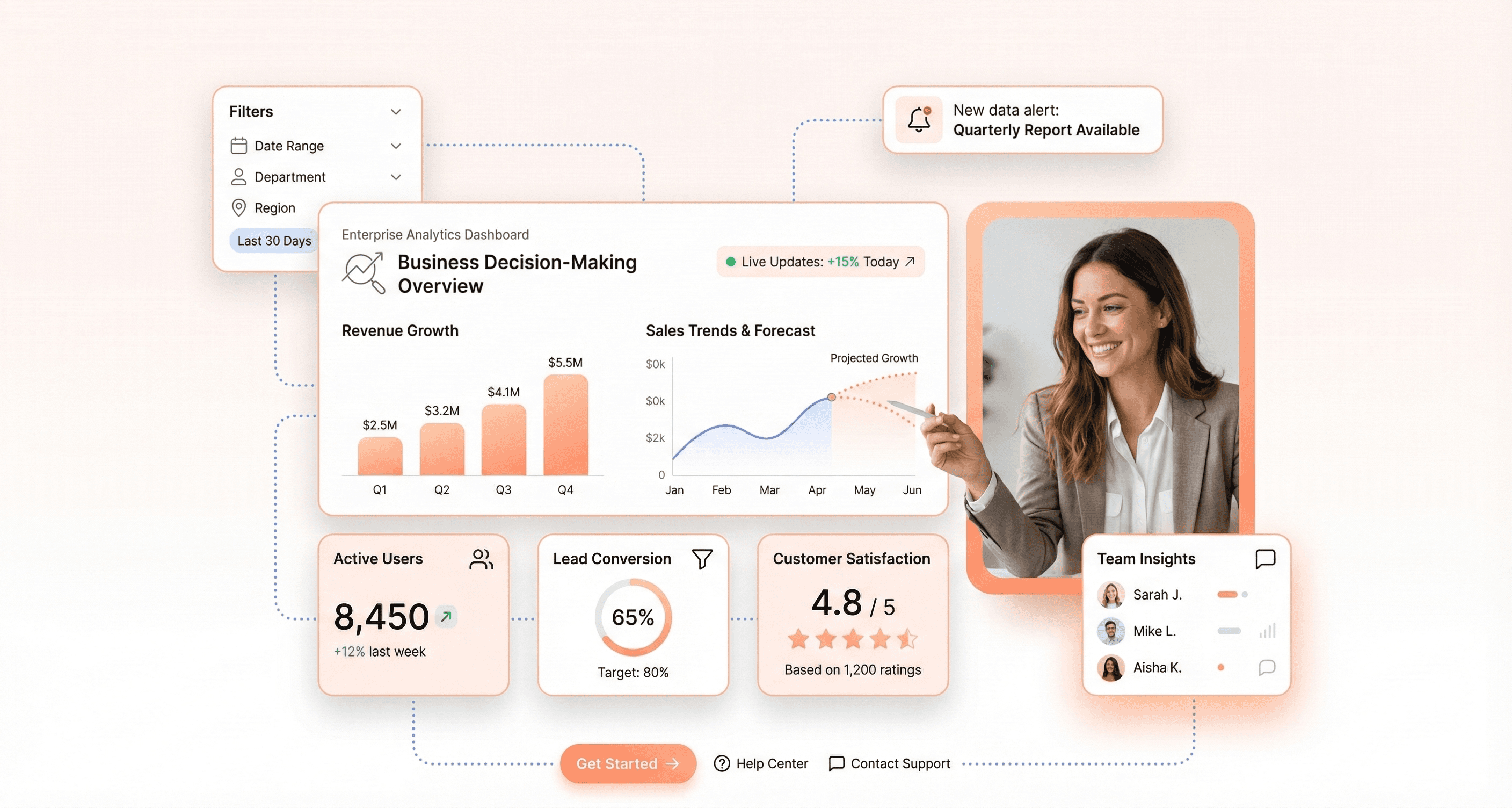
Enterprise applications handle vast amounts of data, but raw numbers in tables don't facilitate quick decision-making. Effective enterprise dashboards emphasise transforming data into actionable insights through thoughtful visualization and dashboard design.
Dashboard hierarchy design should highlight key insights prominently while allowing users to drill down into specifics when needed. The most critical data belongs at the top level, with secondary details accessible through intuitive navigation patterns.
Visual representation strategies move beyond traditional tables to include bar charts, line graphs, and pie charts that help users identify patterns quickly. Different data types require different visualisation approaches: trends work well in line charts, while categorical comparisons suit bar charts better.
Interactive filtering capabilities empower users to adjust filters, toggle metrics, and customize reports on demand. This interactivity transforms static dashboards into dynamic exploration tools that adapt to specific user needs and questions.
Real-time data streaming becomes increasingly important for operational dashboards where timely information drives critical decisions. WebSocket connections and event-driven updates ensure users see current information without manual refreshing.
Modern platforms provide pre-built chart components and table functionality with bulk action capabilities for database manipulation. Integration with specialized visualization libraries like Plotly enables highly interactive charts, while native streaming support facilitates live reports and real-time dashboards that keep pace with business operations.
E. Ensuring seamless integration with existing systems and APIs
Enterprise software design rarely exists in isolation. Modern enterprise UIs must connect reliably with internal systems, third-party services and external APIs while keeping data consistent across tools.
API-first architecture principles guide the development of flexible UIs that aren't tightly coupled to single backends. This approach enables interfaces to pull data from multiple sources while exposing major functions via APIs for use by external tools, automation systems, and future interfaces.
Standardized integration approaches rely on established protocols like REST, GraphQL, and webhooks rather than custom solutions for each connection. This standardization simplifies maintenance and reduces the complexity of managing multiple system connections.
Event-driven architecture eliminates the inefficiency of constant API polling by enabling backends to push updates to UIs through WebSockets or event triggers. This approach reduces server load while providing more responsive user experiences.
Modular integration design keeps API connections separate from frontend logic, allowing easy backend changes without requiring frontend modifications. This separation of concerns improves long-term maintainability and system flexibility.
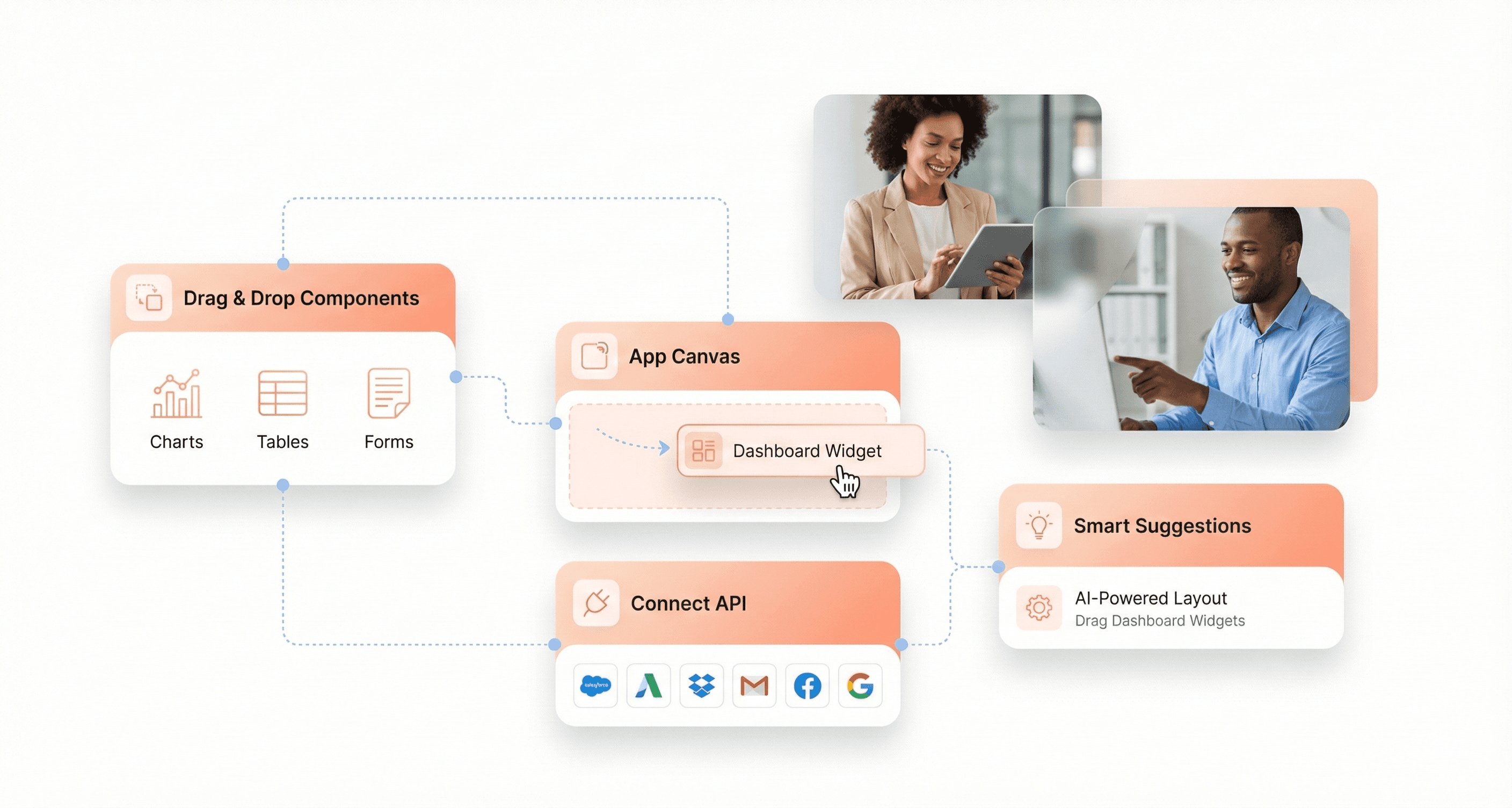
Pre-built connector ecosystems significantly accelerate integration timelines. Rather than building custom integrations for every tool, modern low-code platforms provide extensive libraries of native connectors. They typically cover databases, APIs, spreadsheets and file storage, which shortens integration work.
Leveraging Low-Code Platforms to Accelerate Enterprise UI Development
Using pre-built components and templates to reduce development time
Low-code platforms such as Mendix, OutSystems, Superblocks, UI Bakery and Appsmith give teams libraries of pre-built components (tables, forms, charts and modals) and templates, so common internal-tool screens can be assembled rather than coded from scratch. They are strongest for admin panels, approval flows and operational dashboards.
Some platforms, including Kissflow and Zoho Creator, add AI-assisted app generation and template libraries for business applications, dashboards, and workflow management. The trade-off is control: customer-facing enterprise products with complex interactions or strict brand and accessibility requirements usually outgrow platform components and need a custom frontend built on a design system.
Connecting unified data sources through built-in integrations
Most low-code platforms ship connectors for SQL and NoSQL databases, REST and GraphQL APIs, cloud storage and common business tools, so one screen can combine data from several systems. Connector lists change often, so check each vendor's current documentation for the systems you rely on, and confirm how credentials, environments and deployments are managed.
Implementing enterprise security features without custom coding
Enterprise security requirements are easier to meet when authentication, role-based permissions and audit logs come built in. Many enterprise low-code platforms include single sign-on, role-based access and audit trails as standard, but you should still confirm certifications and data residency, and check that permissions are enforced on the server rather than only hidden in the UI.
Accelerating AI adoption in enterprise applications
AI features in low-code tools range from generating a first version of an app from a text description to suggesting workflow steps and automating approvals. Treat generated apps as drafts: review the data model, permissions and accessibility before anything reaches employees, and keep a person in control of automated decisions that affect money, customers or compliance.
Core UI Design Principles That Drive User Success
Directing user attention effectively with visual hierarchy
Visual hierarchy serves as the foundation for directing user attention in enterprise UI design. By strategically applying font size and weight, designers can emphasize critical information and buttons that drive business workflows. Large and bold fonts naturally stand out, guiding users toward primary actions like "Submit Report" or "Approve Budget."
Contrast becomes equally powerful when implemented thoughtfully. The strategic use of contrasting colors directs users to key elements within complex enterprise interfaces. For instance, a red "Delete Account" button against a white background immediately commands attention while reinforcing the critical nature of the action.
Spacing creates visual interest and demonstrates relationships between UI elements. Thoughtful spacing helps users understand how different components connect within enterprise workflows, reducing cognitive load during complex tasks.
Consider what users see first versus what requires scrolling. Your UI content hierarchy should reflect what enterprise users care about most, typically real-time data, urgent notifications, and primary task completion buttons.
Creating intuitive navigation through proximity and similarity
Things that belong together should stay together in enterprise interfaces. Users naturally perceive UI elements positioned close together as related, creating more intuitive user experiences and natural workflow patterns.
Enterprise applications benefit significantly from proximity principles. Control panels group related functions: play, pause and stop buttons sit together because they all control the same process. However, destructive actions like "Delete Database" live separately to prevent accidental clicks that could interrupt critical business processes.
This visual organization reduces mental effort required to complete user actions, particularly important in enterprise environments where users juggle multiple complex tasks simultaneously.
Building adaptive designs that work across all devices
Enterprise users access applications across phones, tablets, and computers, making responsive design non-negotiable. Adaptive designs ensure consistent functionality whether employees work from desktop workstations or mobile devices in the field.
Context matters. Enterprise users may work from a warehouse floor, a client site or a train with a weak connection, so design for small screens, interrupted sessions and slow networks.
Maintaining consistency across all pages and interactions
Consistency creates familiarity from the first click in enterprise applications. When buttons look and work identically throughout your product, users stop thinking about the interface and focus on completing business tasks.
Design systems establish this familiarity through consistent patterns. However, irregularities add cognitive load, creating hesitancy and confusion in enterprise workflows. If one UI button suddenly appears bigger, users wonder why, disrupting their task flow.
Enterprise design systems often rely on custom CSS framework development to ensure reusable UI components remain scalable across internal tools and workflow platforms.
Consistency becomes increasingly critical as users advance through multi-step enterprise processes. Deviation from established patterns needs a strong reason; otherwise it introduces unnecessary complexity into already demanding business workflows.
Clean lines and strong grid systems make enterprise interfaces feel professional while improving readability. Consistent alignment creates predictability, essential for users navigating complex business applications efficiently.
Enterprise Design Systems: Tokens, Governance and Accessibility
An enterprise design system is the shared set of design tokens, components, patterns, guidelines and code that teams use to build every screen in a product or product family. In enterprise software it is the main tool for keeping many teams, modules and products consistent without slowing delivery. It is also the focus of our enterprise design system development work.
Design tokens
Design tokens are named design decisions, such as colour, spacing, type and elevation, stored as data rather than hard-coded values. Atlassian describes them as "a single source of truth to name and store design decisions", using names such as "color.icon.success" instead of a specific shade of green (Atlassian Design System). Because every component reads from tokens, a new theme, brand or dark mode becomes a change to token values rather than to hundreds of components. For exchanging tokens between tools, the Design Tokens Community Group published a vendor-neutral file format as a final community group report in October 2025 (Design Tokens Format Module 2025.10).
Governance
A design system only stays useful if someone owns it. Governance defines who can add or change a component, how proposals are reviewed, how versions are released and retired, and how product teams report gaps. In practice that means a versioned component library, a published changelog, a contribution process product teams will actually use, and a review of new patterns before they reach production.
Accessibility built into components
When accessibility is solved once in a component (keyboard behaviour, focus states, labels and colour contrast), every screen that uses it inherits the fix. IBM's Carbon Design System says it is "committed to following and complying with accessibility best practices" and publishes keyboard, colour and developer guidance alongside its components (Carbon accessibility). Components still need testing in context, because an accessible button can sit inside an inaccessible workflow.
Consistency across multiple products
Large software vendors run one system across many products. Carbon is IBM's open source design system for products and digital experiences, with component libraries for React, Angular, Vue and Svelte and four token-driven themes: White, Gray 10, Gray 90 and Gray 100 (Carbon themes). Salesforce maintains the Lightning Design System, now in its second major version, for its platform, and Atlassian uses one design language so that, in its own words, "every app feels cohesive and familiar" (atlassian.design). The same approach works at a smaller scale: one shared, versioned component package, one token set and a theme per product or tenant.
Example: Silver Oak Wealth Advisors
Silver Oak Wealth Advisors asked Hashbyt to modernise a legacy wealth management platform. The work included rebuilding dashboards, creating a scalable design system and reaching WCAG 2.1 AA accessibility across multi-tenant workflows. After the modernisation, UI-related support tickets fell by 65%, which the team attributes to cleaner workflows and more consistent UI patterns (Silver Oak case study).
Making Enterprise UIs Accessible and User-Friendly
Designing for Users with Disabilities and Diverse Needs
Accessible enterprise interfaces let every employee do their job, including people who use a keyboard, a screen reader, magnification or voice control. The benchmark is the Web Content Accessibility Guidelines (WCAG). WCAG 2.2 became a W3C Recommendation on 5 October 2023, the current edition is dated 12 December 2024, and most organisations aim for Level AA.
To make content perceivable for all users, enterprise UI design must incorporate larger fonts, bold highlighting for essential phrases, and high color contrast between text and backgrounds. Clear labels for form elements are crucial for screen readers and assistive technologies. Supporting keyboard navigation is fundamental, as many users cannot operate touchpads or mice effectively.
WCAG 2.2 added nine success criteria, several of which matter in data-heavy tools: Focus Not Obscured (keyboard focus must not be hidden by sticky headers or panels), Target Size (Minimum) of 24 by 24 CSS pixels for most controls, Dragging Movements (every drag action needs a single-pointer alternative), Redundant Entry and Accessible Authentication (What's New in WCAG 2.2). Pre-built components help, but they do not make an application conformant on their own, so test real workflows with a keyboard and a screen reader, or commission an accessibility and UX audit.
Providing Clear Feedback on All User Actions
Enterprise applications must provide transparent and immediate feedback for every user interaction to maintain trust and efficiency. Users should always understand what action they're performing and what the system is doing in response.
Clear feedback mechanisms include visual confirmations when buttons are clicked, progress indicators for long-running processes, and status updates for data submissions. The interface should distinguish between different types of interactive elements, because users who confuse links with buttons hesitate and make mistakes.
When users perform any action, they should receive immediate acknowledgment that their input was received and processed. This is particularly important in enterprise environments where actions might affect critical business data or trigger important workflows.
Creating Informative Error Messages and Recovery Options
Effective error handling in enterprise UI design goes beyond simply alerting users that something went wrong. Informative error messages should explain what happened, why it occurred, and most importantly, provide clear steps for recovery.
Error messages must use simple, jargon-free language to avoid misunderstanding. Instead of technical error codes, enterprise applications should present human-readable explanations that help users understand the situation and take corrective action. The interface should guide users toward resolution rather than leaving them stranded with cryptic messages.
Recovery options should be prominently displayed and easily accessible. This might include "Try Again" buttons, alternative pathways to complete tasks, or clear instructions for contacting support when automated recovery isn't possible.
Testing Interfaces from the End-User Perspective
Data-driven decision making is essential for creating truly user-friendly enterprise interfaces. UI designers working in enterprise environments should base decisions on qualitative and quantitative data rather than relying solely on assumptions or aesthetic preferences.
Conducting user testing reveals how employees actually interact with the interface during their daily workflows. Analyzing user behavior, time spent on specific functions, and session duration can uncover weak points in the design that might not be apparent during development.
A/B testing provides valuable insights by presenting different design options to user groups and measuring which performs better. Measures such as task completion rate, time on task and error rate show where the design needs work. This testing approach ensures that enterprise UIs serve their primary purpose: helping employees work more efficiently and productively in their day-to-day tasks.
Human-centered design principles emphasize building empathy and deep understanding of end users' needs. This approach streamlines processes, removes friction points, and grants workers the ability to perform their duties more efficiently within the enterprise environment.
Emerging Trends Shaping the Future of Enterprise UI
Integrating AI-powered interfaces and automation
AI is now part of many enterprise tools, through intelligent search, workflow suggestions and predictive data entry. Designing for AI means deciding what the system may do on its own, how it explains its suggestions and how users review, correct or undo them.
Teams now plan AI behaviour from the start: what it explains, when it asks for confirmation and how users stay in control. Generated microcopy can make error messages and guidance more specific to the task, as long as it is reviewed like any other interface text.
Implementing dark mode and customizable themes
Many people who spend all day in one tool now expect a dark theme and some control over density and text size. With a token-based design system, each theme is a set of token values rather than a separate build.
Themes also support accessibility: a high-contrast theme or a larger default text size helps users with low vision, provided every theme is checked for contrast.
Adopting mobile-first design approaches
Enterprise applications are increasingly embracing integrated cross-platform experiences that prioritize mobile functionality without compromising desktop capabilities. This mobile-first approach recognizes that modern enterprise users expect seamless functionality across all devices, from smartphones during field work to tablets in meeting rooms and desktops for complex data analysis.
The challenge lies in creating consistent experiences across platforms while adapting to different interaction patterns and screen constraints. Successful mobile-first enterprise UI design maintains core functionality while optimizing touch interactions, gesture controls, and voice commands for hands-on work environments where traditional input methods aren't practical.
Context-aware interfaces are becoming essential, automatically adjusting layouts and information hierarchy based on device type, user role, and current tasks. This ensures that mobile interfaces remain focused on immediate needs while providing pathways to more comprehensive functionality when required.
Expanding no-code and low-code development adoption
The expansion of no-code and low-code platforms is changing how enterprise teams approach scalability and customisation. These platforms enable faster prototyping and deployment of user interfaces while maintaining consistency through standardized design systems and reusable components.
Low-code UI development is particularly valuable for enterprise organizations that need to rapidly adapt interfaces to changing business requirements without extensive development resources. These platforms support the creation of role-based interfaces that can be customized for different user groups while maintaining overall system coherence.
The integration of AI within low-code platforms is accelerating this trend, with intelligent systems suggesting optimal interface configurations based on user behavior patterns and business objectives. This combination enables enterprise teams to create sophisticated, user-friendly enterprise applications that can evolve with organizational needs while maintaining professional design standards and accessibility compliance.
Conclusion
Enterprise UI design works when it serves the job: fast screens at scale, clear role-based access, accessible components, readable data and reliable integrations. Good enterprise UX makes sure those screens fit real workflows, and a governed design system keeps them consistent as products and teams grow.
Start with the workflows that cost the most time or generate the most support requests: measure them, fix them and build the design system as you go.
Low-code platforms have changed how teams build internal tools, and they suit admin panels and operational dashboards well. Customer-facing enterprise products usually need a custom frontend on a shared design system, so the right choice depends on who uses the software and how much control you need.
If you want an outside view first, a UX and accessibility audit of your highest-traffic workflows is a practical place to start.




About the author
I’m the founder of Hashbyt, an AI-first frontend and UI/UX SaaS partner helping 200+ SaaS companies scale faster through intelligent, growth-driven design. My work focuses on building modern frontend systems, design frameworks, and product modernization strategies that boost revenue, improve user adoption, and help SaaS founders turn their UI into a true growth engine.
Is a clunky UI holding back your growth?
Is a clunky UI holding back your growth?
▶︎
Transform slow, frustrating dashboards into intuitive interfaces that ensure effortless user adoption.
▶︎
Transform slow, frustrating dashboards into intuitive interfaces that ensure effortless user adoption.
