


Poor frontend development choices can transform a promising website into a user experience nightmare that drives visitors away and tanks conversion rates. This guide targets backend developers who occasionally handle frontend tasks, junior developers building their skills, and project managers who need to identify potential issues during code reviews.
Your users won't stick around when pages load slowly due to massive unoptimized images, when your site breaks on mobile devices, or when messy CSS makes simple updates impossible. These frontend mistakes create real business consequences, from lost sales to frustrated customers who never return. This is why modern product teams are shifting toward AI-driven UI generation for SaaS frontends to eliminate performance, UX, and scalability risks early.
We'll walk through the most damaging frontend mistakes, including image optimization errors that destroy page performance and mobile responsiveness failures that alienate half your audience. You'll also discover CSS styling mistakes that create maintenance nightmares and improper HTML structure that hurts both SEO rankings and accessibility compliance.
Each mistake comes with practical fixes you can implement immediately, helping you build faster, more reliable websites that work seamlessly across all devices and screen sizes.
Image Optimization Errors That Destroy Page Performance
Using Uncompressed Images That Slow Load Times
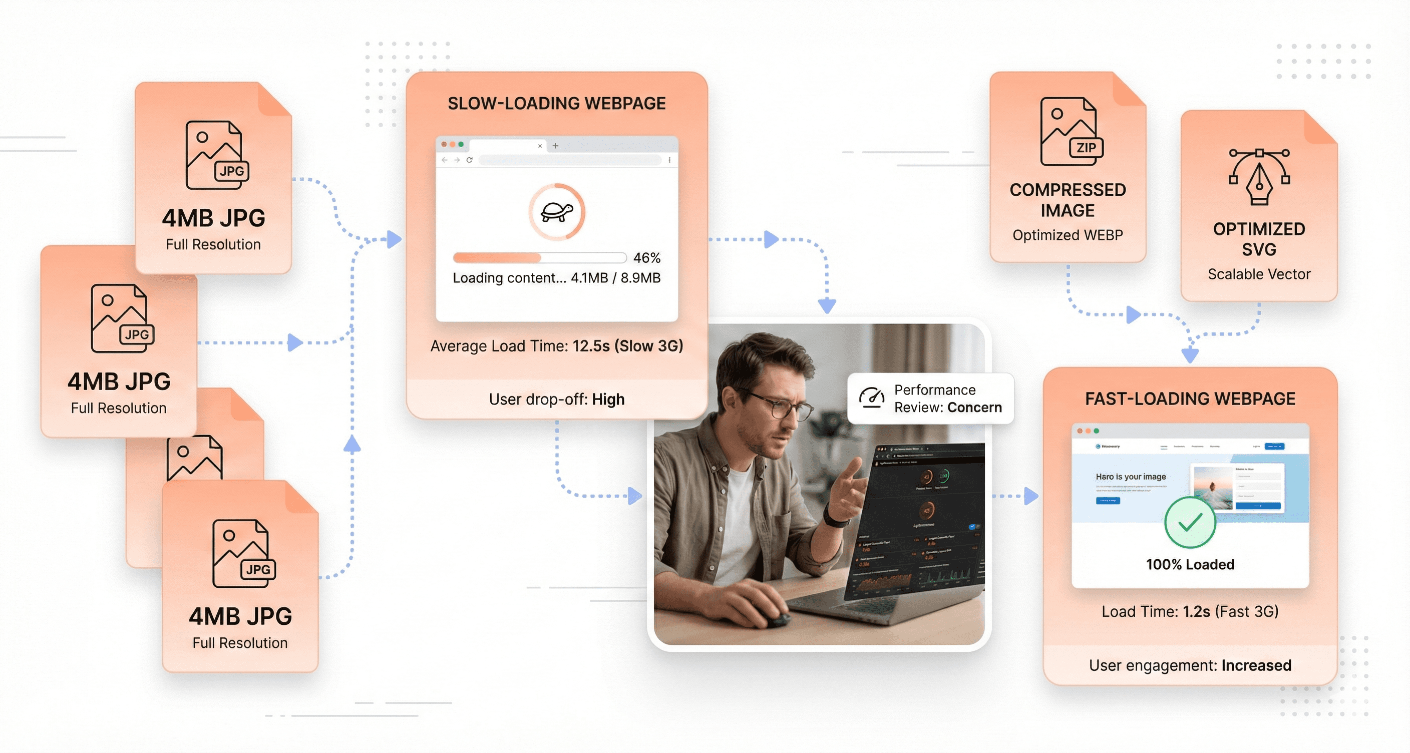
One of the most prevalent frontend mistakes that developers make is failing to optimize images before deploying them to production. This oversight becomes particularly problematic because testing in a local environment creates a false sense of security. Everything appears to download instantly when files are served locally, making it easy to overlook the real-world impact of bandwidth usage on actual users.
When uncompressed images make their way into production websites, they create significant performance bottlenecks that directly translate to poor user experience. Large file sizes force users to wait extended periods for pages to load, particularly those on slower internet connections or mobile networks. This delay doesn't just frustrate users; it actively drives them away from your site, as studies consistently show that users abandon pages that take more than a few seconds to load.
The solution requires a systematic approach to image optimization. Every image that enters your website should be checked for size and optimized accordingly before implementation. This isn't just about reducing file size, it's about maintaining visual quality while ensuring optimal performance across all devices and connection speeds.
Displaying Large Files as Small Thumbnails
Perhaps one of the most egregious examples of poor image optimization occurs when developers use massive image files for small display purposes. A classic scenario involves serving 4 MB pictures that are ultimately displayed as tiny 200x150px thumbnails, a practice that represents an enormous waste of bandwidth and server resources.
This mistake stems from a fundamental misunderstanding of how images should be prepared for web use. When a large image is simply scaled down using CSS or HTML attributes, the browser still downloads the entire original file, regardless of how small it appears on screen. This means users are forced to download megabytes of unnecessary data just to view a thumbnail-sized image.
The bandwidth waste extends beyond just the initial load time. Mobile users, who may be operating under data caps or paying for metered internet access, suffer additional costs due to this inefficiency. From a technical perspective, serving oversized images as thumbnails also increases server load and can contribute to higher hosting costs due to increased bandwidth usage across your entire user base.

Lacking Automated Image Optimization Workflows
The manual optimization of images becomes unsustainable as websites grow and content volumes increase. Without establishing a stable workflow for image optimization, developers find themselves either skipping optimization entirely or spending disproportionate amounts of time on repetitive tasks that could be automated.
Professional development teams should implement systematic approaches to image processing that integrate seamlessly into their existing workflows. This includes setting up automated compression processes that can handle various image formats efficiently without requiring manual intervention for each file.
For practical implementation, several tools have proven particularly effective in professional environments. ImageOptim serves as an excellent solution for optimizing .jpg and .png files, providing significant compression without noticeable quality loss. For vector graphics, SVGO offers specialized optimization for .svg files, removing unnecessary metadata and reducing file sizes substantially. The command-line interface versions of these tools represent the fastest and most efficient way to work, as they can be integrated into build processes and automated deployment workflows.
By establishing these automated workflows, development teams can ensure consistent image optimization across all their projects while freeing up valuable time for other critical development tasks.
Mobile Responsiveness Failures That Alienate Users
Ignoring Mobile-First Design Principles
The most fundamental error developers make is designing exclusively for large screens and treating mobile as an afterthought. This backward approach creates cascading problems throughout the entire development process, forcing teams to retrofit desktop-centric layouts onto smaller screens rather than building from the ground up with mobile constraints in mind.
Adopting a mobile-first approach ensures frontend work starts with mobiles in mind, creating a solid foundation that scales upward rather than cramming down. The fix involves starting by sketching layouts for the narrowest screens, establishing content hierarchy, and user flows that work within the tightest constraints. This methodology naturally leads to cleaner, more focused designs that prioritize essential content and functionality.
When developers reverse this process, they inevitably encounter layouts that simply don't translate to mobile devices. Complex desktop interfaces with multiple columns, hover states, and spacious navigation systems become unusable when compressed into mobile viewports, requiring extensive redesign work that could have been avoided with proper planning.

Skipping Mobile Testing During Development
Back-end developers often forget to check if changes work on mobile devices, typically testing only on desktop breakpoints during the development cycle. This oversight creates a dangerous blind spot where mobile-breaking changes accumulate unnoticed until late in the development process, when fixes become more expensive and time-consuming to implement.
Regular mobile testing throughout development prevents these issues from compounding. Without consistent mobile validation, developers may implement features that work perfectly on desktop but fail on mobile devices, discovering these problems only during final testing phases or, worse, after deployment when users begin experiencing issues.
Creating Touch-Unfriendly Interface Elements
Many interfaces cram desktop layouts onto tiny screens, forcing users to zoom, scroll sideways, or hunt for hidden menus, which creates a frustrating and error-prone experience. Users expect buttons that fit their thumb and content that doesn't require endless pinching on mobile devices, yet developers frequently ignore these fundamental touch interaction principles.
Touch-unfriendly elements include tiny clickable areas, closely spaced interactive elements that cause accidental taps, and navigation systems designed for precise mouse cursors rather than finger navigation. These design choices force users into cumbersome workarounds, leading to increased bounce rates and frustrated user experiences that could have been avoided with proper mobile interface considerations.
CSS Styling Mistakes That Create Maintenance Nightmares
Using Inline Styles Instead of External Stylesheets
Using inline styles represents one of the most detrimental practices in frontend development, fundamentally breaking the separation of styling from content. This approach directly violates the core principle of maintaining clean HTML structure by embedding CSS properties within HTML elements themselves.
The maintenance challenges created by inline styles become exponentially worse as projects scale. When styling needs to change across multiple elements, developers must hunt through numerous HTML files to update each occurrence rather than making a single modification in a centralized stylesheet. This scattered approach transforms simple design updates into time-consuming, error-prone tasks that significantly increase development overhead.
Beyond maintenance difficulties, inline styles create performance bottlenecks by preventing CSS caching and reusability. Each element carries its own styling burden, leading to code duplication and larger file sizes that directly impact page load times.
Mixing Styling Classes with JavaScript Hooks
Another critical mistake involves failing to separate classes needed for CSS styling from those required for JavaScript functionality. This mixing creates a dangerous dependency where refactoring visual styles can inadvertently break JavaScript behavior, leading to unexpected functionality failures.
The solution lies in implementing a clear naming convention that distinguishes between styling and functional classes. A recommended practice involves using separate classes specifically for JavaScript hooks, typically prefixed with js- (such as js-btn-newsletter). This prefix system immediately signals to developers that these classes serve functional purposes rather than visual ones, preventing accidental removal during style refactoring.
Leaving Redundant Code That Clutters Performance
Redundant code represents a subtle yet pervasive issue that degrades both performance and code maintainability. Common examples include unnecessarily adding display: block to selectors already using float properties, since floated elements automatically become block-level by default. Similarly, applying width: 100% to block elements proves redundant, as block elements naturally occupy the full available width.
Another frequent occurrence involves overriding properties within single selectors unnecessarily, creating confusion about which declarations actually take effect. This redundancy not only increases file sizes but also makes debugging more complex, as developers must parse through unnecessary code to understand the actual styling logic.

Improper HTML Structure That Hurts SEO and Accessibility
Using Heading Tags for Visual Styling Instead of Semantic Purpose
One of the most detrimental mistakes developers make is treating heading tags (h1, h2, h3, etc.) as mere visual styling tools rather than semantic elements that communicate document structure. This approach completely undermines the semantic purpose these tags serve in organizing content hierarchy and conveying meaning to both search engines and assistive technologies.
The proper use of headings significantly impacts SEO, emphasizing the need for care in their application. Search engines rely heavily on heading tags to understand content structure and importance. These frontend SEO and accessibility issues can directly affect campaign dashboards, analytics tools, and reporting interfaces in marketing SaaS products, which is why teams invest in MarTech AdTech UI UX services to improve usability, SEO visibility, and conversion-focused interface performance.
When heading tags are chosen based solely on their default visual appearance, the semantic meaning becomes corrupted, leading to confused crawlers and poor search visibility.
For decorative text that visually resembles a heading but doesn't represent an actual content section, it should be contained within a div and styled with appropriate classes (e.g., .h1) to avoid interfering with SEO's reliance on semantic heading tags. This approach maintains the visual impact while preserving the document's semantic integrity.
Capitalizing Text in HTML Rather Than CSS
Capitalizing text directly in HTML represents a fundamental misunderstanding of the separation between content and presentation. Writing text such as 'JOB ADS' in uppercase directly within the HTML markup is incorrect because capitalization is a presentation concern, not a structural one.
Text capitalization should be handled in CSS using the text-transform: uppercase property, maintaining the separation between HTML's document structure and CSS's presentation layer. This approach ensures that screen readers and other assistive technologies can properly interpret the content without being confused by artificial capitalization, while also making the content more maintainable and flexible for future design changes.
An exception for uppercasing in HTML is when quoting someone who is shouting, as this represents actual content meaning rather than stylistic preference.
Breaking Proper Document Structure Hierarchy
Now that we've covered individual heading misuse, it's crucial to understand how improper heading hierarchy damages the overall document structure. Breaking the logical flow of heading levels creates confusion for both users and automated systems that rely on structured content navigation.
A properly structured document follows a logical hierarchy where h1 represents the main topic, h2 tags denote major sections, h3 tags represent subsections, and so forth. When this hierarchy is disrupted, such as jumping from h1 directly to h3 or using multiple h1 tags inappropriately, the document loses its semantic clarity and becomes difficult for assistive technologies to navigate effectively.

Font Implementation Errors That Break Typography Control
Misusing Font-Face Declarations Without Weight Specifications
The most fundamental error developers make with font implementation stems from a misunderstanding of how @font-face declarations should be structured. Many developers fail to specify font-weight and font-style properties within their font declarations, instead of attempting to control these crucial typographic properties through the font-family property alone.
This misguided approach creates a cascade of problems that undermines the entire typography system. When developers assign font variations like 'Averta-Regular' and 'Averta-Bold' to separate font-family values, they're essentially treating each weight as a completely different typeface rather than variations of the same font family.
The correct implementation requires using the same font-family value across all @font-face declarations for a particular typeface, while defining the appropriate font-weight and font-style properties within each declaration. This establishes a proper font family hierarchy that browsers can understand and utilize effectively.
Creating False Font Weights Through Browser Processing
When font variations are incorrectly assigned to separate font-family values, attempting to apply CSS properties font-weight: 700 often results in unexpected behavior. In many cases, there's no visual change whatsoever, leaving developers puzzled about why their bold styling isn't working.
Even worse, browsers may attempt to compensate by creating what's known as 'false boldness' - artificially processing a regular font weight to appear bold. This browser-generated boldness produces inferior visual results compared to actual designed bold weights, creating inconsistent and unprofessional typography that degrades the overall user experience.
Losing Typography Consistency Across Different Styles
This improper font implementation approach inevitably leads to a complete loss of typography consistency across different styles throughout the website or application. Instead of being able to use standard CSS font properties to control typography, developers find themselves forced to use specific font-family names for each weight or style variation, such as explicitly calling 'Averta-Bold' instead of applying font-weight: bold to the base 'Averta' family.
This fragmented approach makes typography management extremely cumbersome and error-prone, as developers must remember and manually specify exact font family names for every typographic variation rather than leveraging the elegant simplicity of CSS font properties.
CSS Architecture Problems That Limit Scalability
Failing to Abstract Reusable Components
One of the most critical architectural mistakes developers make involves keeping child elements tightly coupled to their parent components instead of abstracting them into reusable modules. This approach severely limits the scalability of your CSS architecture and creates unnecessary code duplication across your project.
Consider a common scenario where you have a newsletter section with a title styled specifically for that context. Many developers will create a selector like _.newsletter__title and call it complete. However, this narrow approach fails to recognize the broader potential of that styling pattern. What happens when you need a similar title treatment for a testimonial section, a product feature, or a blog post summary?
The solution lies in transforming these context-specific child elements into generic, standalone components. Instead of _.newsletter__title, you should create a more versatile _.section-title class that can be applied across multiple contexts throughout your application. This abstraction removes the dependency on the parent container and makes the component truly reusable.
Creating Overly Specific Parent-Child Dependencies
Tight coupling between parent and child elements represents another significant scalability barrier in CSS architecture. When components are designed with rigid parent-child relationships, they become inflexible and resistant to reuse in different contexts.
This mistake often manifests when developers create styling rules that rely heavily on nested selectors or specific DOM hierarchies. Such dependencies force you to maintain the same HTML structure whenever you want to reuse a component, eliminating the flexibility that modern web applications require.
Missing Opportunities for Modular Design Systems
The failure to anticipate reuse scenarios prevents the development of truly modular design systems. Successful CSS architecture requires developers to think beyond immediate requirements and consider how elements might be repurposed in future contexts.
Many product teams address this by investing in custom CSS framework development to build reusable UI systems that scale across SaaS platforms.
Proactive abstraction involves identifying styling patterns that could potentially serve multiple purposes and designing them as independent, composable modules from the start. This forward-thinking approach creates a more robust and scalable foundation for your entire design system, enabling faster development and more consistent user experiences across your application.
Layout Technology Oversights That Complicate Development
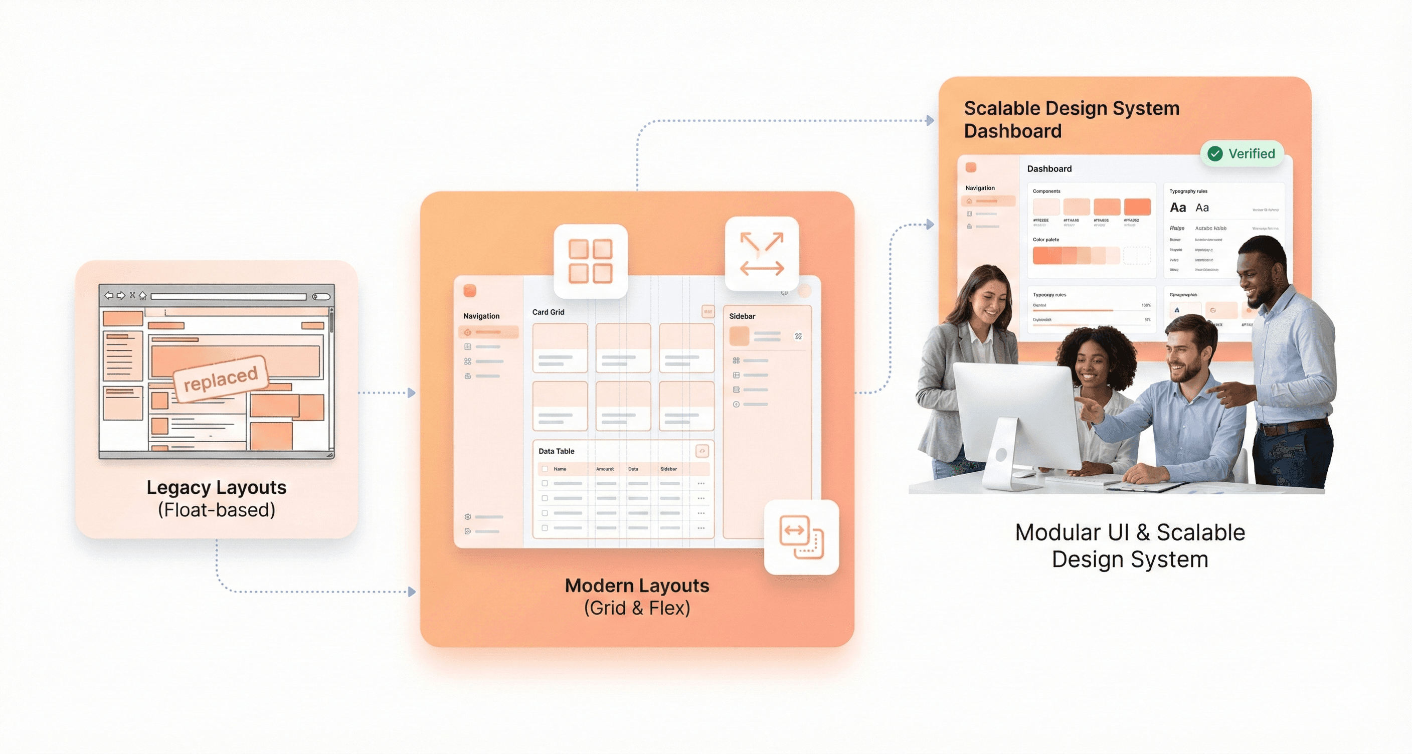
Struggling with Outdated Float and Inline-Block Methods
Developers frequently struggle with outdated layout methods like floats and inline-blocks, creating unnecessary complexity in their frontend development workflow. These legacy approaches, while functional, introduce a multitude of challenges that modern CSS solutions have elegantly addressed. Float-based layouts require extensive clearfix hacks, careful container management, and intricate workarounds to achieve even basic layout patterns that should be straightforward.
Inline-block methods present their own set of frustrations, including mysterious whitespace issues between elements, baseline alignment problems, and the constant battle with vertical centering. These approaches force developers to write verbose CSS, implement numerous browser-specific fixes, and maintain code that becomes increasingly difficult to modify as projects scale.
The persistence of these outdated methods stems from habit, fear of learning new technologies, or misplaced concerns about browser support. However, continuing to rely on floats and inline-blocks in modern web development creates technical debt that accumulates over time, making maintenance more expensive and feature implementation more time-consuming.
Avoiding Modern Flexbox and CSS Grid Solutions
Modern solutions such as Flexbox and CSS Grid can achieve the same layout results significantly faster, cleaner, and easier than their outdated counterparts. While Flexbox can be confusing initially, it is highly recommended for its problem-solving capabilities, unless support for IE9 or lower is required, which is increasingly rare in today's web landscape.
Flexbox revolutionizes one-dimensional layout challenges, providing intuitive solutions for alignment, distribution, and flexible sizing that previously required complex calculations and workarounds. CSS Grid complements Flexbox by handling two-dimensional layouts with unprecedented control and simplicity.
Interactive tutorials like 'Flexbox Froggy' are suggested for learning Flexbox efficiently, making the learning curve more manageable through gamification and practical examples. Philip Walton's 'Solved by Flexbox' project demonstrates the powerful capabilities of Flexbox that were previously impossible or very difficult to achieve, showcasing real-world scenarios where modern layout methods shine.
Creating Unnecessarily Complex Positioning Workarounds
The avoidance of modern layout technologies leads developers down rabbit holes of unnecessarily complex positioning workarounds that could be eliminated with proper tool selection. These workarounds often involve absolute positioning, negative margins, JavaScript-based layout calculations, and other brittle solutions that break under different screen sizes or content changes.
Such complexity not only increases development time but also creates maintenance nightmares where simple layout adjustments require extensive testing and debugging across multiple scenarios. The cognitive load of understanding and maintaining these workarounds diverts energy from more valuable development tasks and increases the likelihood of introducing bugs during future updates.
Poor Separation of Concerns That Reduces Code Quality
Mixing Presentation Logic with Content Structure
Frontend developers often compromise code quality by blending presentation logic directly with content structure, fundamentally violating the separation of concerns principle between CSS and HTML. Using inline styles represents one of the most common manifestations of this problem, where styling decisions become embedded within the markup itself. This approach creates a tangled relationship between content and presentation that undermines maintainability and scalability.
Another prevalent example involves uppercasing text directly in HTML instead of utilizing CSS's text-transform property. This practice forces presentation decisions into the content layer, making it nearly impossible to modify text styling globally without touching individual HTML elements. When presentation logic infiltrates the markup, developers sacrifice the flexibility that proper separation of concerns provides.
Combining Styling Responsibilities with Functional Hooks
The practice of combining styling classes with JavaScript functional hooks creates particularly problematic, tightly coupled code structures. When CSS classes serve dual purposes, both for visual styling and as JavaScript selectors—any modifications to the styling can inadvertently break JavaScript functionality. This coupling forces developers to navigate a complex web of dependencies whenever changes are required.
This approach transforms simple styling updates into potential functional hazards, where renaming a class for better semantic meaning or reorganizing CSS architecture can suddenly disable critical JavaScript features. The resulting code becomes fragile and unpredictable, requiring extensive testing for even minor visual adjustments.
Creating Tightly Coupled Code That Resists Changes
Carelessness in preparing unscalable solutions consistently results in tightly coupled code that actively resists changes, ultimately leading to costly refactoring efforts later in the development lifecycle. When concerns aren't properly separated, modifications in one area create ripple effects throughout the codebase, transforming simple updates into complex, time-consuming operations.
This tight coupling manifests in codebases where changing a single visual element requires modifications across multiple files and systems. The lack of proper separation creates dependencies that weren't intentionally designed, making the code brittle and expensive to maintain over time.
Conclusion
These eight frontend mistakes represent the most critical barriers between your code and a truly exceptional user experience. From unoptimized images that slow page loads to poor CSS architecture that creates maintenance nightmares, each mistake compounds to frustrate users and damage your site's performance. The good news is that every one of these issues is entirely preventable with the right approach and attention to detail.
The path forward is clear: prioritize mobile responsiveness from day one, optimize every image before deployment, structure your HTML for both SEO and accessibility, and maintain clean separation between your styling, content, and JavaScript. Remember that frontend development isn't just about making things work—it's about creating seamless experiences that users barely notice because everything flows so naturally. Take the time to implement these fixes now, and you'll save countless hours of refactoring while delivering the polished, professional interfaces your users deserve.


About the author
I’m the founder of Hashbyt, an AI-first frontend and UI/UX SaaS partner helping 200+ SaaS companies scale faster through intelligent, growth-driven design. My work focuses on building modern frontend systems, design frameworks, and product modernization strategies that boost revenue, improve user adoption, and help SaaS founders turn their UI into a true growth engine.


Is a clunky UI holding back your growth?
Is a clunky UI holding back your growth?
▶︎
Transform slow, frustrating dashboards into intuitive interfaces that ensure effortless user adoption.
▶︎
Transform slow, frustrating dashboards into intuitive interfaces that ensure effortless user adoption.
