
Menu
Menu
Menu
Build Once. Scale Forever
Build Design Systems That Scale and Accelerate Development 2x
Build Design Systems That Scale and Accelerate Development 2x
Build Design Systems That Scale and Accelerate Development 2x
Comprehensive atomic design systems that ensure brand consistency and reusable components
Comprehensive atomic design systems that ensure brand consistency and reusable components
Comprehensive atomic design systems that ensure brand consistency and reusable components


Trusted by 50+ SaaS Enterprises and Startups in USA and Europe
Trusted by 50+ SaaS Enterprises and Startups in USA and Europe
Trusted by 50+ SaaS Enterprises and Startups in USA and Europe


Why Choose Hashbyt for Design Systems
Eliminate UI Inconsistency and Double Development Velocity
Eliminate UI Inconsistency and Double Development Velocity
Seamless design-dev handoff, brand consistency, and scalable team growth
Seamless design-dev handoff, brand consistency, and scalable team growth
Bridge Handoff
Faster Content
Brand Consistency
Scale Teams
Evolve Efficiently

The disconnect between design and development leads to significant financial losses for companies each year. Designers produce mockups that developers often misinterpret, causing prolonged revision cycles and team frustration.
We address this issue by creating design systems with ready-to-use code components that align perfectly with designs. This approach allows product teams to launch features efficiently, developers to utilize pre-built components, and designers to maintain a unified source of truth, enhancing overall productivity.
Keep your workspace spotless with our Office Cleaning Service. Our team ensures a hygienic environment.
Restore shine with our Floor Polishing Service. Our team uses advanced techniques for a sleek, polished finish.
Breathe cleaner with our Dust Removal Service. Our team ensures a dust-free space for a healthier environment.
Bridge Handoff
Faster Content
Brand Consistency
Scale Teams
Evolve Efficiently
The disconnect between design and development leads to significant financial losses for companies each year. Designers produce mockups that developers often misinterpret, causing prolonged revision cycles and team frustration.
We address this issue by creating design systems with ready-to-use code components that align perfectly with designs. This approach allows product teams to launch features efficiently, developers to utilize pre-built components, and designers to maintain a unified source of truth, enhancing overall productivity.
Keep your workspace spotless with our Office Cleaning Service. Our team ensures a hygienic environment.
Restore shine with our Floor Polishing Service. Our team uses advanced techniques for a sleek, polished finish.
Breathe cleaner with our Dust Removal Service. Our team ensures a dust-free space for a healthier environment.
Complete Design System Services
End-to-End Design System Development From Audit to Governance
End-to-End Design System Development From Audit to Governance
Token architecture, component libraries, documentation, and migration strategies
Token architecture, component libraries, documentation, and migration strategies
Strategy & Audit
We start by evaluating your current UI to identify inconsistencies, redundant patterns, and technical debt. We document every button variation, color scheme, typographic style, and component pattern. This assessment highlights the chaos in your codebase and determines the cost of inconsistency, leading to a strategic plan for governance and pattern unification.
Token Architecture
Design tokens are key variables that define your visual identity through colours, spacing, and typography. We develop strong token systems that support theming and dark mode, allowing brand evolution without code changes. A single colour update can propagate across numerous components, keeping your product adaptable for the future.
Component Libraries
Our production-ready component libraries feature vital user interface elements like buttons, inputs, selects, modals, tooltips, navigation, data tables, and cards. Each component is accessible, tested, and documented with examples in various contexts. They support all states and keyboard navigation, ensuring seamless functionality across browsers for easy developer import.
Pattern Documentation
Teams require guidance on efficient component usage. We offer comprehensive documentation detailing usage patterns, design rationale, code examples, and accessibility considerations, along with component variant guidance. This resource reduces misuse, accelerates onboarding for new members, and serves as a decision-making framework, ensuring consistency as your team grows.
Migration Strategy
Implementing design systems in existing products requires careful planning. We create incremental adoption strategies to minimize disruptions, prioritize high-impact components for quick wins, and establish patterns for coexistence between legacy and new components. Our collaboration with your team ensures a gradual transition from the old user interface to design system components while monitoring improvements.
Governance Framework
Design systems require ongoing management for effectiveness. We establish governance processes that define contributor roles, the proposal and approval of new patterns, acceptable breaking changes, and documentation practices. Our contribution guidelines ensure quality while promoting progress, along with version management for safe updates and feedback mechanisms to address user needs.
Proven Impact
Measurable Results. Real Products. Proven Impact.
Measurable Results. Real Products. Proven Impact.
These aren’t design exercises, they’re business outcomes. Here’s what structured product design and development looks like in practice.
These aren’t design exercises, they’re business outcomes. Here’s what structured product design and development looks like in practice.
200+
SaaS Partners Served
95%
Client Retention Rate
3x
AI-Fast Delivery
10M+
End-Users Impacted
Benefits of Enterprise Design Systems
Ship Features 2x Faster and Achieve 95% UI Consistency
Ship Features 2x Faster and Achieve 95% UI Consistency
Reusable components and automated consistency that builds user trust
Reusable components and automated consistency that builds user trust
Ship Features 2x Faster With Reusable Components
Every team rebuilds the same UI elements repeatedly, which includes buttons, forms, modals, and data tables. Every month, hundreds of developer hours are wasted due to this redundancy. Design systems eliminate this waste by providing production-ready components that developers can simply import and compose. Because 70% of the UI elements are pre-existing, tested, and documented, creating a dashboard that used to take two weeks now only takes three days. This acceleration compounds over time as your component library grows, making each subsequent feature faster than the last.
Increases development velocity by 2x within 6 months
Increases development velocity by 2x within 6 months
Reduces UI development time by 60% through reusable components
Reduces UI development time by 60% through reusable components


Stop Users From Noticing Sloppy Inconsistency
Unreliable user interfaces make products seem unprofessional and erode user trust. Users doubt your professionalism when buttons appear differently on each page, colours change at random, or interactions act erratically. Design systems enforce consistency automatically through shared components and design tokens. Every interaction follows established patterns, every visual element aligns with brand standards, and users develop reliable mental models of how your product works. Consistency builds confidence and makes your product feel premium rather than patched together.
Achieves 95%+ UI consistency across all product touchpoints
Achieves 95%+ UI consistency across all product touchpoints
Reduces UI-related support tickets by 40% through predictable patterns
Reduces UI-related support tickets by 40% through predictable patterns
Build a Design System That Scales With Your Enterprise.
Build a Design System That Scales With Your Enterprise.
▶︎
✔ Standardize UI components to eliminate inconsistencies across teams and products ✔ Accelerate feature delivery with reusable, production-ready design libraries ✔ Reduce frontend rework and design-to-code friction ✔ Create a single source of truth that supports long-term product scalability
✔ Standardize UI components to eliminate inconsistencies across teams and products ✔ Accelerate feature delivery with reusable, production-ready design libraries ✔ Reduce frontend rework and design-to-code friction ✔ Create a single source of truth that supports long-term product scalability

Our Technology Stack
The Stack Behind Products That Scale
The Stack Behind Products That Scale
We use the same tools the world’s best product teams use, because your users deserve a product built on technology that won’t slow you down in 12 months.
We use the same tools the world’s best product teams use, because your users deserve a product built on technology that won’t slow you down in 12 months.
Frontend
Angular
React
Vue.js
Next.js
Vite
Webpack
Micro-Frontends
UI Libraries
Material UI
Tailwind
Bootstrap
Shadcn
Design Tool
Figma
Framer
Sketch
Adobe Creative Suite
Testing & QA Tools
Jest
React Testing Library
Cypress
State Management
Redux Toolkit
Zustand
TanStack Query
NGRX
Design Systems
Storybook
Design Tokens
CSS Variables
Monorepos
Performance
Lighthouse
Web Vitals
Sentry
LogRocket
New Relic
Compliance
WCAG 2.1 AA
ARIA
axe DevTools
Accessibility Audits
CI/CD & DevOps
GitHub Actions
Vercel
Netlify
Docker
Enterprise Security
OWASP
RBAC / Permission UI
Audit Logs UI
HIPAA / GDPR
Our Design System Development Process
How We Build Scalable Design Systems in 5 Strategic Steps
How We Build Scalable Design Systems in 5 Strategic Steps
Audit to governance with component libraries and comprehensive documentation
Audit to governance with component libraries and comprehensive documentation

Step 1: Audit & Analysis
We meticulously document all button variants, color usage, typography styles, spacing values, and component patterns, analyzing technical debt and identifying opportunities for consolidation and consistency.
Step 2: Foundation & Tokens
We establish your design token system, defining essential variables like colors and typography, ensuring components adapt to future needs with theming flexibility and dark mode support.
Step 3: Component Development
We create your essential component library with key elements: buttons, inputs, modals, navigation, and more, ensuring each is accessible, reliable, well-documented, and versatile.
Step 4: Documentation & Guidelines
We offer usage examples, design rationale, accessibility notes, code snippets, and guidelines for each pattern, ensuring consistency and efficient onboarding while preventing component misuse throughout the organization.
Step 5: Migration & Governance
We implement gradual migration strategies to replace legacy UI with design system components, measure improvements, establish governance for evolution, and train your team through workshops.
Step 5: Migration & Governance
Discover carbon reuse strategies with cloud-native, data-driven automation. Filter carbon emissions with air capture systems. Get real-time carbon trapping analysis.
Industries Where Product Excels
A Trusted UI/UX Development Company Serving Multiple Industries
A Trusted UI/UX Development Company Serving Multiple Industries
FinTech compliance, HealthTech security, Supply Chain complexity, every industry has its own design demands. We bring deep sector knowledge to every product so your users get an experience built for their world, not a generic template.
FinTech compliance, HealthTech security, Supply Chain complexity, every industry has its own design demands. We bring deep sector knowledge to every product so your users get an experience built for their world, not a generic template.


Clients' Pov
From Our Clients' Perspective
From Our Clients' Perspective
Where Great Ideas Become Big Wins and Real Results
Hashbyt delivered beyond our expectations. Their frontend architecture transformed our product's performance and measurably boosted our conversion rates. A strategic technical partner.

Murli Sid
CTO, Forwood

The UI/UX compliance expertise was crucial. They ensured our complex FinTech platform achieved WCAG 2.1 AA accessibility standards. We also saw a 65% reduction in UI-related support tickets.

Sarah Sparre
Director of R&D, 3Shape

They are more than an agency—they are partners. Hashbyt re-thought our entire user flow to be more compliant and efficient. Their strategic design decisions saved us significant iteration time later on.

Tim Hansan
Head of IT, Disney Cruise Line

Hashbyt delivered beyond our expectations. Their frontend architecture transformed our product's performance and measurably boosted our conversion rates. A strategic technical partner.
Murli Sid
CTO, Forwood
The UI/UX compliance expertise was crucial. They ensured our complex FinTech platform achieved WCAG 2.1 AA accessibility standards. We also saw a 65% reduction in UI-related support tickets.
Sarah Sparre
Director of R&D, 3Shape
They are more than an agency—they are partners. Hashbyt re-thought our entire user flow to be more compliant and efficient. Their strategic design decisions saved us significant iteration time later on.
Tim Hansan
Head of IT, Disney Cruise Line
Design System FAQs
Frequently Asked Questions About Enterprise Design Systems
Learn about design systems, timelines, adoption strategies, and development impact
Design System FAQs
A design system is your product's visual and functional DNA, a comprehensive collection of reusable components, design tokens, patterns, and guidelines that define how your product looks and behaves. It includes a component library with pre-built UI elements, design tokens defining colours and spacing, usage documentation explaining when to use what, accessibility standards ensuring inclusive design, and code implementations matching designs perfectly. Unlike style guides that just show colours and fonts, design systems provide actual working components developers use daily, making consistency automatic rather than aspirational.
Answer
What exactly is a design system?
Question
Component libraries are one part of design systems. A component library provides the code, which consists of buttons, inputs, and modals. Design tokens for systematic theming, comprehensive documentation describing usage, accessibility guidelines ensuring compliance, contribution processes for evolution, and governance models maintaining quality are all examples of design systems. Think of component libraries as vocabulary while design systems are complete languages with grammar, usage rules, and cultural context. Many teams build component libraries but fail to get adoption because they lack the surrounding ecosystem that makes components actually usable at scale.
Answer
How is this different from a component library?
Question
For mid-sized products, the initial design system development process, which includes audit and strategy, design token architecture, core component development (20–30 components), documentation creation, and migration planning, usually takes 8–12 weeks. But design systems are always changing; you start with the essential elements and add more as needed. We recommend starting with components covering 80% of common use cases, which provides immediate value while avoiding analysis paralysis. Full enterprise systems serving multiple products might take 16-24 weeks initially, but deliver value incrementally throughout development rather than requiring complete before shipping.
Answer
How long does design system development take?
Question
Initially, there's a small investment period while we build the foundation and migrate existing code. However, this pays back within 2-3 months as development velocity increases dramatically. Because developers compose interfaces from pre-existing components rather than creating everything from scratch, features that used to take two weeks now take four days. The time saved on every future feature quickly dwarfs the initial investment. As the component library develops and developers internalise patterns, teams usually report breaking even after three months and attaining twofold development acceleration within six months.
Answer
Will this slow down our current development?
Question
Adoption is critical, so we engineer it into our process. We involve your team at every stage of the development process to make sure components meet actual needs, produce excellent documentation that makes usage clear, offer practical training and onboarding sessions, set up clear contribution processes for evolution, measure adoption metrics and continuously collect feedback, and celebrate successes that demonstrate time savings. Additionally, we make it easier to use the design system than to not use it; creating excellent components with excellent documentation is quicker than creating custom solutions. Adoption occurs organically when consistency and the path of least resistance coincide.
Answer
How do you ensure our team actually uses it?
Question
Design System FAQs
Frequently Asked Questions About Enterprise Design Systems
Learn about design systems, timelines, adoption strategies, and development impact
Design System FAQs
A design system is your product's visual and functional DNA, a comprehensive collection of reusable components, design tokens, patterns, and guidelines that define how your product looks and behaves. It includes a component library with pre-built UI elements, design tokens defining colours and spacing, usage documentation explaining when to use what, accessibility standards ensuring inclusive design, and code implementations matching designs perfectly. Unlike style guides that just show colours and fonts, design systems provide actual working components developers use daily, making consistency automatic rather than aspirational.
Answer
What exactly is a design system?
Question
Component libraries are one part of design systems. A component library provides the code, which consists of buttons, inputs, and modals. Design tokens for systematic theming, comprehensive documentation describing usage, accessibility guidelines ensuring compliance, contribution processes for evolution, and governance models maintaining quality are all examples of design systems. Think of component libraries as vocabulary while design systems are complete languages with grammar, usage rules, and cultural context. Many teams build component libraries but fail to get adoption because they lack the surrounding ecosystem that makes components actually usable at scale.
Answer
How is this different from a component library?
Question
For mid-sized products, the initial design system development process, which includes audit and strategy, design token architecture, core component development (20–30 components), documentation creation, and migration planning, usually takes 8–12 weeks. But design systems are always changing; you start with the essential elements and add more as needed. We recommend starting with components covering 80% of common use cases, which provides immediate value while avoiding analysis paralysis. Full enterprise systems serving multiple products might take 16-24 weeks initially, but deliver value incrementally throughout development rather than requiring complete before shipping.
Answer
How long does design system development take?
Question
Initially, there's a small investment period while we build the foundation and migrate existing code. However, this pays back within 2-3 months as development velocity increases dramatically. Because developers compose interfaces from pre-existing components rather than creating everything from scratch, features that used to take two weeks now take four days. The time saved on every future feature quickly dwarfs the initial investment. As the component library develops and developers internalise patterns, teams usually report breaking even after three months and attaining twofold development acceleration within six months.
Answer
Will this slow down our current development?
Question
Adoption is critical, so we engineer it into our process. We involve your team at every stage of the development process to make sure components meet actual needs, produce excellent documentation that makes usage clear, offer practical training and onboarding sessions, set up clear contribution processes for evolution, measure adoption metrics and continuously collect feedback, and celebrate successes that demonstrate time savings. Additionally, we make it easier to use the design system than to not use it; creating excellent components with excellent documentation is quicker than creating custom solutions. Adoption occurs organically when consistency and the path of least resistance coincide.
Answer
How do you ensure our team actually uses it?
Question
Turn Design Chaos Into Scalable Product Infrastructure.
✔ Align design and engineering through structured component architecture ✔ Improve development velocity with modular, reusable UI systems ✔ Enforce governance, accessibility, and brand consistency at scale ✔ Future-proof your SaaS platform with a system built for growth
▶︎
Build a Design System That Scales With Your Enterprise.
✔ Standardize UI components to eliminate inconsistencies across teams and products ✔ Accelerate feature delivery with reusable, production-ready design libraries ✔ Reduce frontend rework and design-to-code friction ✔ Create a single source of truth that supports long-term product scalability
Our Service
Stay Current with the Strategic Insights
Stay Current with the Strategic Insights
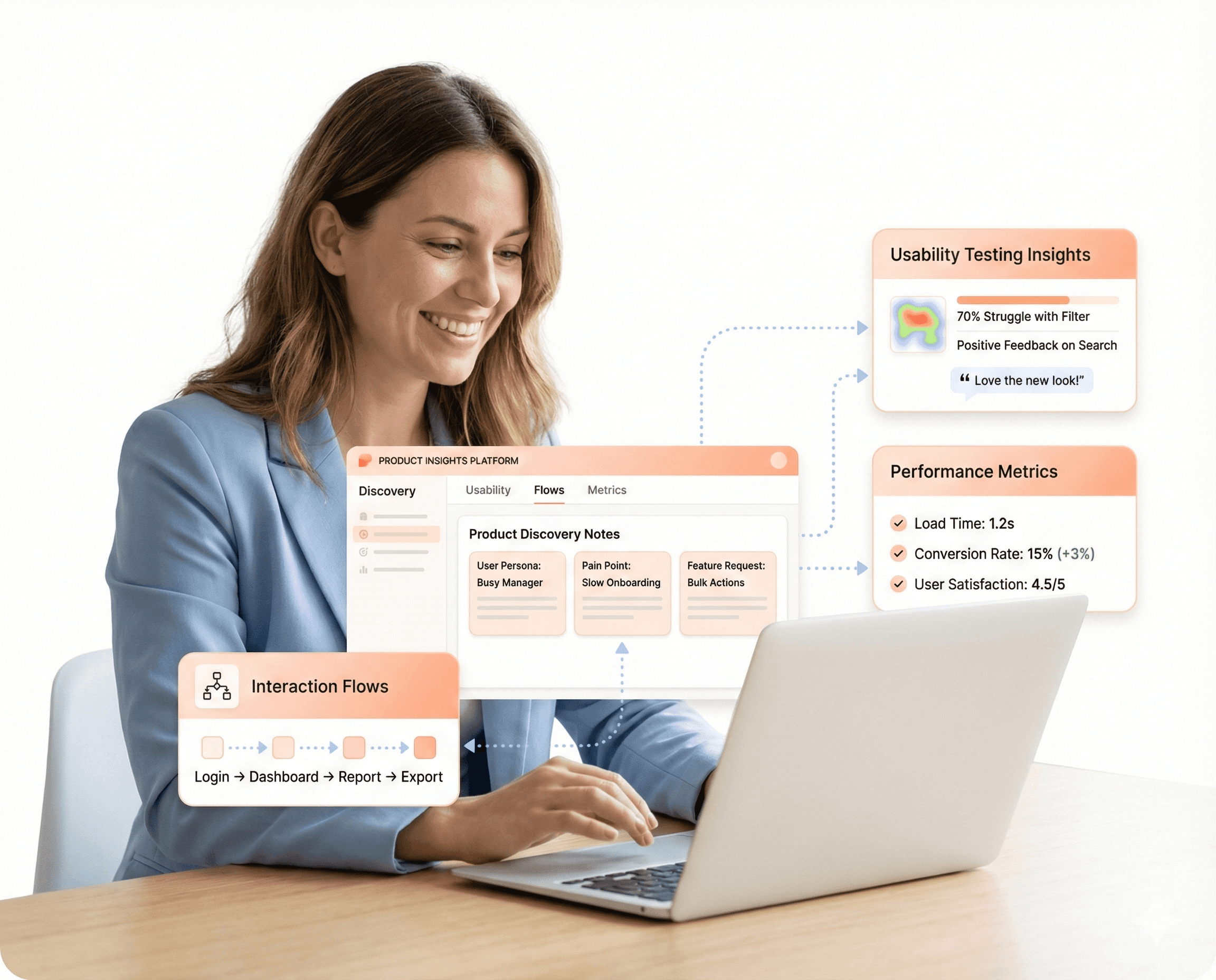
Most Digital Products Fall Short
Most SaaS teams jump straight to design before they’ve validated what users actually need. The result? Features nobody uses, onboarding flows that confuse, dashboards that frustrate, and an engineering backlog full of rework. Structured product design changes that, aligning every interface decision with real user workflows before a single line of code is written.

Productivity Risks
Hidden usability issues in enterprise interfaces reduce adoption, slow workflows, and impact overall product performance across SaaS environments.

Built for SaaS teams
Slow delivery, messy codebases, scaling issues, poor performance, these aren’t just engineering problems. They’re product problems. And they compound every sprint.
Most Digital Products Fall Short
Most SaaS teams jump straight to design before they’ve validated what users actually need. The result? Features nobody uses, onboarding flows that confuse, dashboards that frustrate, and an engineering backlog full of rework. Structured product design changes that, aligning every interface decision with real user workflows before a single line of code is written.
Productivity Risks
Hidden usability issues in enterprise interfaces reduce adoption, slow workflows, and impact overall product performance across SaaS environments.
Our Service
Stay Current with the Strategic Insights
Most Digital Products Fall Short
Most SaaS teams jump straight to design before they’ve validated what users actually need. The result? Features nobody uses, onboarding flows that confuse, dashboards that frustrate, and an engineering backlog full of rework. Structured product design changes that, aligning every interface decision with real user workflows before a single line of code is written.
Productivity Risks
Hidden usability issues in enterprise interfaces reduce adoption, slow workflows, and impact overall product performance across SaaS environments.
Built for SaaS teams
Slow delivery, messy codebases, scaling issues, poor performance, these aren’t just engineering problems. They’re product problems. And they compound every sprint.
Hashbyt delivered beyond our expectations. Their frontend architecture transformed our product's performance and measurably boosted our conversion rates. A strategic technical partner.
Murli Sid
CTO, Forwood
The UI/UX compliance expertise was crucial. They ensured our complex FinTech platform achieved WCAG 2.1 AA accessibility standards. We also saw a 65% reduction in UI-related support tickets.
Sarah Sparre
Director of R&D, 3Shape
They are more than an agency—they are partners. Hashbyt re-thought our entire user flow to be more compliant and efficient. Their strategic design decisions saved us significant iteration time later on.
Tim Hansan
Head of IT, Disney Cruise Line
Hashbyt delivered beyond our expectations. Their frontend architecture transformed our product's performance and measurably boosted our conversion rates. A strategic technical partner.
Murli Sid
CTO, Forwood
The UI/UX compliance expertise was crucial. They ensured our complex FinTech platform achieved WCAG 2.1 AA accessibility standards. We also saw a 65% reduction in UI-related support tickets.

Sarah Sparre
Director of R&D, 3Shape

“They are more than an agency—they are partners. Hashbyt re-thought our entire user flow to be more compliant and efficient. Their strategic design decisions saved us significant iteration time later on.”
Tim Hansan
Head of IT, Disney Cruise Line
Clients' POV
From Our Clients' Perspective
Where Great Ideas Become Big Wins and Real Results
Build a Design System That Scales With Your Enterprise.
▶︎
✔ Standardize UI components to eliminate inconsistencies across teams and products ✔ Accelerate feature delivery with reusable, production-ready design libraries ✔ Reduce frontend rework and design-to-code friction ✔ Create a single source of truth that supports long-term product scalability