


88% of users abandon a product after a poor interface experience — and in 2026, with more digital products competing for the same attention, that drop-off happens faster than ever. That staggering number highlights a core truth of the digital landscape: how a product looks and feels is just as important as what it does. User Interface (UI) design plays a critical role in shaping this experience by transforming complex functionality into clear, intuitive, and visually engaging interfaces. In 2026, clean layouts, thoughtful interactions, and modern UI design principles have become the baseline expectation for SaaS products competing for user attention.
So, what is UI design? It is the process of creating the visual and interactive elements of digital products, websites, mobile apps, and SaaS platforms that users see and interact with every day. It encompasses everything users see and interact with, from buttons and typography to layout, color systems, and animations.
Effective UI design guides users effortlessly through a product, improving usability, engagement, and conversions. In this guide, you’ll learn the fundamentals of UI design, explore the complete UI design process, and discover best practices and tools to master user interface design in 2026, whether you’re a designer, product leader, or business owner.
Understanding UI User Interface Design: Scope, Meaning, and Business Impact
User Interface (UI) design focuses on the aesthetic and interactive qualities that bring a digital product to life. The primary goal is to create an interface that is not only visually appealing but also easy to navigate and predictable in its behavior. When users encounter a new app or website, the UI is their first point of contact. A cluttered, confusing, or inconsistent interface can lead to frustration and high drop-off rates, while a thoughtful one builds trust and encourages repeat engagement.
In 2026, the significance of UI design extends beyond simple usability. It is a key differentiator in a crowded market. With countless digital products competing for attention, an exceptional UI can be the deciding factor that captivates a user and converts them into a loyal customer. It addresses critical user pain points, from navigating a complex system to ensuring a design is accessible to everyone. Ultimately, effective UI design translates into better user satisfaction, stronger brand perception, and measurable business growth.
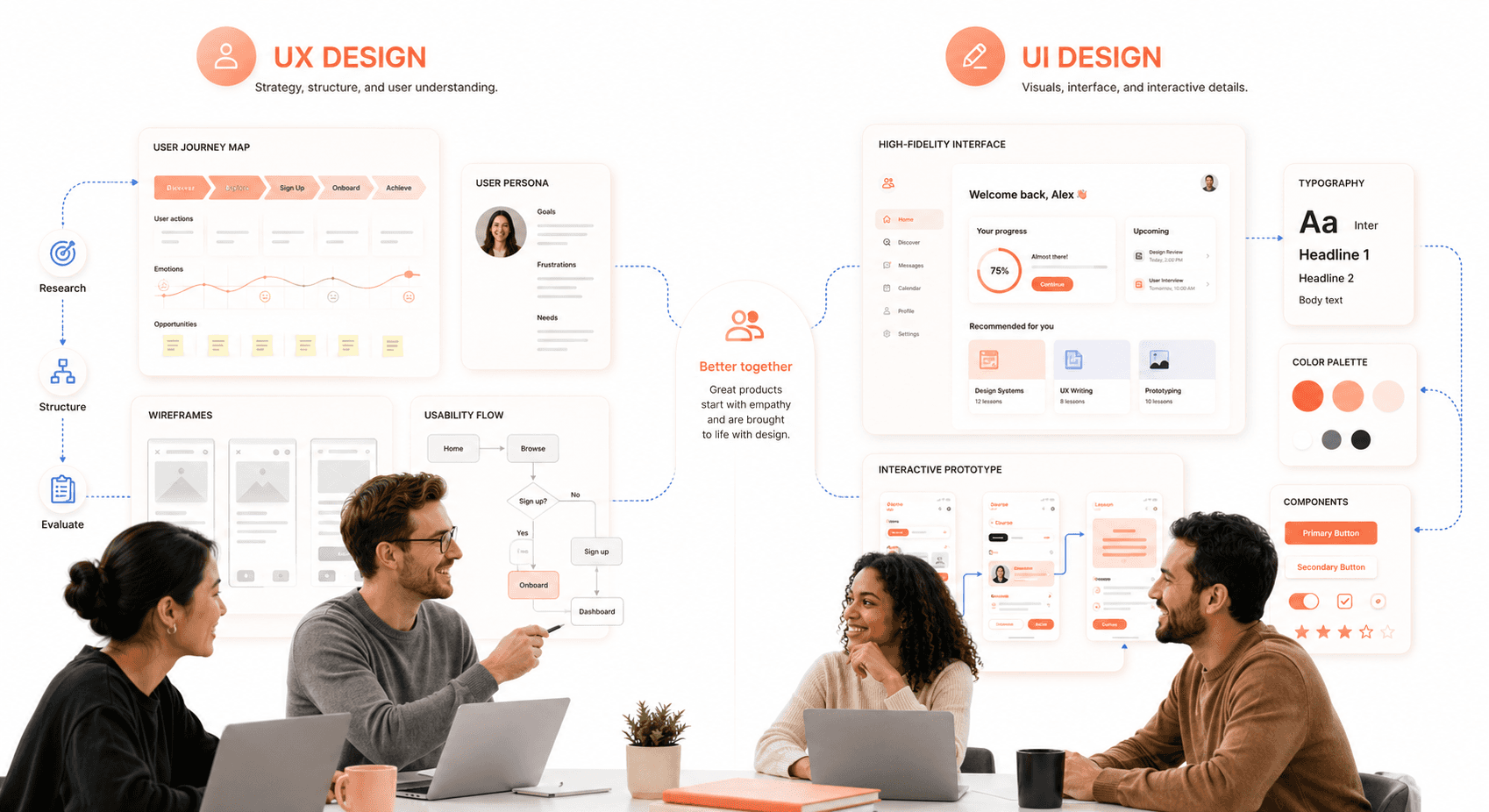
UI vs UX Design: Key Differences Every SaaS Team Should Know
UI user interface design and UX are often used interchangeably, but they represent two distinct disciplines and understanding the difference matters for anyone building or improving a digital product. Understanding their relationship is fundamental for anyone involved in product development.
User Experience (UX) Design is the holistic process of enhancing a user's overall satisfaction with a product. UX designers focus on the entire user journey, from initial discovery to final interaction. Their work involves extensive research to understand user needs, defining the product's structure (information architecture), creating user flows, and conducting usability testing. UX is about the feeling. It is the product logical, efficient, and enjoyable to use?
User Interface (UI) Design is a subset of UX that concentrates on the product's visual presentation and interactivity. Designers and founders aligning on scope should review the essential UI/UX design terms every SaaS founder should know before kicking off. UI designers take the structural foundation laid by UX designers and build the tangible interface. They are responsible for the color schemes, typography, button styles, iconography, and spacing. If UX is the blueprint for a house, UI is the paint, furniture, and interior decor that make it a beautiful and livable space.
In short, what is UI design versus UX is one of the most common questions in product teams because the two disciplines are deeply symbiotic and rarely succeed in isolation. A beautiful UI is ineffective if the underlying UX is flawed, and a brilliant UX can be undermined by a poor UI. A successful product requires both to work in harmony, creating an experience that is both functional and delightful.
UI Design Process: 7 Essential Steps from Concept to Launch
A structured process is essential for transforming an idea into a polished and functional interface. While the exact steps can vary, this framework provides a comprehensive roadmap for delivering high-quality UI design.
Step 1: User Research and Goal Definition
Before a single pixel is placed, the process begins with understanding. This involves two key areas: the user and the business.
User Understanding: Who are you designing for? Through user personas, interviews, and surveys, you can gather insights into their goals, pain points, and technical abilities. This user-centered approach ensures the final design solves real problems.
Goal Definition: What does the product need to achieve? Collaborate with stakeholders to define clear business objectives and functional requirements. For example, a goal might be to increase newsletter sign-ups by 20% or to simplify the checkout process. These goals will guide every design decision.
Step 2: Market Research and Design Inspiration
With a clear understanding of the project, the next step is to explore the existing landscape. Look at competitor products to identify industry conventions, see what they are doing well, and find opportunities for differentiation. Gather inspiration from design platforms like Dribbble, Behance, and design awards sites. This research phase helps spark creative ideas and ensures your design is both innovative and grounded in established patterns that users will find familiar.
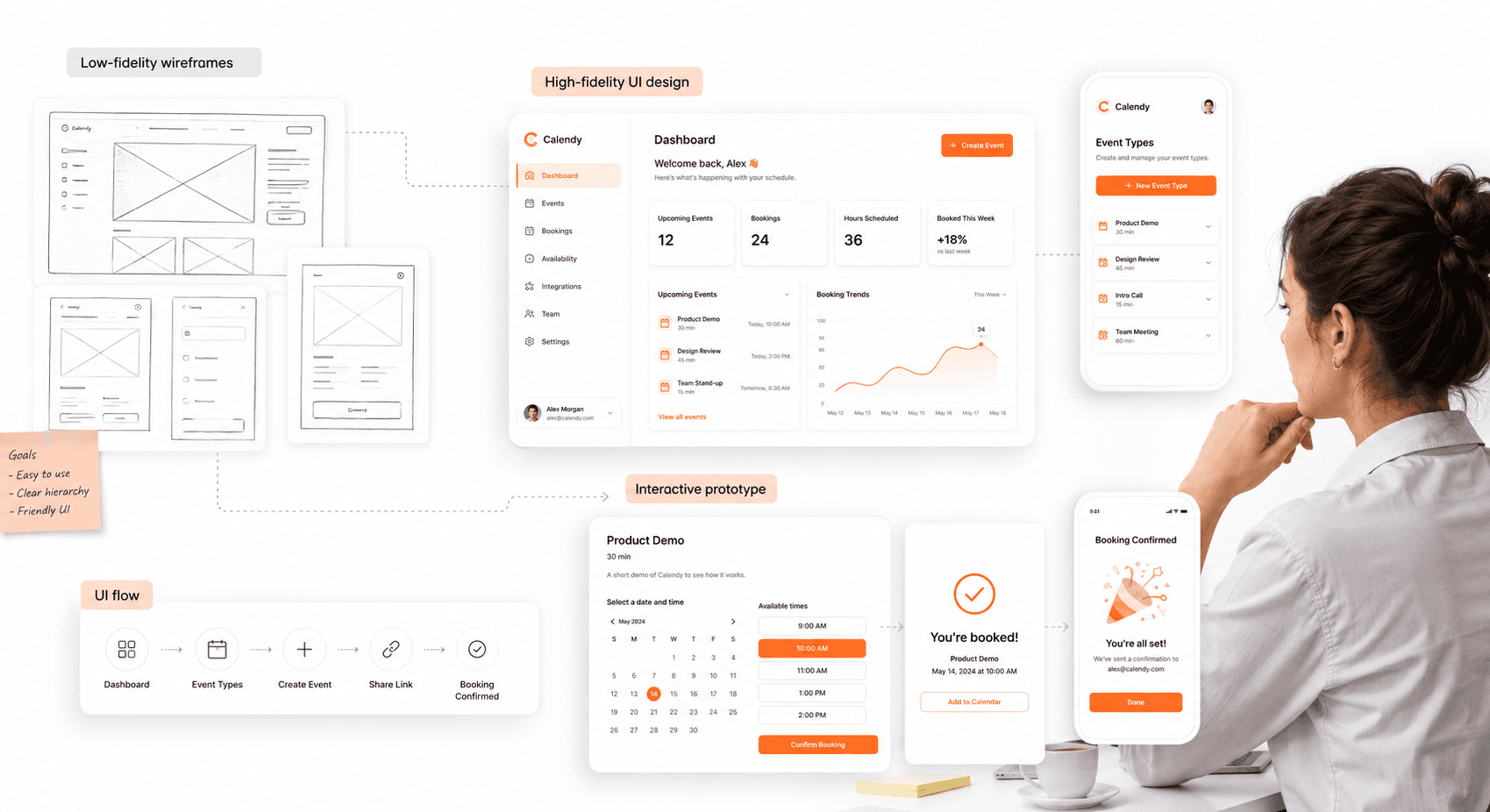
Step 3: Wireframing and Layout Planning
This is where visual ideation begins. Start with rough sketches on paper or a digital whiteboard to explore different layouts and concepts quickly. Once you have a promising direction, create low-fidelity wireframes.
Wireframes are basic, black-and-white blueprints of the interface. They focus exclusively on structure, hierarchy, and the placement of key elements like navigation, buttons, and content blocks. This step is about defining the skeleton of the interface without the distraction of colors or typography, allowing for rapid iteration and feedback on the core functionality.
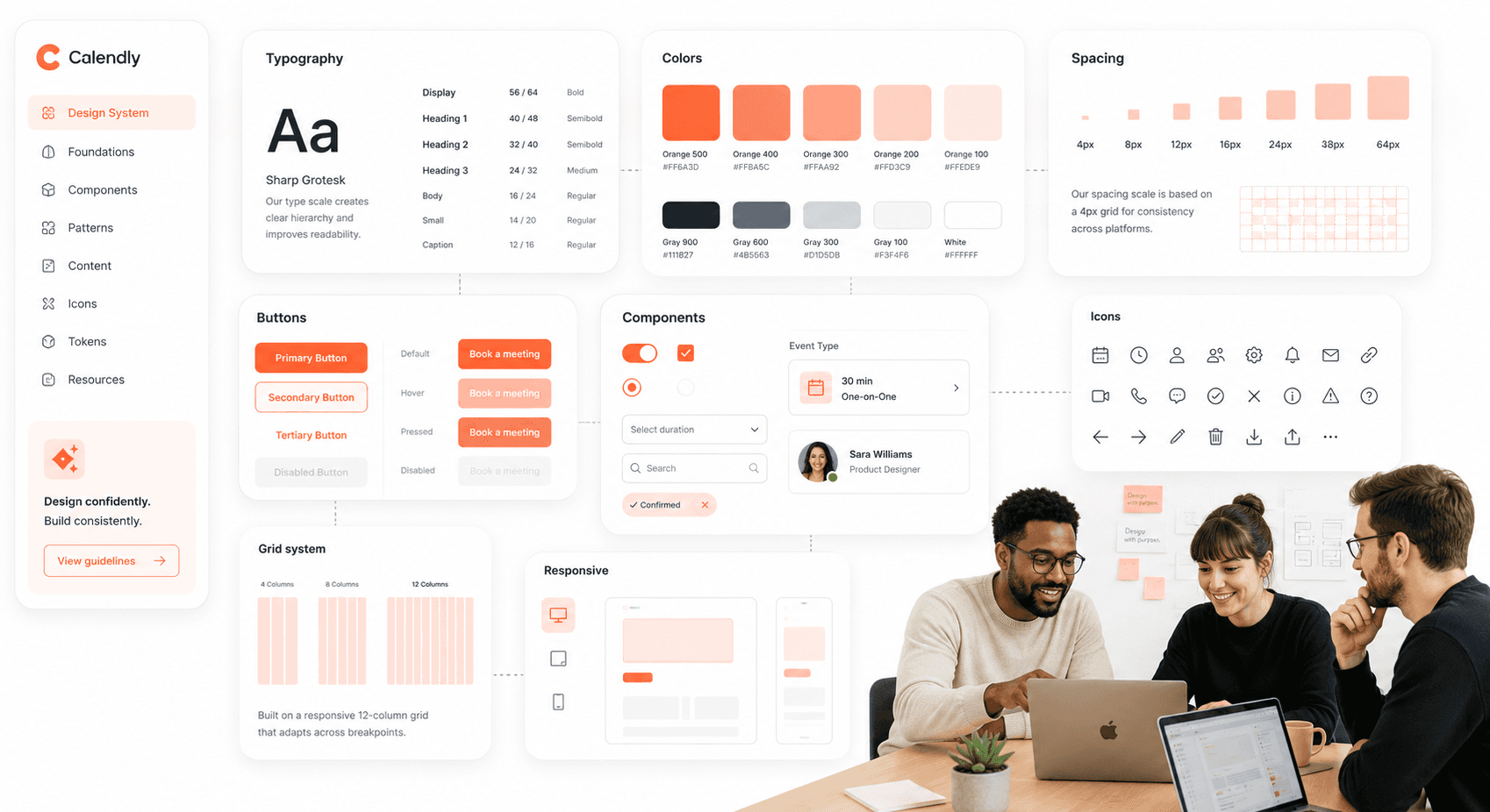
Step 4: Visual Design and Design Systems
Consistency is the foundation of good UI design. Before moving to high-fidelity screens, establish a clear visual direction — for ambitious brand systems, tetradic color schemes for richer SaaS palettes give you four anchor hues that map cleanly onto primary, secondary, accent, and alert roles.
Color Palette: Select primary, secondary, and accent colors that align with the brand's identity and evoke the desired emotional response.
Typography: Choose readable and scalable fonts for headings, body text, and labels. A clear typographic hierarchy guides the user's eye and improves comprehension.
Iconography: Select or create a consistent set of icons that are universally understood.
Design System: For larger projects, creating a design system, a centralized library of reusable components and guidelines, is invaluable. It ensures consistency across the entire product and streamlines future development.
Step 5: High-Fidelity UI and Interactive Prototypes
Now it's time to bring the wireframes to life. High-fidelity mockups are detailed, pixel-perfect representations of the final interface. They incorporate the established design style, including colors, typography, imagery, and branding. These mockups provide a static but realistic view of what the product will look like.
The next stage is to create an interactive prototype. Using tools like Figma or Adobe XD, you can link the mockups together to simulate the user flow. Prototypes allow users and stakeholders to click through the interface, test navigation, and experience the product's interactivity before any code is written. This is a critical step for identifying usability issues early.
Step 6: Usability Testing and Iteration
With an interactive prototype in hand, it's time to test it with real users — a step-by-step 48-hour UX audit is a fast way to surface the friction points that need fixing before development starts. Pay close attention to where they struggle, what confuses them, and what they find intuitive.
Gathering this direct feedback is invaluable for validating design choices and uncovering blind spots. After analyzing the findings, iterate on the design to address any identified problems. This cycle of testing and refinement is what elevates a good design to a great one. The core of what is ux ui design lies in this iterative, user-focused loop.
Step 7: Developer Handoff and UI Implementation
The final step is to prepare the design for implementation. A smooth handoff to the development team is crucial for ensuring the final product matches the design intent. This involves:
Detailed Specifications: Provide clear documentation for colors, fonts, spacing, and component behavior.
Asset Export: Prepare all necessary assets, such as icons, images, and logos, in the correct formats and resolutions.
Collaboration: Work closely with developers throughout the building process. Be available to answer questions, provide clarification, and review the implemented design to ensure accuracy.
What Makes Good UI Design: Best Practices for Modern UI Design in SaaS
The field of UI design is constantly evolving. Staying current with best practices is essential for creating modern, effective interfaces. Here are key trends and principles to focus on in 2026.
Mobile-First UI Design Strategy
More users access the internet from mobile devices than from desktops. A mobile-first approach involves designing for the smallest screen first and then scaling up. This methodology forces you to prioritize essential content and functionality, resulting in a cleaner, more focused experience across all devices. Key considerations include large touch targets, streamlined navigation, and optimized performance for slower connections.
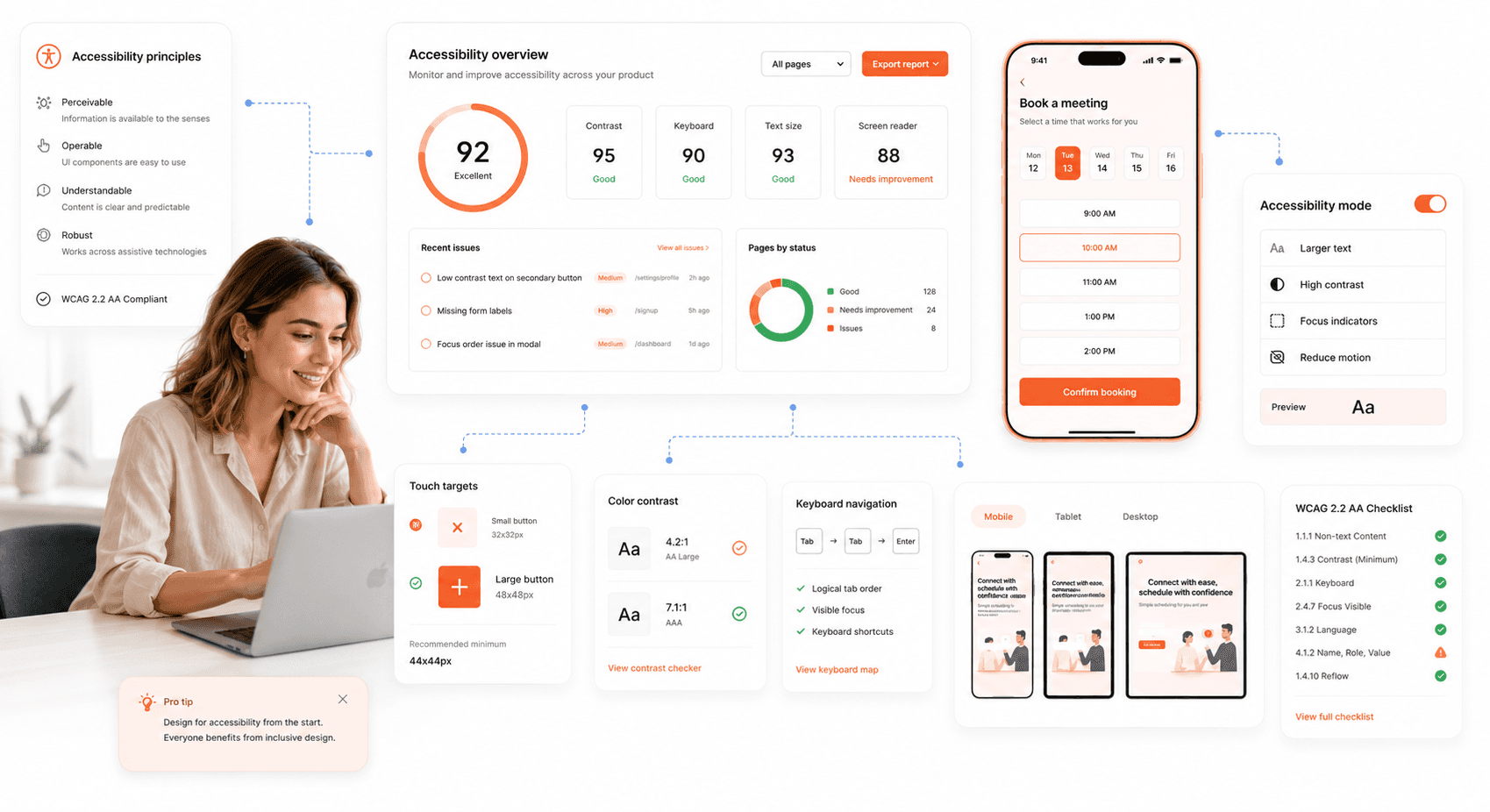
Accessible UI Design (WCAG & A11y)
An accessible design can be used by everyone, including people with disabilities. This is not just a best practice, it's an ethical and often legal requirement. Key accessibility principles include:
Sufficient Color Contrast: Ensure text is easily readable against its background.
Keyboard Navigation: All interactive elements should be accessible using only a keyboard.
Screen Reader Support: Use proper semantic HTML and provide descriptive alt text for images.
Clear and Simple Language: Avoid jargon and write content that is easy to understand.
Dark Mode UI Design Guidelines
Dark mode has become a user expectation. It can reduce eye strain in low-light conditions and save battery life on OLED screens. When implementing dark mode, avoid pure black backgrounds, which can increase eye strain. Instead, opt for dark gray tones. Ensure that your color palette is adapted to maintain readability and visual hierarchy in both light and dark themes.
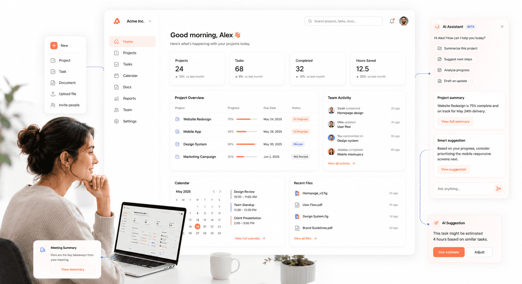
AI-Integrated UI Design
One of the defining shifts in modern UI design is moving away from AI as an all-knowing autopilot and toward AI as a thoughtful copilot — present, optional, and respectful of user context, present, optional, and respectful of human context. In practice, this means AI should live in the sidebars, overlays, and collapsible panels of your interface offering assistance when called, not interrupting the user's primary flow.
AI becomes an ambient layer — invisible unless needed — reducing cognitive load and shifting focus from talking to AI to getting work done faster. The current AI UX design patterns for SaaS show how this plays out across sidebars, overlays, and inline assist surfaces. For SaaS products especially, the question is no longer whether to include AI in the UI, but how to integrate it without disrupting the experience users already know.
Performance-Optimized Interface Design
A user's patience is thin. A slow-loading interface is a primary cause of user frustration and abandonment. Optimize your design by compressing images, using efficient code, and minimizing the use of heavy animations or scripts. A fast, responsive interface feels professional and respects the user's time.
Cognitive Load Reduction
A clear trend for UX/UI in 2026 is reducing cognitive load interfaces should prioritize white space, visible and easy defaults, and conveniently placed content hierarchies. The assumption that "more features = more value" has been replaced by its opposite: users are distracted, time-poor, and rarely operating at peak focus.
Streamline navigation, limit the number of decisions per screen, and remove anything decorative that doesn't carry functional weight. Reducing complexity doesn't mean strictly minimalist aesthetics, it means minimalist structure.
This principle is especially visible in UI design dashboard contexts, where users are processing multiple data streams simultaneously. A well-structured dashboard limits decisions per screen, uses progressive disclosure, and reserves visual emphasis for the actions that matter most.
Microinteractions and Visual Feedback
Microinteractions are the small, subtle animations that respond to a user's action, like a button changing color on hover or a subtle bounce when an item is added to a cart. These details provide immediate feedback, guide the user, and make the interface feel more alive and engaging. Thoughtful microinteractions can significantly improve the perceived quality of a product. The goals of a ui designer should include mastering these small details that create a big impact.
In 2026, motion earns its keep not by flashing but by guiding communicating state, structure, and system intent. Equally important: always implement a "Reduce Motion" option. Giving users a way to say "stop" is now considered a baseline accessibility requirement, not a nice-to-have particularly for users with vestibular disorders or attention differences.
UI Design Dashboard Principles: How to Handle Data-Heavy Interfaces
Dashboards are one of the most demanding UI design challenges, users arrive with specific goals, limited time, and low tolerance for confusion. Good UI design dashboard thinking starts with a single question: what does this user need to decide or act on right now?
From there, every element earns its place. Use progressive disclosure to hide secondary data behind expandable rows rather than crowding the primary view. Establish a clear visual hierarchy, the most important metric is the largest, most prominently positioned element on screen. Limit color use to encode meaning: green for healthy, red for critical, gray for neutral. Avoid decorative charts that look impressive but don't answer a real question.
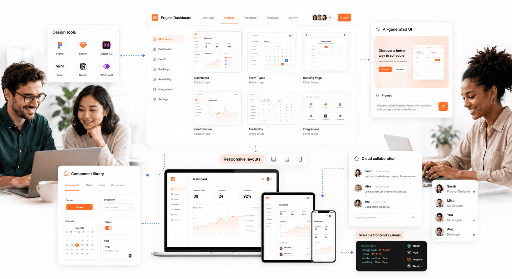
For teams evaluating UI design applications to build or prototype dashboards, Figma remains the dominant choice for collaboration, while tools like Penpot offer an open-source path for teams avoiding per-seat pricing.
Top UI Design Applications Used by Professionals in 2026
Choosing the right UI design applications can dramatically accelerate your workflow and team collaboration. The market has consolidated around a few tools that now dominate professional practice.
Figma
Best For: Collaborative workflows and cloud-based teams.
Key Features: Figma is a browser-based tool that allows for real-time collaboration. Its powerful vector editing, prototyping, and design systems management capabilities have made it a favorite for teams of all sizes. Since it works on any operating system, it removes barriers to collaboration.
Sketch
Best For: macOS users and designers who rely on an extensive plugin ecosystem.
Key Features: Sketch is a lightweight, vector-based design tool that was a pioneer in the UI design space. Its clean interface and powerful features, such as Symbols for reusable components, make it a strong choice. However, its macOS-only limitation can be a drawback for cross-platform teams.
Penpot

Best For: Teams wanting a free, open-source alternative with full design system capabilities.
Key Features: Penpot is the leading open-source UI design tool free forever, self-hostable, and built on open web standards (SVG-native). It supports real-time collaboration, components, prototyping, and design tokens, and runs in any browser. For teams that want Figma-level functionality without per-seat pricing, Penpot is the most credible alternative in 2026. Worth noting: Adobe XD has been placed in maintenance mode no new features are being added and it is no longer sold as a standalone app, so any team currently on XD should be planning a migration.
AI-Native Design Tools (Figma Make, Google Stitch, Uizard)
Best For: Rapid prototyping, early-stage ideation, and teams wanting to reduce time from concept to testable UI.
Key Features: A new wave of AI-powered tools generates UI from text prompts rather than blank canvases — see how AI UI generation is reshaping SaaS product design for the broader workflow context. Google Stitch, from Google Labs, turns text prompts, images, and wireframes into UI designs and front-end code, ideal for early-stage ideation and concept validation where speed matters more than pixel-perfect output. Figma Make generates UI directly within Figma from natural language prompts. Uizard can scan hand-drawn wireframes and convert them into editable digital designs. These tools don't replace the design process, but they compress the time from idea to testable prototype significantly.
Understanding what is ui design is only the first step. Mastering the craft requires process, practice, and a deep sense of empathy for the user. By following these steps and staying current with best practices, you can create interfaces that not only look beautiful but also deliver real value and drive success.
Final Thoughts: How to Master UI Design in 2026
UI design in 2026 is no longer just about how a product looks, it's about how clearly it thinks on behalf of the user. The interfaces that win are the ones that reduce friction, guide without overwhelming, and earn trust before asking for action.
Following the 7-step process here, combined with 2026's defining principles ambient AI, cognitive simplicity, accessible motion, and system-level consistency, gives you the foundation to build interfaces that don't just look good, but actually perform. Ready to modernize your product's frontend? Partner with Hashbyt to build scalable, AI-first UI that drives real growth.


About the author
I’m the founder of Hashbyt, an AI-first frontend and UI/UX SaaS partner helping 200+ SaaS companies scale faster through intelligent, growth-driven design. My work focuses on building modern frontend systems, design frameworks, and product modernization strategies that boost revenue, improve user adoption, and help SaaS founders turn their UI into a true growth engine.


Is a clunky UI holding back your growth?
Is a clunky UI holding back your growth?
▶︎
Transform slow, frustrating dashboards into intuitive interfaces that ensure effortless user adoption.
▶︎
Transform slow, frustrating dashboards into intuitive interfaces that ensure effortless user adoption.
