


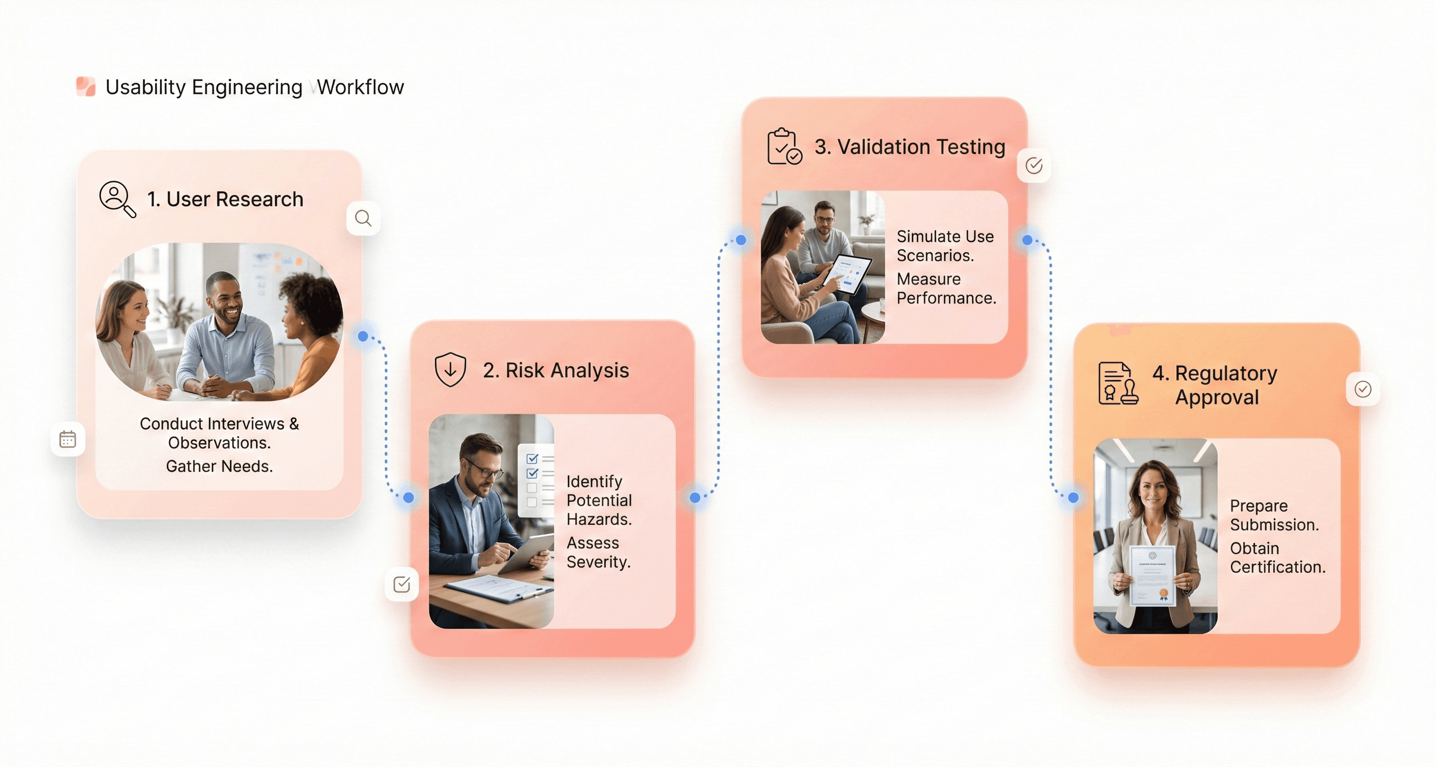
Medical device UX design sits at the intersection of user experience and life-saving technology, where poor design choices can directly impact patient safety and clinical outcomes. This guide is written for UX designers, product managers, and medical device developers who must balance usability, regulatory compliance, and real-world clinical demands.
Unlike consumer apps or websites, medical devices require a safety-first UX approach that aligns with strict FDA regulations, international standards like IEC 62366-1, and usability engineering best practices. Every interface decision, from visual hierarchy to interaction flow, must reduce risk and prevent use errors in high-pressure healthcare environments.
This guide explains how medical device UX design improves patient safety while meeting FDA and IEC 62366 requirements. It covers usability engineering, clinical testing, risk management, interface design for high-stress environments, and compliance documentation. Built for designers and product teams, it offers a practical framework to create safe, compliant medical devices that perform reliably in real healthcare settings.
Medical Device UX Design Process (End to End)
What Medical Device UX Means in Healthcare Environments
User experience in medical devices goes far beyond making technology look appealing or easy to navigate. Healthcare UX centers on creating interfaces and interactions that medical professionals can use accurately and efficiently, even under extreme pressure. When a nurse needs to program an IV pump during a code blue emergency, every second matters. The device interface must communicate clearly, respond predictably, and prevent errors that could harm patients.
Medical device UX encompasses the entire journey users have with a device - from initial setup and training to daily operation and maintenance. This includes physical ergonomics, cognitive load management, and emotional considerations. A dialysis machine interface that confuses technicians doesn't just create workflow inefficiencies; it creates stress and potential safety risks.
The healthcare environment adds unique constraints that consumer technology designers rarely face. Medical devices must function reliably in sterile conditions, accommodate users wearing gloves, work under varied lighting conditions, and integrate seamlessly with existing hospital systems and workflows.
Medical Device UX Stakeholders and User Needs
Medical device design involves multiple user groups with distinct priorities and requirements. Primary users include physicians, nurses, technicians, and other clinical staff who directly operate devices. Each group brings different technical expertise levels, workflow pressures, and interaction patterns.
Primary Clinical Users:
Physicians need quick access to critical information and streamlined decision-making tools
Nurses require interfaces that support accurate medication administration and patient monitoring
Technicians focus on device maintenance, calibration, and troubleshooting capabilities
Secondary Users:
Patients and family members who may interact with certain devices
Hospital administrators are concerned with efficiency and cost-effectiveness
Biomedical engineers are responsible for device maintenance and integration
Regulatory bodies ensure safety and compliance standards
Support Staff:
Training coordinators who must teach device operation
IT personnel managing device connectivity and data integration
Procurement teams evaluating usability factors in purchasing decisions
Each stakeholder group evaluates device success differently. While a surgeon might prioritize precision and speed, a hospital administrator focuses on training costs and error reduction. Successful medical device UX balances these competing needs without compromising safety.
How Medical Device UX Impacts Patient Safety
Design decisions in medical devices directly affect patient safety and treatment outcomes. Poor interface design contributes to medical errors, which represent a leading cause of patient harm in healthcare settings. When infusion pumps display confusing dosage information, medication errors increase. When ventilator alarms are unclear or too frequent, alarm fatigue develops, and critical alerts get ignored.
Research shows that well-designed medical devices reduce error rates by up to 50% in some categories. Clear visual hierarchies help clinicians quickly identify critical information. Intuitive workflows reduce the cognitive burden on already overwhelmed healthcare workers. Effective error prevention mechanisms catch mistakes before they reach patients.
The stakes become even higher with life-supporting devices. Defibrillator interfaces must guide users through complex emergency procedures under extreme stress. Anesthesia machines require clear feedback systems to prevent potentially fatal dosing errors. Every design choice, from button placement to screen layout - can influence whether a patient receives optimal care.
Consider the impact of alarm design in intensive care units. Poorly designed alarm systems create environments where patients experience an average of 700 alarms per day, leading to desensitization and delayed responses to genuine emergencies. Thoughtful UX design helps distinguish between routine notifications and critical alerts.
Usability Engineering and Medical Device Effectiveness
Medical device effectiveness extends beyond clinical accuracy to include how successfully users can operate the device in real-world conditions. A highly accurate diagnostic tool becomes ineffective if healthcare workers consistently misinterpret its results or avoid using it due to interface complexity.
Usability directly impacts three key effectiveness measures:
Adoption Rates: Devices with intuitive interfaces see higher adoption rates among healthcare staff. When new technology integrates smoothly into existing workflows, resistance decreases and utilization increases.
Error Reduction: Clear interfaces, logical workflows, and effective error prevention reduce user-induced errors. This includes both prevention mechanisms that stop errors before they occur and recovery systems that help users correct mistakes quickly.
Efficiency Gains: Well-designed devices reduce task completion time and mental workload. When a blood gas analyzer provides results in an easily scannable format, clinicians spend less time interpreting data and more time treating patients.
The relationship between usability and effectiveness creates a positive feedback loop. As devices become easier to use, healthcare workers develop greater confidence and competency. This improved user experience leads to better patient outcomes, which reinforces the value of usability-focused design.
Measuring this connection requires tracking both traditional clinical metrics and user experience indicators. Successful medical device UX demonstrates improved patient outcomes alongside reduced training time, decreased error rates, and higher user satisfaction scores.
Medical Device Regulatory Requirements and UX Compliance
FDA Human Factors and Usability Engineering Requirements
The FDA takes medical device usability seriously, and for good reason. When users struggle with medical devices, patient safety hangs in the balance. The FDA's usability engineering guidance, outlined in documents like "Applying Human Factors and Usability Engineering to Medical Devices," provides a roadmap for manufacturers.
Key FDA requirements center on conducting user research throughout the design process. You can't just design a device and hope users figure it out. The FDA wants to see evidence that you've studied how real users interact with your device in realistic conditions. This means testing with actual healthcare professionals, patients, and caregivers who represent your intended user population.
The FDA also requires manufacturers to identify and analyze use-related risks. This goes beyond basic functionality testing. You need to understand where users might make mistakes, what happens when they do, and how those errors could impact patient safety. The agency expects comprehensive documentation of these analyses, including how you've mitigated identified risks through design changes.
Validation testing represents another critical FDA requirement. Before your device hits the market, you must demonstrate through rigorous testing that users can operate it safely and effectively. This testing should occur in simulated use environments that closely mirror real-world conditions.
IEC 62366-1 Usability Engineering Standard Explained
IEC 62366 serves as the international standard for applying usability engineering to medical devices. Unlike general usability guidelines, this standard specifically addresses the unique challenges of healthcare environments where user errors can have life-threatening consequences.
The standard introduces the concept of "use-related risk analysis," which goes deeper than traditional risk assessment. You must identify not just what could go wrong with your device, but how users might contribute to those failures. This includes analyzing cognitive workload, environmental stressors, and the complexity of clinical workflows.
A central element of IEC 62366 compliance involves establishing a "usability engineering file." This comprehensive documentation package must include:
User research findings and analysis
Use-related risk assessments
Design rationale for safety-critical features
Validation testing protocols and results
Post-market surveillance plans
The standard also requires manufacturers to define "use scenarios" that capture the full range of intended use conditions. These scenarios must account for different user types, environmental conditions, and clinical contexts where the device will be used.
Summative evaluation represents the final validation step under IEC 62366. This testing phase requires you to demonstrate that your device meets all usability requirements through controlled studies with representative users performing realistic tasks.
Risk Management and Safety Integration in Medical Device UX
Risk management can't be an afterthought in medical device design. The most successful manufacturers weave risk analysis into every design decision from concept to commercialization. This integrated approach helps identify potential safety issues early when they're easier and cheaper to fix.
Start with use-related hazard analysis during the early design phases. Map out every way users might interact with your device, then systematically evaluate what could go wrong at each step. Consider factors like user fatigue, distractions, time pressure, and varying levels of training or experience.
Design controls must directly address identified risks. When your risk analysis reveals that users might confuse two similar buttons, the design response might involve using different colors, shapes, or tactile feedback. Document these design decisions clearly to demonstrate how each choice supports risk mitigation.
Regular risk reassessment keeps your analysis current as the design evolves. What seemed like a minor risk in early prototypes might become critical as you add features or change the user interface. Schedule formal risk reviews at key design milestones to catch these shifts.
Post-market surveillance closes the risk management loop.Similar compliance-driven platforms such as LegalTech SaaS products rely on LegalTech UI UX services to design audit-ready documentation workflows, case management dashboards, and regulatory traceability systems across enterprise legal environments. Real-world use often reveals risks that testing didn't uncover. Establish systems to collect and analyze user feedback, complaint data, and adverse event reports. This information feeds back into your risk management process for current and future device iterations.
Medical Device Usability Testing and User Research Methods
Usability Testing with Healthcare Professionals
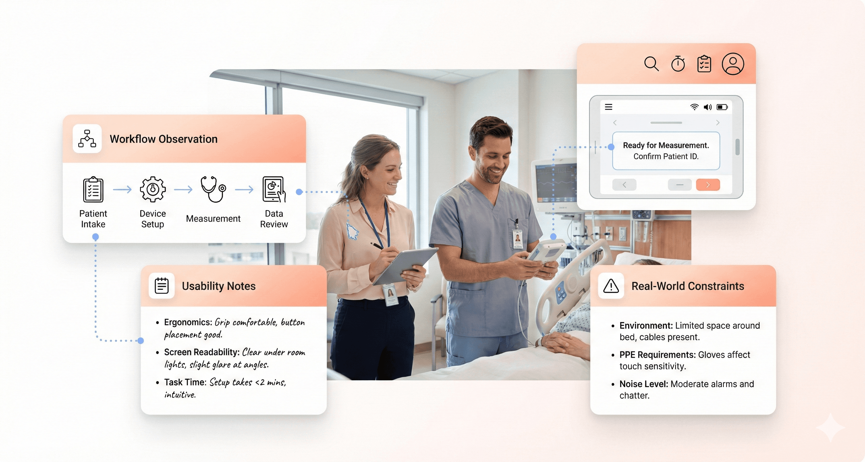
User testing with healthcare professionals requires careful coordination to avoid disrupting patient care. Schedule testing sessions during shift changes, lunch breaks, or designated training times. Create realistic but simplified scenarios that mirror actual workflows without real patient data. Use mock patient information and simulated environments when possible.
Medical professionals often work under intense time pressure, so keep testing sessions focused and efficient. A 30-minute session typically yields better participation than longer studies. Provide clear instructions about the testing purpose and emphasize that you're evaluating the device, not their performance.
Consider the hierarchical nature of healthcare teams when recruiting participants. Include representatives from different roles - attending physicians, residents, nurses, and technicians - as each group interacts with devices differently. Senior staff may delegate certain tasks, while junior members might use devices more frequently.
Remote testing can work well for administrative interfaces or documentation systems. However, hands-on medical devices require in-person observation to capture the full range of physical interactions and environmental factors that affect usability.
Clinical Observational Studies for Medical Devices
Shadowing healthcare workers during actual procedures provides invaluable insights into real-world device usage. However, patient privacy and safety must take priority over research objectives. Obtain proper approvals from hospital ethics boards and ensure all observers complete required training and background checks.
Position yourself strategically to observe device interactions without interfering with patient care. Use unobtrusive recording methods like small cameras or audio devices when permitted. Take detailed field notes about environmental factors like lighting, noise levels, and space constraints that impact device use.
Document interruptions and multitasking patterns, as these are common in healthcare settings. Notice how staff adapt their device usage when called away for emergencies or when managing multiple patients simultaneously. These real-world constraints often reveal usability issues that don't surface in controlled testing environments.
Pay attention to informal workarounds that staff develop. These often indicate design problems or missing features. However, distinguish between innovative adaptations and potentially unsafe practices that need addressing through design improvements.
Patient Feedback Collection and HIPAA Compliance
Patient feedback collection requires strict adherence to HIPAA regulations and institutional privacy policies. Develop consent forms that clearly explain how feedback will be used and stored. Consider using anonymous feedback systems when detailed demographic information isn't essential for your research.
Timing matters when approaching patients for feedback. Avoid collecting input during acute medical episodes or immediately after procedures when patients may be experiencing pain or discomfort. Recovery periods often provide better opportunities for thoughtful responses.
Keep feedback sessions brief and focus on specific aspects of their device experience. Patients may have limited technical knowledge, so frame questions around their comfort, confidence, and ease of use rather than technical specifications. Ask about any confusion or concerns they experienced during device interactions.
Create multiple feedback channels to accommodate different patient preferences and abilities. Some may prefer written surveys, while others respond better to verbal interviews. Consider accessibility needs for patients with visual, hearing, or mobility limitations.
Feedback Method | Best For | Privacy Considerations |
|---|---|---|
Anonymous surveys | General usability ratings | Minimal identifiers needed |
Structured interviews | Detailed experience insights | Secure recording/storage required |
Digital feedback forms | Tech-comfortable patients | Encrypted transmission essential |
Focus groups | Comparative evaluations | Group consent and confidentiality agreements |
Healthcare Workflow Analysis for Medical Device Design
Healthcare workflows are complex systems involving multiple stakeholders, technologies, and processes. Map out complete workflows from patient admission through discharge, identifying every point where your device intersects with existing systems. This comprehensive view helps prevent unintended disruptions to established processes.
Use process mapping techniques to visualize current workflows before introducing new devices. Document handoff points between different staff members and departments, as these transitions often create opportunities for errors or inefficiencies. Understanding these patterns helps design devices that integrate smoothly into existing routines.
Consider seasonal and temporal variations in workflow patterns. Emergency departments operate differently during night shifts compared to day shifts. Surgical suites have different rhythms than patient floors. ICUs maintain different staffing patterns than general medical units. These variations affect how and when devices get used.
Time-motion studies can reveal efficiency opportunities and potential bottlenecks. However, balance the benefits of this detailed analysis with the administrative burden of data collection. Focus on high-impact workflows where device improvements could significantly affect patient outcomes or staff efficiency.
Document the ripple effects of workflow changes. Introducing a new device in one department often affects processes in connected areas. For example, faster diagnostic equipment in radiology might increase patient throughput, requiring adjustments in transport and scheduling systems downstream.
Designing Medical Device Interfaces for Critical Use Scenarios
Preventing Use Errors in Medical Device Interfaces
Medical devices demand zero tolerance for user errors. Every button press, screen interaction, and workflow step can mean the difference between successful treatment and patient harm. The most effective approach starts with understanding how errors actually happen in real healthcare settings.
Cognitive overload ranks as the primary culprit behind dangerous mistakes. When healthcare workers juggle multiple patients, urgent notifications, and complex procedures simultaneously, even simple interface elements can become confusing. Design solutions must account for divided attention and mental fatigue.
Error-prone interactions require special attention during the design phase. Consider how similar-looking buttons could lead to accidental medication overdoses or how unclear labels might cause operators to select the wrong treatment parameters. Implementing constraints that prevent impossible or dangerous input combinations creates essential safety barriers.
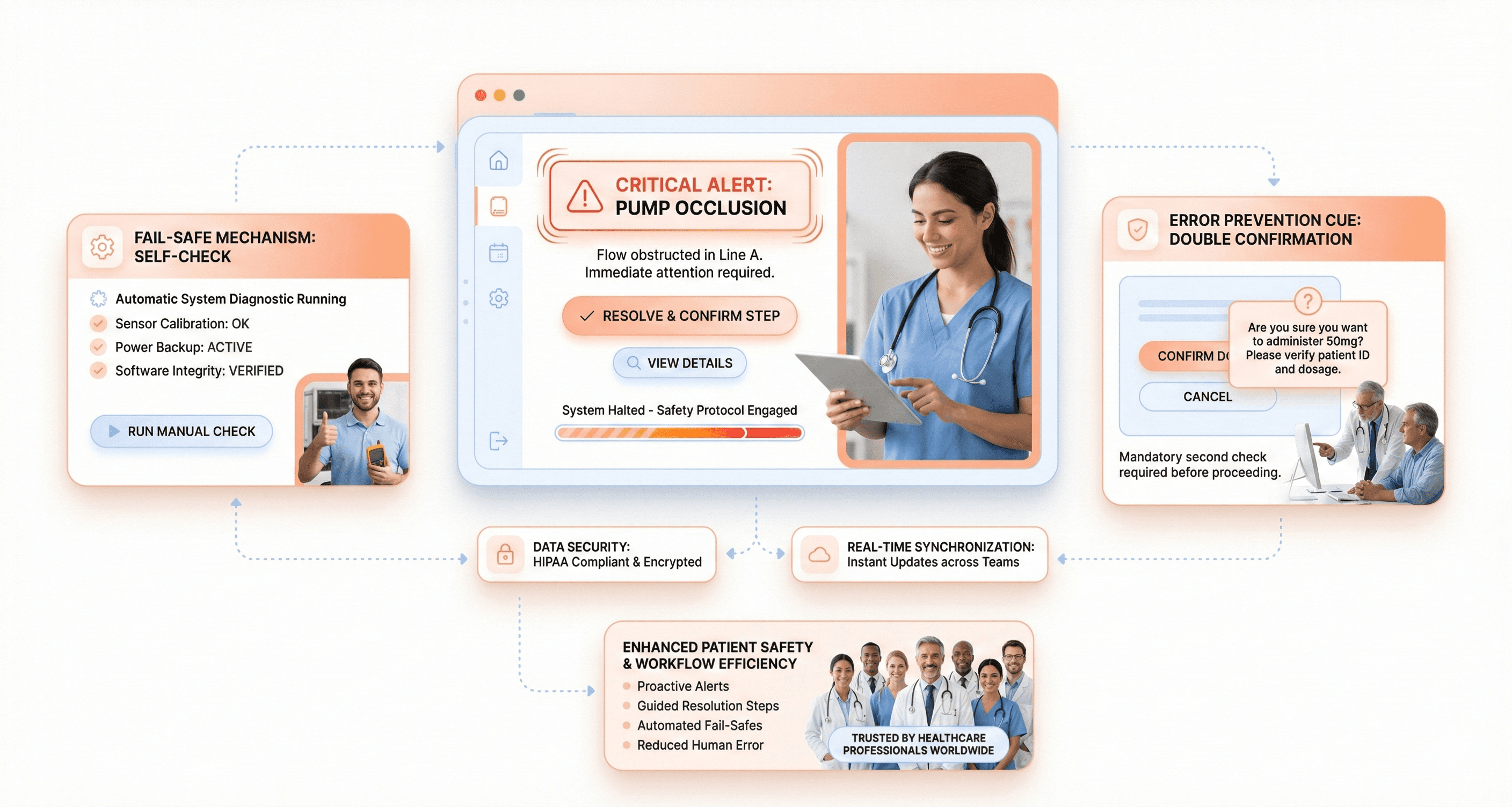
Confirmation dialogs serve as critical checkpoints for high-risk actions, but they need careful implementation. Too many confirmations create alert fatigue, while too few leave room for catastrophic mistakes. The key lies in reserving confirmations for truly irreversible or high-consequence actions.
Visual differentiation between critical and routine functions helps users quickly identify what requires extra caution. Color coding, size variations, and positioning all contribute to creating clear hierarchies that guide attention appropriately during stressful moments.
Designing UX for High-Stress Clinical Situations
Emergencies strip away the luxury of time for learning or remembering complex interface patterns. Users operating under extreme pressure rely heavily on muscle memory and immediate visual recognition. Interface design must accommodate tunnel vision, elevated heart rates, and compromised fine motor control.
Information architecture becomes crucial when seconds count. Primary functions need immediate visibility without scrolling or navigation. Secondary features should remain accessible but never interfere with critical pathways. Think about how smartphone emergency calling works - one swipe reveals the most important function without complexity.
Feedback mechanisms must be impossible to miss during high-stress scenarios. Subtle animations or quiet beeps that work fine during routine use become invisible when adrenaline kicks in. Audio alerts, haptic feedback, and bold visual confirmations ensure users receive critical information even when their attention narrows.
Gesture design requires extra consideration for trembling hands and reduced dexterity. Larger touch targets, simplified swipe patterns, and forgiving interaction zones help accommodate the physical effects of stress. Avoid requiring precise movements or complex multi-touch gestures.
Progressive disclosure helps manage cognitive load by showing only essential information initially. Users can access additional details when needed, but the primary interface remains uncluttered and focused on immediate needs.
Medical Device UX for PPE and Gloved Users
Personal protective equipment creates significant barriers between users and device interfaces. Gloves reduce tactile sensitivity, face shields distort vision, and full protective suits limit mobility. These constraints demand thoughtful interface adaptations.
Touch sensitivity drops dramatically when wearing medical gloves, especially thicker protective varieties. Interface elements need larger targets and higher touch sensitivity settings. Consider how gloved fingers might accidentally trigger adjacent buttons or struggle with small checkboxes.
Visual clarity becomes compromised through face shields and safety glasses. Screen brightness, contrast ratios, and text sizes must account for these optical barriers. Anti-glare coatings and adjustable display settings help users customize visibility based on their specific protective equipment.
Cleaning and disinfection protocols affect both hardware and software design. Interfaces must withstand frequent chemical cleaning without degrading functionality. Smooth surfaces, sealed buttons, and antimicrobial materials become design requirements rather than preferences.
Voice control and hands-free operation gain importance when manual dexterity is compromised. However, speech recognition must work through masks and face shields while filtering out background noise common in healthcare environments.
Ensuring Interface Visibility in Clinical Lighting Conditions
Healthcare environments present extreme lighting challenges that most consumer devices never encounter. Operating rooms feature intense surgical lights, emergency rooms have harsh fluorescent overhead lighting, and patient rooms often operate in dim conditions to promote rest.
Adaptive brightness systems must respond quickly to changing conditions without causing eye strain. Auto-adjustment algorithms need fine-tuning for medical environments where lighting can shift dramatically within seconds. Manual override controls allow users to optimize display settings for their specific situation.
Color choices require careful validation across different lighting spectrums. Colors that appear distinct under office lighting might become indistinguishable under surgical lights or appear completely different under emergency red lighting. Testing with actual medical lighting equipment prevents critical visibility failures.
Text readability extends beyond simple size considerations. Font weight, character spacing, and background contrast all influence legibility under challenging lighting. Sans-serif fonts generally perform better on screens, while adequate white space prevents text from appearing crowded on small displays.
Screen reflection and glare create major obstacles in environments with multiple light sources. Anti-reflective coatings, matte displays, and adjustable screen angles help users position devices for optimal visibility. Some applications benefit from dark mode interfaces that reduce overall brightness while maintaining readability.
Medical Device Safety Design and Validation Documentation
Fail-Safe Design and Error Prevention Mechanisms
Medical devices must anticipate human error and system failures before they happen. Think of insulin pumps that automatically stop delivery when they detect air bubbles, or defibrillators that won't discharge unless proper electrode placement is confirmed. These aren't just nice features - they're lifesaving necessities.
A fail-safe design means building devices that default to safe states when something goes wrong. A ventilator should maintain basic breathing support even if its touchscreen fails. An MRI machine should immediately halt scanning if it detects metal objects in the room. The key is identifying every possible failure point and creating backup systems that protect patients.
Error prevention goes hand-in-hand with fail-safes. Smart interfaces can prevent users from making dangerous mistakes in the first place. Consider IV pumps that require double confirmation for high-risk medications, or surgical robots that won't operate outside predetermined boundaries. These systems guide users toward correct actions while blocking harmful ones.
Effective error prevention also means designing with cognitive load in mind. When healthcare workers are stressed, tired, or distracted, they're more prone to mistakes. Simple confirmation dialogs, clear visual feedback, and logical workflow sequences help reduce these risks. The best medical devices make it harder to do the wrong thing than the right thing.
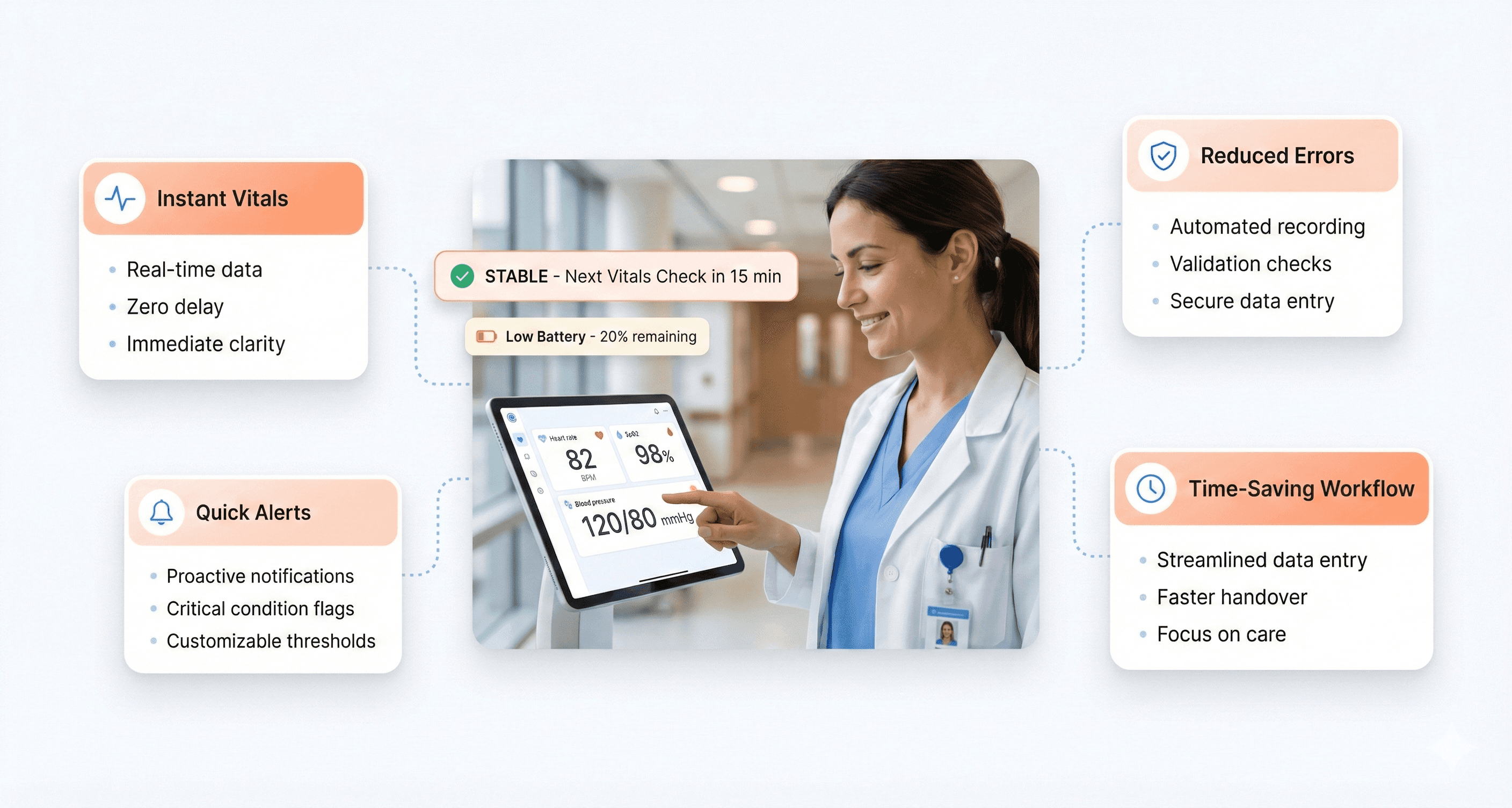
Visual Hierarchy for Safety-Critical Medical Information
Life-and-death information demands instant recognition. Critical alerts must dominate the interface, while routine data stays in the background. This isn't about making everything bigger and brighter - it's about creating visual systems that guide attention exactly where it needs to go.
Color coding plays a crucial role, but it can't be your only strategy. Red typically signals danger, but what about users with color blindness? Successful medical interfaces combine color with shape, size, position, and animation to ensure critical information reaches everyone. A cardiac monitor might use red text, bold fonts, larger size, and flashing borders simultaneously for life-threatening arrhythmias.
Typography hierarchy matters enormously in medical contexts. Vital signs should use large, bold fonts that remain readable from across a room. Secondary information can be smaller but still clear. Drug names and dosages need special treatment - they must be unmistakably legible to prevent medication errors.
Information grouping reduces cognitive burden. Related data should cluster together visually. Patient vitals belong in one section, medication information in another, and alerts in their own distinct area. This organization helps users scan and find what they need without hunting through cluttered interfaces.
Consistency Across Medical Device Interfaces
Healthcare environments contain dozens of different devices, often from multiple manufacturers. Nurses and doctors shouldn't need to relearn basic interactions every time they switch from one machine to another. Consistent patterns reduce training time and minimize errors during high-pressure situations.
Button placement and behavior should follow established conventions. Emergency stop buttons belong in the same relative position across devices. Menu navigation should work similarly whether users are operating an ultrasound machine or a patient monitor. When devices share common interaction patterns, muscle memory transfers between them.
Gesture and touch interactions need standardization, too. Pinch-to-zoom should work the same way on every touchscreen device in the hospital. Swipe directions for navigating between screens should remain consistent. Even simple actions like scrolling through patient lists benefit from uniform behavior patterns.
Voice commands and audio feedback represent another consistency opportunity. Similar devices should respond to the same verbal instructions and provide comparable audio cues. This becomes especially important in sterile environments where healthcare providers can't always touch screens directly. Consistent voice interactions allow hands-free operation without confusion about which commands work with which devices.
Usability Documentation and Regulatory Traceability
Medical device usability testing generates massive amounts of data that must be organized into reports that satisfy both internal design teams and regulatory reviewers. The key to creating effective reports lies in structuring information so that critical safety insights jump off the page while maintaining complete traceability to source data.
Start with an executive summary that highlights any safety-critical findings, use errors, and areas where the device met or exceeded performance expectations. Regulatory bodies want to see the bottom line upfront - did users operate the device safely and effectively under realistic conditions?
Document your testing methodology with enough detail that another researcher could replicate your study. Include participant demographics, task scenarios, environment setup, and success criteria. Screenshots and video clips can be invaluable for showing exactly how users interacted with your device.
The meat of your report should categorize findings by severity level. Critical issues that could lead to patient harm deserve dedicated sections with detailed root cause analysis. Include direct quotes from participants, task completion rates, and error frequencies. Tables work well for presenting quantitative data like task times and success rates across different user groups.
Don't forget to document what worked well. Positive findings demonstrate that your design decisions were validated and can help justify design choices during regulatory review.
Submission-Ready FDA and IEC Compliance Documentation
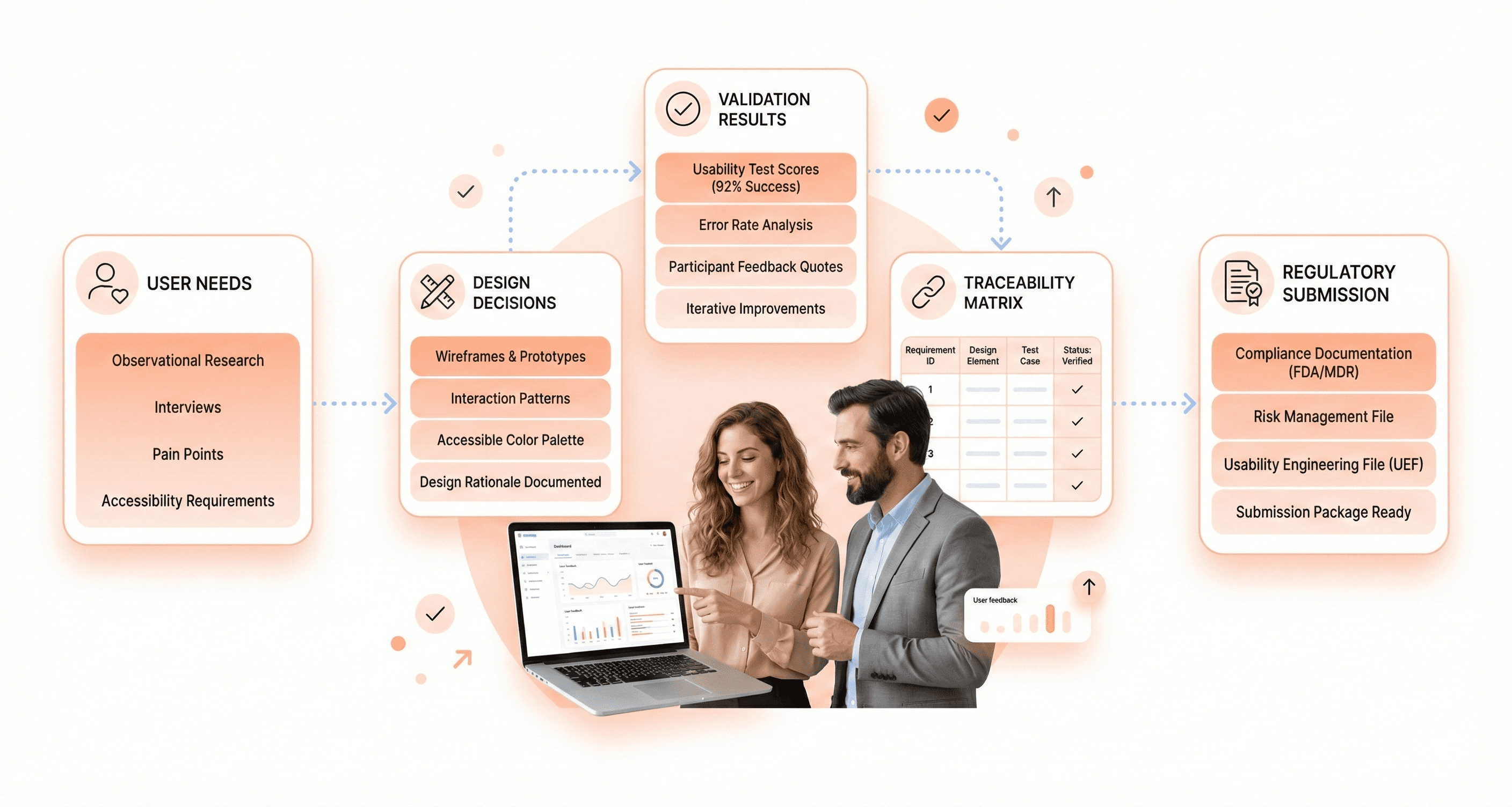
Design rationale documentation serves as the bridge between user research insights and actual design decisions. This documentation becomes critical during regulatory submissions when reviewers question why specific design choices were made.
Create a living document that captures the "why" behind every significant design decision. When you choose a particular button placement, color scheme, or interaction flow, record the user research findings, safety considerations, and technical constraints that influenced that choice. Include references to specific usability test sessions, user interviews, or clinical observations that supported the decision.
Use a consistent template that includes the design element being documented, the problem it solves, alternatives considered, and the rationale for the chosen solution. Screenshots or sketches help reviewers visualize the design evolution over time.
Version control becomes essential as designs evolve. Track how design rationales change based on new user feedback or safety insights. When a design decision gets reversed, document why the change occurred and what new evidence supported the revision.
Link design rationales directly to risk analysis documentation. When a design choice specifically addresses an identified hazard or use error, make that connection explicit. This creates a clear audit trail showing how safety considerations influenced design decisions.
Establishing Traceability Between User Needs and Design Decisions
Traceability matrices might sound bureaucratic, but they're actually powerful tools for ensuring no user need gets lost in the design process. Think of traceability as creating a GPS that connects every user requirement to its corresponding design solution.
Start by cataloging user needs at multiple levels - high-level workflow requirements, specific task needs, and detailed interaction preferences. Each need should have a unique identifier and clear acceptance criteria. User needs might include "nurses must be able to operate the device while wearing gloves" or "emergency responders need single-handed operation capability."
Create a matrix that links each user need to specific design features, usability test scenarios, and validation activities. This matrix becomes your master reference for ensuring comprehensive coverage. When stakeholders question whether a particular user group's needs were addressed, you can point directly to the relevant design elements and supporting test data.
Update traceability documentation whenever requirements change or new user insights emerge. If usability testing reveals that a design solution doesn't fully address its intended user need, document the gap and track the revised solution through to validation.
Digital tools can automate much of the traceability process, but the key is maintaining accuracy as requirements and designs evolve. Regular reviews ensure that traceability remains current and complete.
Preparing Submission-Ready Compliance Documentation
Regulatory submissions require documentation that tells a complete story about your device's usability and safety profile. Reviewers need to understand not just what you designed, but how you validated that real users can operate it safely in actual clinical environments.
Organize submission documentation around regulatory requirements rather than internal project phases. FDA guidance documents provide clear templates for human factors submissions that specify required content and organization. Follow these templates exactly - reviewers appreciate consistency and completeness.
Include a human factors validation plan that maps to your actual testing activities. Show how your usability testing scenarios cover critical tasks, high-risk use conditions, and representative user populations. Document any deviations from the original plan and explain why changes were necessary.
Present test results with clear connections to safety outcomes. When users made errors during testing, explain the potential clinical consequences and how design changes mitigated those risks. Include before-and-after comparisons when design iterations addressed specific use errors.
Appendices should contain detailed test protocols, raw data summaries, and participant feedback. While reviewers may not read every appendix, they need confidence that complete documentation exists to support your claims.
Cross-reference related submissions like 510(k) applications or quality management system documentation. Consistency across all regulatory filings strengthens your overall submission package and demonstrates systematic attention to compliance requirements.
Conclusion
Medical device UX design requires a careful balance between user needs and regulatory demands. The success of any healthcare product depends on thorough user research, rigorous safety protocols, and comprehensive documentation that meets FDA and international standards. Designers must understand that their work directly impacts patient outcomes, making every design decision critical to both usability and compliance.
Getting medical device UX right isn't just about following guidelines, it's about creating products that healthcare professionals can trust in high-pressure situations. Start by conducting extensive user research in real healthcare environments, design with safety as your top priority, and maintain detailed documentation throughout your process. Your commitment to both user experience and regulatory compliance will ultimately determine whether your device succeeds in improving patient care and saving lives.

About the author
Author Name:
Parth G
|
Founder of
Hashbyt
I’m the founder of Hashbyt, an AI-first frontend and UI/UX SaaS partner helping 200+ SaaS companies scale faster through intelligent, growth-driven design. My work focuses on building modern frontend systems, design frameworks, and product modernization strategies that boost revenue, improve user adoption, and help SaaS founders turn their UI into a true growth engine.
Follow the expert:


Is a clunky UI holding back your growth?
Is a clunky UI holding back your growth?
▶︎
Transform slow, frustrating dashboards into intuitive interfaces that ensure effortless user adoption.
▶︎
Transform slow, frustrating dashboards into intuitive interfaces that ensure effortless user adoption.
