


Knowing how to conduct a UX audit can transform your digital product's performance, yet most teams assume it requires weeks of research, expensive tooling, or an outside agency.
This guide shows how UX designers, product managers, and SaaS teams can complete a full UX audit in just 48 hours using analytics, heuristic evaluation, and accessibility testing. You’ll learn a practical, repeatable framework to uncover usability issues, prioritize fixes, and improve conversions, without lengthy research cycles or complex tooling.
This guide shows how UX designers, product managers, and SaaS teams can complete a full SaaS UX audit in 48 hours, covering analytics, heuristic evaluation, and UX design audit frameworks you can apply immediately without a lengthy research setup.
You’ll learn how to work smarter by building a strong audit foundation, analyzing meaningful performance data, and uncovering usability issues through proven evaluation frameworks. The guide also covers accessibility testing methods to identify critical barriers that impact real users.
By the end, you’ll have a repeatable UX audit process that delivers actionable insights, improves usability, and drives conversions, all within two days instead of two weeks.
Before You Conduct a UX Audit: Setting Goals, Scope, and Priorities
Define Business Goals for Your UX Audit
Before diving into any UX audit process, establishing clear business objectives serves as the foundation for a successful evaluation. Without specific goals, your UX audit could easily become unfocused and continue indefinitely, as UX audits are inherently exploratory in nature.
Start by hosting stakeholder interviews to align on vision, goals, and business needs. This collaborative approach ensures everyone is on the same page before the audit begins. Focus on setting goals with "the biggest potential of pushing your business forward," such as reducing user onboarding time, simplifying sign-up flows, or improving conversion rates at critical touchpoints.

Your objectives should directly address business challenges you're currently facing. For instance, if you're experiencing declining retention rates, your goal might be to identify friction points in the user journey that cause churn. If conversions are dropping, focus on evaluating checkout processes or lead generation flows.
Consider timing your UX audit around specific business needs:
After launching new functionality or completing a redesign
When experiencing drops in retention or conversion rates
Following negative user feedback regarding UX
After conducting competitive product analysis
When new accessibility compliance guidelines are released
Select UX Audit Scope: Platforms & Key User Journeys
Defining the audit's scope prevents your evaluation from becoming overwhelming and ensures you examine the most critical areas of your product. Start by determining the timeline, when you'll run the review, how long it will last, and which specific areas you'll examine.
Map out the key user flows that align with your established objectives. For example, if your goal is reducing user onboarding time, you might scope your audit to review the UX starting from user sign-up and ending when they complete their first core action, such as creating their first dashboard or completing their initial setup.
Consider the platforms and touchpoints most relevant to your goals:
Web applications and mobile apps
Specific feature sets or product areas
Critical conversion paths
Customer support touchpoints
Onboarding sequences
Create detailed customer journey maps for each selected user flow. This visualization gives you a clear overview of how users move through your product and their goals at each stage, helping you focus your evaluation efforts on the most impactful areas.
Identify High-Value Users and Traffic Sources
Not all users contribute equally to your business success, so prioritizing your audit focus on high-value segments maximizes the impact of your findings. Begin by creating detailed user personas for each key audience, using the jobs-to-be-done framework to establish each persona's desired outcomes and motivations.
Analyze your conversion data to identify which audience segments, traffic sources, or product areas perform better than others. Look for patterns in your highest-value customers:
Where do they typically enter your site or app?
Which user journeys correspond with users who convert at higher rates?
What traffic sources generate the most valuable users?
Which user segments show the strongest engagement and retention?
Examine how key metrics vary across different user personas and traffic sources. This analysis reveals which segments deserve priority attention during your audit. For instance, if users from organic search convert at twice the rate of social media traffic, focus more audit attention on optimizing the organic user experience.
Consider both quantitative performance data and qualitative feedback when prioritizing. High-spend customers or users with strong engagement metrics should receive priority, but also consider segments that show significant potential for improvement or represent strategic growth opportunities for your business.
UX Audit Process Step 1: Data Analysis - Analytics, Heatmaps, and Behaviour
Analyze User Behavior with Google Analytics
Starting your UX audit with comprehensive data analysis provides the quantitative foundation needed for informed decision-making. Google Analytics serves as your primary window into user behavior patterns, revealing critical insights about how visitors navigate and interact with your website during this 48 hour UX audit process.
Begin by examining key metrics that directly impact user experience:
User flow reports to identify common navigation paths and drop-off points
Page-level engagement metrics including time on page and scroll depth
Conversion funnel analysis to pinpoint where users abandon their journey
Device and browser breakdowns to understand your audience's technical context
Traffic source performance to assess which channels bring the most engaged users
Focus particularly on pages with high bounce rates or unusually low engagement times, as these often indicate usability evaluation opportunities. Export data from the past 30-90 days to establish reliable baselines for your audit findings.

Use Heatmaps and Session Recordings for UX Insights
Now that we have established the quantitative foundation through Google Analytics, advanced behavioral analytics tools provide the qualitative context essential for a comprehensive UX audit process. These specialized platforms offer deeper insights into user behavior patterns that traditional analytics cannot capture.
Session recording tools reveal exactly how users interact with your interface:
Tool Type | Primary Function | Key Insights |
|---|---|---|
Session Recordings | Visual user journey capture | Click patterns, scrolling behavior, form interactions |
User Polls | Direct feedback collection | Pain points, satisfaction levels, feature requests |
Feedback Widgets | Real-time user input | Contextual insights at specific page locations |
These tools complement your heuristic evaluation by providing real user behavior data rather than theoretical assessments. Configure tracking on high-traffic pages and conversion-critical sections to maximize data collection efficiency within your 48-hour timeframe.
Examine Heatmaps, Bounce Rates, and Engagement Metrics
With behavioral data collection established, heatmap analysis becomes crucial for understanding user attention patterns and interaction preferences. Heat mapping technology visualizes user behavior through color-coded representations of clicks, scrolls, and mouse movements.
Click heatmaps reveal which interface elements receive the most user attention, helping identify:
Ineffective call-to-action placement
Navigation confusion points
Content areas that fail to engage users
False affordances that mislead user expectations
Scroll heatmaps demonstrate content consumption patterns, showing where users typically stop reading and which sections maintain engagement. This data directly supports your accessibility assessment by highlighting content hierarchy issues.
Cross-reference heatmap data with bounce rate analysis to identify correlation patterns. Pages with high bounce rates often exhibit:
Poor visual hierarchy leading to user confusion
Slow-loading elements affecting engagement metrics
Misaligned user expectations versus actual content delivery
Technical barriers preventing smooth interaction flows
Engagement metrics provide quantitative validation for qualitative observations. Monitor average session duration, pages per session, and return visitor rates to gauge overall user satisfaction levels throughout your UX audit checklist evaluation process.
AI-Assisted Analysis in the 2026 UX Audit Process
AI-assisted analysis tools have materially changed the first-pass phase of a UX audit in 2026. Tools can now automatically cluster session recording data, flag friction patterns across thousands of sessions, and generate prioritisation suggestions based on drop-off rates and task completion anomalies, work that previously required hours of manual review.
The practical implication for a 48-hour audit is significant: automated pattern detection compresses the analytics review phase from 4–6 hours to 1–2 hours, giving your team more time for the manual heuristic evaluation and accessibility checks that AI cannot replicate. Tools like Contentsquare, FullStory, and Hotjar have integrated AI summarisation layers that surface the 20% of sessions causing 80% of friction, without requiring you to watch hundreds of recordings individually.
Important caveat: AI accelerates the discovery phase. It does not replace the human judgment required for root-cause analysis, stakeholder prioritisation, or contextual recommendations. Any 2026 UX audit process that relies solely on AI output will produce well-formatted findings without real insight.
UX Design Audit: Heuristic Evaluation and Identifying Usability Issues
Apply Jakob Nielsen’s 10 Usability Heuristics
Now that you've gathered your performance data, it's time to conduct the core heuristic evaluation using Jakob Nielsen's renowned 10 usability heuristics. Originally published in 1994, these principles were updated by Nielsen Norman Group in 2020 with revised language to reflect modern interface contexts, the underlying principles remain the gold standard for heuristic evaluation in any UX design audit.
Begin your evaluation by systematically reviewing each heuristic against your product:
Visibility of System Status - Check if users always know what's happening through appropriate feedback within a reasonable time. Look for loading indicators, confirmation messages, and progress bars.
Match Between System and Real World - Verify the interface uses familiar language, concepts, and follows real-world conventions rather than internal jargon.
User Control and Freedom - Ensure users have clearly marked "emergency exits" to undo actions without going through extended processes.
Consistency and Standards - Confirm that similar elements function identically throughout the interface, following platform conventions.
Error Prevention - Identify error-prone conditions and check if the system prevents problems before they occur through confirmation dialogs or constraints.
6. Recognition Rather Than Recall - Minimize memory load by making elements, actions, and options visible instead of forcing users to remember information.
7. Flexibility and Efficiency of Use - Look for shortcuts and customization options that cater to both novice and expert users.
8. Aesthetic and Minimalist Design - Assess if every interface element supports users' primary goals without unnecessary information competing for attention.
9. Help Users Recognize, Diagnose, and Recover from Errors - Evaluate error messages for plain language, problem identification, and constructive solutions.
10. Help and Documentation - Check if assistance is easy to search, task-focused, and provides concrete steps when needed.

Evaluate UX from a Real User Perspective
With the heuristics framework in mind, navigate through your product as if you're completing actual user tasks. This approach ensures you evaluate the interface contextually rather than in isolation.
Start by becoming familiar with the product if you haven't used it before. Complete your target user journey once just to understand the flow without evaluating anything. This familiarization pass prevents you from missing context-specific usability issues.
During your second pass, adopt your target user's mindset and goals. If evaluating an e-commerce site, think like someone genuinely trying to purchase a product. Move through each step methodically:
Entry points: How users discover and access your product
Onboarding: First-time user experience and setup processes
Core workflows: Primary tasks users need to complete
Decision points: Areas where users must choose between options
Completion: Task fulfillment and confirmation processes
Error scenarios: What happens when things go wrong
Pay particular attention to transitions between screens or sections, as these often reveal navigation and consistency issues. Notice when you feel confused, frustrated, or uncertain about next steps, these emotional responses often indicate heuristic violations.
Consider different user types if applicable. A novice user might struggle with efficiency heuristics, while expert users might find the interface too restrictive, violating the flexibility principle.
Document Usability Issues with Evidence
Proper documentation transforms your heuristic evaluation from a casual review into actionable audit results. Create a systematic record that your team can reference and prioritize effectively.
For each identified issue, capture:
Screenshot Evidence: Include visual proof of the problem. For dynamic issues, consider screen recordings or multiple screenshots showing the problematic sequence.
Heuristic Violation: Clearly identify which of Nielsen's 10 heuristics the issue violates. Some problems may violate multiple heuristics, document all relevant ones.
Detailed Description: Write specific, objective descriptions rather than vague observations. Instead of "navigation is confusing," write "hamburger menu hides primary navigation categories, forcing users to remember available options rather than recognize them (violates heuristic #6)."
Context Information: Note the specific page, screen, or workflow step where the issue occurs. Include device type, browser, or platform details if relevant.
Severity Assessment: Rate each issue's potential impact on user experience and business goals. Consider both frequency (how often users encounter this) and consequence (how much it disrupts their task).
Recommended Solutions: When possible, suggest specific improvements. These don't need to be final design solutions, but should provide clear direction for addressing the heuristic violation.
Use a consistent documentation format across your team. Whether using spreadsheets, the NN/G heuristic evaluation workbook, or digital collaboration tools, maintain standardized fields and naming conventions. This consistency becomes crucial when consolidating findings from multiple evaluators and ensures nothing gets lost in translation during the synthesis phase.
Remember that just because something violates a heuristic doesn't automatically make it wrong. Context matters. A hamburger menu violates recognition rather than recall, but mobile interfaces often require this tradeoff due to space constraints. Document these contextual considerations alongside your findings.
Accessibility in Your User Experience Audit: WCAG 2.2, ISO/IEC 40500:2025, and Legal Compliance
Test Accessibility for All User Abilities
A critical regulatory update that changes the stakes of any accessibility audit: on 21 October 2025, WCAG 2.2 was formally approved as an international standard ISO/IEC 40500:2025 by the ISO/IEC Joint Technical Committee. This elevates WCAG 2.2 from a W3C recommendation to a globally recognised compliance benchmark. Separately, the European Accessibility Act (EAA) became enforceable on 28 June 2025, requiring all e-commerce and digital services selling to EU customers to meet WCAG 2.2 Level AA compliance, regardless of where the business is incorporated. Non-compliance fines can reach €500,000 or more depending on jurisdiction. For any SaaS UX audit or user experience audit conducted in 2026, WCAG 2.2 Level AA is no longer a best practice, it is the legal baseline for any product with European users. This assessment evaluates how well your digital experience functions with assistive technologies like screen readers, which convert text into usable formats for people with visual impairments.

A thorough accessibility assessment examines multiple components of your interface:
Text accessibility includes font size and readability testing, color contrast verification, line spacing evaluation, and semantic HTML structure analysis. Your audit should confirm that text can be scaled appropriately and maintains sufficient contrast ratios against backgrounds.
Interactive content evaluation focuses on keyboard navigation capabilities, form labeling accuracy, focus indicators visibility, and accessible dropdown menus. All interactive elements must be operable via keyboard alone to accommodate users with motor disabilities.
Media accessibility requires testing for alt text on meaningful images, captions and transcripts for audio/video content, descriptive link labels, and audio descriptions. These features enable screen readers to convey visual information effectively.
Technology compatibility involves testing screen reader integration, responsive design across devices, assistive technology compatibility, and browser/operating system functionality.
Run Accessibility and Performance Audits with Lighthouse
Google Lighthouse provides automated accessibility testing as part of your UX audit process. This free tool generates comprehensive reports that identify common accessibility issues, including missing alternative text, form label problems, and color contrast failures.
Access Lighthouse through Chrome DevTools or run it directly from the Lighthouse website. The accessibility audit section evaluates your pages against WCAG guidelines and provides actionable recommendations with specific code references for developers.
Lighthouse excels at detecting technical accessibility barriers, but cannot evaluate subjective elements like keyboard tab order logic or color contrast over complex background images. The tool provides scores and detailed explanations for each accessibility criterion, making it invaluable for quick automated assessment during your 48-hour audit timeline.
Use Accessibility Tools and Color Contrast Checkers
Automated accessibility testing tools like Lighthouse and WAVE catch approximately 30–40% of WCAG issues, according to recent auditing research the remaining 60–70% require manual testing, including keyboard navigation testing, screen reader evaluation, and cognitive accessibility checks that automated tools cannot assess. With this in mind, specific plugins and tools become essential for comprehensive evaluation.
The WAVE Tool serves as the backbone for automated accessibility testing. This free tool identifies missing alternative text, form label issues, and basic color contrast problems. Use WAVE directly through their website rather than browser extensions to ensure reliable evaluation of all page scripts.
For color contrast analysis, particularly with background images and gradients, use the Color Contrast Analyzer Chrome extension. This tool analyzes text against complex backgrounds that automated tools often miss. When contrast ratios fail, utilize Accessible Colors (https://accessible-colors.com/) to identify the nearest compliant alternatives for your brand colors.
Manual testing requirements include:
Keyboard-only navigation using standard shortcuts (tab, arrow keys, enter)
Screen reader testing with tools like VoiceOver (Mac) or JAWS
Text resizing verification through browser zoom functionality
Responsive layout testing across multiple devices and orientations
Document all findings systematically, noting the specific location of issues, affected WCAG guidelines, and remediation suggestions. This structured approach ensures your accessibility assessment integrates seamlessly with your overall UX audit results while meeting legal compliance requirements under ADA, Section 508, and international accessibility standards.
UX Audit Checklist: Severity, Heuristics, and Impact
Document UX Issues and Their Locations
Once you conduct a UX audit's core evaluation phases, documentation is what separates useful findings from wasted effort. A systematic record is what gets issues prioritised, resourced, and fixed. Effective documentation serves as the foundation for translating your UX audit discoveries into actionable improvements.
Start by creating detailed issue descriptions that clearly articulate each usability problem you've identified. Your descriptions should include the specific location where the issue occurs, such as "Navigation menu - Mobile view" or "Checkout process - Step 3 payment form." Include screenshots or screen recordings to provide visual context for each problem, making it easier for stakeholders to understand the severity and location of issues.

Document the exact steps needed to reproduce each problem, ensuring that development teams can easily replicate and address the issues. This level of detail transforms your UX audit findings from abstract observations into concrete, actionable items that can be prioritized and resolved systematically.
Map UX Problems to Usability Heuristics
With your issues documented, the next phase involves mapping each identified problem to Jakob Nielsen's established usability heuristics. This systematic approach ensures your heuristic evaluation maintains consistency and provides a clear rationale for each finding.
Create a structured mapping system that connects each usability issue to its corresponding heuristic principle. For example, map confusing error messages to "Error Prevention" or unclear navigation structures to "Recognition Rather Than Recall." This mapping process not only validates your findings but also helps prioritize fixes based on fundamental usability principles.
Use a standardized template that includes columns for issue description, affected heuristic, and supporting evidence. This approach ensures your UX audit checklist remains organized and provides clear justification for recommended improvements to stakeholders who may need to understand the reasoning behind your recommendations.
Prioritize UX Issues by Impact and Accessibility
Previously, you've documented and categorized your findings, now it's time to establish a priority framework that guides implementation efforts. Develop a scoring system that evaluates both usability severity and accessibility impact to create a comprehensive priority matrix.
Implement a numerical scale (typically 1-5 or 1-10) that considers factors such as frequency of occurrence, impact on user task completion, and potential business consequences. High-priority issues should include those that prevent users from completing critical tasks or create significant accessibility barriers for users with disabilities.
Create an accessibility impact rating that specifically addresses how each issue affects users with various disabilities. Consider screen reader compatibility, keyboard navigation, color contrast issues, and cognitive load factors. This dual-scoring approach ensures your UX audit addresses both general usability concerns and specific accessibility requirements.
Document your scoring methodology clearly so team members and stakeholders understand how priorities were determined. Include a legend that explains what each score level means in practical terms, such as "Score 5: Prevents task completion" or "Score 1: Minor aesthetic issue." This systematic approach to your heuristic evaluation checklist ensures that the most critical issues receive immediate attention while less severe problems are scheduled for future iterations.
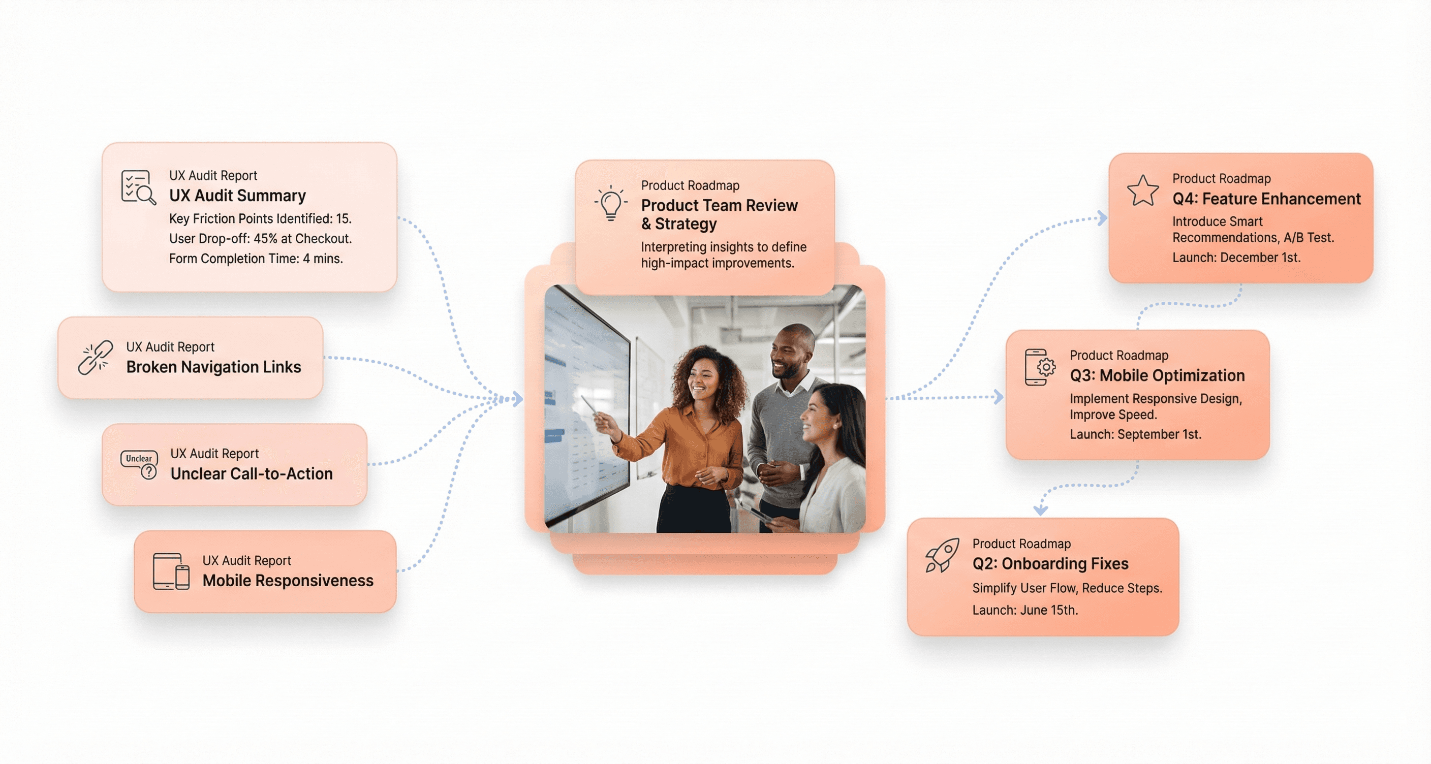
UX Audit Report: Turning Findings into Action, Or When to Bring in a UX Audit Company
Create a Standalone UX Audit Report
After completing your heuristic evaluation and accessibility assessment, the next crucial step in your UX audit process is creating a comprehensive standalone report. This document serves as the primary deliverable that stakeholders can reference independently, making it essential for driving action and securing buy-in for improvements.
Your UX audit report should follow a structured format that begins with an executive summary highlighting the most critical findings and their business impact. Start by organizing your content into logical sections that correspond to the areas you evaluated during your audit, navigation and information architecture, forms and interactive elements, overall usability issues, accessibility compliance, and visual consistency problems.
For each section, document your findings systematically using a consistent format. Include the specific page or feature affected, a clear description of the issue identified, and the usability heuristic or accessibility guideline it violates. This structured approach ensures that your audit results are easily digestible and actionable for different team members, from designers to product managers to developers.
Recommend UX Improvements That Drive Results
Now that you've documented the issues, the next critical component is providing concrete, actionable recommendations rather than simply identifying problems. Each finding in your UX audit should be paired with specific solutions that your team can implement.
When crafting recommendations, offer multiple alternatives where possible. For example, instead of just stating "The signup form is too long," provide specific solutions such as "reduce to 3 essential fields OR implement progressive disclosure to break the form into steps." This approach gives your team flexibility in choosing the most feasible solution based on their resources and technical constraints.
Prioritize your recommendations using a severity scale - typically high, medium, and low priority based on user impact and business goals. High-priority issues should address critical usability flaws that significantly hinder the user journey, while lower-priority items might focus on visual inconsistencies or minor accessibility improvements. This prioritization system helps teams with limited resources focus on the most impactful changes first, ensuring maximum return on their UX investment.
Support UX Findings with Data and Visual Proof
Visual evidence transforms your UX audit from subjective opinion into compelling, data-driven insights. Include annotated screenshots for every issue you identify, clearly highlighting the problematic areas with callouts and explanations. These visual annotations make your findings concrete and help stakeholders immediately understand the problems without having to navigate through the product themselves.
Support your findings with quantitative data whenever possible. Integrate analytics data showing user behavior patterns, heatmap screenshots revealing interaction hotspots, and session recording insights that demonstrate user frustration points. For instance, if you've identified a confusing navigation element, include heatmap data showing where users actually click versus where they should click, or bounce rate statistics for pages with identified usability issues.
Present user evidence through direct quotes from user interviews, survey responses, or usability testing feedback that validates your audit findings. This combination of visual evidence, behavioral data, and user feedback creates a compelling case for your recommendations. Organize this supporting evidence alongside each finding rather than in separate appendices, ensuring that stakeholders can immediately see the proof behind your conclusions.
Consider creating before-and-after mockups for your most critical recommendations, showing how the proposed changes would improve the user experience. This visual representation of potential improvements helps stakeholders envision the impact of implementing your suggestions and builds stronger support for moving forward with the recommended changes.
SaaS UX Audit Best Practices: Patterns, Root Causes, and Long-Term Improvement
Map Complete User Journeys Visually
With this in mind, next, we'll see how comprehensive user journey mapping transforms raw audit data into actionable insights. Visual documentation serves as the foundation for understanding how users actually navigate your product versus how you intended them to move through it.
Effective journey mapping requires capturing the complete end-to-end experience, from the moment users first encounter your product through task completion. Document each touchpoint using screenshots, annotations, and flow diagrams that highlight critical decision points where users might hesitate or abandon their goals.
For example, if auditing an e-commerce checkout process, map every step from cart review through payment confirmation, noting where users encounter friction like confusing form fields or unclear error messages.
The visual documentation should include user behavior patterns observed through session recordings and heatmaps. When users consistently click non-interactive elements or struggle to locate key features, these patterns reveal gaps between interface design and user expectations. Annotated screenshots showing click density, scroll depth, and interaction hotspots provide concrete evidence of usability issues that stakeholders can immediately understand.
Customer journey analysis reveals opportunities to streamline complex workflows by identifying unnecessary steps or redundant interactions. As noted in professional UX audit methodology, you should examine each user flow to spot where manual data entry can be automated or where multiple clicks can be reduced to single interactions without compromising functionality.
Identify UX Patterns and Root Causes
Now that we have covered visual documentation, identifying recurring themes across your audit findings becomes crucial for developing solutions that address root causes rather than symptoms. Systematic pattern recognition helps prioritize fixes that will have the broadest positive impact on user experience.
Analyze trends by categorizing similar issues across different areas of your product. For instance, if users consistently struggle with unclear navigation labels in multiple sections, the underlying theme might be inconsistent information architecture rather than isolated labeling problems.
Similarly, if accessibility barriers appear throughout your interface, missing alt text, poor color contrast, inadequate keyboard navigation, this indicates a systematic accessibility compliance issue that requires comprehensive remediation.
The most effective approach involves documenting how frequently each type of issue occurs and where it appears in the user journey.
As an example: if 82 out of 100 session recordings show users increasing browser zoom on multiple pages, this pattern indicates a design system typography problem rather than an isolated page issue and should be scored accordingly in your severity matrix. Conversely, if only two users mention search functionality issues, this might be deprioritized in favor of addressing the widespread typography concern.
Professional UX auditing best practices emphasize looking beyond surface-level problems to understand underlying causes. Navigation gaps, design inconsistencies, and content structure issues often stem from broader information architecture or design system deficiencies. By identifying these recurring themes, you can develop comprehensive solutions that prevent similar issues from reappearing as your product evolves.
Quantify UX Issues and Prioritize Fixes
Previously, I've mentioned the importance of systematic prioritization, and now we'll examine how quantification transforms subjective observations into objective decision-making frameworks. Effective prioritization requires measuring both the frequency of issues and their impact on critical user flows and business outcomes.
The PIE framework (Potential, Importance, Ease) provides a structured approach for ranking audit findings. Potential measures how much improvement a fix could bring to overall user experience or conversion rates.
Importance evaluates how critical the affected area is within the user journey; issues in checkout flows or sign-up processes typically score higher than problems in secondary features. Ease assesses implementation complexity, helping teams identify quick wins alongside strategic, resource-intensive improvements.
Quantification should include specific metrics wherever possible. Instead of noting "users struggle with navigation," document that "73% of users required more than 3 clicks to locate the account settings page, compared to the optimal 2-click path." This precision helps stakeholders understand the scope of problems and measure improvement after fixes are implemented.
Performance bottlenecks require particular attention to quantification. Page load times exceeding 3 seconds, forms with high abandonment rates, or mobile interfaces with tap targets smaller than recommended guidelines all represent measurable problems with clear success criteria. By establishing baseline metrics during the audit, you create benchmarks for evaluating whether subsequent changes actually improve the user experience or merely address superficial concerns.
Conclusion
You can conduct a UX audit, a comprehensive user experience audit, within 48 hours when you follow the structured process covered in this guide. By preparing your foundation with clear business objectives, gathering performance data, executing thorough heuristic evaluations, and assessing accessibility compliance, you create a roadmap for meaningful improvements. The key lies in maintaining focus on your defined user journeys and platforms while systematically documenting each issue with proper context and recommendations.
Remember that a UX audit is like giving your digital product a health check, it's valuable to complete regularly, not just when problems become obvious. Whether you're identifying usability issues through Jakob Nielsen's established heuristics or developing your own evaluation criteria, the goal remains consistent: creating actionable insights that directly support your business objectives. If internal capacity is the constraint, a specialist UX audit company brings the external objectivity that in-house teams, who are too close to their own product, often cannot provide.


About the author
I’m the founder of Hashbyt, an AI-first frontend and UI/UX SaaS partner helping 200+ SaaS companies scale faster through intelligent, growth-driven design. My work focuses on building modern frontend systems, design frameworks, and product modernization strategies that boost revenue, improve user adoption, and help SaaS founders turn their UI into a true growth engine.


Is a clunky UI holding back your growth?
Is a clunky UI holding back your growth?
▶︎
Transform slow, frustrating dashboards into intuitive interfaces that ensure effortless user adoption.
▶︎
Transform slow, frustrating dashboards into intuitive interfaces that ensure effortless user adoption.
