


Choosing the Right React UI Component Library in 2026
Choosing the right React UI component library is no longer just a frontend styling decision. The library you select directly affects development velocity, bundle size, accessibility compliance, long-term scalability, and the overall maintainability of your application.
For SaaS startups, enterprise dashboards, internal tools, and modern Next.js applications, the wrong UI architecture can create significant technical debt as products scale. Some React UI libraries prioritize rapid development and polished components out of the box, while others focus on customization, accessibility primitives, and long-term design system ownership.
In this guide, we compare the best React UI component libraries for 2026 based on:
performance and bundle efficiency
accessibility and WCAG compliance
React Server Components compatibility
Tailwind CSS integration
enterprise scalability
customization flexibility
developer experience
Whether you're building a data-heavy admin dashboard, a highly customized design system, or a fast-moving SaaS MVP, this comparison will help you choose the best React UI library for your specific use case.
Best React UI Libraries by Use Case
Different React UI libraries solve different frontend problems. Some are optimized for enterprise dashboards and CRUD-heavy workflows, while others prioritize accessibility, headless architecture, or Tailwind-first customization.
Here’s a quick recommendation breakdown based on real-world frontend use cases.
Use Case | Recommended React UI Library |
|---|---|
Enterprise Dashboards | MUI, Ant Design |
Custom Design Systems | Radix UI, shadcn/ui |
Tailwind CSS Projects | Headless UI, shadcn/ui |
Fast SaaS MVPs | Chakra UI, Mantine |
Accessibility-Focused Apps | React Aria, Radix UI |
Analytics Platforms | Tremor, BlueprintJS |
Mobile & Hybrid Apps | Onsen UI, Grommet |
CRUD-heavy Admin Panels | PrimeReact, Ant Design |
Headless vs Pre-Styled React UI Libraries
One of the biggest frontend architecture decisions in 2026 is choosing between headless React UI libraries and pre-styled component systems.
Pre-Styled UI Libraries
Libraries like MUI, Ant Design, Chakra UI, and Mantine provide fully designed components out of the box. They accelerate development and ensure visual consistency with minimal setup.
These libraries work best for:
enterprise applications
internal dashboards
rapid MVP development
teams prioritizing speed and consistency
However, highly customized products can eventually run into styling limitations and abstraction overhead.
Headless UI Libraries
Libraries like Radix UI, React Aria, and Headless UI separate functionality from presentation. They provide accessibility, interaction logic, and composable primitives without imposing design constraints.
This approach gives teams:
full branding control
long-term design system scalability
cleaner customization workflows
lower styling limitations
Headless systems are increasingly preferred for modern SaaS platforms and design-system-driven frontend teams.
In practice, many organizations now combine:
Radix UI for primitives
Tailwind CSS for styling
shadcn/ui for reusable patterns
This architecture provides significantly more flexibility than traditional monolithic UI frameworks.
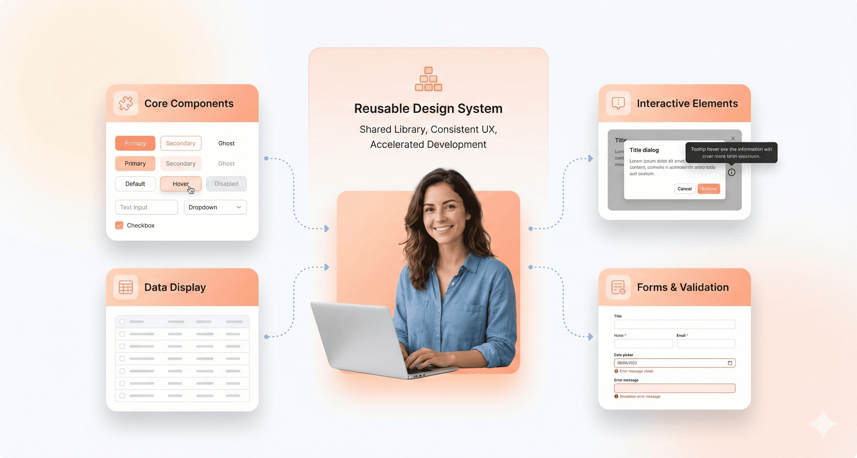
What Are React UI Component Libraries and Design Systems?
React UI component libraries are collections of pre-built, reusable user interface elements designed to work seamlessly within React applications. These libraries bundle together basic UI elements like buttons, input fields, modals, tables, tooltips, and more with uniform APIs, accessibility capabilities, and often the ability to change the look of the library.
The primary purpose of a React UI component library is to streamline and standardize the UI development process. Instead of building every design element from scratch, developers can leverage these ready-made components to ensure design consistency, reduce repetitive code, and accelerate the creation of polished, interactive interfaces. By abstracting away much of the low-level implementation details and best practices (like accessibility and responsive layouts), these libraries help teams focus on the unique business logic and user experiences that set their products apart.
Whether you’re working solo or across a large engineering team, React UI component libraries play a crucial role in modern frontend workflows, especially when the UI takes center stage. They help enforce design guidelines, improve code maintainability, and make it easier to roll out new features. This gives both individual developers and organizations the tools they need to build better apps faster, focusing on accessibility throughout the process.
How to Choose the Best React UI Library for Your Product
Choosing a React UI component library should depend on your product architecture, scalability requirements, and customization needs not just visual appearance.
Here’s the framework we recommend when evaluating React UI libraries.
Choose MUI or Ant Design if:
you are building enterprise dashboards or admin panels
you need mature ecosystems and production-ready components
your team prioritizes development speed over deep customization
you rely heavily on tables, forms, and CRUD workflows
Choose shadcn/ui or Radix UI if:
you want complete design system ownership
your product requires highly customized branding
your team uses Tailwind CSS extensively
accessibility and composability are top priorities
Choose Chakra UI or Mantine if:
you need to ship MVPs quickly
your frontend team is small
developer experience matters more than low-level control
you want simpler theming and responsive utilities
Choose React Aria if:
accessibility is business-critical
you need advanced keyboard navigation and interaction patterns
you are building highly inclusive applications at scale
Benefits of Using Modern React UI Component Libraries
The latest generation of React UI component libraries delivers more than just pre-designed elements, they form the backbone of modern, accessible, and visually consistent user interfaces across web and mobile platforms. Unlike monolithic systems of the past, UI libraries for 2026 are streamlined, modular, and often focused on specific developer needs, such as community support, performance-first rendering, mobile optimization, and deep customization options.
Key advantages of adopting a modern UI component library:
Accelerated web development using pre-built UI and reusable components
Reliable built-in accessibility features and strict adherence to WAI-ARIA guidelines
Rapid community support for troubleshooting and fast iteration
Advanced utility-first libraries for unique branding, Next.js integration, or headless workflows
Optimized performance with SSR, tree-shaking, lazy loading, and hybrid mobile support
Modern animation support via native CSS animations or optional Framer Motion integration — Chakra UI v3 moved to native CSS animations in October 2024, reducing bundle overhead while HeroUI (NextUI) retains Framer Motion as an opt-in for richer motion design
Whether your priority is creating frictionless landing pages, scalable admin tools, or responsive mobile UIs, the right library empowers your team to quickly build, implement, and maintain consistent, accessible React components, thereby keeping both branding and user experience future-ready.
Our Evaluation Criteria for React UI Libraries in 2026
With hundreds of React UI libraries available and new ones launching every year, it's crucial to narrow the selection to those that truly move the needle for modern frontend development in 2026 and beyond. Our criteria were informed by long-term relevance, future readiness, and practical day-to-day utility for professional teams.
Here are the factors we prioritized:
Active Maintenance & Community Support: We only included libraries that show ongoing maintenance, frequent updates, and robust activity in their GitHub repositories. A thriving community signals better long-term stability and access to expert help.
Modern Tech Stack: Compatibility with React 19 (the current stable release as of 2026), strong TypeScript support, and alignment with SSR and RSC are must-haves. Libraries still on React 17 compatibility layers only should be treated as legacy choices.
Accessibility by Design: Accessibility isn't optional. It's critical for compliance and universal usability. Our selections prioritize libraries with built-in ARIA support and WCAG compliance, or those that make it easy to implement accessible components.
Theming & Customization Capabilities: UI libraries must be easily adaptable to your brand via theming, dark mode, and minimal styling friction. Deep, intuitive customization is increasingly important for organizations building unique design systems.
Performance & Scalability: We looked for libraries architected around concepts like tree-shaking, bundle splitting, and minimal runtime overhead. This is especially vital as SSR and React Server Components shift more responsibility server-side.
Alignment with Design System Best Practices: The best libraries make it seamless to synchronize design and code, offering Figma kits, clear documentation, and flexible component APIs to fit into modern workflows.
Component Breadth and Quality: Finally, we considered comprehensiveness and reliability across real-world scenarios, from primitive inputs to sophisticated data tables, charts, and native-feeling complex widgets.
Only those React component libraries delivering across these key dimensions made the final cut.
React UI Libraries Comparison Table (2026)
Library Name | GitHub Stars | Weekly Downloads | Key Features | Best Use Cases |
|---|---|---|---|---|
Material-UI (MUI) | 98k | 6.6M+ | 100+ components, v9: accessibility overhaul, 30% sx perf gains, MUI X Scheduler + Chat alpha, Data Grid AI Assistant | Enterprise apps, admin panels, SaaS |
Ant Design (AntD) | 96.6k | 2.1M+ | Trusted by OpenAI, Adobe, Sonos. CLI v4 (Mar 2026): agent-ready, preset system, multi-framework scaffolding | CRMs, fintech, dashboards |
React-Bootstrap | 22k+ | 1.3M+ | Rebuilt Bootstrap, theme compatibility, stable community | Legacy upgrades, quick landing pages |
shadcn/ui | 97.9k+ | NA | Copy-paste components, Tailwind/Radix, code ownership, utility-first approach | Custom design systems, developer control |
Radix UI | 17k+ | 20M+ | Unstyled primitives, composable, accessibility best practices | Accessible React, custom workflows |
React Aria | 11.5k+ | 1.1M+ | Accessibility hooks, headless logic, WAI-ARIA, gesture & touch support | Robust a11y, custom design systems |
Headless UI | 28k+ | 3.26M+ | Unstyled, Tailwind-native, SSR, accessibility | Tailwind + Next.js projects |
Chakra UI | 39k+ | 2.2M+ | Modular, dark mode, style props API, TypeScript, built-in accessibility features | Fast prototyping, custom themes |
Mantine | 30k+ | 893k+ | 120+ components, 70+ hooks, feature-rich, mobile focus | Dashboards, SaaS, business tools |
HeroUI (NextUI) | 27k+ | 197K+ | Tailwind/React Aria synergy, modern design, Framer Motion animations | Modern marketing, fast MVPs |
React Suite | 8.6k+ | 118k+ | Multi-theme, internationalization, accessible, pre-built UI | Admin, back-office, B2B |
Tremor | 15k+ | 124k+ | Data viz, analytics, dashboard layouts, copy-paste friendly | Analytics panels, data-driven UIs |
BlueprintJS | 21k+ | 224k+ | Data-dense, desktop-focused, performance-optimized | Enterprise dashboards, tools |
PrimeReact | 8k+ | 2.2M+ | 90+ components, advanced data table, themes, accessibility | ERP, data-heavy frontends |
Semantic UI React | 13.2k+ | 255k+ | Declarative, jQuery-free, expressive API | Team adoption, readable codebases |
Grommet | 8k+ | 48k+ | Responsive, mobile-first, easy theming, accessibility | Public sites, educational apps |
React-Admin | 26.3k+ | 112k+ | B2B focus, CRUD, MUI-based, API connectors | Admin panels, CRMs, internal tooling |
Onsen UI | 8k+ | 5k+ | Native mobile look/feel, cross-platform, hybrid/PWA, lazy loading | Mobile-first, hybrid web/mobile apps |
CoreUI | 712+ | 93k+ | Admin templates, SASS-based, dedicated icon set, cross-browser | Admin dashboards, backend templates |
In-Depth Reviews of the Best React UI Libraries
1.Material UI (MUI): Best for Enterprise React Applications
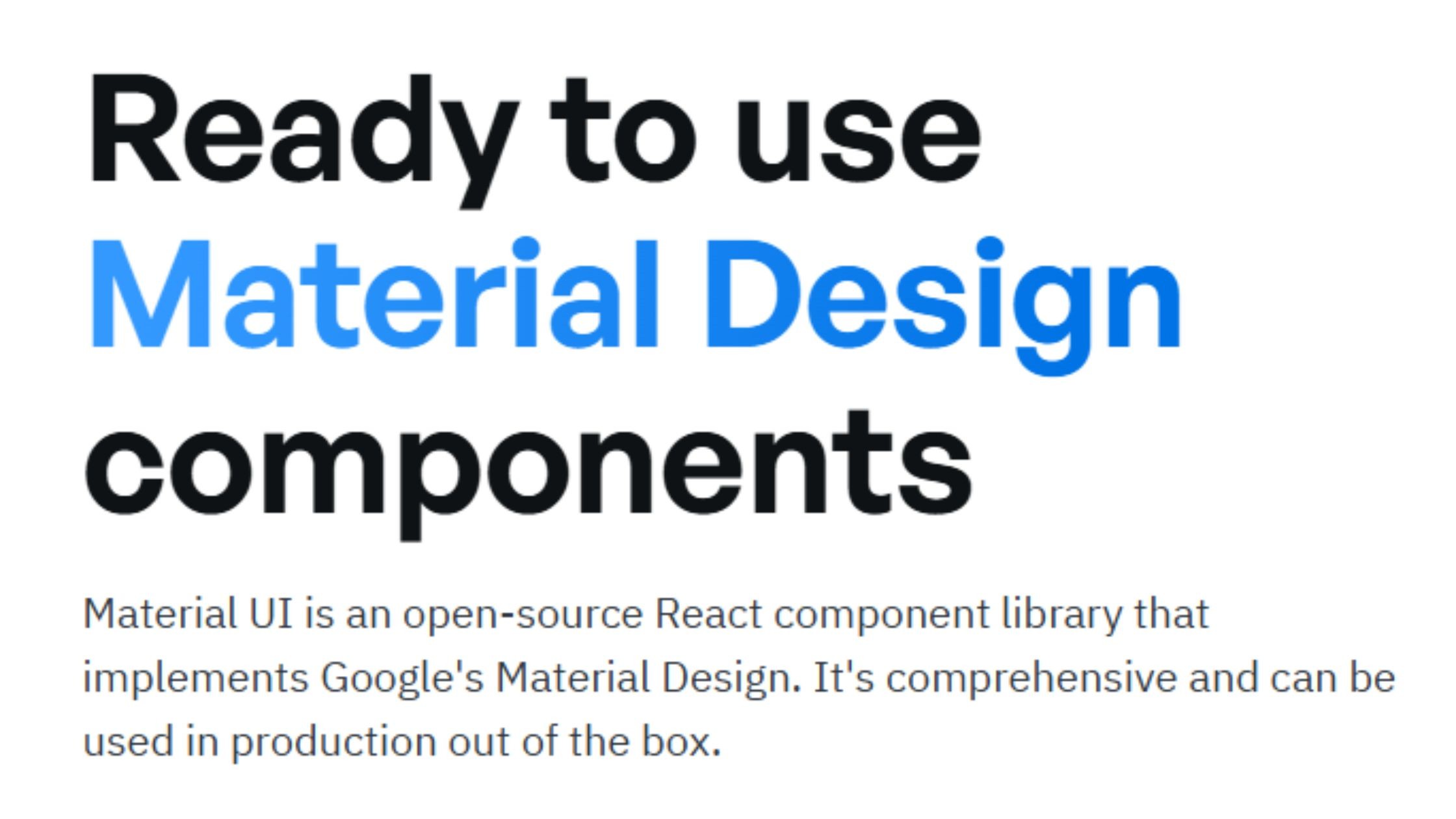
Material-UI (MUI) is one of the most popular React UI libraries, trusted by thousands of development teams for building scalable enterprise applications. It stands out for its comprehensive suite of pre-built components, robust theming and customization options, and first-class accessibility support, making it a go-to choice for data-driven products and design systems.
GitHub Stars: a testament to its popularity among top React UI component libraries. 96.8k+
Weekly Downloads: ui is optimized for high performance. 6.6M+
Key Features:
Robust implementation of Google’s Material Design principles, prioritizing accessibility.
Advanced theming, dark/light mode, CSS variables, and new Pigment CSS zero-runtime styling
Huge catalog of production-ready components, including data grids and charts
Built-in accessibility, localization, and TypeScript support
Accessibility improvements, up to 30% `sx` prop performance gains, keyboard navigation overhaul for Stepper, Tabs and MenuList, and the addition of NumberField and Menubar.
Note: MUI skipped v8 entirely — version numbers now align with MUI X v9 for a unified ecosystem. MUI X v9 adds a Scheduler, Chat component (alpha), and Data Grid AI Assistant.
Advantages:
Mature, actively maintained, and trusted for enterprise work
Large ecosystem, great documentation, and internationalization
Consistent, modern design out-of-the-box; adaptable for branding
Predictable upgrades with co-aligned versioning across MUI Core and MUI X from v9 onwards — no more guessing compatibility between library versions
2. Ant Design (AntD) - Enterprise User Interface Powerhouse
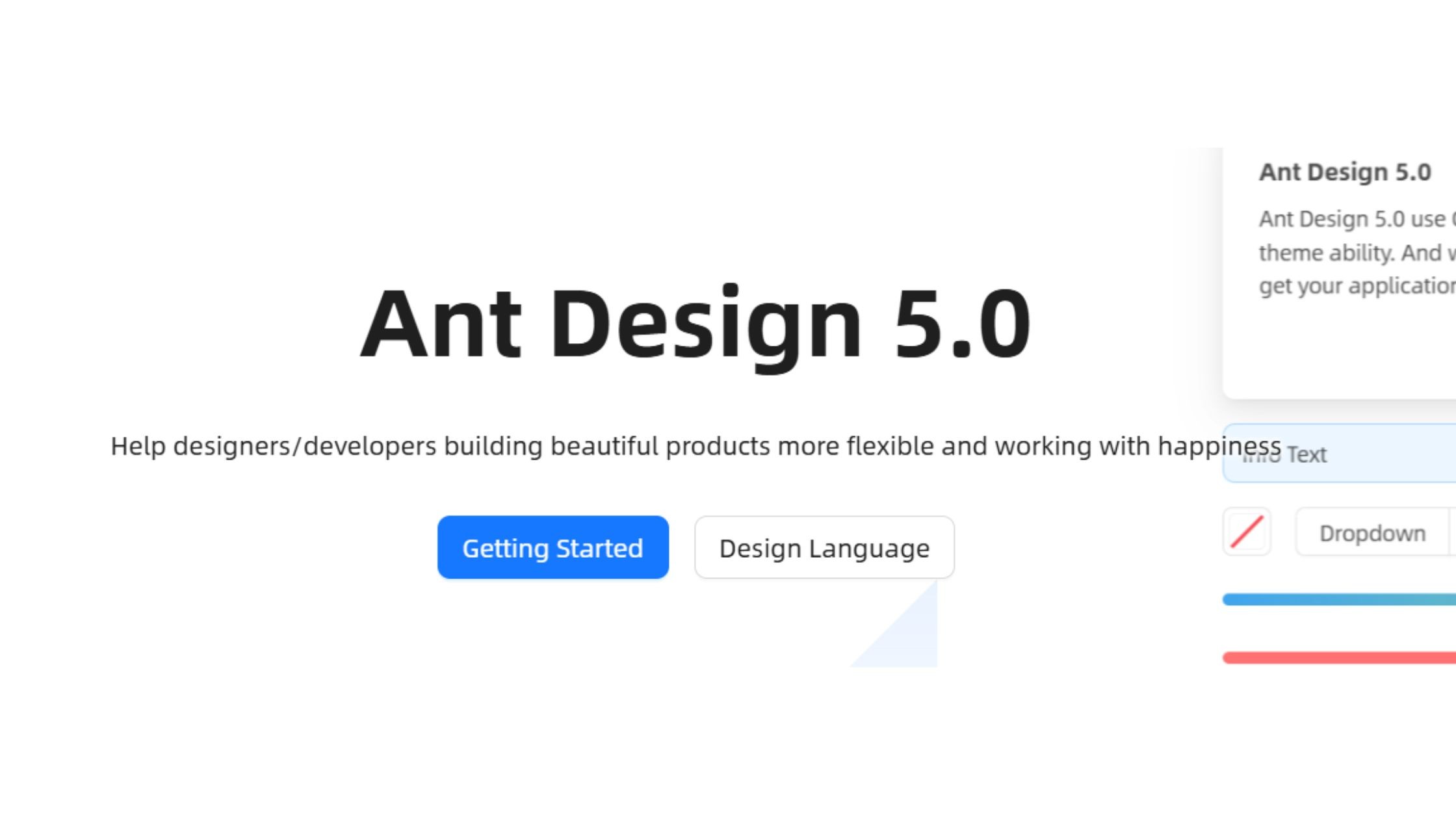
Ant Design v6, released November 2025, is a comprehensive React UI library designed for building data-heavy and enterprise-level applications. V6 introduces zero-runtime style generation (opt-in via `zeroRuntime: true` in ConfigProvider), full React 19 compatibility with the React Compiler enabled in bundled outputs, complete removal of IE support in favour of pure CSS Variables mode, and a new official CLI (`@ant-design/cli`) for offline component knowledge queries and project usage analysis. RTL support is now handled via CSS logical properties across all components.
GitHub Stars: 96.4k+
Weekly Downloads: 2.1M+
Key Features:
Vast library of enterprise-grade UI components
Advanced data visualization, charts, date pickers, and input controls
Strong internationalization/localization support is essential for libraries focused on creating global applications
Robust theming engine and CSS variables
Comprehensive accessibility by default
Advantages:
Ideal for building financial apps, admin portals, and SaaS back-offices
Quick development of complex, data-heavy dashboards
Active community and regular updates
V6 ships React Compiler integration in bundles, zero-runtime CSS mode, and an official CLI tool — the RSC and AI-tooling roadmap items from v5 have shipped
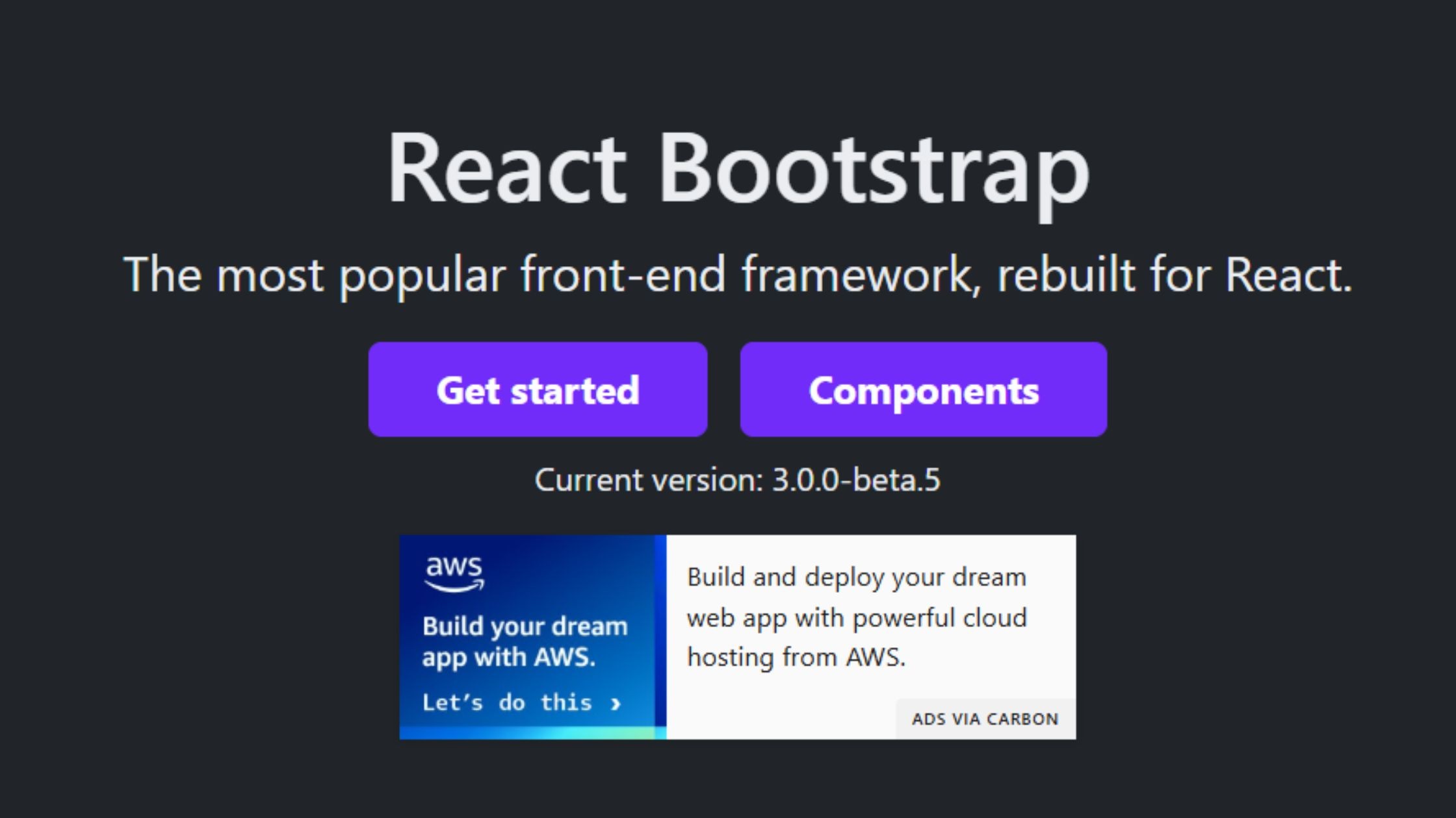
React-Bootstrap brings all of Bootstrap’s popular grid system and components natively into the React ecosystem. It’s a trusted choice for developers seeking to modernize legacy Bootstrap projects, rapidly build landing pages, or deliver admin panels with minimal friction, while maintaining full compatibility with React’s component-driven paradigm.
GitHub Stars: 22k+
Weekly Downloads: 1.3M+
Key Features:
Seamless Bootstrap v5 grid and utility integration
Familiar syntax for teams from Bootstrap backgrounds
SSR-friendly and accessibility-focused
Modular imports for optimized bundles
Advantages:
Rapid migration of legacy UIs into React
Stable, predictable, and beginner-friendly libraries help developers build applications with confidence.
Great documentation, wide adoption, and simple customization
4.Shadcn/ui: Best for Custom Design Systems
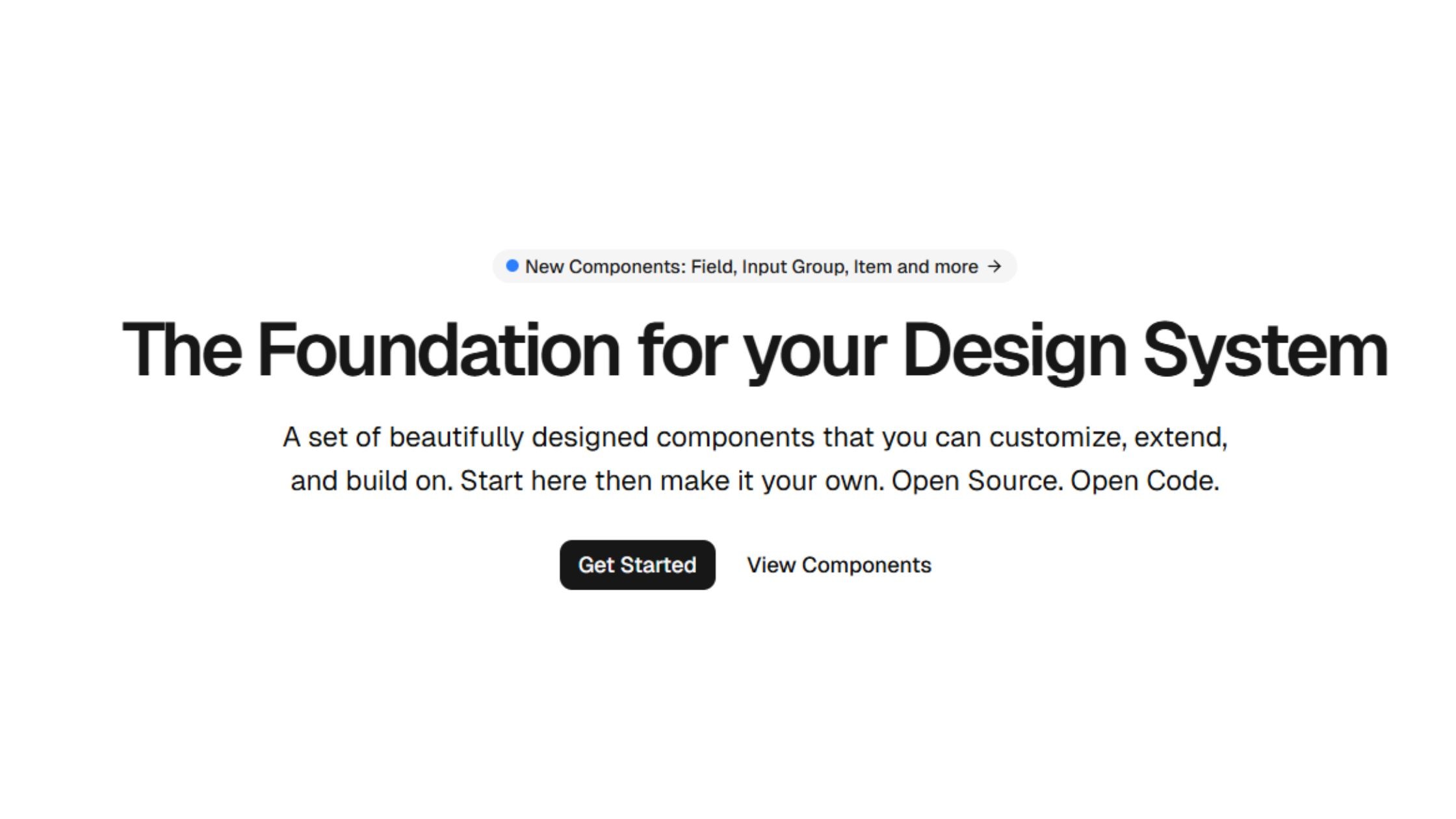
shadcn/ui is a utility-first React library that delivers highly customizable, accessible components you copy and paste directly into your project — trusted in production by OpenAI, Adobe, Sonos, and others. Its approach gives developers complete ownership of the UI code, enabling extensive customization without managing external dependencies. Built with Tailwind CSS v4 and Radix UI (with Base UI as an alternative primitive layer since February 2026), it's the go-to choice for teams wanting maximum control.
GitHub Stars: 97.9k+
Weekly Downloads: N/A (copy-paste model)
Key Features:
Copy-paste Tailwind CSS-based React components for total code ownership
Accessibility-first: built with Radix UI primitives
shadcn CLI v4 (March 2026): AI-agent-ready with `shadcn/skills` context packs, full project scaffolding for Next.js, Vite, Astro, Laravel and TanStack Start, preset system for sharing full design system configs in a single code string, and `--diff` flag for tracking registry updates
Designed for rapid prototyping and full customization
Advantages:
Developer freedom: your code, your rules
Lightweight: only add what you use
Built for AI-agent workflows: CLI v4 ships `shadcn/skills` so coding agents can scaffold and modify components correctly without context errors — the first component library with native AI-agent integration
Fast-growing, active community, and excellent documentation
5. Radix UI - Unstyled Primitives, Composable Workflows
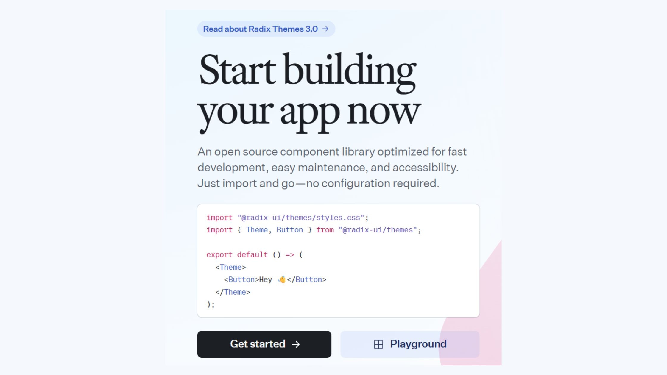
Radix UI is a developer-focused library that delivers a collection of unstyled, accessible React primitives. It empowers teams to build fully custom, branded user interfaces by giving them granular control over appearance and behavior, while handling complex accessibility and interaction logic under the hood.
GitHub Stars: 17k+
Weekly Downloads: 20M+
Key Features:
Offers 25+ primitive, unstyled, accessible components
Manages complex UI logic like focus and keyboard navigation
Ideal for SSR and headless UI implementations
Advantages:
Provides ultimate flexibility for building custom-branded UI libraries
Delivers strong accessibility out of the box
Serves as the foundation for other UI libraries, such as shadcn/ui
6. React Aria - Hooks-Based, Highly Accessible
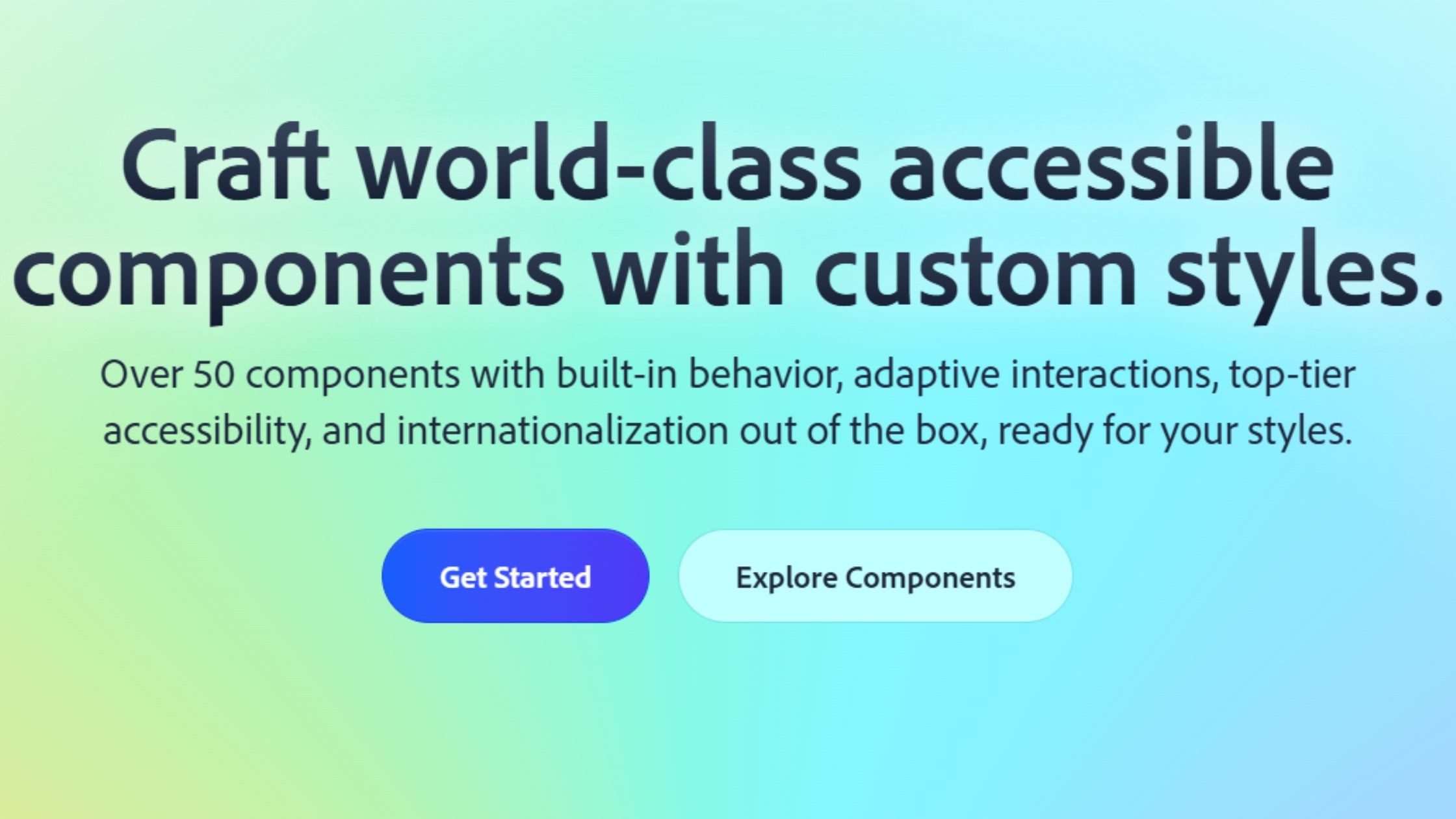
React Aria is a hooks-driven library developed and supported by Adobe, designed to bring accessible, robust interaction logic to your React components. Abstracting away complex accessibility patterns and event handling into easy-to-use hooks, it empowers developers to build highly inclusive interfaces while maintaining full control over styling and structure.
GitHub Stars: 11.5k+ (React Spectrum umbrella)
Weekly Downloads: 1.1M+ (in libraries using it)
Key Features:
Accessibility and interaction logic as composable React hooks
Internationalization and advanced gesture support
Roadmap for voice, gesture, and multimodal input
Advantages:
Highest accessibility compliance; ideal for global products
Facilitates building bespoke, accessible design systems
Corporate backing by Adobe ensures longevity
7. Headless UI - Tailwind-Native, Pre-Built Logic
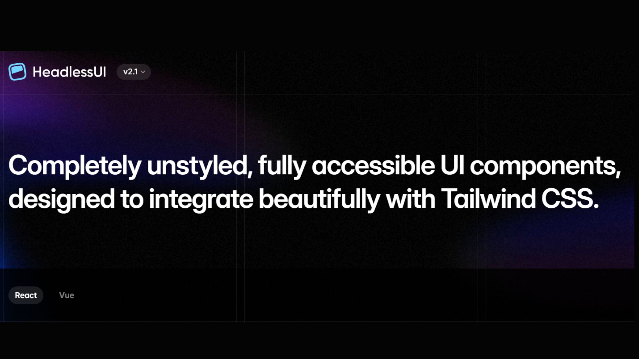
Headless UI is a Tailwind-native library that provides unstyled, fully accessible components, giving developers the power to build custom, branded UIs without sacrificing accessibility or performance. It pairs seamlessly with Tailwind CSS and frameworks like Next.js, delivering robust state and accessibility logic while letting you handle all aspects of presentation.
GitHub Stars: 28k+
Weekly Downloads: 3.26M+
Key Features:
Fully unstyled, accessible components (menus, lists, modals, etc.)
Tight integration with Tailwind CSS and Next.js
SSR and dark mode support
Ships only state and accessibility logic for maximum creative control
Advantages:
Empowers design system teams to implement custom designs effortlessly
Seamlessly fits modern Tailwind and Next.js workflows
Lightweight, ensuring fast, responsive user experiences
8. Chakra UI: Best for Fast SaaS Prototyping
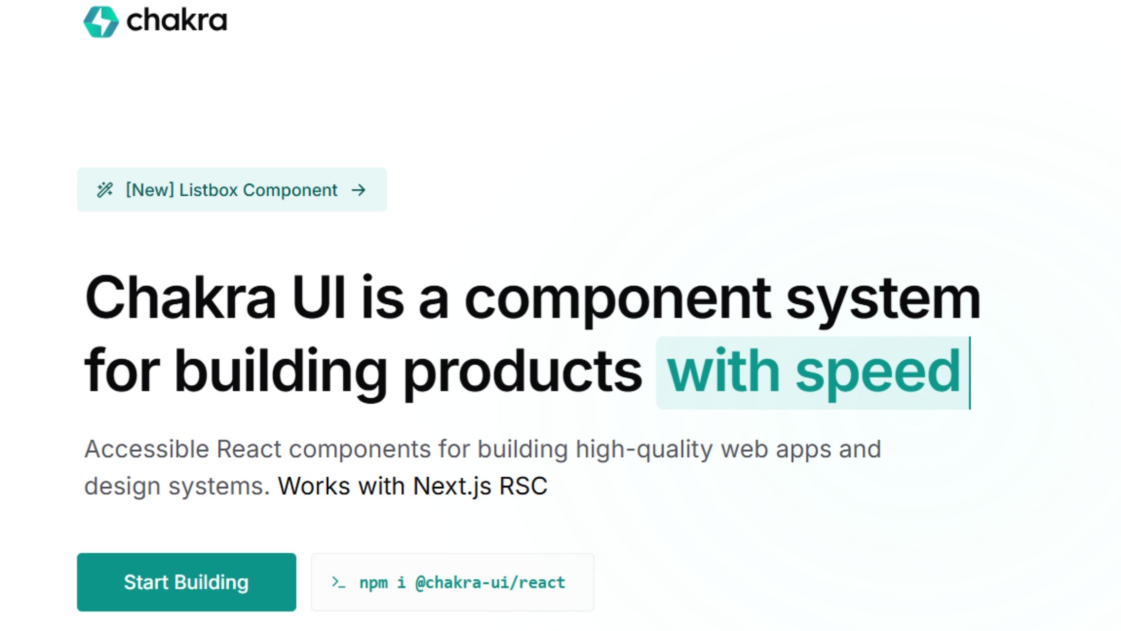
Chakra UI v3 (released October 2024) is a complete ground-up rewrite of the library. It replaces the previous style-prop approach with a token-based recipe system powered by Panda CSS conventions, integrates Ark UI state machines for interactive components, and removes the Framer Motion dependency in favour of native CSS animations — reducing bundle size and enabling full React Server Component compatibility. Over 25 new components were added in v3.0 alone.
GitHub Stars: 39k+
Weekly Downloads: 2.2M+
Key Features:
Token-based recipe system replacing the v2 style-prop API — semantic tokens adapt automatically to dark/light mode with zero manual overrides
Built-in themes, color modes, and dark mode
Accessibility-first and responsive by default
TypeScript and RTL (right-to-left language) support
Advantages:
Accelerates MVP and design system creation
Pleasant DX, easy theming, and extensive documentation
Forward compatibility with Ark UI primitives and RSC
9.Mantine: Best for Feature-Rich Dashboards
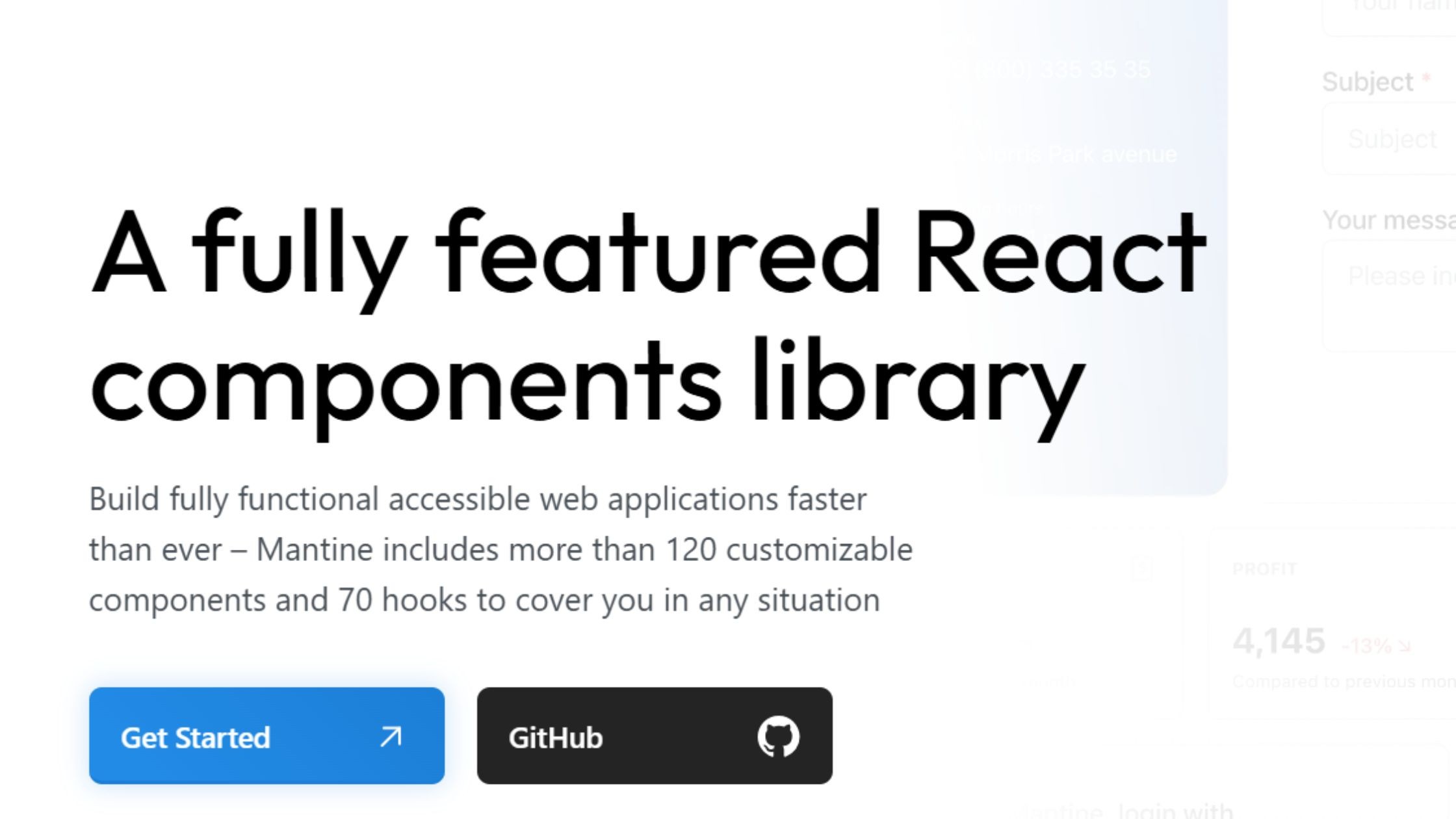
Mantine v9 (released March 31, 2026) is a comprehensive React UI library excelling in component breadth and hook depth. V9 introduces React 19 style tag deduplication via `deduplicateInlineStyles` on MantineProvider, a new adapter-based code highlighting system replacing the previous highlight.js dependency, and a Heatmap component for `@mantine/charts`. Mantine v8 added the Heatmap, a redesigned website, and adapter APIs — v9 builds on those foundations with React 19 alignment.
GitHub Stars: 30k+
Weekly Downloads: 893k+
Key Features:
120+ components, 70+ hooks, now on v9.1 — current release adds React 19 deduplication and adapter-based syntax highlighting
Deep customization with CSS-in-JS and theme utilities
Built-in notifications, date pickers, form handling, and modal features
Adapter-based code highlighting (v8+): bring any syntax highlighter via the new adapters API — shiki and highlight.js supported out of the box
Advantages:
Ideal for dashboards, analytics, and mobile-first UIs
Fast learning curve; excellent for collaborative teams
Robust and forward-thinking, optimized for React Server Components (RSC) and developer experience
10. HeroUI (NextUI) - Modern Design, Framer Motion Support
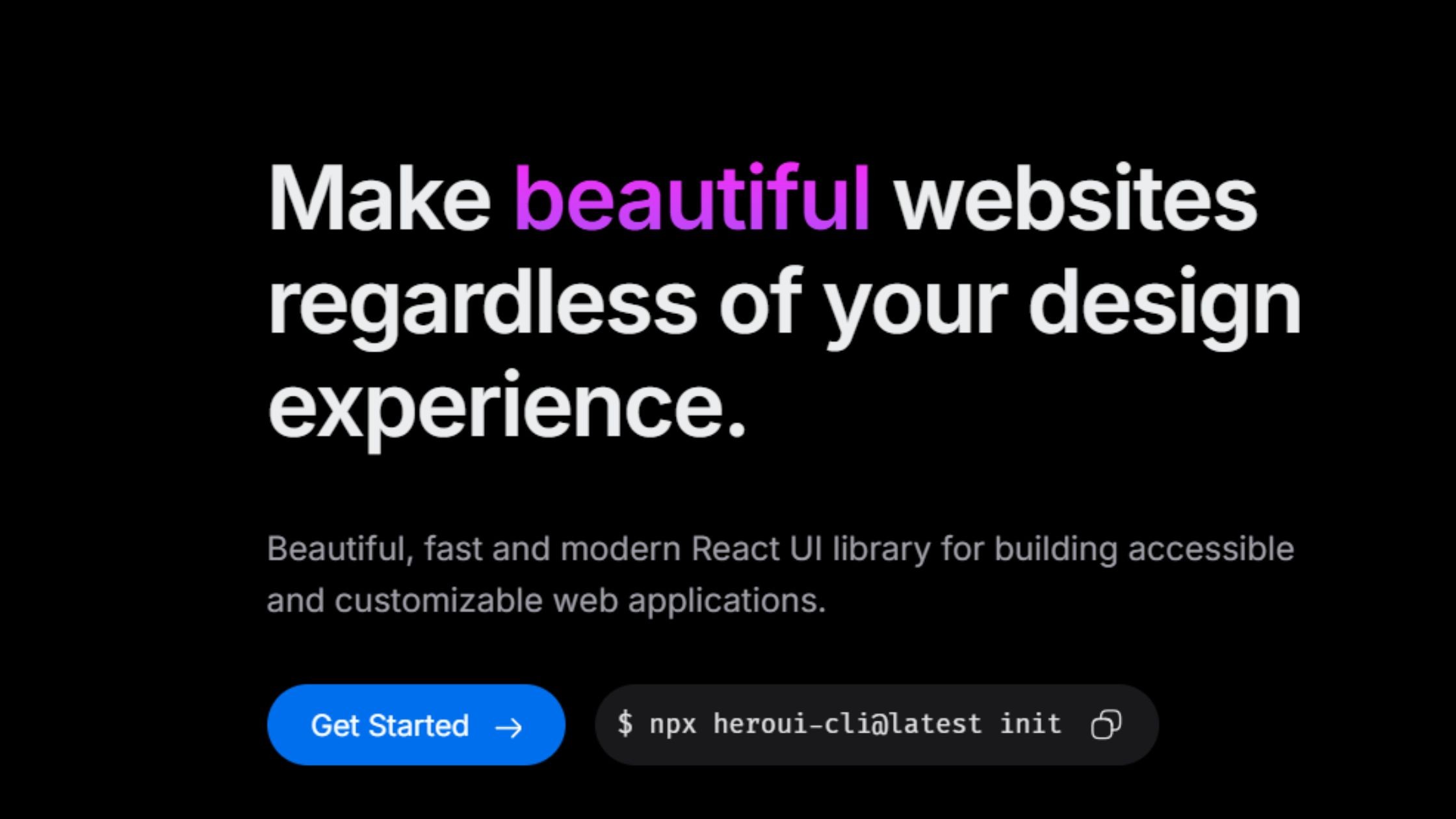
HeroUI (formerly NextUI) is a modern React UI library combining the utility of Tailwind CSS with the accessibility features of React Aria. It's especially well-suited for building visually stunning websites, landing pages, and marketing sites where design impact and performance are top priorities, thanks to its customizable components.
GitHub Stars: 27k+
Weekly Downloads: 197k+
Key Features:
Built on Tailwind CSS and React Aria
Modern component design with customizable theming
Integrated Framer Motion animations
SSR support and accessibility by default
Advantages:
Great for visually impactful sites and landing pages
Lightweight and fast, ideal for Next.js projects
Consistent, modern aesthetics with flexibility out of the box
11. React Suite – Robust for Back Office and B2B
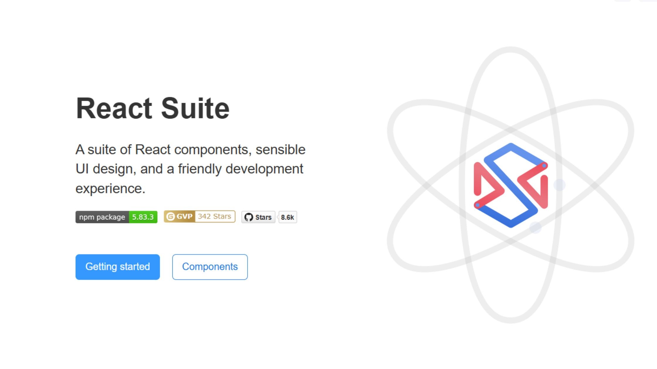
React Suite is a comprehensive React UI library purpose-built for enterprise back-office, middle-platform, and B2B applications. It stands out with its strong focus on multi-theme, multi-language, and internationalization support, making it a reliable solution for complex admin panels and business apps that require global scalability.
GitHub Stars: 8.6k+
Weekly Downloads: 118k+
Key Features:
Designed for enterprise back/mid-office systems
Multi-theme, multi-language support
Internationalization and dark/light toggle
Rich data tables, forms, and chart widgets
Advantages:
Reliable for admin panels, CRMs, and SaaS projects
Customizable design and workflow
Maintained with enterprise productivity in mind
12. Tremor – Dashboard & Analytics Specialist
Tremor is a specialized React UI library purpose-built for creating dashboards and analytics interfaces. It provides a suite of prebuilt components designed for metrics, charts, filtering, and analytics, making it easy to build professional data visualizations and business intelligence UIs with minimal setup.
GitHub Stars: 15K
Weekly Downloads: 124K
Key Features:
Prebuilt metrics, charts, filters, and analytics components
Built on Tailwind CSS for easy theming
Focused exclusively on dashboard UI needs
Advantages:
Build business intelligence dashboards fast
Professional data visualizations with minimal setup
No bloat—bring-your-own layout, plug-and-play usage
13. Blueprint UI - Data-Dense, Desktop-Like Experience
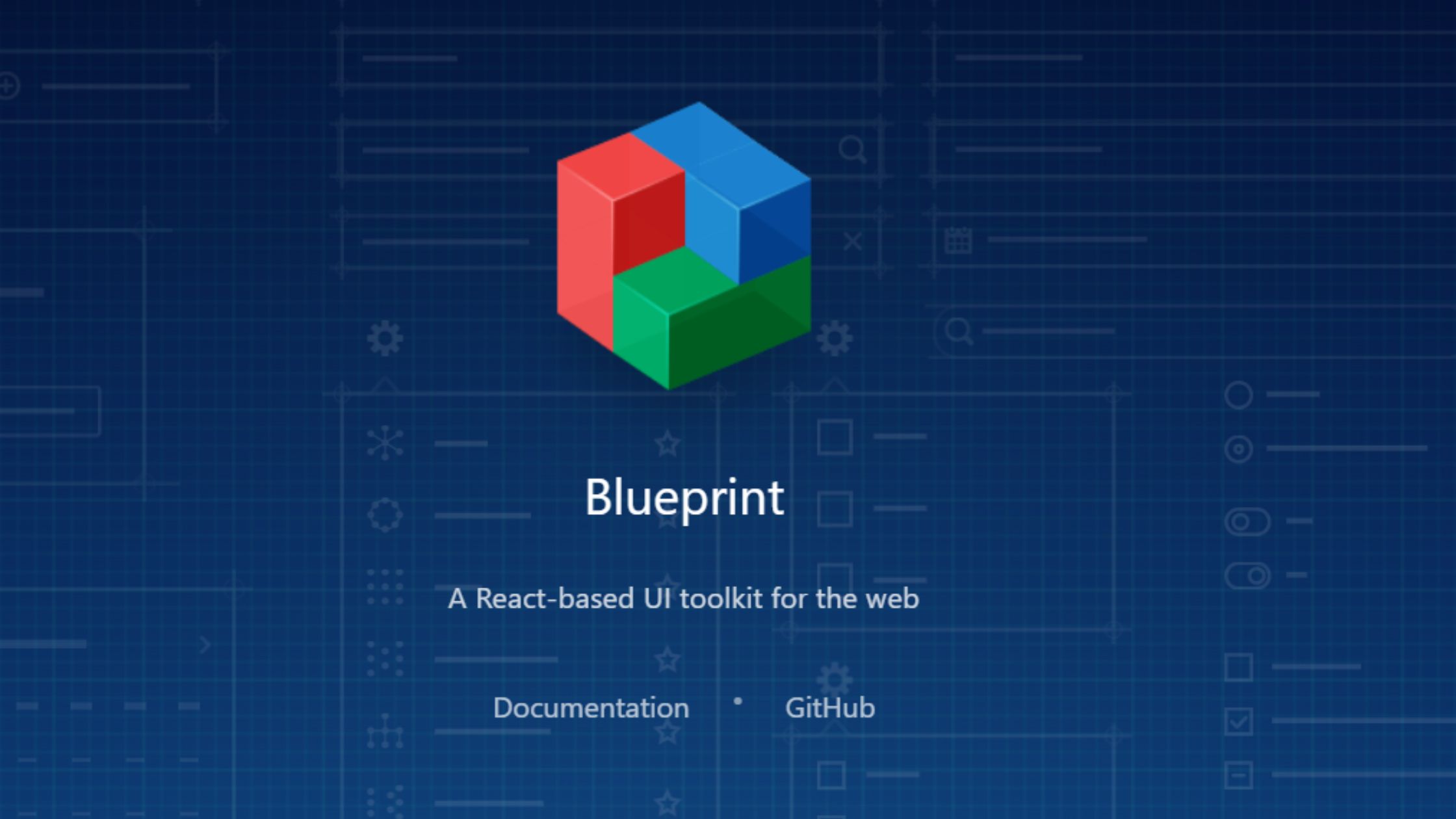
BlueprintJS is a robust React UI toolkit purpose-built for complex, data-intensive applications that demand a desktop-like user experience. It excels in creating feature-rich admin panels, internal tools, and enterprise dashboards where performance, scalability, and powerful table or form components are critical.
GitHub Stars: 21k+
Weekly Downloads: 224k+
Key Features:
High-performance table, form, and overlay components
Optimized for keyboard navigation and screen-reader support
Themeable with light/dark built-in
Advantages:
Outstanding for data-heavy internal tools
Handles large-scale datasets and “desktop app” interfaces smoothly
Constantly maintained by Palantir and the open source community
14. PrimeReact - All-in-One, Feature-Rich Set
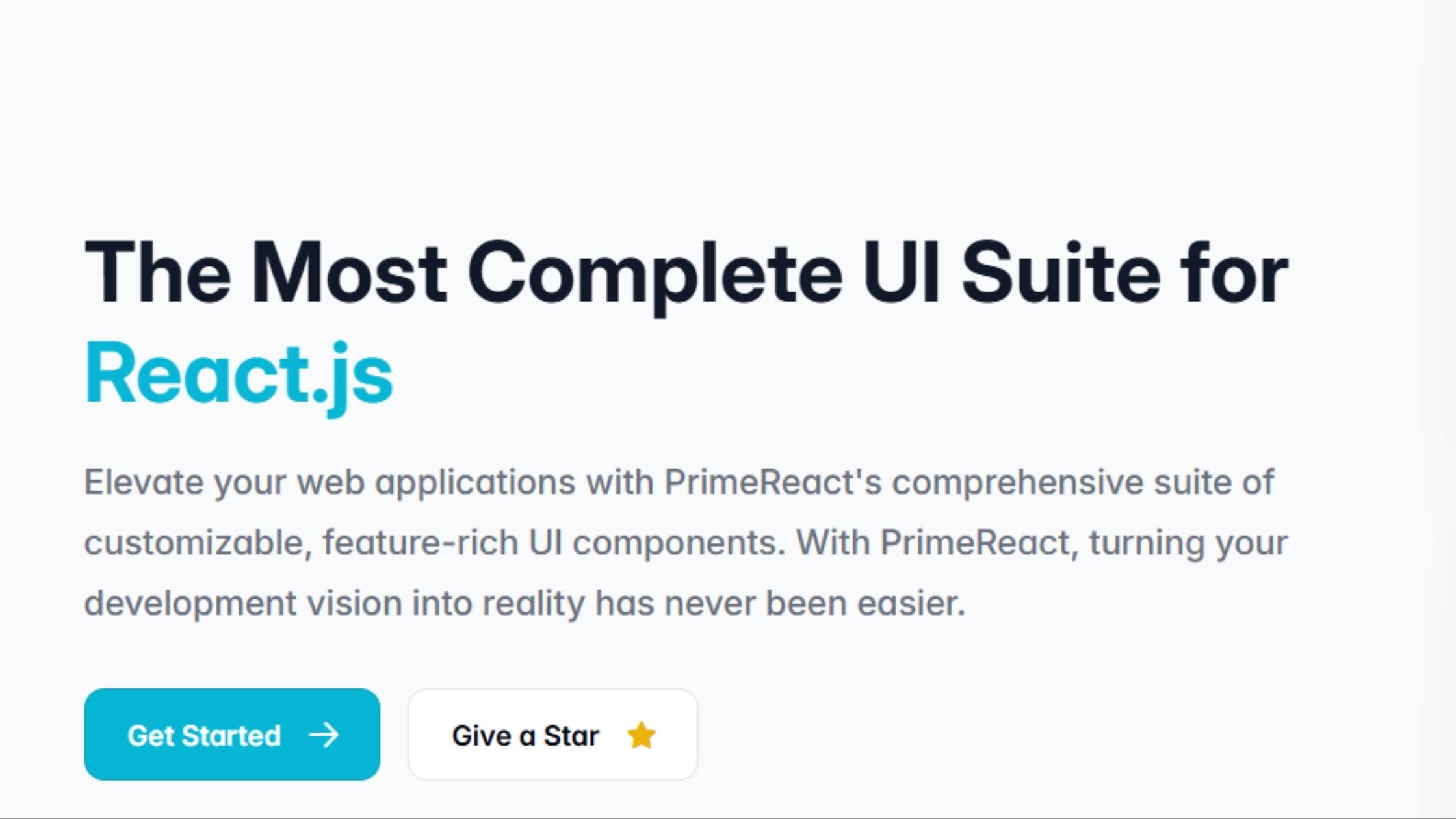
PrimeReact is a design-agnostic React UI library renowned for its extensive set of over 90 components, enabling developers to build enterprise applications with advanced tables, charts, and form controls. Its flexible theming system, strong accessibility support, and robust internationalization make it a go-to solution for large-scale business, fintech, and analytics platforms.
GitHub Stars: 8.3k+
Weekly Downloads: 2.2M+
Key Features:
90+ prebuilt UI components (v10 current stable), advanced tables, tree controls, and charting. PrimeReact v11 is in active alpha development adding Menu, ContextMenu, InputTags, and Tree components — a significant component expansion is in progress.
Design-agnostic and easily themeable
Data export, import, and validation tools
Accessibility and internationalization are built in
Advantages:
Ideal for ERP, fintech, admin, and analytics platforms
Fast release cadence with strong community support
Flexible use: plug-and-play or select components as needed
15. Semantic UI React - Human-Friendly, Declarative
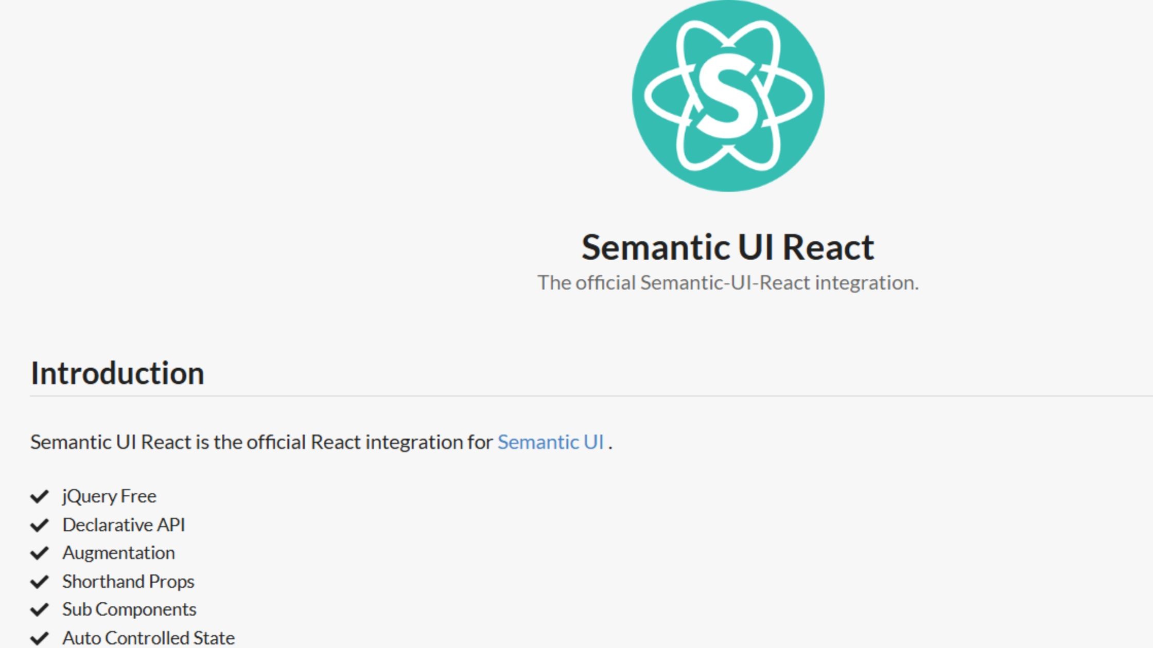
Semantic UI React is known for its intuitive, human-friendly API that uses familiar class-based naming, making it easy for developers to create accessible and cohesive interfaces quickly. It's an excellent choice for teams looking to rapidly prototype applications or prioritize readability and accessibility in production-ready UIs.
GitHub Stars: 13.2k+
Weekly Downloads: 255k+
Key Features:
Human-friendly, class-based API (CSS-based)
100+ UI elements, including messaging, menus, and inputs
Auto-managed component state
Advantages:
Extremely readable and declarative code structure is a hallmark of lightweight libraries that promote efficient development.
Easy adoption for newcomers and quick prototyping
Responsive, accessible out-of-the-box
16. Grommet – Mobile-First, Inclusive by Design
Grommet is designed with a mobile-first philosophy, making it a fantastic fit for responsive, accessible applications that need to perform on a wide range of devices. It offers a unique design system with a strong emphasis on accessibility, flexible theming, and ease of customization, making it especially well-suited for educational tools, public sites, and projects that prioritize inclusivity.
GitHub Stars: 8k+
Weekly Downloads: 48k+
Key Features:
Responsive, mobile-first components
Theming for light, dark, and custom color schemes
Strong accessibility and screen reader support
Advantages:
Excels on touch devices and public-facing apps
Designed for inclusivity, perfect for education and social platforms
Easy to customize with built-in icon support
17. React-Admin – B2B Admin Framework
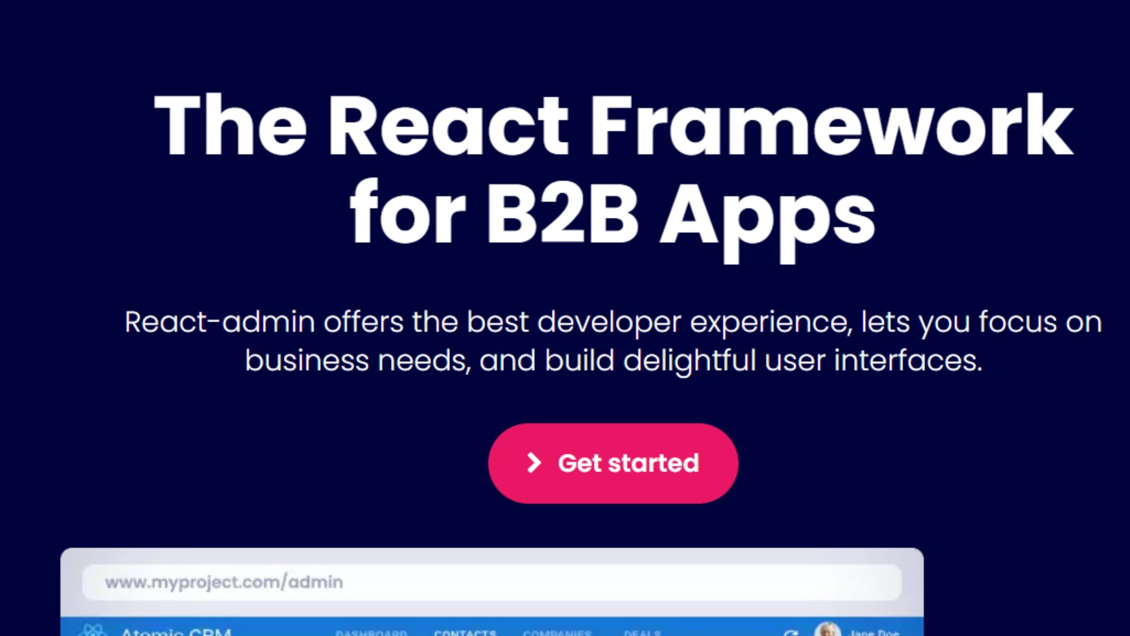
React-Admin is a specialized framework designed for efficiently building scalable back-office and business-to-business (B2B) admin panels. Leveraging Material UI at its core, React-Admin streamlines the creation of robust CRUD interfaces, supports integration with REST and GraphQL APIs, and delivers built-in accessibility and customizable workflows for complex enterprise needs.
GitHub Stars: 26.3k+
Weekly Downloads: 112k+
Key Features:
Built atop Material UI
Authentication, authorization, and CRUD workflow support
REST/GraphQL backend integration, rich form validation
Built-in accessibility and responsive design
Advantages:
Enables rapid build of scalable admin panels
Used by major organizations and enterprises
18. Onsen UI – Native Mobile & Hybrid Specialist
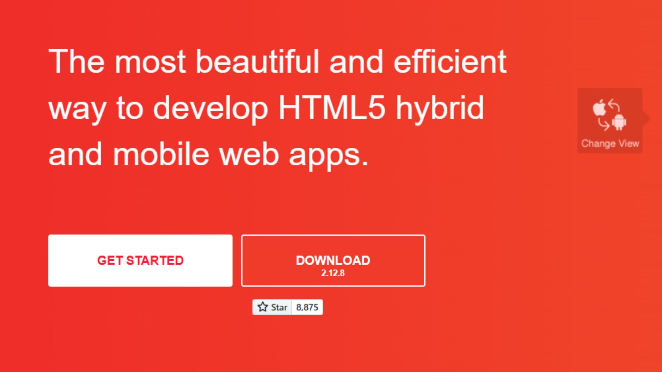
Onsen UI is designed for cross-platform development, allowing teams to create hybrid mobile and web applications with a native look and feel. With robust mobile-focused components and gesture support, it streamlines the process of building responsive, app-like interfaces for both iOS and Android from a single codebase.
GitHub Stars: 8k+
Weekly Downloads: 5k+
Key Features:
Mobile-focused UI and gesture support
Pre-built iOS and Android-style themes
Lazy loading for optimal performance
Router integration for efficient cross-platform delivery
Advantages:
Enables building hybrid mobile/web applications with near-native performance
Provides a polished, mobile-first user experience in a small bundle
Ideal for teams targeting both iOS and Android with one codebase
19. CoreUI – Modern Admin Templates
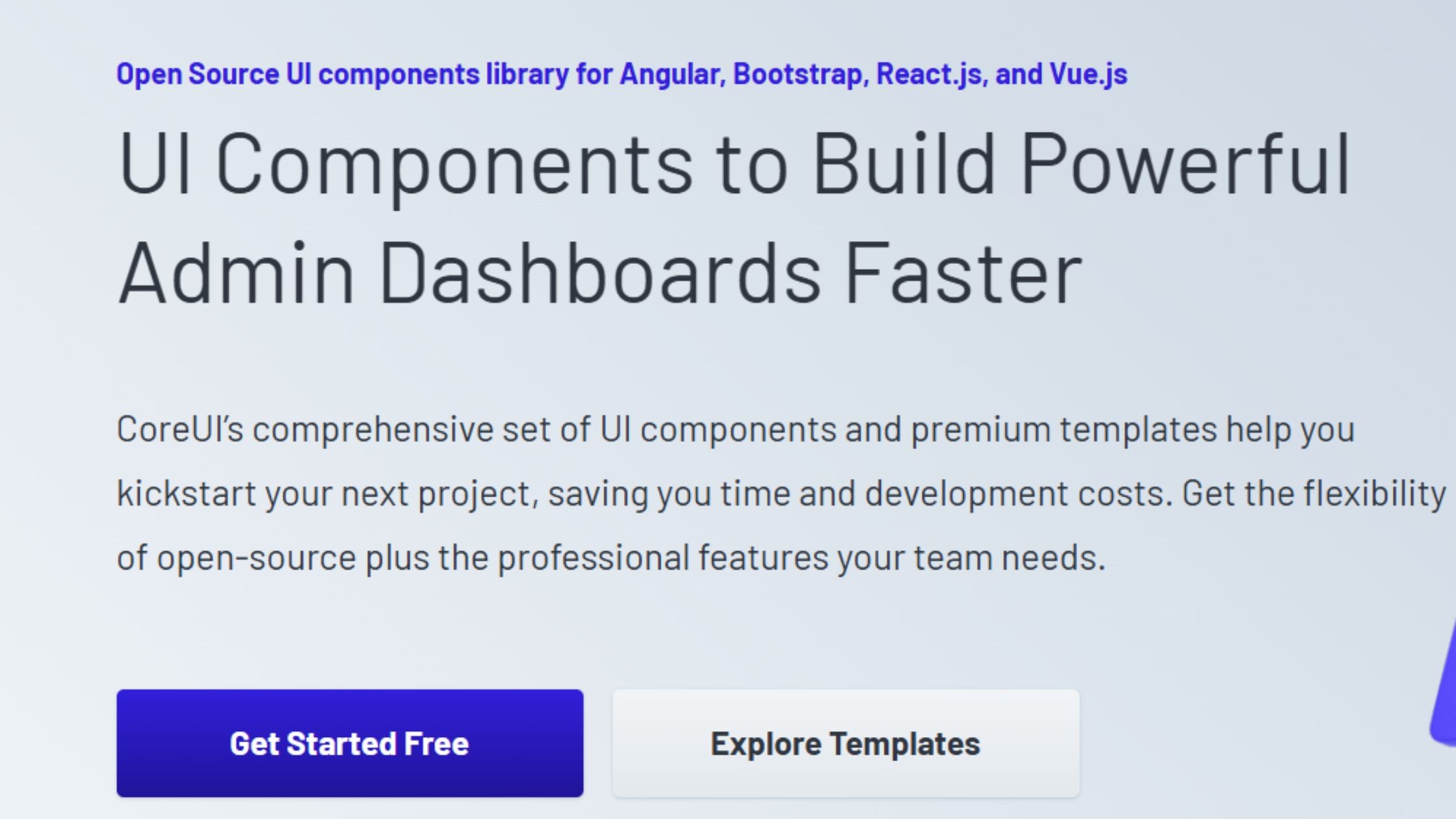
CoreUI is a modular React UI library dedicated to providing pre-built admin and dashboard templates. Designed for flexibility and cross-platform development, it supports teams working across React, Angular, and Vue, streamlining the creation of professional back-office interfaces with minimal setup.
GitHub Stars: 712+
Weekly Downloads: 93k+
Key Features:
Modular SASS-based admin and dashboard templates
Integrated icon set and exclusive widgets
Cross-browser support
RTL/LTR toggle for multilingual layouts
Suitable for multi-platform (React, Angular, Vue) teams
Advantages:
Quick assembly of back-office dashboards
Delivers a modern look and user experience without heavy customization
Simplifies cross-platform development for diverse frontend stacks
How to Select the Right React UI Stack for Your Use Case
When it comes to selecting the best React component library for 2026:
For enterprise and scalable projects: Choose libraries like Material-UI (MUI), Ant Design, or PrimeReact, which excel in stability, performance optimization, and community support.
For brand customization and long-term flexibility: Consider libraries that allow developers to create custom themes easily. Headless UI frameworks, such as Radix UI, React Aria, Headless UI, and shadcn/ui, offer the best foundation for a unique, maintainable design system.
For speed and smooth developer workflow: Toolkits like Chakra UI, Mantine, and HeroUI balance out-of-the-box usability with a deep capacity for unique themes and visual innovation.
For mobile or hybrid web development: Libraries like Grommet and Onsen UI prioritize responsive, native-like experiences and are optimized for mobile, making them ideal for developers building app-like interfaces.
Our Frontend Engineering Perspective
At Hashbyt, we’ve worked with multiple React UI libraries across SaaS products, enterprise dashboards, frontend modernization projects, and highly customized design systems.
In our experience:
MUI remains one of the strongest choices for enterprise CRUD-heavy applications because of its mature ecosystem and production-ready component depth.
Ant Design performs exceptionally well for fintech, ERP, and data-intensive admin workflows.
Chakra UI is excellent for fast-moving startup teams shipping MVPs quickly.
Radix UI and shadcn/ui provide the best long-term flexibility for organizations building scalable custom design systems.
React Aria stands out for accessibility-first frontend architectures where keyboard navigation and inclusive interaction patterns are critical.
The best React UI library ultimately depends on whether your priority is:
speed,
scalability,
accessibility,
customization,
or long-term design system ownership.
Which React UI Component Library Should You Choose?
If you need:
fast enterprise development → choose MUI or Ant Design
full design flexibility → choose Radix UI or shadcn/ui
Tailwind-native workflows → choose Headless UI or HeroUI
accessible primitives → choose React Aria
dashboard-heavy analytics → choose Tremor or BlueprintJS
rapid SaaS prototyping → choose Chakra UI or Mantine
There is no single “best” React UI component library for every project. The right choice depends on:
your frontend architecture
team size
customization requirements
accessibility standards
long-term scalability goals
The most successful frontend teams optimize for maintainability and developer velocity, not just visual aesthetics.
Final Verdict: Choosing the Best React UI Component Library
The React frontend ecosystem in 2026 is increasingly moving toward composable, accessibility-first, and design-system-driven architectures. While traditional component frameworks like MUI and Ant Design continue to dominate enterprise development, modern headless solutions such as Radix UI and shadcn/ui are becoming the preferred choice for highly customized SaaS products and scalable frontend systems.
For teams prioritizing:
rapid development → Chakra UI and Mantine remain excellent choices
enterprise workflows → MUI and Ant Design are still industry leaders
customization and flexibility → Radix UI and shadcn/ui provide the strongest long-term foundation
accessibility → React Aria continues to set the benchmark
The best React UI library is ultimately the one that aligns with your:
product architecture,
frontend team workflow,
scalability goals,
and long-term maintenance strategy.


About the author
I’m the founder of Hashbyt, an AI-first frontend and UI/UX SaaS partner helping 200+ SaaS companies scale faster through intelligent, growth-driven design. My work focuses on building modern frontend systems, design frameworks, and product modernization strategies that boost revenue, improve user adoption, and help SaaS founders turn their UI into a true growth engine.


Is a clunky UI holding back your growth?
Is a clunky UI holding back your growth?
▶︎
Transform slow, frustrating dashboards into intuitive interfaces that ensure effortless user adoption.
▶︎
Transform slow, frustrating dashboards into intuitive interfaces that ensure effortless user adoption.
