
Menu
Menu
Menu
Blog
Master Tetradic Color Schemes for UI/UX | 7 Expert Tips
Master Tetradic Color Schemes for UI/UX | 7 Expert Tips
Posted on
SAAS Growth
SAAS Growth
Posted at
Jun 25, 2024
Jun 25, 2024
Min read
10

I hope you found this post valuable. If you’re looking for proven frontend and design expertise to elevate your product, feel free to reach out.
I hope you found this post valuable. If you’re looking for proven frontend and design expertise to elevate your product, feel free to reach out.

Color is more than just a visual element in UI/UX design; it's a powerful communication tool. It guides user behavior, evokes emotion, and defines a brand's identity. For designers looking to create vibrant, engaging, and memorable digital products, mastering advanced color theory is essential. One of the most dynamic yet challenging palettes to work with is the tetradic color scheme. This four-color structure, built from two pairs of complementary colors, offers incredible versatility and visual richness. However, it can just as easily lead to a chaotic and overwhelming interface if not handled with precision.
For designers struggling to create balanced and harmonious color palettes, the tetradic approach can feel like a double-edged sword. It promises a world of creative possibilities but demands a deep understanding of balance, contrast, and hierarchy. This guide will equip you with the knowledge and confidence to wield this complex palette like a pro. We will explore the fundamentals, address common challenges, and provide seven expert tips to help you master the tetradic color scheme for stunning and effective UI/UX designs.
Understanding the Building Blocks of Color Harmony
Before diving into the complexities of a four-color palette, it’s crucial to grasp the foundational principles of color theory. These concepts are the bedrock upon which all successful color schemes are built, helping you make intentional and strategic design choices.
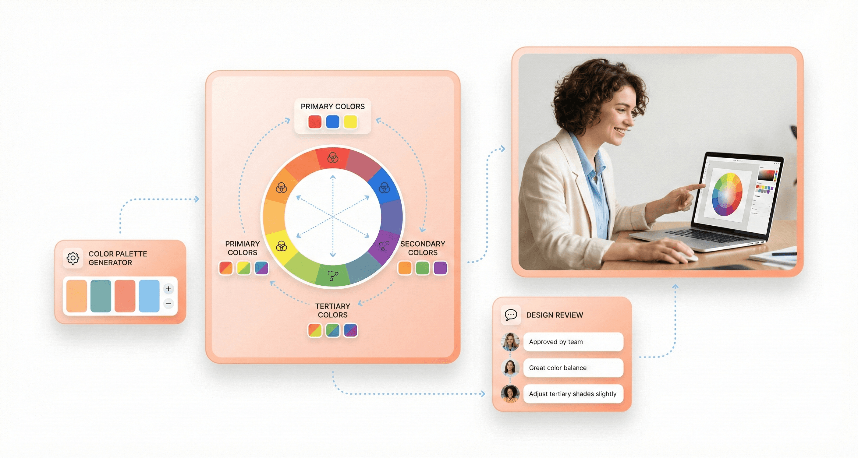
The Color Wheel: Your Map to Color Relationships
The color wheel is an illustrative model that organizes colors based on their relationships. It was first developed by Isaac Newton and remains an indispensable tool for designers today. It is typically composed of:
Primary Colors: Red, yellow, and blue. These are the fundamental colors from which all other colors are derived.
Secondary Colors: Orange, green, and purple. These are created by mixing two primary colors.
Tertiary Colors: These are created by mixing a primary color with an adjacent secondary color, resulting in hues such as red-orange, yellow-green, and blue-violet.
The wheel provides a visual guide for creating harmonious combinations. It helps you see how colors interact, whether they clash or complement each other, and how to build a palette that aligns with your design goals.
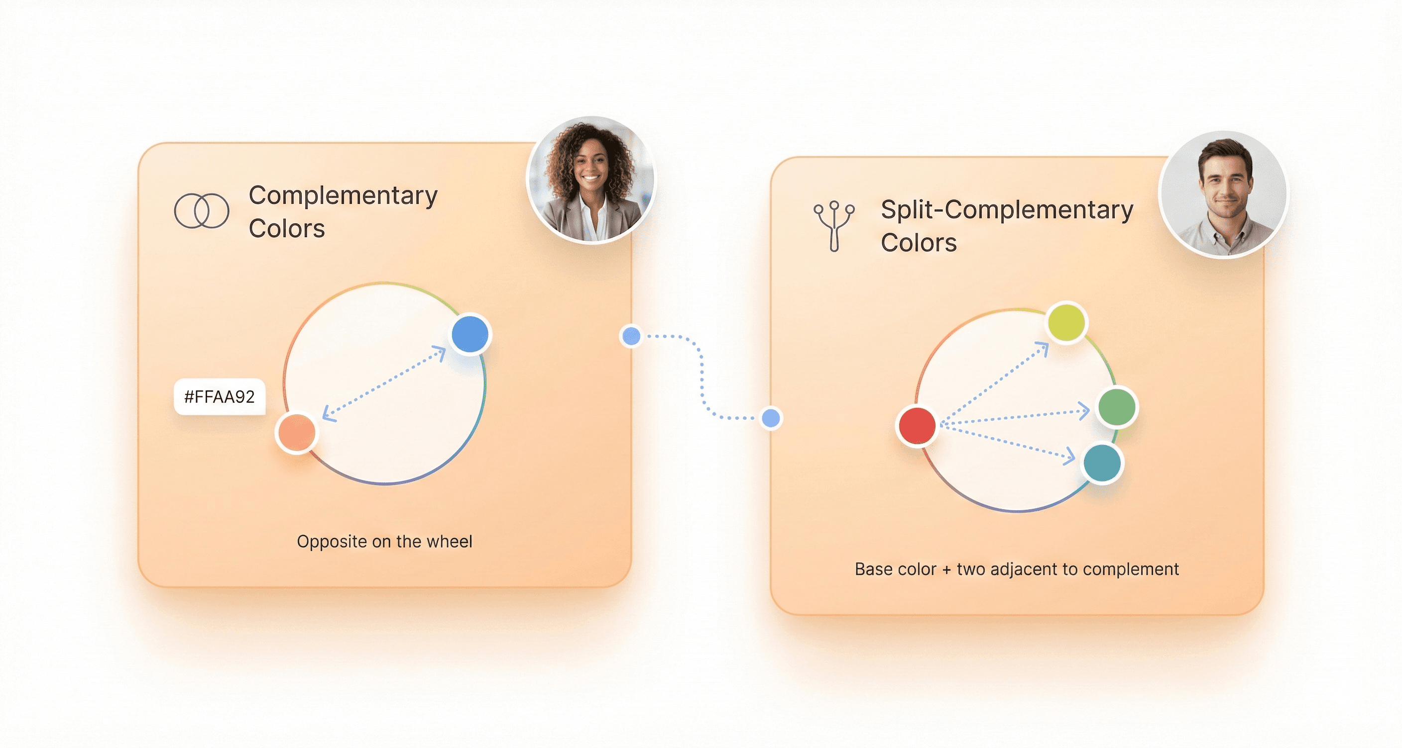
Complementary and Split Complementary Colors
Understanding complementary colors is key to unlocking the power of the tetradic color scheme.
Complementary Colors: These are pairs of colors located directly opposite each other on the color wheel (e.g., red and green, blue and orange). When placed side-by-side, they create the highest level of contrast, making elements pop.
Split Complementary Colors: This scheme involves one base color and the two colors adjacent to its direct complement. It offers strong visual contrast but with less tension than a standard complementary pairing. We have many split-complementary color examples, such as red paired with yellow-green and blue-green. This creates a more nuanced and balanced look.
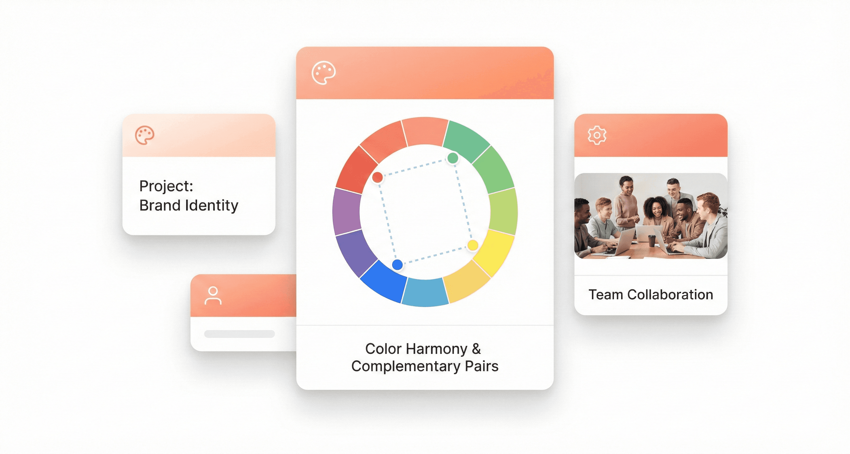
Forming a Tetradic Color Scheme
A tetradic color scheme is formed by selecting two pairs of complementary colors. These four colors form a rectangle on the color wheel. For instance, you might pair red and green with blue and orange. This structure inherently creates a rich palette with a natural balance between warm and cool tones, offering more creative freedom than simpler schemes like triadic or analogous.
Why Use a Tetradic Color Scheme in Digital Design?
While more complex to manage, the tetradic color scheme offers significant advantages for digital product design, making it a popular choice for brands aiming for a modern and dynamic visual identity.
Unmatched Versatility and Depth
With four colors at your disposal, you have a broader range to define different states, actions, and information hierarchies within your UI. You can assign specific colors to primary actions, secondary elements, notifications, and backgrounds without the palette feeling repetitive. This depth is especially valuable in complex applications, dashboards, and platforms where clear visual differentiation is critical for usability.
Dynamic Contrast and Visual Energy
The inherent structure of two complementary pairs creates a high level of natural contrast. This energy makes designs feel vibrant, engaging, and memorable. When balanced correctly, this contrast draws attention to key elements like calls-to-action (CTAs), highlights important information, and guides the user’s eye through the interface. It helps you build a visual narrative that keeps users engaged.
Building a Unique and Memorable Brand Identity
In a crowded digital marketplace, a unique color palette can make your brand instantly recognizable. Tetradic schemes are less common than simpler ones, allowing you to stand out. Brands like Google and Slack have successfully used multi-color palettes to convey innovation, diversity, and user-friendliness. A well-executed tetradic palette tells a story of a confident, modern, and forward-thinking brand.

Navigating the Common Challenges of Tetradic Palettes
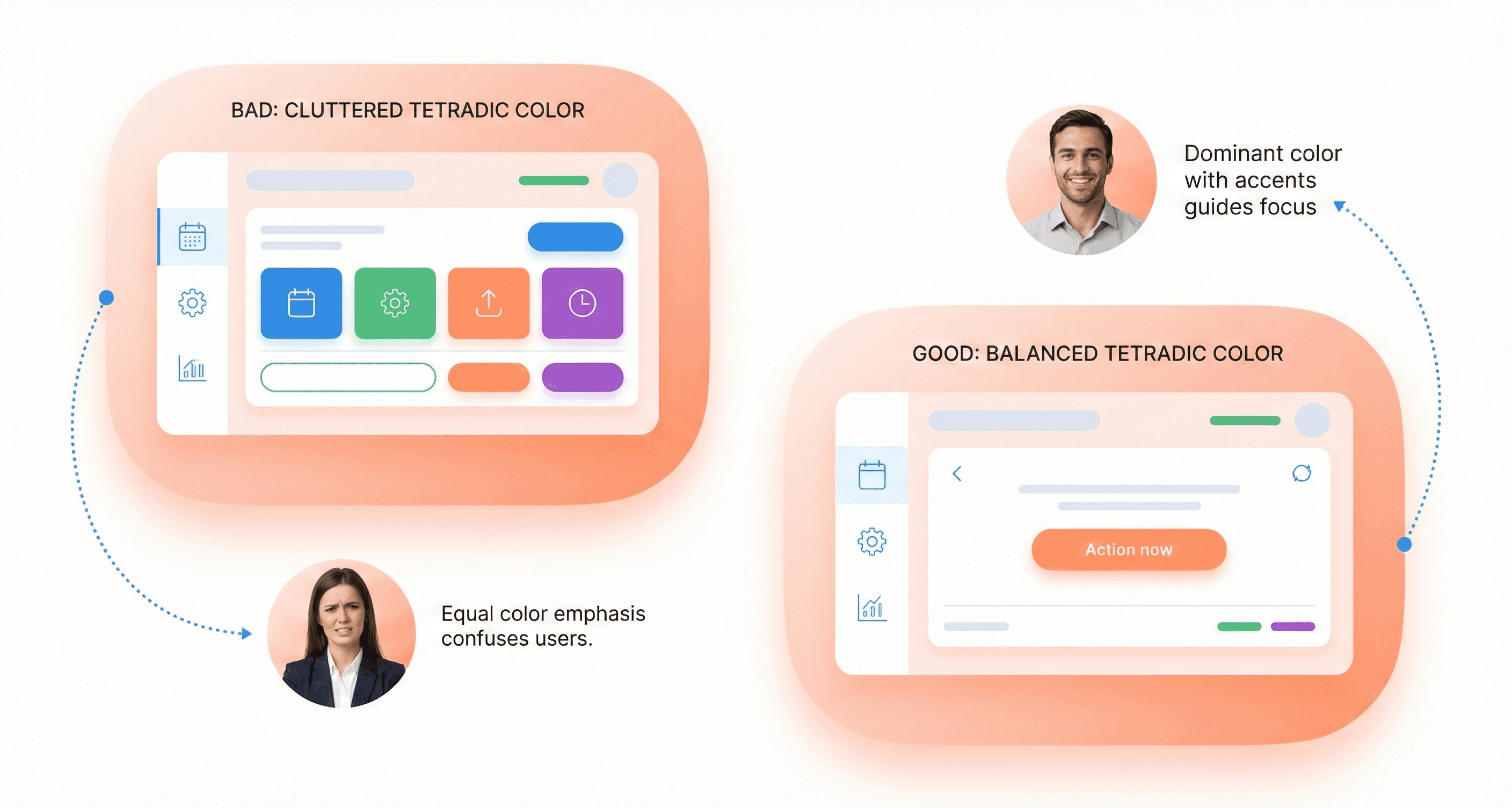
The richness of a tetradic color scheme is also its greatest challenge. Juggling four distinct hues requires a strategic approach to avoid creating a design that feels chaotic, unprofessional, or visually overwhelming.
Visual Chaos: The most common pitfall is treating all four colors with equal importance. Without a clear hierarchy, the colors compete for attention, leading to a cluttered and confusing interface.
Poor Harmony: A lack of balance between warm and cool tones can create visual tension. An interface dominated by warm colors may feel aggressive, while one with too many cool tones might seem cold and uninviting.
Accessibility Issues: High-contrast colors, if used improperly, can lead to poor readability. Text and important UI elements might become difficult to discern, especially for users with visual impairments.
Brand Inconsistency: Without a clear system for applying the colors, the brand’s visual identity can become fragmented and inconsistent across different screens and platforms.
Addressing these challenges is not about limiting your creativity but about channeling it through a structured and intentional process.
7 Expert Tips to Master the Tetradic Color Scheme
Here are seven actionable tips to help you harness the power of tetradic colors while maintaining balance, clarity, and professionalism in your UI/UX designs.
1. Choose a Dominant Color
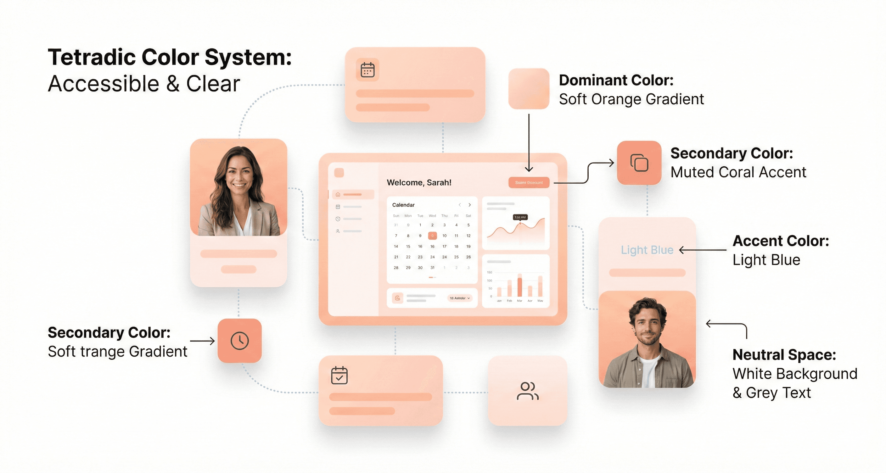
Never treat all four colors equally. The key to a harmonious tetradic palette is to establish a clear visual hierarchy. Select one color to be your dominant hue, which should cover approximately 60% of your design. This color will often serve as the primary background or the main brand color. The other three colors should act as secondary and accent colors, used more sparingly to highlight key elements.
2. Balance Warm and Cool Tones Strategically
A tetradic palette naturally includes both warm (reds, oranges, yellows) and cool (blues, greens, purples) colors. A successful design balances these to create a desired mood. A common strategy is to use cool colors for backgrounds and larger UI components to create a sense of calm and stability, while reserving warm colors for interactive elements like buttons and notifications to draw attention and prompt action.
3. Use Saturation and Brightness Variations
Your four chosen colors are just a starting point. Create a more sophisticated and cohesive palette by using different tints (adding white), shades (adding black), and tones (adding gray). Instead of using four highly saturated colors that compete with each other, use muted versions for backgrounds and less important elements, while saving the most vibrant versions for accents. An orange purple green and yellow palette, for example, can be softened by using a muted green for the background, a light yellow for highlights, and a vibrant orange for the primary CTA.
4. Incorporate Neutral Colors for Balance
Neutral colors—like white, gray, and black—are your secret weapon for taming a vibrant tetradic palette. They provide visual breathing room and prevent the design from becoming overwhelming. Use neutrals for typography, containers, and negative space. A clean, neutral background can make your tetradic colors pop without creating visual noise, ensuring your design feels polished and professional.
5. Assign Specific Roles to Each Color
To maintain consistency and create an intuitive user experience, assign a specific function to each color in your palette. For example:
Dominant Color (Cool): Backgrounds, main layout structure.
Secondary Color (Cool): Secondary navigation, card backgrounds.
Primary Accent (Warm): CTAs, active states, important icons.
Secondary Accent (Warm): Notifications, alerts, status indicators.
By creating a system and sticking to it, you ensure that your design is not only beautiful but also functional and easy to navigate.
6. Test for Accessibility and Readability
A beautiful design is useless if it’s not accessible. Vibrant color combinations can sometimes fail to meet web accessibility standards, particularly for text contrast. Use tools like the WCAG color contrast checker to ensure that your text is readable against its background. Pay special attention to text on colored buttons and links. This not only makes your product usable for people with visual impairments but also improves the experience for all users in various lighting conditions.
7. Adapt for Light and Dark Mode
Modern UI design often requires both a light and dark theme. Your tetradic color scheme must be flexible enough to work effectively in both modes. This may require adjusting the saturation and brightness of your colors. A color that works well as a background in light mode might be too dominant in dark mode. Test your palette extensively in both themes to ensure it remains balanced, readable, and visually appealing.
Real-World Applications of Tetradic Color Schemes
Many successful brands have embraced complex color palettes to create memorable and effective user experiences.
Google: Perhaps the most famous example, Google’s logo and product ecosystem use a palette of red, yellow, green, and blue. This scheme communicates approachability, innovation, and the diversity of information it organizes. In their UI, these colors are used functionally to guide users and differentiate products.
Slack: The communication platform uses a vibrant palette that includes purple, green, blue, and yellow-orange. This playful yet professional scheme reflects the brand's mission to make work life simpler and more pleasant. The colors are used strategically within the app to denote statuses, channels, and notifications.
Microsoft: The iconic Windows logo uses a tetradic color scheme to represent the different facets of its operating system. This approach creates a sense of integration and diversity within its product family, from business tools to creative software.
eBay: The online marketplace uses red, blue, yellow, and green to convey a sense of energy, variety, and excitement, reflecting the dynamic nature of its platform where millions of items are bought and sold.
Tools and Resources for Building Your Palette
You don't have to create your tetradic palettes from scratch. Several powerful tools can help you generate, test, and refine your color choices.
Adobe Color: A comprehensive tool that allows you to create color schemes based on different harmony rules, including tetradic. You can explore palettes created by other designers, extract themes from images, and check for accessibility.
Coolors: A fast and intuitive palette generator. You can quickly generate random palettes, lock colors you like, and adjust hues, saturation, and brightness. It's an excellent tool for rapid brainstorming.
Khroma: An AI-powered tool that learns your color preferences and generates personalized palettes for you. It's a great way to discover unique combinations you might not have considered.
Muzli Colors: An advanced color palette generator that lets you search for palettes by color, style, or keyword, and even test them live on UI mockups.
Elevate Your Designs with a Bold Color Strategy
The tetradic color scheme is a powerful tool for any UI/UX designer looking to create visually rich and dynamic digital products. While it presents unique challenges, mastering it can elevate your designs from good to unforgettable. By establishing a clear hierarchy, balancing warm and cool tones, and assigning strategic roles to each color, you can build interfaces that are not only beautiful but also intuitive and accessible.
Remember to start with a dominant color, use neutrals to provide balance, and always test for readability. With practice and a systematic approach, you can confidently solve your audience's pain points and deliver designs that are both professional and inspiring.
What are your thoughts on using tetradic colors in UI design? Share your favorite examples in the comments below!
Ready to transform your product's visual identity? Partner with Hashbyt to craft scalable, AI-first frontend experiences that drive engagement and growth. Or, for more actionable insights, let’s elevate your product design. Subscribe for actionable UI/UX and color strategy insights.
Color is more than just a visual element in UI/UX design; it's a powerful communication tool. It guides user behavior, evokes emotion, and defines a brand's identity. For designers looking to create vibrant, engaging, and memorable digital products, mastering advanced color theory is essential. One of the most dynamic yet challenging palettes to work with is the tetradic color scheme. This four-color structure, built from two pairs of complementary colors, offers incredible versatility and visual richness. However, it can just as easily lead to a chaotic and overwhelming interface if not handled with precision.
For designers struggling to create balanced and harmonious color palettes, the tetradic approach can feel like a double-edged sword. It promises a world of creative possibilities but demands a deep understanding of balance, contrast, and hierarchy. This guide will equip you with the knowledge and confidence to wield this complex palette like a pro. We will explore the fundamentals, address common challenges, and provide seven expert tips to help you master the tetradic color scheme for stunning and effective UI/UX designs.
Understanding the Building Blocks of Color Harmony
Before diving into the complexities of a four-color palette, it’s crucial to grasp the foundational principles of color theory. These concepts are the bedrock upon which all successful color schemes are built, helping you make intentional and strategic design choices.
The Color Wheel: Your Map to Color Relationships
The color wheel is an illustrative model that organizes colors based on their relationships. It was first developed by Isaac Newton and remains an indispensable tool for designers today. It is typically composed of:
Primary Colors: Red, yellow, and blue. These are the fundamental colors from which all other colors are derived.
Secondary Colors: Orange, green, and purple. These are created by mixing two primary colors.
Tertiary Colors: These are created by mixing a primary color with an adjacent secondary color, resulting in hues such as red-orange, yellow-green, and blue-violet.
The wheel provides a visual guide for creating harmonious combinations. It helps you see how colors interact, whether they clash or complement each other, and how to build a palette that aligns with your design goals.
Complementary and Split Complementary Colors
Understanding complementary colors is key to unlocking the power of the tetradic color scheme.
Complementary Colors: These are pairs of colors located directly opposite each other on the color wheel (e.g., red and green, blue and orange). When placed side-by-side, they create the highest level of contrast, making elements pop.
Split Complementary Colors: This scheme involves one base color and the two colors adjacent to its direct complement. It offers strong visual contrast but with less tension than a standard complementary pairing. We have many split-complementary color examples, such as red paired with yellow-green and blue-green. This creates a more nuanced and balanced look.
Forming a Tetradic Color Scheme
A tetradic color scheme is formed by selecting two pairs of complementary colors. These four colors form a rectangle on the color wheel. For instance, you might pair red and green with blue and orange. This structure inherently creates a rich palette with a natural balance between warm and cool tones, offering more creative freedom than simpler schemes like triadic or analogous.
Why Use a Tetradic Color Scheme in Digital Design?
While more complex to manage, the tetradic color scheme offers significant advantages for digital product design, making it a popular choice for brands aiming for a modern and dynamic visual identity.
Unmatched Versatility and Depth
With four colors at your disposal, you have a broader range to define different states, actions, and information hierarchies within your UI. You can assign specific colors to primary actions, secondary elements, notifications, and backgrounds without the palette feeling repetitive. This depth is especially valuable in complex applications, dashboards, and platforms where clear visual differentiation is critical for usability.
Dynamic Contrast and Visual Energy
The inherent structure of two complementary pairs creates a high level of natural contrast. This energy makes designs feel vibrant, engaging, and memorable. When balanced correctly, this contrast draws attention to key elements like calls-to-action (CTAs), highlights important information, and guides the user’s eye through the interface. It helps you build a visual narrative that keeps users engaged.
Building a Unique and Memorable Brand Identity
In a crowded digital marketplace, a unique color palette can make your brand instantly recognizable. Tetradic schemes are less common than simpler ones, allowing you to stand out. Brands like Google and Slack have successfully used multi-color palettes to convey innovation, diversity, and user-friendliness. A well-executed tetradic palette tells a story of a confident, modern, and forward-thinking brand.
Navigating the Common Challenges of Tetradic Palettes
The richness of a tetradic color scheme is also its greatest challenge. Juggling four distinct hues requires a strategic approach to avoid creating a design that feels chaotic, unprofessional, or visually overwhelming.
Visual Chaos: The most common pitfall is treating all four colors with equal importance. Without a clear hierarchy, the colors compete for attention, leading to a cluttered and confusing interface.
Poor Harmony: A lack of balance between warm and cool tones can create visual tension. An interface dominated by warm colors may feel aggressive, while one with too many cool tones might seem cold and uninviting.
Accessibility Issues: High-contrast colors, if used improperly, can lead to poor readability. Text and important UI elements might become difficult to discern, especially for users with visual impairments.
Brand Inconsistency: Without a clear system for applying the colors, the brand’s visual identity can become fragmented and inconsistent across different screens and platforms.
Addressing these challenges is not about limiting your creativity but about channeling it through a structured and intentional process.
7 Expert Tips to Master the Tetradic Color Scheme
Here are seven actionable tips to help you harness the power of tetradic colors while maintaining balance, clarity, and professionalism in your UI/UX designs.
1. Choose a Dominant Color
Never treat all four colors equally. The key to a harmonious tetradic palette is to establish a clear visual hierarchy. Select one color to be your dominant hue, which should cover approximately 60% of your design. This color will often serve as the primary background or the main brand color. The other three colors should act as secondary and accent colors, used more sparingly to highlight key elements.
2. Balance Warm and Cool Tones Strategically
A tetradic palette naturally includes both warm (reds, oranges, yellows) and cool (blues, greens, purples) colors. A successful design balances these to create a desired mood. A common strategy is to use cool colors for backgrounds and larger UI components to create a sense of calm and stability, while reserving warm colors for interactive elements like buttons and notifications to draw attention and prompt action.
3. Use Saturation and Brightness Variations
Your four chosen colors are just a starting point. Create a more sophisticated and cohesive palette by using different tints (adding white), shades (adding black), and tones (adding gray). Instead of using four highly saturated colors that compete with each other, use muted versions for backgrounds and less important elements, while saving the most vibrant versions for accents. An orange purple green and yellow palette, for example, can be softened by using a muted green for the background, a light yellow for highlights, and a vibrant orange for the primary CTA.
4. Incorporate Neutral Colors for Balance
Neutral colors—like white, gray, and black—are your secret weapon for taming a vibrant tetradic palette. They provide visual breathing room and prevent the design from becoming overwhelming. Use neutrals for typography, containers, and negative space. A clean, neutral background can make your tetradic colors pop without creating visual noise, ensuring your design feels polished and professional.
5. Assign Specific Roles to Each Color
To maintain consistency and create an intuitive user experience, assign a specific function to each color in your palette. For example:
Dominant Color (Cool): Backgrounds, main layout structure.
Secondary Color (Cool): Secondary navigation, card backgrounds.
Primary Accent (Warm): CTAs, active states, important icons.
Secondary Accent (Warm): Notifications, alerts, status indicators.
By creating a system and sticking to it, you ensure that your design is not only beautiful but also functional and easy to navigate.
6. Test for Accessibility and Readability
A beautiful design is useless if it’s not accessible. Vibrant color combinations can sometimes fail to meet web accessibility standards, particularly for text contrast. Use tools like the WCAG color contrast checker to ensure that your text is readable against its background. Pay special attention to text on colored buttons and links. This not only makes your product usable for people with visual impairments but also improves the experience for all users in various lighting conditions.
7. Adapt for Light and Dark Mode
Modern UI design often requires both a light and dark theme. Your tetradic color scheme must be flexible enough to work effectively in both modes. This may require adjusting the saturation and brightness of your colors. A color that works well as a background in light mode might be too dominant in dark mode. Test your palette extensively in both themes to ensure it remains balanced, readable, and visually appealing.
Real-World Applications of Tetradic Color Schemes
Many successful brands have embraced complex color palettes to create memorable and effective user experiences.
Google: Perhaps the most famous example, Google’s logo and product ecosystem use a palette of red, yellow, green, and blue. This scheme communicates approachability, innovation, and the diversity of information it organizes. In their UI, these colors are used functionally to guide users and differentiate products.
Slack: The communication platform uses a vibrant palette that includes purple, green, blue, and yellow-orange. This playful yet professional scheme reflects the brand's mission to make work life simpler and more pleasant. The colors are used strategically within the app to denote statuses, channels, and notifications.
Microsoft: The iconic Windows logo uses a tetradic color scheme to represent the different facets of its operating system. This approach creates a sense of integration and diversity within its product family, from business tools to creative software.
eBay: The online marketplace uses red, blue, yellow, and green to convey a sense of energy, variety, and excitement, reflecting the dynamic nature of its platform where millions of items are bought and sold.
Tools and Resources for Building Your Palette
You don't have to create your tetradic palettes from scratch. Several powerful tools can help you generate, test, and refine your color choices.
Adobe Color: A comprehensive tool that allows you to create color schemes based on different harmony rules, including tetradic. You can explore palettes created by other designers, extract themes from images, and check for accessibility.
Coolors: A fast and intuitive palette generator. You can quickly generate random palettes, lock colors you like, and adjust hues, saturation, and brightness. It's an excellent tool for rapid brainstorming.
Khroma: An AI-powered tool that learns your color preferences and generates personalized palettes for you. It's a great way to discover unique combinations you might not have considered.
Muzli Colors: An advanced color palette generator that lets you search for palettes by color, style, or keyword, and even test them live on UI mockups.
Elevate Your Designs with a Bold Color Strategy
The tetradic color scheme is a powerful tool for any UI/UX designer looking to create visually rich and dynamic digital products. While it presents unique challenges, mastering it can elevate your designs from good to unforgettable. By establishing a clear hierarchy, balancing warm and cool tones, and assigning strategic roles to each color, you can build interfaces that are not only beautiful but also intuitive and accessible.
Remember to start with a dominant color, use neutrals to provide balance, and always test for readability. With practice and a systematic approach, you can confidently solve your audience's pain points and deliver designs that are both professional and inspiring.
What are your thoughts on using tetradic colors in UI design? Share your favorite examples in the comments below!
Ready to transform your product's visual identity? Partner with Hashbyt to craft scalable, AI-first frontend experiences that drive engagement and growth. Or, for more actionable insights, let’s elevate your product design. Subscribe for actionable UI/UX and color strategy insights.
Learn 7 expert tips to master tetradic color schemes in UI/UX design. Create balanced, vibrant interfaces that enhance user experience and brand identity.
Stuck with slow releases and high IT costs?
▶︎
Launch 2.5x faster with our AI-driven frontend workflows, specialized for SaaS.
▶︎
Cut IT costs by up to 50% and boost user adoption by 2x with our proprietary frameworks.
Stuck with slow releases and high IT costs?
▶︎
Launch 2.5x faster with our AI-driven frontend workflows, specialized for SaaS.
▶︎
Cut IT costs by up to 50% and boost user adoption by 2x with our proprietary frameworks.
Stuck with slow releases and high IT costs?
▶︎
Launch 2.5x faster with our AI-driven frontend workflows, specialized for SaaS.
▶︎
Cut IT costs by up to 50% and boost user adoption by 2x with our proprietary frameworks.
Frequently Asked Questions
We're ready to answer your questions
Slow releases, clunky dashboards, and frustrated users? You've got questions about how to fix them. We have the Frontend-First answers that unlock growth. Let's talk solutions.
The core difference lies in the number of colors and the resulting complexity. A triadic scheme uses three colors that are evenly spaced around the color wheel, forming a triangle. It offers a vibrant look but is generally simpler and more cohesive to balance . A tetradic (or double-complementary) scheme uses four colors, forming two pairs of complementary colors in a rectangle on the wheel . This makes it the richest and most versatile scheme, but also the most challenging to harmonize, as it requires careful management of contrast and color roles to avoid visual chaos.
Answer
What is the difference between a tetradic and a triadic color scheme?
Question
Several major companies use tetradic schemes to create vibrant and memorable brand identities. Google is perhaps the most famous example, using a palette of red, blue, yellow, and green to convey diversity, innovation, and approachability . Microsoft also employs a tetradic scheme in its Windows branding, using color to represent its diverse product offerings and create a modern, accessible feel . Other notable examples include eBay, whose red, blue, yellow, and green palette reflects its dynamic marketplace, and NBC with its iconic peacock logo.
Answer
What are some famous examples of brands using tetradic color schemes?
Question
Absolutely. While tetradic schemes are vibrant, they can be adapted for professional contexts by focusing on sophistication over loudness. The key is to use more muted or desaturated versions of the colors . For example, instead of bright primary colors, use deeper burgundies, forest greens, navy blues, and mustard yellows. Furthermore, leaning heavily on neutral backgrounds like white, gray, or off-black can ground the vibrant colors and create a polished, trustworthy interface suitable for fintech, SaaS, or corporate websites.
Answer
Can a tetradic color scheme be used for professional or corporate designs?
Question
In a tetradic palette, no single color is naturally dominant, so you must make a strategic choice to establish a clear hierarchy and prevent the colors from competing visually. Your decision should be guided by several key factors. First, align the dominant color with your primary brand color to reinforce brand identity. Second, consider the mood you wish to evoke; for instance, a calm blue might be ideal for a fintech app, while an energetic orange could be perfect for an entertainment platform. Finally, consider the color's function, as the dominant hue is typically applied to about 60% of the interface, serving as the foundational tone for backgrounds and large surface areas to anchor the entire design.
Answer
How do I choose which color should be dominant in a tetradic palette?
Question
The 60-30-10 rule is a classic design principle for creating balanced and visually comfortable color proportions. It provides a simple framework for distributing colors across a design: 60% of the space is dedicated to a dominant color, which acts as the main hue for elements like backgrounds. A secondary color occupies 30% of the space, supporting the main color in areas such as navigation bars or card backgrounds. The final 10% is reserved for an accent color, used sparingly to make key interactive elements like buttons and alerts stand out. When applying this rule to a tetradic scheme with four colors, you assign one color to the 60% role, another to the 30% role, and then strategically use the two remaining colors within the 10% accent space to create highlights and visual interest without overwhelming the composition.
Answer
What is the 60-30-10 rule, and how does it apply to a tetradic scheme?
Question
About the author
Author Name:
Parth G
|
Founder of
Hashbyt
I’m the founder of Hashbyt, an AI-first frontend and UI/UX SaaS partner helping 200+ SaaS companies scale faster through intelligent, growth-driven design. My work focuses on building modern frontend systems, design frameworks, and product modernization strategies that boost revenue, improve user adoption, and help SaaS founders turn their UI into a true growth engine.
Follow the expert:

Related Blogs
Related Blogs


Is a clunky UI holding back your growth?
Is a clunky UI holding back your growth?
▶︎
Transform slow, frustrating dashboards into intuitive interfaces that ensure effortless user adoption.
▶︎
Transform slow, frustrating dashboards into intuitive interfaces that ensure effortless user adoption.

Is a clunky UI holding back your growth?
Is a clunky UI holding back your growth?
▶︎
Transform slow, frustrating dashboards into intuitive interfaces that ensure effortless user adoption.
▶︎
Transform slow, frustrating dashboards into intuitive interfaces that ensure effortless user adoption.
Is a clunky UI holding back your growth?
Is a clunky UI holding back your growth?
▶︎
Transform slow, frustrating dashboards into intuitive interfaces that ensure effortless user adoption.
▶︎
Transform slow, frustrating dashboards into intuitive interfaces that ensure effortless user adoption.