

Building a successful SaaS company today means understanding that design isn't just about making things look pretty, it's your competitive advantage in a saturated market. This guide is for SaaS founders and executives who need to hire product design services but want to avoid costly mistakes and miscommunication.
When you're evaluating design agencies or building internal teams, knowing the right terminology helps you ask better questions, set clearer expectations, and spot red flags before they become expensive problems. We'll cover the critical design concepts that directly impact SaaS success, including user activation and retention strategies that can make or break your growth metrics. You'll also learn the key design process terminology that separates professional agencies from those just making interfaces look better, plus the design system and scalability terms that determine whether your product can grow without descending into chaos.
Essential UI/UX Design Terms SaaS Founders Must Understand
User Interface (UI) vs User Experience (UX) Definitions
Understanding the fundamental distinction between UI and UX is crucial for SaaS founders before engaging product design services. User Interface (UI) determines what the interface looks like and what physical characteristics it acquires. It determines what color your product will be, whether it will be convenient for a person to hit the buttons with their finger, whether the text will be readable, and other visual elements that users directly interact with.
User Experience (UX), on the other hand, represents a set of impressions and emotions the user gets from interacting with the interface of software or a website. UX design is responsible for product functionality and user experience, the simpler and more intuitive the interface, the easier it is to reach the desired result and complete the targeted action.
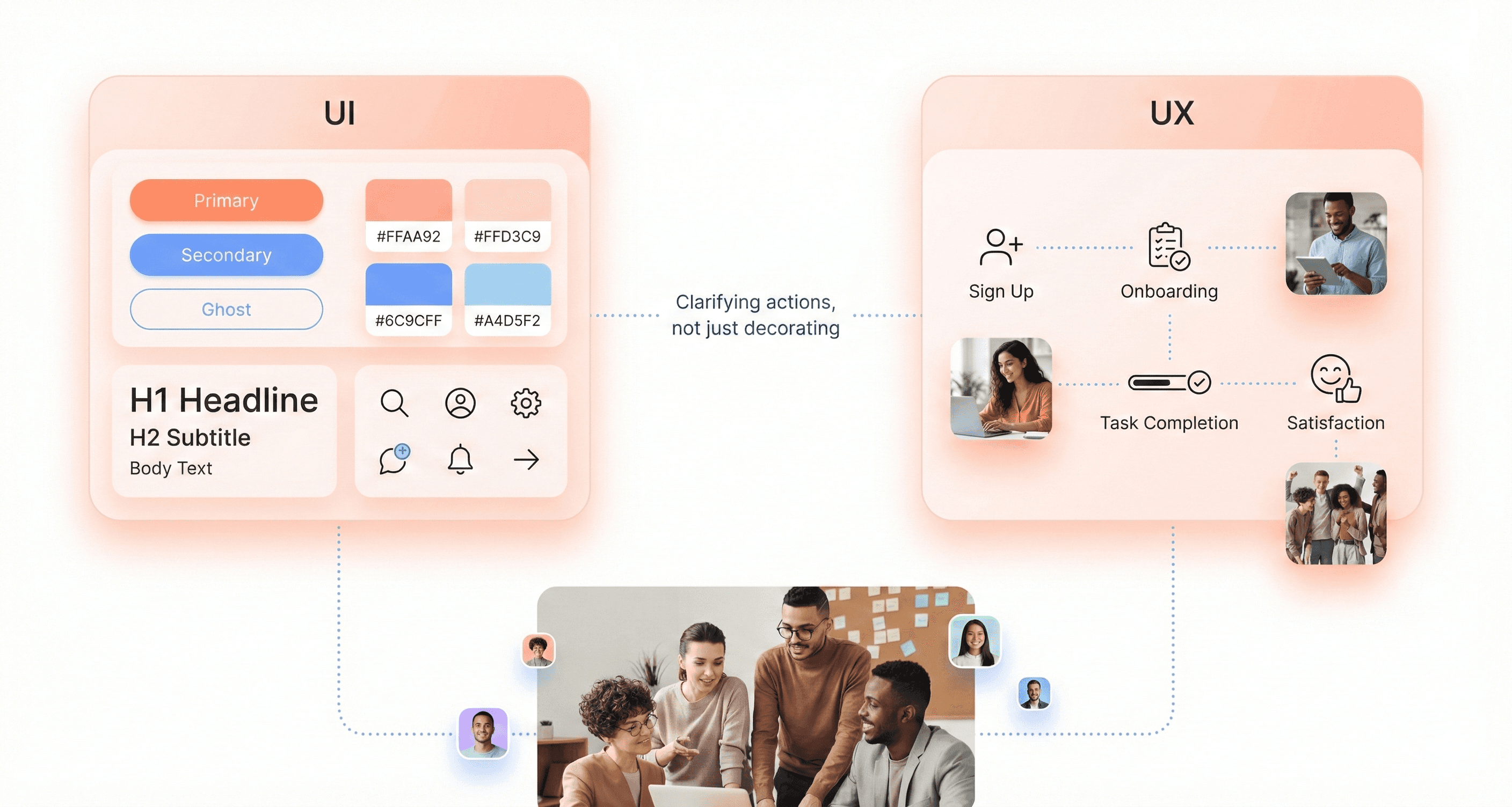
The key difference lies in scope: UI focuses on the visual and interactive elements users see and touch, while UX encompasses the entire journey and emotional response users have with your product. UI/UX design combines both disciplines, where usability is as important as the look of the app or website.
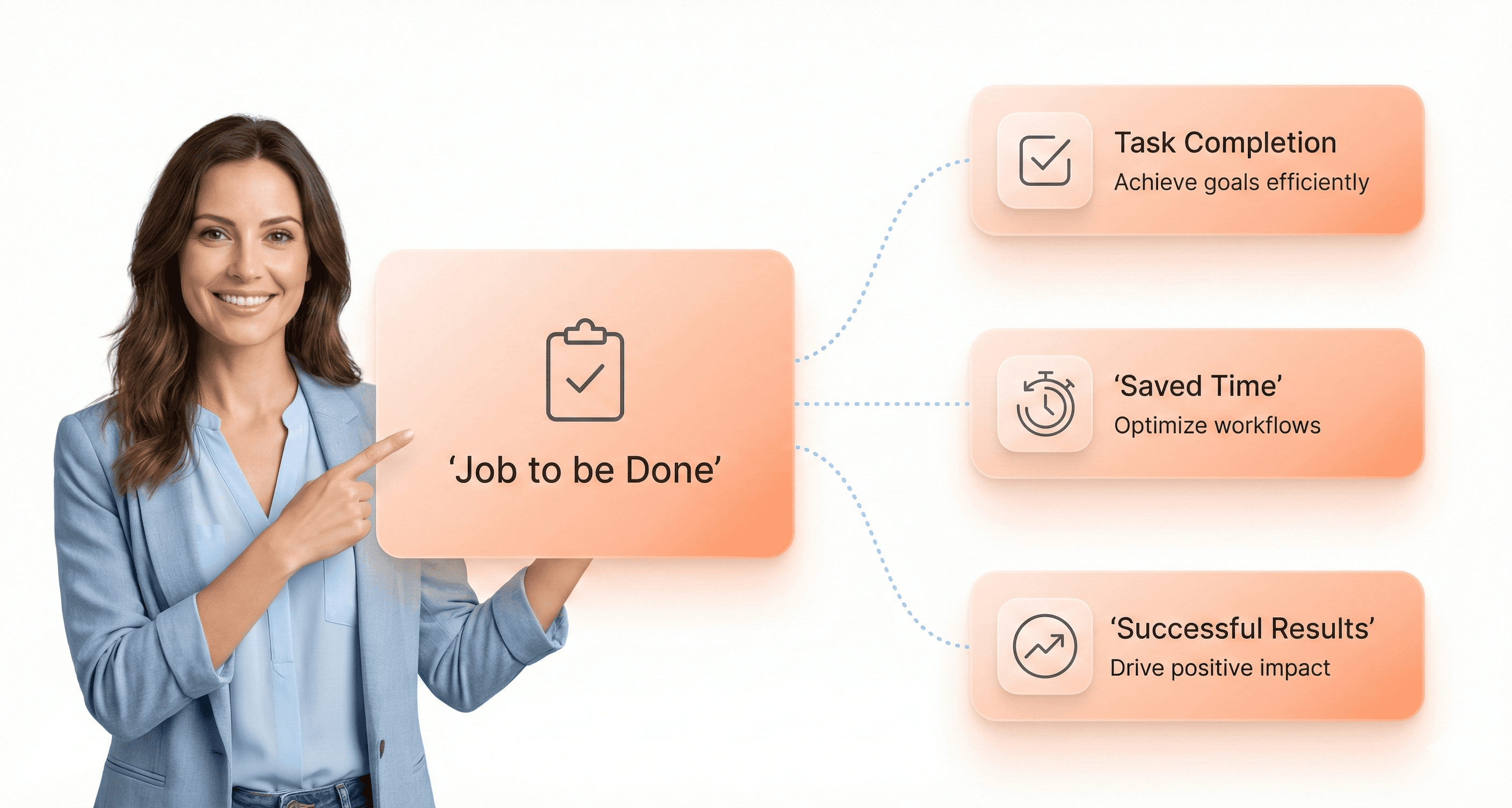
Jobs-to-be-Done (JTBD) Framework
The Jobs-to-be-Done framework provides a powerful lens for understanding user motivations and designing products that truly solve customer problems. This methodology focuses on identifying the specific "job" that users are trying to accomplish when they interact with your SaaS product.
JTBD goes beyond traditional demographic-based user research by examining the circumstances that drive users to seek solutions. It asks fundamental questions: What job is the user hiring your product to do? What outcome are they seeking? What constraints or frustrations are they experiencing with current solutions?
For SaaS founders, implementing JTBD thinking means shifting focus from feature lists to outcome delivery. This framework helps prioritize development efforts by ensuring every design decision directly contributes to helping users complete their intended jobs more effectively and efficiently.
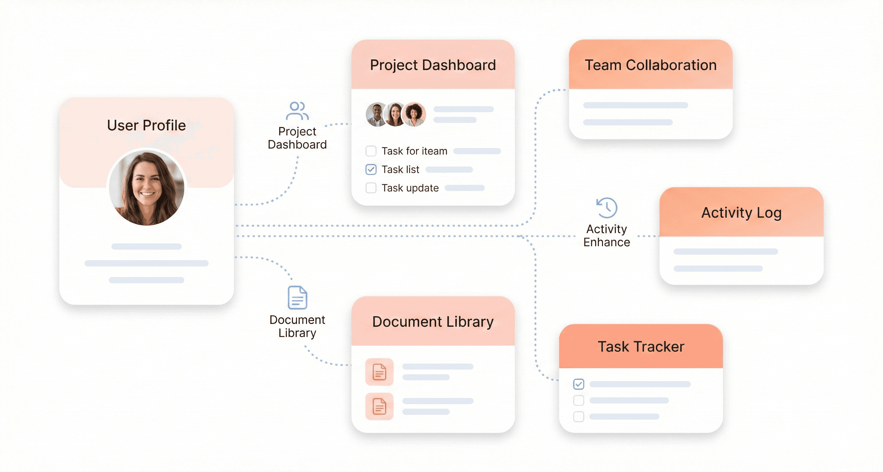
Object-Oriented UX (OOUX) Principles
Object-Oriented UX (OOUX) represents a systematic approach to designing digital products by identifying and organizing the core objects within your system. This methodology treats your SaaS application as a collection of interconnected objects, each with specific attributes, relationships, and actions.
The OOUX process begins by cataloging all the "things" in your system - whether they're users, documents, projects, or any other entities your software manages. Each object is then defined by its properties (what it is), relationships (how it connects to other objects), and calls-to-action (what users can do with it).
This approach ensures consistency across your product interface and creates a mental model that aligns with how users naturally think about their work. For SaaS products handling complex data relationships, OOUX principles help prevent interface confusion and reduce cognitive load by presenting information in logical, predictable patterns.
Progressive Disclosure and Information Architecture
Progressive disclosure is a technique that presents information in carefully sequenced layers, showing users only what they need at each step while keeping additional options accessible but not overwhelming. This approach is particularly valuable for SaaS products that must balance powerful functionality with ease of use.
Information architecture involves the process of organizing information, which includes structure, design, layout, and navigation. It allows users to find and manage the information they need effectively. Information architecture determines the placement of elements on a page, their navigation, and the relationship between different sections of your application.
Effective progressive disclosure works hand-in-hand with solid information architecture to create intuitive user flows. By strategically revealing complexity only when needed, SaaS products can maintain clean interfaces while providing access to advanced features. This approach reduces cognitive load during initial user interactions while ensuring power users can access sophisticated tools without friction.
The combination of these principles ensures your SaaS product remains approachable for new users while scaling to meet the needs of experienced users who require more advanced functionality.
Critical Design Concepts That Impact SaaS Success
Time-to-Value (TTV) and Activation Metrics
Time-to-Value represents the duration between a user's initial sign-up and their first meaningful experience with your SaaS product. In the competitive SaaS landscape, reducing TTV is crucial for preventing churn during the critical onboarding phase. According to the technical insights from SaaS design experts, users form their initial impressions within the first few interactions, making this metric a key predictor of long-term success.
Activation metrics complement TTV by measuring specific user actions that indicate genuine engagement. These might include completing a profile setup, creating their first project, or successfully integrating with existing tools. The challenge lies in balancing the desire to showcase your product's full capabilities with the need to get users to their "aha moment" quickly.
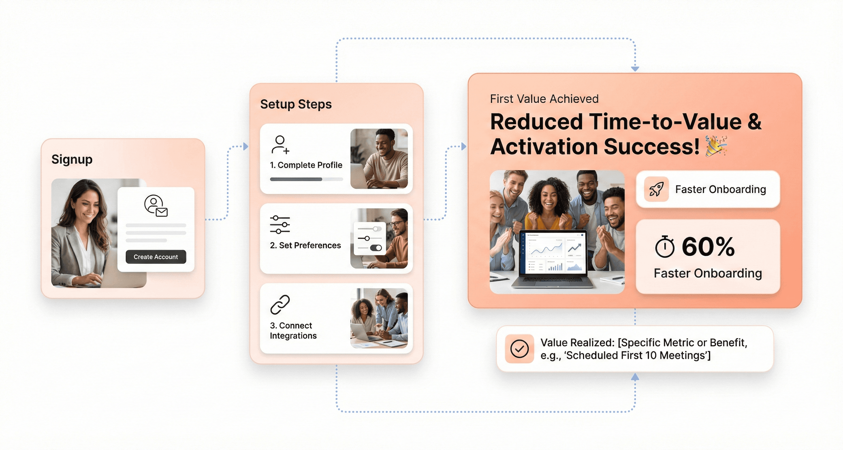
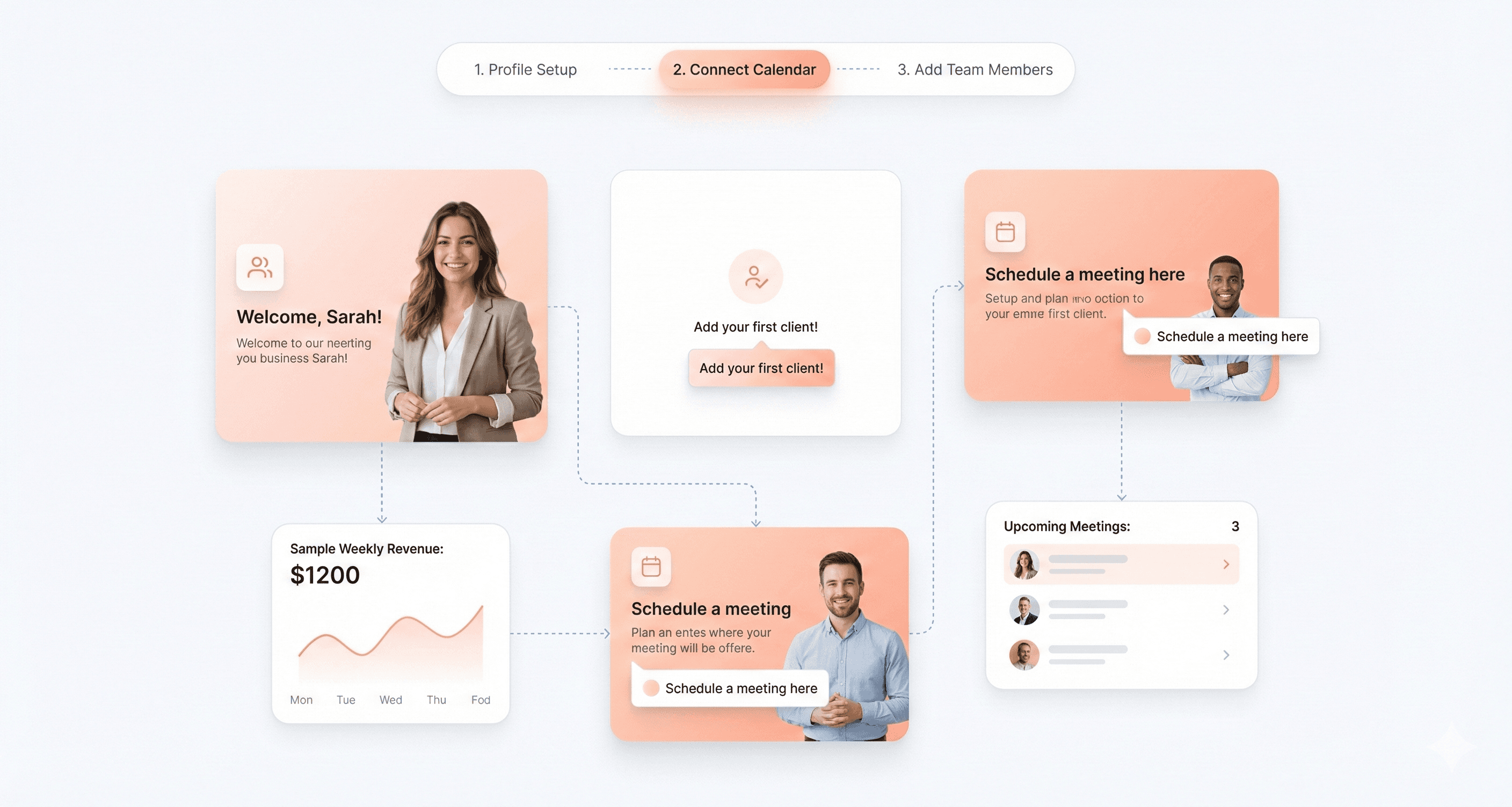
Empty State Paradox and Contextual Onboarding
The Empty State Paradox presents a unique challenge in SaaS design: new users need to see value before they've invested time in populating the system with data. This creates a chicken-and-egg problem where the product's value isn't apparent until users have already committed significant effort.
Contextual onboarding addresses this paradox by providing meaningful guidance exactly when users need it. Rather than overwhelming new users with comprehensive tutorials, effective SaaS products deliver targeted assistance at decision points. As noted in the reference material, successful onboarding often employs tooltips, step-by-step guides, and short video tutorials that appear contextually as users navigate through their first tasks.
The key is designing empty states that don't feel empty. Preview content, sample data, and progressive disclosure patterns help users envision the product's potential while gradually building their confidence and competence.
Cognitive Load and Miller's Law Applications
Cognitive load theory is fundamental to SaaS design success, particularly given the complex nature of business software. Miller's Law suggests that the average person can only keep 7±2 items in their working memory, which has profound implications for interface design in data-heavy SaaS applications.
SaaS designers must carefully manage information architecture to prevent cognitive overload. This involves strategic use of progressive disclosure, where complex functionality is revealed gradually as users demonstrate readiness. The reference content emphasizes that "the most successful SaaS designers make fundamentally different choices" when they understand how technical constraints interact with cognitive limitations.
Practical applications include limiting navigation menu items, grouping related functions, and using visual hierarchy to guide attention to the most important elements. When designing for enterprise users who work with complex datasets, cognitive load management becomes even more critical as system complexity naturally increases with scale.
Dopamine Loops in Business Software
While traditionally associated with consumer apps and gaming, dopamine loops are increasingly relevant in business software design. These psychological mechanisms create anticipation, reward completion of tasks, and encourage continued engagement through carefully timed positive reinforcement.
In SaaS products, dopamine loops might manifest as progress indicators during data processing, achievement badges for completing setup tasks, or visual celebrations when users reach milestones. The reference material highlights gamification as an evolving trend that "can dramatically increase user engagement" through elements like points, badges, and leaderboards.
However, implementing dopamine loops in business software requires careful consideration of professional context. The rewards must feel appropriate and valuable rather than trivial. Successful implementations focus on acknowledging real progress toward business objectives rather than arbitrary achievements, ensuring that the psychological engagement mechanisms align with legitimate productivity goals.
Key Design Process Terminology Every Founder Should Know
Discovery vs Definition Phase Differences
The design thinking methodology distinguishes between two critical early phases that shape the entire product development trajectory. The Discovery phase focuses on problem identification and understanding, where teams systematically explore every possible combination of user needs, market conditions, and technical constraints. This phase emphasizes deep research and exploration, much like the scientific approach observed in Bryan Lawson's studies where scientists "systematically explored every possible combination" to understand the fundamental rules governing a problem.
In contrast, the Definition phase shifts toward solution-focused problem-solving. As Nigel Cross noted in his seminal research, designers are "solution-focused problem-solvers" who "quickly created multiple arrangements" and tested their viability against established criteria. This phase involves synthesizing discovery insights into clear problem statements and design requirements that guide subsequent development work.
The key difference lies in the cognitive approach: Discovery employs divergent thinking to expand understanding, while Definition uses convergent thinking to narrow focus toward actionable solutions.
Low-Fidelity Wireframing vs High-Fidelity Prototyping
Understanding the distinction between low-fidelity wireframing and high-fidelity prototyping is essential for managing design resources effectively. Low-fidelity wireframes represent the initial solution generation phase, where designers "quickly generate a satisfactory solution" rather than engaging in "prolonged analysis of the problem," as Herbert Simon described in his concept of 'satisficing.'
Low-fidelity wireframes serve as rapid testing mechanisms for basic user flows and information architecture. They embody the design thinking principle of generating "a large number of solutions and eliminating those which did not work," allowing teams to iterate quickly without significant resource investment.
High-fidelity prototypes, however, represent the refinement stage where selected concepts undergo detailed development. These prototypes enable teams to "construct systems and observe their behavior," following Simon's early observations about understanding complex systems through construction and behavioral observation.
Aspect | Low-Fidelity Wireframes | High-Fidelity Prototypes |
|---|---|---|
Purpose | Rapid concept testing | Detailed validation |
Resource Investment | Minimal | Significant |
Testing Focus | User flow and structure | Interaction and usability |
Iteration Speed | Very fast | Moderate to slow |
Heuristic Evaluation and UX Audit Methods
Heuristic evaluation represents a structured approach to identifying usability issues through expert review against established design principles. This methodology aligns with the solution-focused problem-solving approach identified in design thinking research, where experts quickly assess multiple design elements against known best practices.
UX audit methods extend beyond heuristic evaluation by incorporating comprehensive analysis of user behavior data, business metrics, and technical performance indicators. These audits follow the holistic problem-solving approach that Richard Buchanan advocated when he discussed design thinking as "a means to integrate highly specialized fields of knowledge" for addressing complex problems.
The systematic nature of both methods reflects the scientific methodology influence that emerged in the 1960s, when attempts were made to "make design scientific" by applying rigorous analytical processes to design evaluation.
User Testing and Validation Metrics
User testing embodies the core design thinking principle of rapid prototyping and testing through observation, concepts that Herbert Simon pioneered in the early development of design methodology. Simon's emphasis on constructing systems and observing behavior directly translates to modern user testing practices where teams validate design decisions through direct user interaction and feedback collection.
Validation metrics serve as the measurement framework for assessing whether design solutions successfully address identified user needs and business objectives. This approach reflects the evolution from the problem-focused scientific methodology of the 1960s to the solution-focused design approach that emerged in subsequent decades.
Effective validation combines qualitative observations with quantitative metrics, creating a comprehensive understanding of design performance that addresses what Horst Rittel termed "wicked problems" - multidimensional and complex challenges that require collaborative methodology and deep understanding of human needs, motivations, and behavior.
The integration of user testing and validation metrics ensures that design decisions are grounded in observable user behavior rather than assumptions, maintaining the empirical foundation that has characterized design thinking evolution since its emergence from engineering and architectural fields in the mid-20th century.
Design System and Scalability Terms
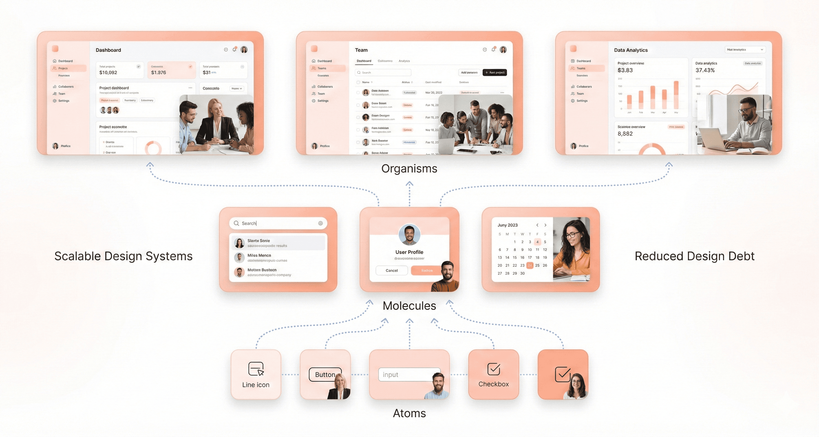
Atomic Design Principles (Atoms, Molecules, Organisms)
Atomic design principles provide a systematic methodology for building scalable design systems by breaking down interfaces into their fundamental components. This hierarchical approach ensures consistency and maintainability across your SaaS platform.
Atoms represent the basic building blocks of your interface - individual HTML elements like buttons, input fields, labels, and icons that cannot be broken down further without losing their meaning. These elements serve as the foundation of your design system and should be defined with clear specifications for colors, typography, and spacing.
Molecules combine atoms to create functional interface components. Examples include a search form (combining an input field atom with a button atom) or a navigation item (linking text atom with an icon atom). These combinations begin to demonstrate purpose and functionality within your interface.
Organisms are more complex components that combine molecules and atoms to form distinct sections of an interface, such as headers, product cards, or entire forms. These represent standalone sections that users recognize and interact with as complete functional units.
This modular approach enables teams to build consistently while maintaining flexibility. When implemented correctly, atomic design principles ensure that changes to base-level atoms automatically propagate throughout your entire system, reducing maintenance overhead and ensuring visual consistency across all touchpoints.
Design Debt and Component Libraries
Design debt accumulates when teams make quick design decisions without considering long-term scalability, similar to technical debt in software development. This occurs when components are created inconsistently, design patterns are duplicated, or when the design system falls behind the actual product implementation.
Component libraries serve as the central repository for all reusable interface elements, documentation, and usage guidelines. A well-maintained component library prevents design debt by establishing a single source of truth for all design elements. This includes detailed specifications for each component's behavior, visual appearance, and implementation guidelines.
The relationship between design debt and component libraries is critical for SaaS scalability. Without proper component library management, teams often create similar components multiple times, leading to inconsistent user experiences and increased maintenance costs. Regular audits of your component library help identify redundant elements and consolidate similar components.
Effective component libraries should include usage examples, code snippets, accessibility guidelines, and clear documentation about when and how to use each component. This documentation reduces the likelihood of improper implementation and helps new team members understand the design system quickly.
Design Tokens and Style Guides
Design tokens are the core values that define your design system's visual properties - colors, typography, spacing, and other design decisions stored as data. Unlike hard-coded values, design tokens create a layer of abstraction that makes global changes efficient and consistent across platforms.
These tokens typically include color palettes (primary, secondary, neutral colors), typography scales (font families, sizes, weights), spacing units, border radius values, and shadow definitions. When properly implemented, changing a design token automatically updates every instance where that token is used throughout your application.
Style guides document how these design tokens should be applied in practice. They provide context for when to use specific colors, typography hierarchies, spacing rules, and interaction patterns. A comprehensive style guide bridges the gap between abstract design tokens and their practical application in user interfaces.
The combination of design tokens and style guides creates a scalable foundation for multi-platform consistency. Whether you're building web applications, mobile apps, or marketing materials, the same design tokens ensure brand consistency while style guides provide implementation guidance for different contexts and platforms.
Responsive Design and Cross-Platform Consistency
Responsive design ensures your SaaS application functions optimally across all device types and screen sizes. This involves creating flexible layouts that adapt seamlessly from desktop computers to tablets and mobile devices without compromising functionality or user experience.
Cross-platform consistency extends beyond responsive design to encompass consistent behavior and appearance across different operating systems, browsers, and device types. This includes maintaining consistent interaction patterns, visual hierarchy, and feature availability regardless of the platform your users choose.
Modern SaaS applications must consider various screen densities, input methods (touch vs. cursor), and platform-specific design conventions while maintaining brand consistency. This requires careful planning of component behavior, content prioritization, and interaction models that work effectively across all target platforms.
Scalable responsive design relies on systematic breakpoint strategies, flexible grid systems, and component variants that adapt intelligently to different contexts. By establishing clear rules for how components behave at different screen sizes, teams can create new features with confidence that they'll work consistently across all supported platforms and devices.
Industry-Specific Design Requirements
WCAG 2.2 AA Compliance for Healthcare
Healthcare SaaS platforms must adhere to the most stringent accessibility standards, with WCAG 2.2 AA compliance serving as the foundation for inclusive design. This compliance level ensures that individuals with disabilities can effectively access and navigate health-related applications, which is particularly critical when dealing with protected health information (PHI) under HIPAA regulations.
For healthcare SaaS founders, understanding WCAG 2.2 AA requirements means ensuring your platform meets specific contrast ratios, keyboard navigation standards, and screen reader compatibility. This compliance framework directly impacts your ability to serve healthcare providers and insurers who are legally obligated to provide accessible services to all patients. Without proper WCAG compliance, healthcare organizations may face legal penalties and exclusion from serving patients with disabilities, creating a significant barrier to market entry for your SaaS solution.
SOC2 and Security Badge Requirements for FinTech
FinTech SaaS platforms face unique regulatory challenges that extend beyond traditional security measures. SOC 2 compliance has become a market-driven expectation specifically designed for service organizations that need to provide assurance that customer data is protected from unauthorized access. For FinTech companies, this framework is essential for demonstrating robust security posture across five key areas: security, availability, processing integrity, confidentiality, and privacy.
Additionally, PCI DSS compliance becomes mandatory for any SaaS platform handling credit card payments or storing payment information. This standard ensures protection of sensitive financial data and maintains secure transaction environments. Without SOC 2 and PCI DSS certifications, payment processors might penalize your platform, increase transaction fees, or revoke your ability to process payments entirely, severely disrupting revenue streams and customer trust.
Canvas-Based Interfaces for MarTech
MarTech SaaS platforms increasingly rely on canvas-based interfaces to provide intuitive drag-and-drop functionality for marketing automation, campaign design, and customer journey mapping. These interfaces require specific design considerations that differ from traditional form-based applications, particularly around user interaction patterns and visual hierarchy.
Canvas-based designs must accommodate complex workflow visualization while maintaining accessibility standards across different user skill levels. The challenge lies in creating interfaces that allow sophisticated marketing operations while remaining intuitive for users who may not have technical backgrounds. This requires careful consideration of component libraries, interaction states, and responsive design principles that work effectively across desktop and tablet environments.
Accessibility Standards Across Verticals
Different industry verticals impose varying accessibility requirements that SaaS founders must understand before engaging design services. While WCAG 2.2 AA serves as the baseline standard, specific industries like healthcare, finance, and government sectors often require additional compliance measures that impact design decisions from the earliest stages of product development.
Government-facing SaaS solutions, for example, must meet FedRAMP standards which include accessibility requirements beyond basic WCAG compliance. These standards affect everything from color choices and font selections to navigation patterns and error messaging systems. Understanding these vertical-specific requirements early in the design process prevents costly retrofitting and ensures your product can successfully penetrate regulated markets without facing compliance-related roadblocks during the sales process.
Engagement and Retention Design Metrics
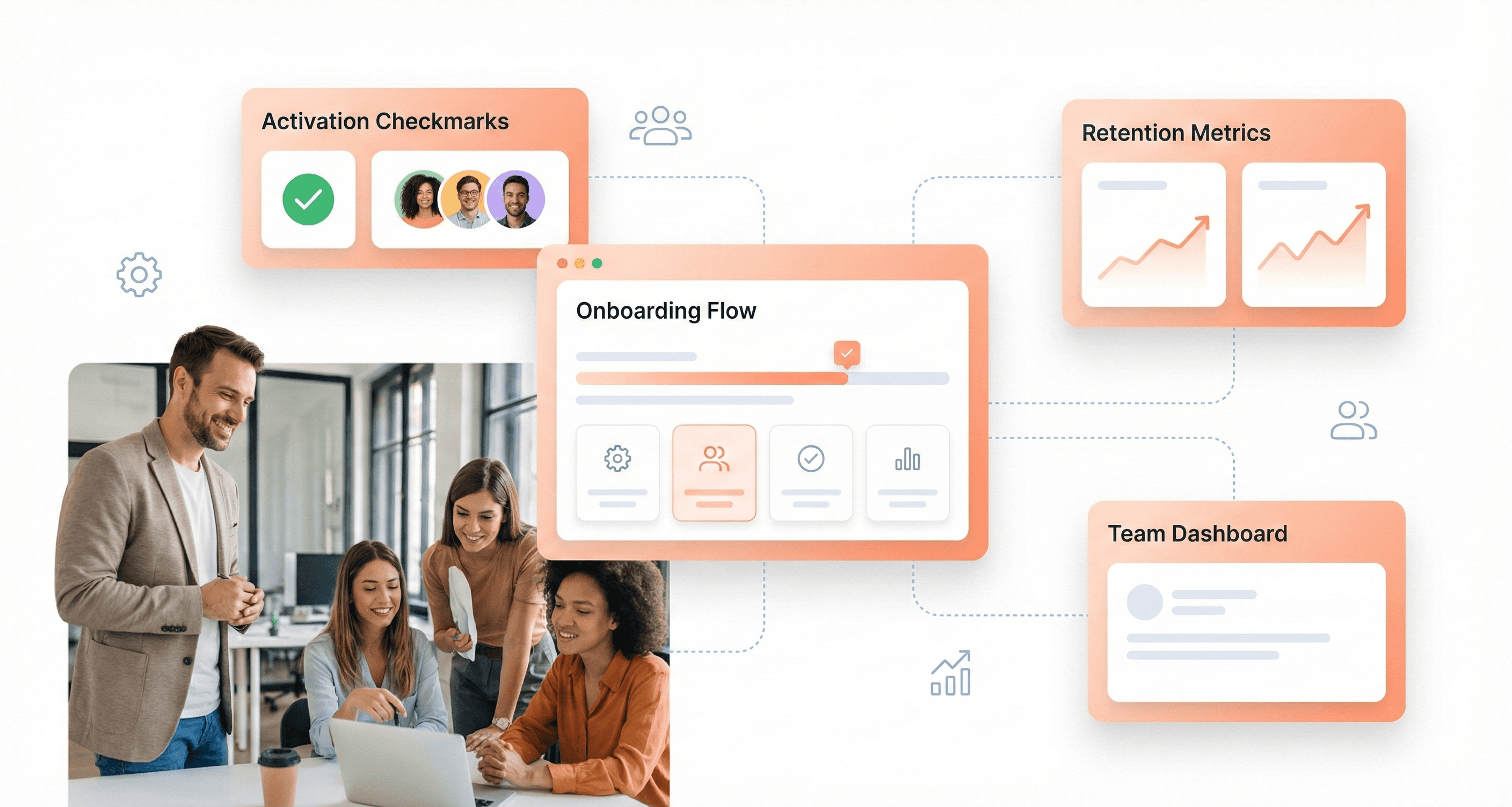
Activation Rate and Onboarding Success
Activation rate measures the percentage of new users who complete a key action that indicates they've experienced the core value of your product. This metric is calculated as (Activated users ÷ total new users) × 100. For example, if 500 new users sign up in a month and 300 complete an activation milestone, your activation rate is 60%.
Users who never activate rarely become paying customers. Tracking activation helps you spot where onboarding friction occurs and which features drive early engagement. Improving activation by even 10% can significantly boost long-term retention. When SaaS founders understand this metric, they can better communicate with design teams about the importance of seamless user onboarding experiences that guide users toward their "aha moment" quickly and effectively.
Churn Reduction Through Friction Elimination
Churn rate measures how much business your company loses over a set period and helps you understand customer satisfaction, product fit, and overall revenue stability. Customer churn rate measures the percentage of customers who cancel or stop using your service within a specific timeframe, calculated as (Customers lost ÷ customers at start of period) × 100.
Revenue churn rate tracks the percentage of recurring revenue lost, excluding new revenue gained in the same period. The formula is (Previous revenue – current revenue) ÷ previous revenue × 100. Losing a $10,000/month enterprise customer has a very different impact than losing ten $100/month accounts. Revenue churn shows you the actual financial damage from customer losses, which often matters more than counting churned accounts alone.
Recurring revenue churn focuses on recurring income, showing how much MRR or ARR is lost through cancellations or downgrades. If recurring revenue churn stays below 5% monthly, your business can grow sustainably. Anything above 10% demands immediate attention to customer success and product quality.
Net Revenue Retention (NRR) Impact
Net revenue retention (NRR) measures how much recurring revenue you retain from existing customers over a given period, including upgrades, downgrades, and churn. It reflects the net impact of customer expansion and contraction without factoring in new customer revenue. The formula is ((Starting MRR + expansion MRR – churned MRR – contraction MRR) ÷ starting MRR) × 100.
NRR shows how well your business grows revenue from its existing customer base. A rate above 100% means your current customers are driving net growth, while a rate below 100% signals revenue loss that needs to be addressed through retention or expansion efforts. High NRR (120%+) is a sign of strong product-market fit and expansion sales.
When comparing gross retention vs. net retention, remember that gross retention only measures how much recurring revenue you keep after churn and downgrades, ignoring any expansion. Net retention includes upsells and cross-sells, giving a fuller picture of how existing customers contribute to overall growth.
Support Ticket Reduction Measurements
Now that we have covered retention metrics, it's important to understand how customer satisfaction indicators like Net Promoter Score (NPS) can predict support burden. NPS measures customer satisfaction and loyalty by asking how likely users are to recommend your product or service to others. The formula is % Promoters (scores 9-10) – % Detractors (scores 0-6).
NPS gives you a pulse check on customer sentiment that often predicts churn before it happens. Scores above 50 are considered excellent in SaaS, while anything below 0 signals serious problems with product satisfaction or customer support. By tracking NPS alongside support ticket volume, SaaS founders can identify when design improvements successfully reduce user confusion and support requests, ultimately improving operational efficiency and customer experience.
Cost Structure and Investment Terms
MVP Design vs Enterprise Redesign Pricing
Understanding the cost difference between MVP design and enterprise redesign is crucial for budget allocation. MVP design typically requires an initial capital expenditure of approximately $25,000-$33,000, covering foundational technology setup and basic branding assets. This includes $8,000 for website and brand identity design, which serves as your platform's first impression to potential customers.
Enterprise redesigns demand significantly higher investment, often exceeding $70,000 in initial CAPEX. These comprehensive overhauls include advanced security audits costing $7,000, network infrastructure upgrades at $5,000, and extensive compliance setups necessary for handling sensitive customer data at enterprise scale.
The timeline difference is equally important: MVP designs can launch within 3-6 months, while enterprise redesigns typically require 12-18 months for completion. This extended timeline directly impacts your runway requirements and cash flow projections.
Freelancer vs Agency vs In-House Cost Comparison
Personnel costs represent the single largest expense category in SaaS design investments. For 2026, projected payroll expenses for in-house teams hit $580,000 annually, with core team wages requiring $290,000 for just the first six months covering CEO ($90,000), Head of Engineering ($80,000), and two engineers ($120,000).
Option | Initial Cost | Annual Cost | Timeline | Risk Level |
|---|---|---|---|---|
Freelancer | $8,000-$25,000 | $50,000-$100,000 | 2-4 months | High |
Agency | $25,000-$70,000 | $150,000-$300,000 | 3-6 months | Medium |
In-House | $290,000+ | $580,000+ | 6-12 months | Low |
Agencies offer middle-ground pricing but require careful scope management to avoid overruns. Freelancers provide cost efficiency but lack the comprehensive support needed for complex SaaS platforms, particularly regarding compliance and security requirements.
Hidden Costs of Poor Design Implementation
Poor design implementation creates substantial hidden costs that can derail your entire business model. The most critical hidden cost is elevated Customer Acquisition Cost (CAC), which starts at $350 in 2026 but can balloon to over $450 with poor user experience design.
Weak website design suggests weak software to SMB clients, directly impacting conversion rates and extending payback periods beyond the target 3.5 months for platforms with $100 average MRR. This delay affects the crucial LTV to CAC ratio, which must maintain 3:1 or better to justify funding rounds.
Additionally, poor initial design leads to expensive redesigns within 12-18 months, often costing 2-3x the original investment. Security vulnerabilities from inadequate initial design can expose your entire $290,000 wage investment and $250,000 marketing budget to massive liability.
Technical debt from rushed design decisions requires additional engineering resources, potentially doubling your projected $580,000 annual personnel costs as you scale.
ROI Measurement for Design Investments
Measuring design investment ROI requires tracking specific metrics that directly impact your cash flow projections. The primary measurement focuses on CAC reduction and conversion rate improvements. A well-designed platform should reduce CAC from the initial $350 to approximately $320 within 12 months, representing a 8.6% efficiency gain.
Conversion rate improvements from 20% to 22% directly impact your ability to acquire the targeted 714 customers annually with your $250,000 marketing budget. This 2% improvement translates to acquiring approximately 71 additional customers without increasing marketing spend.
The payback period serves as a critical ROI indicator. With proper design implementation, platforms achieving $100 average MRR should maintain the 3.5-month payback period, ensuring positive unit economics that attract venture capital investment.
Design ROI also impacts your minimum cash requirements. Effective design can reduce the projected $242,000 minimum cash point in February 2028 by improving customer acquisition efficiency and reducing churn rates. Every 1% improvement in monthly retention extends runway and reduces the total capital required to reach profitability.
Track these metrics monthly: CAC trends, conversion rates, customer lifetime value, and monthly recurring revenue growth. These indicators directly correlate with design effectiveness and justify continued investment in professional design services.
Emerging Technology Terms for 2025
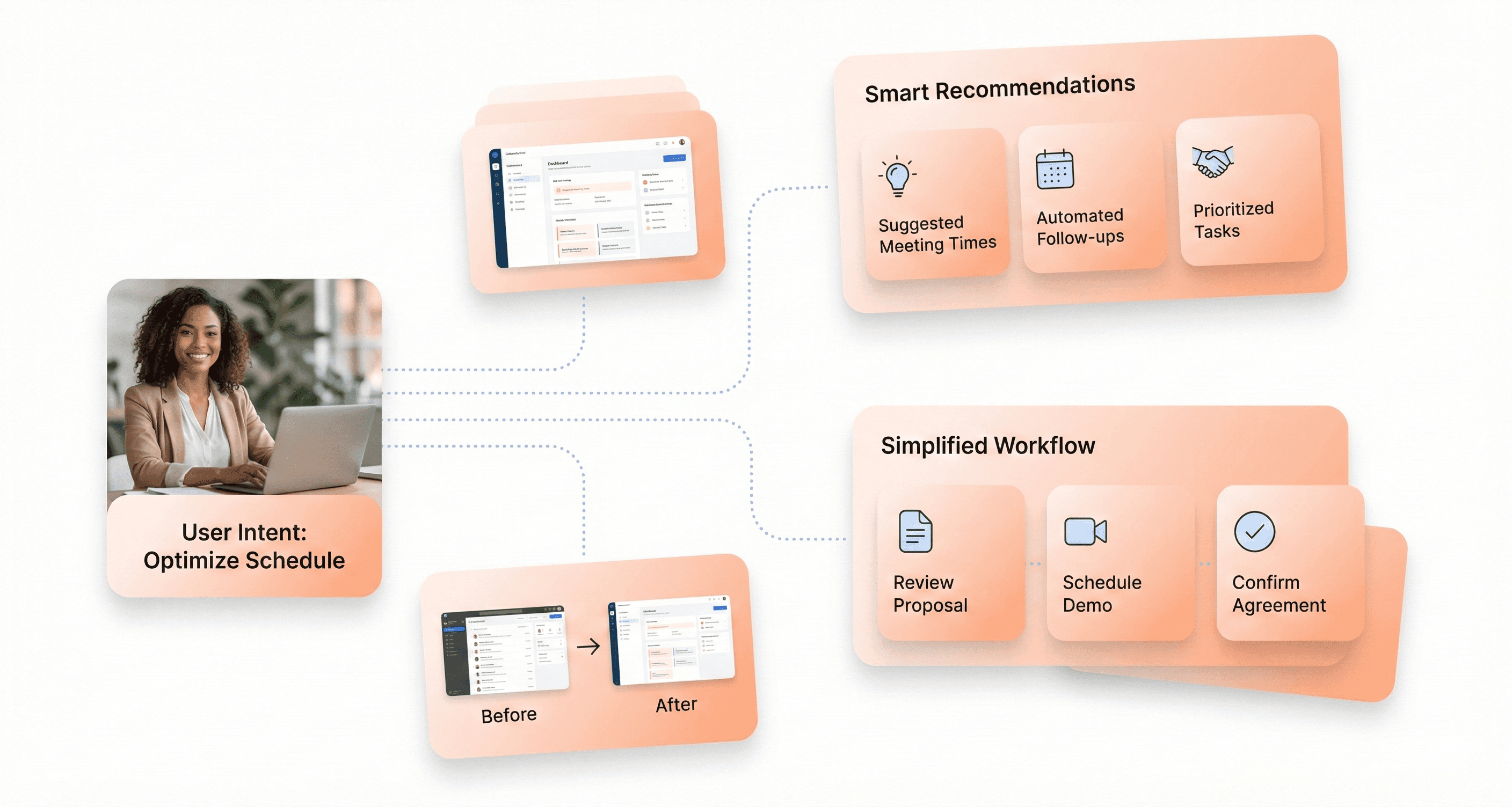
Generative UI and Intent-Based Interfaces
Now that we've covered the foundational design concepts, let's explore how emerging technologies are reshaping the SaaS landscape. Generative UI represents a paradigm shift where artificial intelligence creates user interface elements dynamically based on user needs and context. This technology leverages AI-powered design systems to automatically generate layouts, components, and interactions that adapt to individual user behaviors and preferences in real-time.
Intent-based interfaces take this concept further by interpreting user goals and automatically configuring the interface to support those objectives. Rather than presenting static navigation menus and fixed layouts, these systems analyze user patterns and generate customized pathways that streamline workflows and reduce cognitive load.
Spatial Computing Applications
Previously, we've seen traditional 2D interfaces dominate SaaS applications, but spatial computing is introducing three-dimensional interaction paradigms that transform how users engage with software. This technology enables applications to understand and respond to physical space, allowing for immersive experiences that blend digital content with real-world environments.
For SaaS founders, spatial computing presents opportunities to create more intuitive data visualization tools, collaborative workspaces, and training platforms. These applications can leverage gesture-based controls, voice commands, and environmental awareness to provide more natural and efficient user experiences.
AI-Powered Design Systems
With the rise of artificial intelligence in design workflows, AI-powered design systems are becoming essential tools for maintaining consistency while enabling rapid iteration. These systems use machine learning to analyze existing design patterns, brand guidelines, and user interactions to automatically generate components, suggest improvements, and ensure design coherence across large-scale applications.
The technology serves as a personal assistant for design teams, helping with inspiration, ideation, and adding finishing touches to designs. However, it's important to note that AI amplifies existing design skills rather than replacing human creativity and strategic thinking.
Conversational Interface Integration
Next, we'll examine how conversational interfaces are becoming integral to SaaS applications through advanced natural language processing and contextual understanding. These interfaces enable users to interact with complex software through natural dialogue, reducing the learning curve and improving accessibility for non-technical users.
Modern conversational interfaces go beyond simple chatbots by incorporating contextual awareness, multi-turn conversations, and integration with core application functions. This allows users to perform complex tasks, access data, and configure settings through natural language commands, making sophisticated SaaS tools more approachable for diverse user bases.
Conclusion
Understanding these essential UI/UX design terms isn't just about speaking the same language as your design team, it's about making informed decisions that directly impact your SaaS product's success. From critical concepts like Time-to-Value and Progressive Disclosure to emerging technologies like AI-powered interfaces and spatial computing, each term represents a piece of the puzzle that determines whether users embrace or abandon your product. The companies thriving in 2025's saturated SaaS landscape are those that recognize design as their defensible moat, not just aesthetic polish.
Before you hire your next product design service, arm yourself with this vocabulary to evaluate their expertise, challenge their recommendations, and ensure they're solving real user problems rather than creating visual complexity. Remember that 78% of SaaS churn stems from friction and confusion, not missing features. The right design partner will speak fluently about activation rates, cognitive load, and design systems, because they understand that every pixel, interaction, and workflow decision impacts your bottom line. Your users aren't leaving for better technology; they're leaving for better experiences.


About the author
I’m the founder of Hashbyt, an AI-first frontend and UI/UX SaaS partner helping 200+ SaaS companies scale faster through intelligent, growth-driven design. My work focuses on building modern frontend systems, design frameworks, and product modernization strategies that boost revenue, improve user adoption, and help SaaS founders turn their UI into a true growth engine.


Is a clunky UI holding back your growth?
Is a clunky UI holding back your growth?
▶︎
Transform slow, frustrating dashboards into intuitive interfaces that ensure effortless user adoption.
▶︎
Transform slow, frustrating dashboards into intuitive interfaces that ensure effortless user adoption.
