


CSS frameworks can make or break your development workflow, especially when scalability, performance, and design flexibility are on the line. Bootstrap vs Tailwind CSS is a practical comparison of two popular frontend frameworks, covering design philosophy, performance, customization, learning curve, and developer productivity, helping teams understand how each choice impacts real-world projects.
This guide is designed for web developers, UI designers, and project managers evaluating frontend frameworks for production use. We break down how Bootstrap’s component-based approach compares with Tailwind’s utility-first methodology, focusing on development speed, customization, team workflow, and long-term maintainability.
You’ll also explore performance implications, learning curves, and practical use cases to help you confidently choose the framework that aligns best with your project goals, team skillset, and product roadmap.
Bootstrap vs Tailwind: Core Design Philosophy Explained
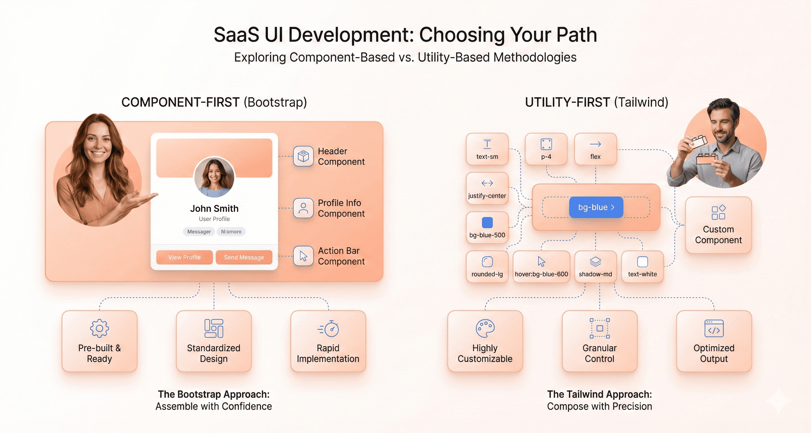
Bootstrap’s Component-Based CSS Architecture
Bootstrap operates on the principle that web development should feel like assembling pre-built components. Think of it as working with a high-quality furniture catalog where every piece has been carefully designed, tested, and documented. The framework provides ready-made components like navigation bars, modals, cards, and buttons that work beautifully right out of the box.
Common Bootstrap Components:
Navigation bars & menus – pre-styled and responsive out of the box
Cards & modals – for content organization and interactions
Buttons & forms – consistent, accessible UI elements
Carousels & accordions – interactive, mobile-friendly components
Grid system – flexible 12-column layout for responsive design
This component-centric approach means you're working with established design patterns that have been refined through years of real-world usage. When you need a carousel, Bootstrap hands you a fully functional one with smooth transitions, touch support, and accessibility features built in. The same goes for forms, tables, and complex navigation systems.
The beauty of Bootstrap's philosophy lies in its consistency. Modern Bootstrap versions also removed the framework’s historical dependency on jQuery, relying instead on vanilla JavaScript for interactive components. This improved compatibility with modern frontend ecosystems like React, Vue, and Angular while reducing unnecessary dependency overhead.
Every component follows the same design language, spacing rules, and interaction patterns. This creates a cohesive user experience across your entire application without requiring extensive design decisions from you as a developer.
Bootstrap also embraces the concept of semantic HTML enhanced with meaningful CSS classes. Instead of worrying about low-level styling details, you focus on the structure and behavior of your components. A button isn't just styled with colors and padding, it's a .btn element that carries semantic meaning and built-in functionality.
Tailwind CSS and the Utility-First Styling Model
Tailwind flips the traditional CSS framework approach on its head. Rather than providing pre-designed components, it gives you an extensive toolkit of utility classes that handle single responsibilities. Want to add padding? Use p-4. Need a blue background? Apply bg-blue-500. This granular control means you're building designs from the ground up using small, reusable pieces.
Examples of Tailwind Utility Classes:
Spacing:
p-4,m-2,gap-6
Color utilities:
bg-blue-500,text-gray-800
Typography:
font-bold,text-lg,leading-snug
Layout control:
flex,grid,items-center,justify-between
Responsive variants:
sm:,md:,lg:,xl:prefixes for adaptive layouts. Container queries: component-level responsiveness using@containerutilities that adapt layouts based on parent container size instead of only viewport width
The utility-first philosophy treats CSS like a functional programming language. Each class does one specific thing, and you combine these classes to create the exact look you want. This approach eliminates the common frustration of fighting against framework defaults or writing custom CSS to override existing styles.
Tailwind's design system is built around consistent scales and design tokens. The spacing system uses a carefully crafted scale that ensures visual harmony, while the color palette provides systematic variations that work well together. This systematic approach gives you creative freedom while maintaining design consistency.
The framework encourages responsive design thinking from the start. Every utility class can be prefixed with breakpoint indicators (md:, lg:, etc.), making it natural to think about how your design adapts across different screen sizes as you build.
How Bootstrap and Tailwind Affect Frontend Workflow
The philosophical differences between these frameworks create dramatically different development experiences. With Bootstrap, you start by choosing components and then customize them to fit your needs. Your workflow involves browsing documentation, copying component examples, and tweaking predefined styles. This approach excels when you need to move quickly and don't mind working within established design patterns.
Tailwind encourages a more iterative, design-in-browser approach. You build layouts piece by piece, adjusting spacing, colors, and typography as you go. This workflow feels more like traditional graphic design but happens directly in your HTML. You spend less time jumping between design tools and code editors because the styling happens inline with your markup.
Tailwind’s productivity advantage typically appears after teams establish reusable component abstractions, internal utility conventions, and shared design patterns. During early adoption, development can initially feel slower compared to Bootstrap’s ready-made component workflow.
Team collaboration differs significantly between these approaches. Bootstrap projects tend to have cleaner, more readable HTML since component classes are semantic and self-documenting. New team members can quickly understand what a .navbar-nav or .card-header does. Tailwind projects require more shared understanding of the utility class system, but they offer greater flexibility for designers who want pixel-perfect control.
The debugging experience also varies. Bootstrap's component-based approach makes it easier to isolate issues since problems typically occur within specific components. Tailwind's utility classes make it simple to trace exactly which styles are applied, but the long lists of classes can feel overwhelming when troubleshooting complex layouts.
Bootstrap vs Tailwind: Learning Curve & DX Compared
Bootstrap's Beginner-Friendly Component System
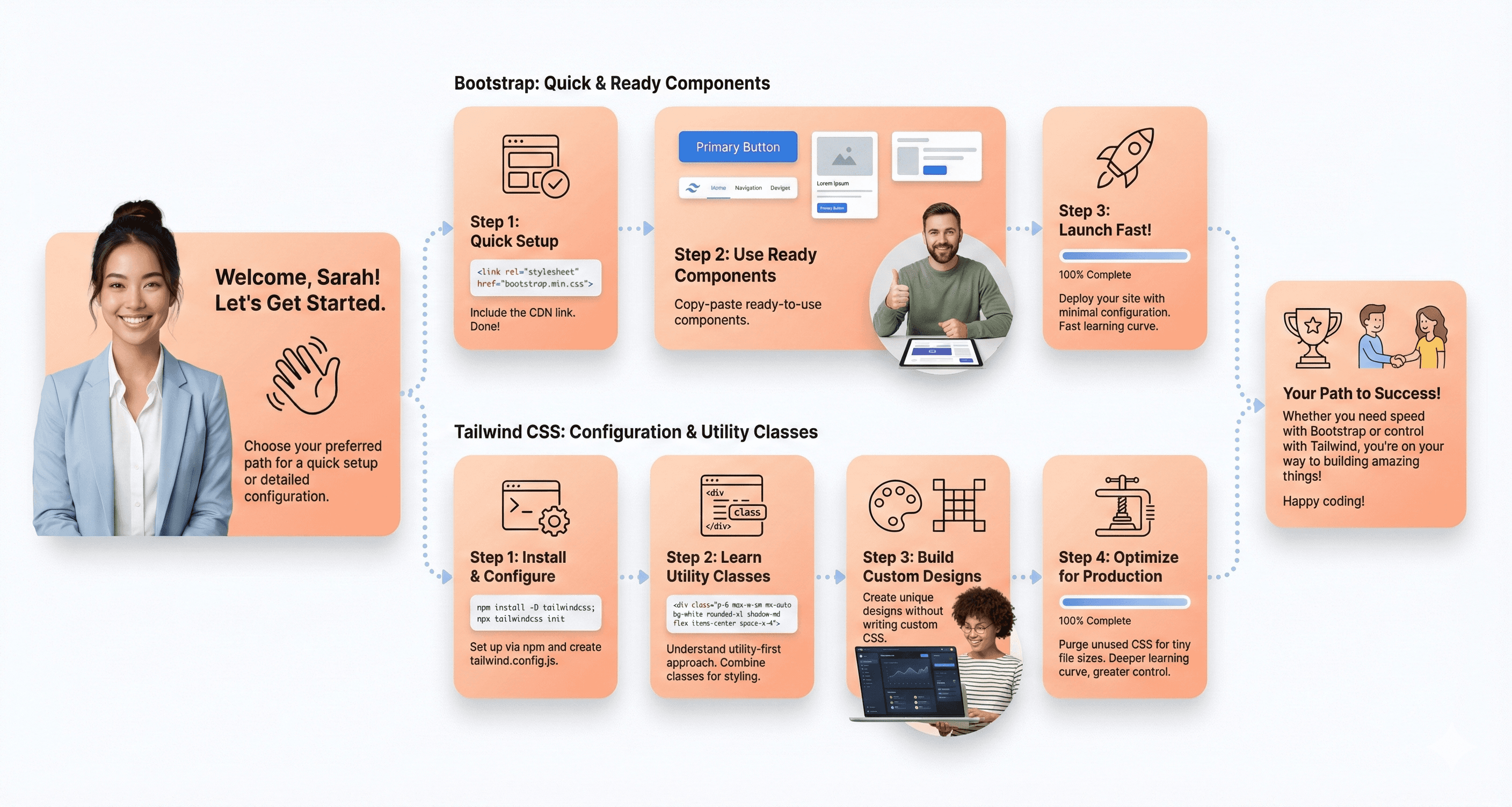
Bootstrap welcomes newcomers with open arms through its intuitive component-based approach. You can literally copy and paste pre-built components like navigation bars, cards, and modals directly into your HTML, and they'll work beautifully out of the box. The framework's extensive collection of ready-made UI elements means developers can build professional-looking interfaces without diving deep into CSS fundamentals.
The documentation reads like a friendly tutorial, with live examples and clear code snippets for every component. New developers often experience that magical moment when they add class="btn btn-primary" and instantly get a polished button that responds perfectly across all devices. This immediate gratification builds confidence and keeps beginners motivated to continue learning.
Bootstrap's grid system follows familiar concepts that mirror traditional layout thinking. The 12-column structure makes sense intuitively – you want something to take up half the screen? Use col-6. Need it full width on mobile but half on desktop? Add col-12 col-md-6. This logical progression helps developers understand responsive design principles without getting overwhelmed.
Tailwind's Initial Setup and Configuration Requirements
Tailwind demands more upfront investment before you see results. The installation process involves npm packages, build tools, and configuration files that can intimidate beginners. Earlier Tailwind versions required more extensive setup involving PostCSS pipelines, build tooling, and JavaScript configuration files. However, Tailwind CSS v4 introduced a CSS-first configuration model that significantly simplified setup for many modern frontend environments like Next.js, Vite, and Astro.
The framework requires a mental shift from thinking in components to thinking in utilities. Instead of applying a single class like btn-primary, you'll combine multiple utility classes: bg-blue-500 text-white px-4 py-2 rounded hover:bg-blue-600. This approach initially feels verbose and overwhelming, especially for developers coming from traditional CSS or component frameworks.
However, once configured properly, Tailwind's developer experience becomes incredibly smooth. The IntelliSense support in modern editors provides autocomplete for thousands of utility classes, and the purge functionality automatically removes unused CSS, keeping your final bundle size minimal. The framework's approach to responsive design through prefix modifiers like md:, lg:, and xl: offers granular control but requires learning a new syntax system.
How Long It Takes to Learn Bootstrap vs Tailwind
Bootstrap offers a gentler learning curve with quicker initial wins. Most developers can become productive within a few days of picking up the framework. You can build complete, responsive websites using Bootstrap's default styles and components in under a week. The learning path feels natural: start with the grid system, add some components, customize colors and spacing, then gradually explore advanced features like JavaScript plugins and custom themes.
Reaching an intermediate level with Bootstrap typically takes 2-3 weeks of regular practice. Advanced mastery, including custom theme creation and SASS customization, might require 1-2 months depending on your existing CSS knowledge.
Tailwind presents a steeper initial climb but potentially faster long-term mastery. The first week can feel frustrating as you memorize utility class names and learn the framework's naming conventions. However, developers often report a breakthrough moment around week 2-3 when the utility-first mindset clicks, and productivity skyrockets.
Framework | Initial Productivity | Intermediate Level | Advanced Mastery |
|---|---|---|---|
Bootstrap | 2-3 days | 2-3 weeks | 1-2 months |
Tailwind | 1-2 weeks | 3-4 weeks | 2-3 months |
The time investment varies significantly based on your existing CSS skills and design experience. Developers with strong CSS fundamentals often adapt to Tailwind faster, while those new to web development might find Bootstrap's structured approach more accessible.
Community Resources and Documentation Quality
Bootstrap boasts mature, comprehensive documentation that has been refined over more than a decade. The official docs include detailed explanations, visual examples, and practical use cases for every component and utility. The community has produced thousands of templates, themes, and tutorials, making it easy to find solutions to common problems.
Stack Overflow contains over 100,000 Bootstrap-related questions with well-documented answers. This massive knowledge base means most issues you encounter have already been solved by someone else. The framework's stability and long history mean that tutorials from several years ago often remain relevant and functional.
Also Read: Next.js vs React in 2026: Which is Best for SaaS?
Tailwind's documentation takes a more modern, searchable approach. The official site includes a powerful search function that lets you quickly find specific utility classes or concepts. The docs are well-organized and include practical examples, but the framework's relative newness means fewer third-party resources compared to Bootstrap.
The Tailwind community is highly active and engaged, particularly on platforms like Discord, Twitter, and GitHub. The framework's creator, Adam Wathan, regularly shares insights and updates, creating a strong sense of community involvement. While there are fewer total resources than Bootstrap, the quality tends to be higher, with more modern best practices and up-to-date techniques.
Both frameworks offer excellent official documentation, but Bootstrap wins in sheer volume of community resources, while Tailwind excels in documentation quality and modern developer experience.
Customization & Design Flexibility: Bootstrap vs Tailwind
Bootstrap's Pre-Built Component Limitations
Bootstrap's strength lies in its comprehensive collection of ready-made components, but this becomes a double-edged sword when you need unique designs. The framework ships with a defined visual language that's instantly recognizable, rounded buttons, specific color schemes, and standardized spacing that millions of websites share.
Earlier Bootstrap versions often required heavy CSS overrides for advanced customization. Bootstrap 5.3 improved flexibility significantly through expanded CSS variables, utility APIs, and native color mode support. However, highly custom brand-driven interfaces may still require additional abstraction layers or custom styling beyond Bootstrap’s default component system.
The grid system, while powerful, locks you into specific breakpoints and column structures. Creating truly responsive designs that break these conventions becomes challenging. Bootstrap performs best when consistency, accessibility, and delivery speed matter more than highly differentiated visual identity. For enterprise dashboards, admin systems, and internal tools, its standardized design language often becomes a practical advantage rather than a limitation.
Tailwind’s Highly Flexible Design System
Tailwind flips the script by providing low-level utility classes instead of opinionated components. Every visual element becomes a combination of atomic classes, giving you pixel-perfect control over appearance. Want a button with specific padding, rounded corners, and a custom hover state? Combine the exact utilities you need without fighting existing styles.
The utility-first approach means no two Tailwind sites look the same by default. You're building from the ground up, crafting each element to match your exact requirements. Complex responsive designs become manageable through Tailwind's mobile-first breakpoint system and extensive responsive variants.
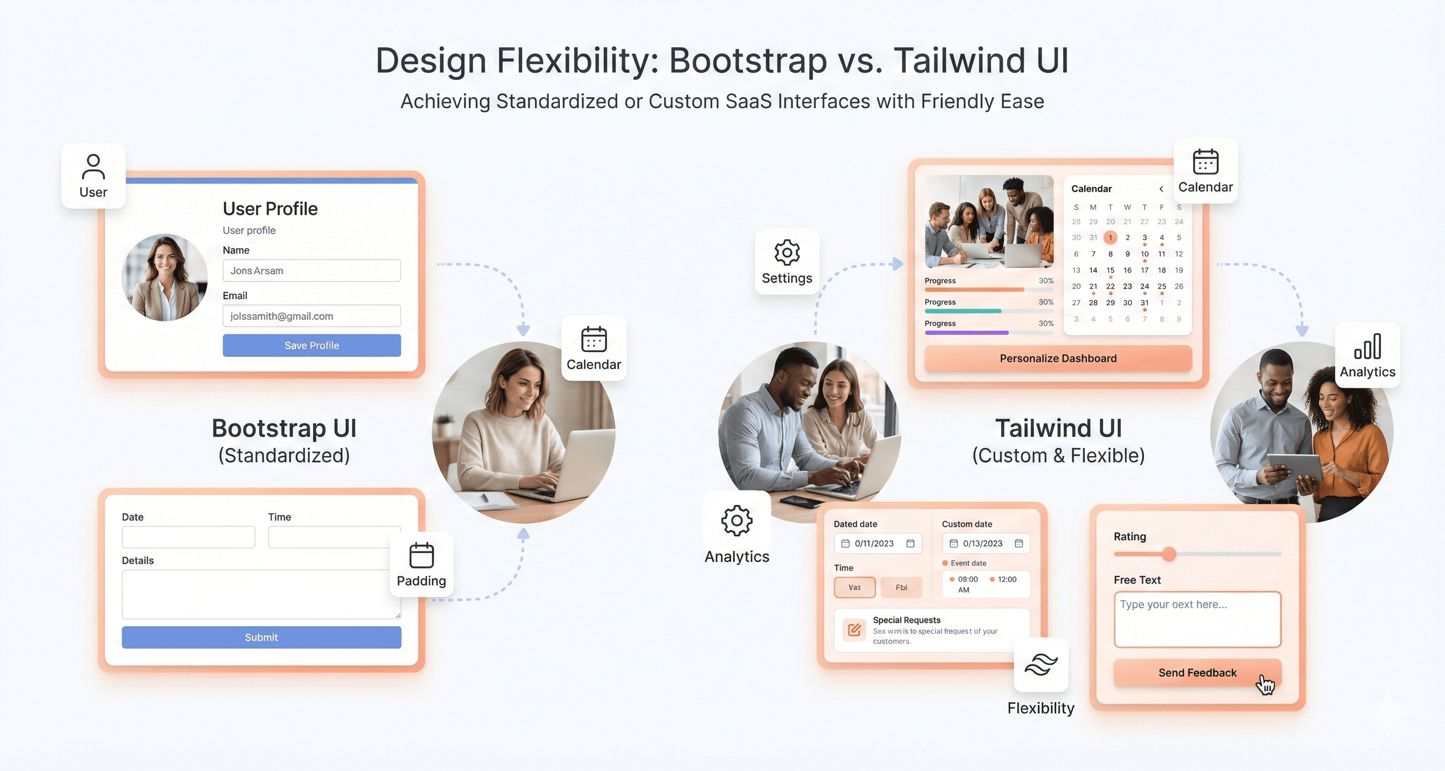
Custom properties, animations, and interactions integrate seamlessly through configuration or arbitrary value support. The framework adapts to your design system rather than forcing conformity to pre-built patterns.
Tailwind CSS v4 also moved closer to a CSS-native architecture by embracing modern platform features like cascade layers, CSS variables, and native browser capabilities. This reduces reliance on heavy JavaScript configuration and aligns more closely with modern frontend tooling standards.
Theme Customization Options in Both Frameworks
Bootstrap 5.3 expanded theming capabilities significantly through its color mode system, including native dark mode support and CSS-variable-driven customization. Developers can now create multiple visual themes with less dependency on heavy Sass overrides compared to older Bootstrap versions.
Framework | Typical Production CSS Size | JavaScript Dependency |
|---|---|---|
Bootstrap | ~140–160KB compiled CSS | Optional JS components |
Tailwind CSS | Often under 10–15KB after purge/tree-shaking | None |
Tailwind's configuration file becomes your design system's single source of truth. Define your color palette, typography scale, spacing values, and breakpoints in one place. Custom utilities extend the framework without conflicts. The JIT compiler generates only the styles you use, keeping builds lean regardless of customization depth.
Creating Unique Brand Identities with Each Tool
Bootstrap sites often struggle with brand differentiation due to shared visual DNA. Creating distinctive identities requires substantial custom CSS work that may conflict with framework updates. The component-centric approach makes it harder to establish consistent design tokens across different elements.
Tailwind excels at brand identity creation through its design token system. Your brand colors, fonts, and spacing become utility classes that maintain consistency across all components. Custom design systems integrate naturally without framework conflicts. The atomic approach ensures brand guidelines translate directly into reusable utility combinations that any team member can apply consistently.
Performance Comparison: Bootstrap vs Tailwind CSS
Tailwind CSS v4 also introduced stricter browser support requirements because it relies on newer CSS capabilities like @property and color-mix(). The framework officially targets Safari 16.4+, Chrome 111+, and Firefox 128+. Projects requiring legacy browser compatibility may still prefer Tailwind v3.4 or Bootstrap’s broader compatibility approach.
Bundle Size Differences Between Frameworks
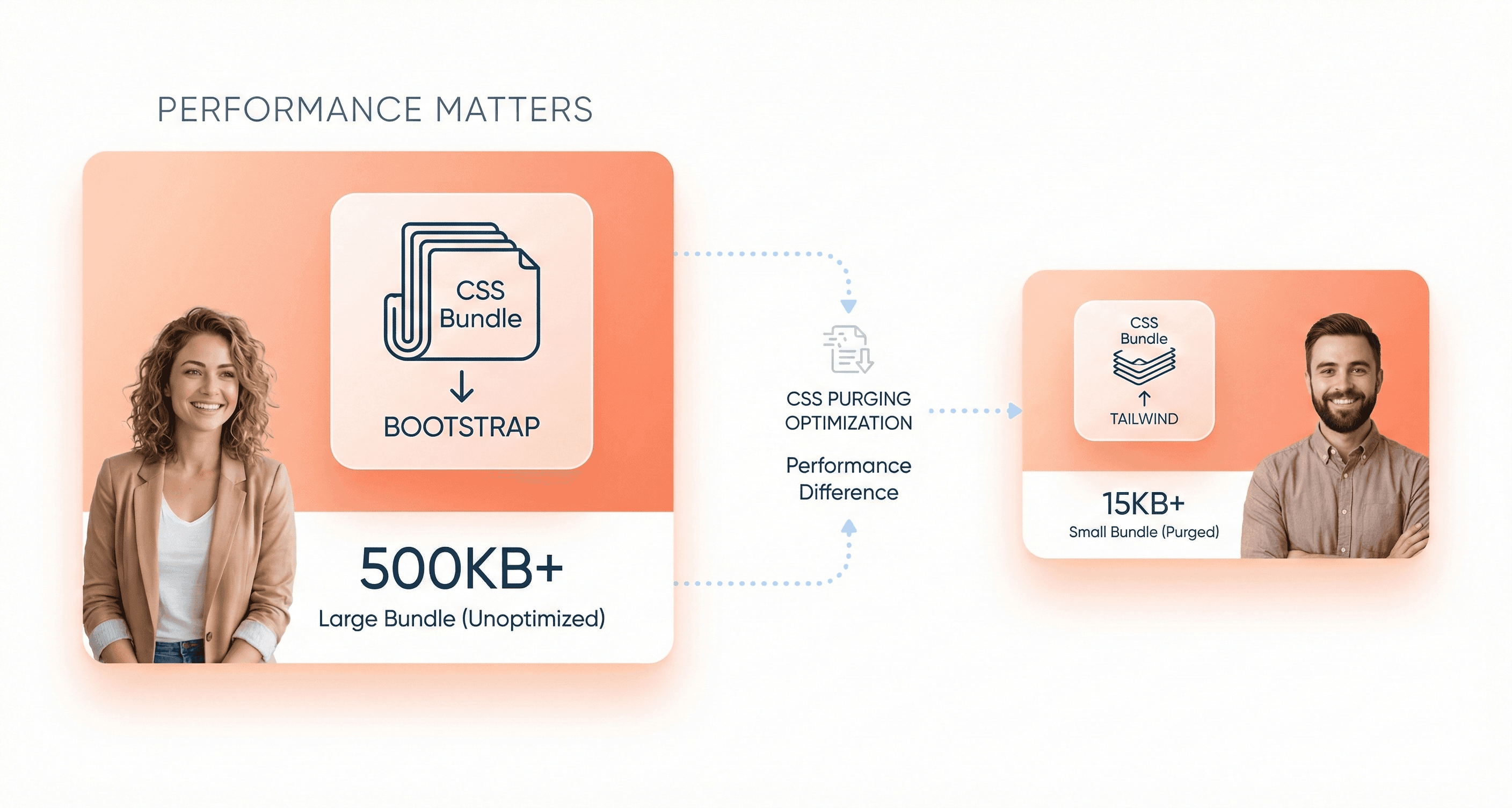
Bootstrap ships with a hefty default package that includes every component, utility, and JavaScript functionality built into the framework. The complete CSS bundle weighs in at around 160KB minified, while the JavaScript components add another 60KB to your project. This means you're loading styles and scripts for components you might never use, like carousels, tooltips, or complex navigation systems.
Tailwind takes a completely different approach with its purging system. The framework generates only the CSS classes you actually use in your project. A typical Tailwind production build often results in CSS files under 10KB, sometimes as small as 5KB for smaller projects. The framework scans your HTML, JavaScript, and template files to identify which utility classes are in use, then strips out everything else.
Framework | Default Size | Typical Production Size | JavaScript Bundle |
|---|---|---|---|
Bootstrap | ~160KB CSS | ~140-160KB CSS | ~60KB JS |
Tailwind | ~3.5MB CSS | ~5-15KB CSS | 0KB (CSS-only) |
Tailwind’s smaller production bundle sizes depend heavily on proper purge configuration and disciplined utility usage. Poorly structured implementations can still introduce CSS bloat through excessive variants, arbitrary values, or duplicated utility patterns.
CSS Loading Speed and Optimization Features
Bootstrap's monolithic approach means your users download a consistent CSS bundle regardless of which pages they visit. This creates predictable caching benefits – once the stylesheet loads, subsequent page visits are lightning fast. However, that initial load carries the weight of unused styles, particularly problematic on mobile networks or slower connections.
Tailwind's utility-first methodology generates atomic CSS classes that compress extremely well with gzip or brotli compression. The repetitive nature of utility classes creates patterns that compression algorithms handle efficiently. Many developers report 70-80% compression ratios with Tailwind CSS files.
The framework also supports advanced optimization techniques like CSS splitting and code splitting when integrated with modern build tools. You can generate different CSS bundles for different sections of your application, loading only what's needed for each page.
Production Build Efficiency Comparison
Bootstrap requires careful manual optimization to achieve optimal production builds. Developers need to identify unused components and either customize their Bootstrap build or rely on CSS purging tools like PurgeCSS as a separate build step. This process can be error-prone and requires ongoing maintenance as your project evolves.
Tailwind's purging happens automatically through its built-in PostCSS plugin. The framework integrates seamlessly with webpack, Vite, Parcel, and other modern build tools. The purging process is fast, reliable, and doesn't require manual intervention or careful component tracking.
Tailwind CSS v4 introduced a redesigned engine focused heavily on build performance improvements. According to the official Tailwind team, full builds can be up to 5x faster while incremental rebuilds can improve by more than 100x compared to earlier versions. This makes Tailwind particularly attractive for large SaaS applications with rapid UI iteration cycles.Teams working on large applications often report 40-60% faster build times after switching from Bootstrap to Tailwind.
The dead code elimination in Tailwind is particularly aggressive and intelligent. It can detect classes used in dynamic content, JavaScript-generated elements, and even classes constructed through string concatenation in many cases.
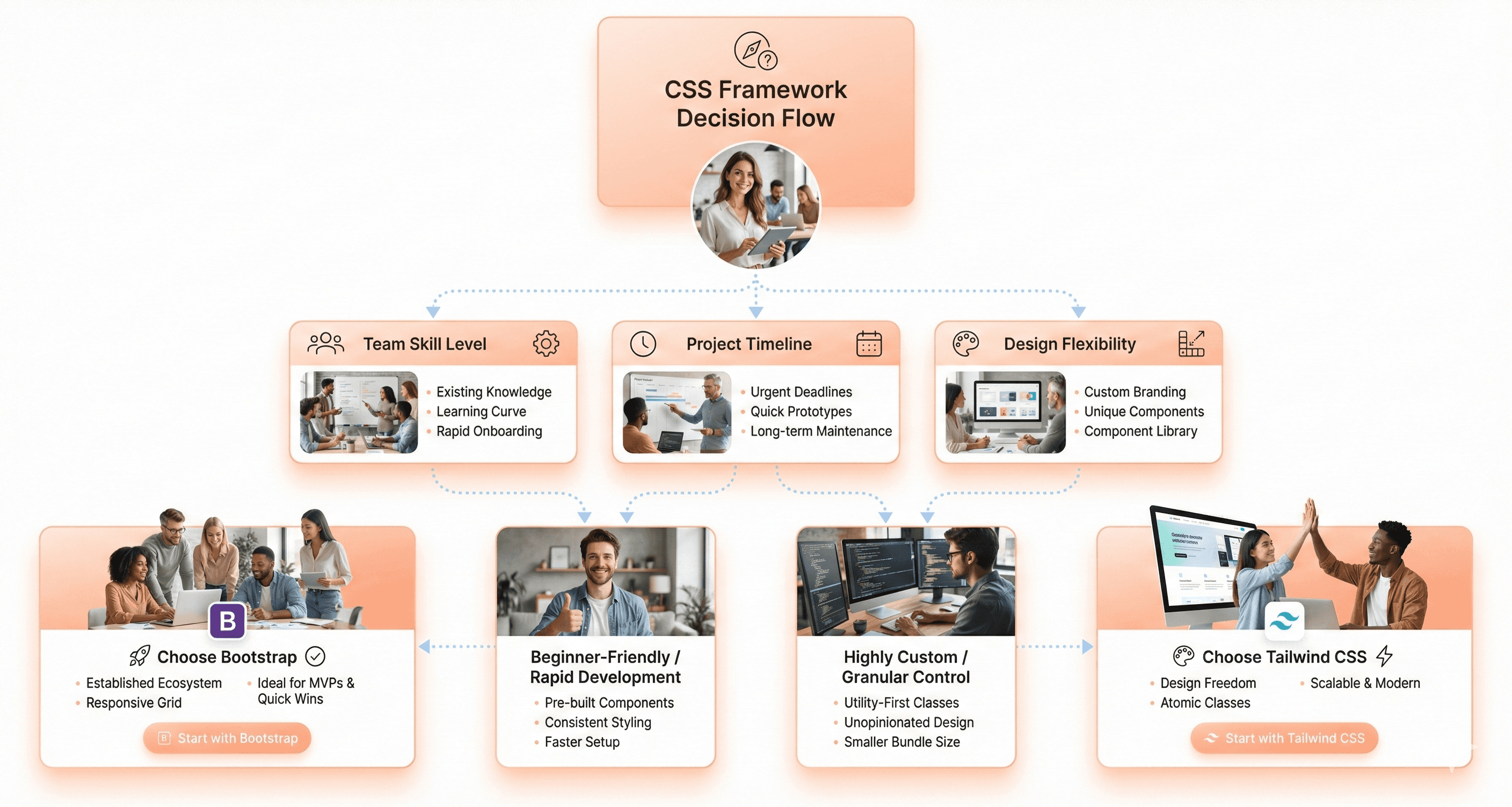
When to Use Bootstrap vs When to Use Tailwind
When Bootstrap Delivers Faster Results
Bootstrap shines brightest when you need to get a professional-looking website up and running quickly. Corporate websites, admin dashboards, and business applications benefit massively from Bootstrap's pre-built components. If you're building a client portal for a financial services company or creating an internal tool for managing inventory, Bootstrap's consistent design patterns help you focus on functionality rather than styling decisions.
Rapid prototyping scenarios make Bootstrap particularly valuable. When stakeholders need to see a working demo in days rather than weeks, Bootstrap's extensive component library becomes your best friend. E-commerce platforms, content management systems, and SaaS applications often choose Bootstrap because it provides battle-tested UI patterns that users already understand.
Teams working under tight deadlines find Bootstrap's opinionated approach liberating rather than limiting. The framework's mature ecosystem means you'll find third-party themes, plugins, and extensions readily available. This ecosystem effect multiplies your development speed, especially for common use cases like landing pages, marketing websites, and customer support portals.
Also Read: React vs Vue vs Angular: Which Should You Choose?
Projects That Benefit Most from Tailwind
Tailwind CSS excels in projects where visual differentiation drives business value. Design-heavy applications like portfolio websites, creative agencies, and brand-focused marketing campaigns leverage Tailwind's utility-first approach to create unique visual experiences. When your design team hands you mockups that don't fit into Bootstrap's predefined patterns, Tailwind gives you the granular control needed to match those designs perfectly.
Modern web applications with complex, interactive interfaces find Tailwind particularly powerful. Single-page applications built with React, Vue, or Angular benefit from Tailwind's component-friendly approach. The utility classes work seamlessly with component-based architectures, allowing developers to style individual components without worrying about global CSS conflicts.
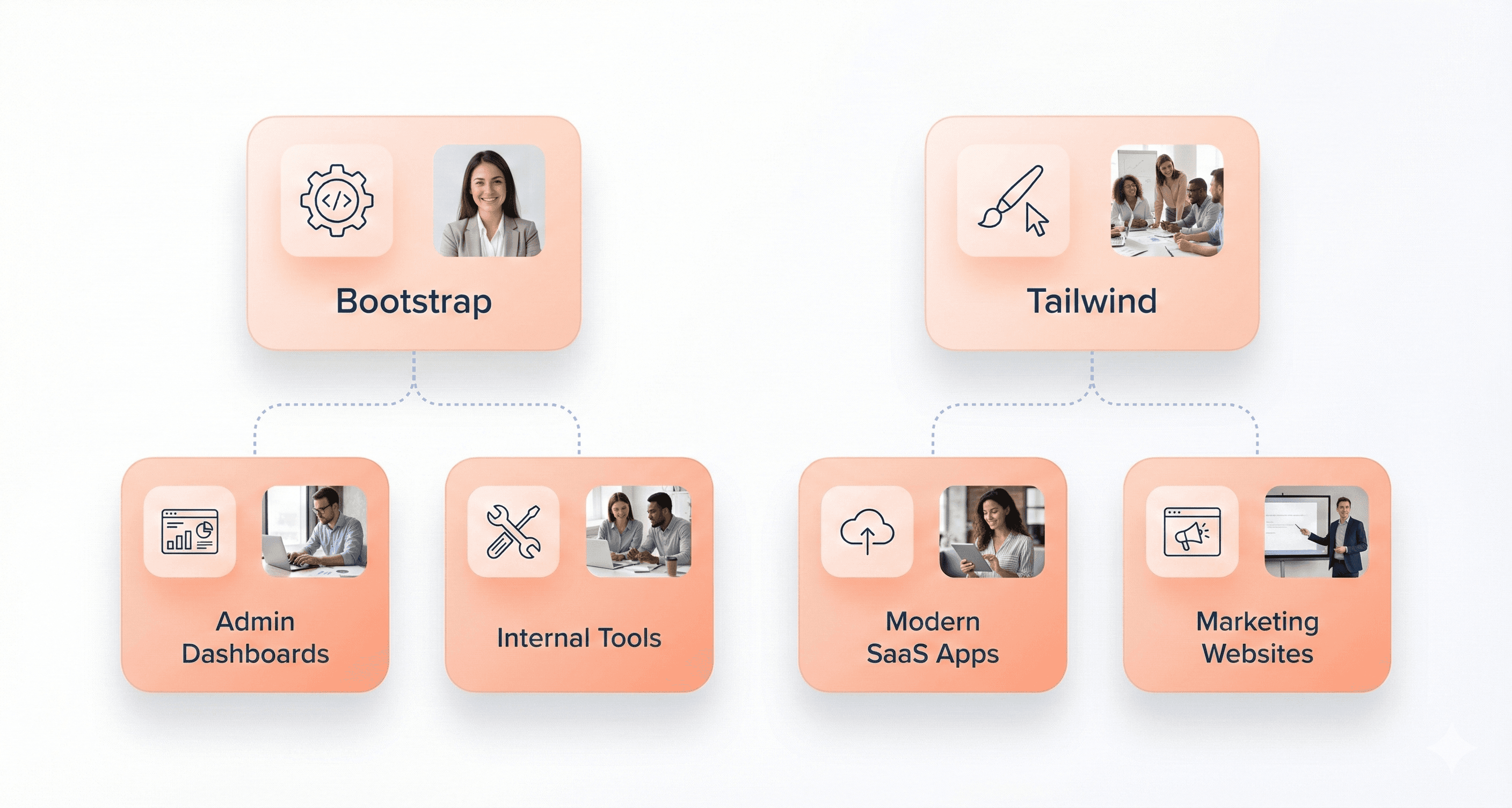
Startups and companies prioritizing brand identity choose Tailwind for its customization capabilities. When your product's visual appeal directly impacts user acquisition and retention, Tailwind's flexibility becomes a competitive advantage. Mobile-first applications, progressive web apps, and platforms where user experience differentiates your product from competitors all benefit from Tailwind's precision.
Team Size and Skill Level Considerations
Larger development teams often gravitate toward Bootstrap because it standardizes design decisions across multiple developers. When you have junior developers, contractors, or distributed teams working on the same project, Bootstrap's conventions reduce the learning curve and minimize inconsistencies. The framework's documentation and community resources make onboarding new team members more straightforward.
Bootstrap remains widely adopted across enterprise SaaS platforms because its predictable component architecture, accessibility maturity, and onboarding simplicity reduce friction for large multi-developer teams working across shared UI systems.
Smaller teams with strong design skills typically prefer Tailwind's flexibility. When you have experienced developers who understand CSS fundamentals, Tailwind becomes a productivity multiplier rather than a learning obstacle. Teams that include dedicated designers often choose Tailwind because it bridges the gap between design mockups and final implementation more effectively.
Mixed-skill teams face interesting trade-offs. Bootstrap might slow down your senior developers but accelerate junior contributors. Tailwind could overwhelm newcomers while empowering experienced team members. Consider your team's growth plans and hiring strategy when making this decision.
Long-term Maintenance Requirements
Bootstrap projects typically require less CSS maintenance because the framework handles most styling decisions. Your codebase stays cleaner with fewer custom styles, making it easier for future developers to understand and modify. However, Bootstrap upgrades can introduce breaking changes that require systematic updates across your entire application.
Tailwind applications often have more predictable maintenance cycles because utility classes remain stable across versions. The framework's purging capabilities keep your CSS bundle size manageable over time, preventing the stylesheet bloat that commonly affects long-running projects. Custom design requirements don't accumulate technical debt as quickly since you're working with atomic utilities rather than complex component overrides.
Documentation becomes more critical with Tailwind because future maintainers need to understand your utility class combinations. Bootstrap's semantic component names are more self-documenting, while Tailwind requires more thorough code comments and style guides to maintain team productivity over time.
Developer Productivity: Bootstrap vs Tailwind
Rapid Prototyping Capabilities
Bootstrap shines when you need to get a working prototype up and running fast. Its pre-built components like navbars, cards, and modals mean you can drag and drop elements together without writing custom CSS. You can have a professional-looking landing page ready in hours, not days. The framework's comprehensive component library covers most common UI patterns, so you're not reinventing the wheel for basic functionality.
Tailwind takes a different approach that initially feels slower but pays dividends once you get the hang of it. While you might spend more time crafting your first few components, the utility-first system lets you iterate incredibly quickly once your design system is established. Making adjustments becomes lightning-fast – changing padding, colors, or layout requires just swapping a few class names rather than hunting through CSS files.
For quick mockups and client presentations, Bootstrap wins hands down. For projects where you'll be making frequent design tweaks and refinements, Tailwind's approach often proves faster in the long run.
Code Reusability and Component Building
Bootstrap's component-based architecture naturally encourages reusability. Once you've built a card component or navigation bar, you can copy the HTML structure across pages with minimal modifications. The framework's consistent naming conventions make it easy for team members to understand and reuse each other's work.
Tailwind excels at component reusability when paired with modern JavaScript frameworks or templating systems. You can create a button component with specific utility classes, then reuse it throughout your application. The real magic happens when you combine Tailwind with component libraries – you get both the flexibility of utility classes and the reusability of structured components.
Framework | Header 2 | Header 3 |
|---|---|---|
Bootstrap | HTML-based components | Static sites, quick projects |
Tailwind | Framework-agnostic utilities | React, Vue, Angular apps |
Bootstrap components work well in pure HTML environments, while Tailwind utilities shine brightest in component-driven development workflows.
Debugging and Troubleshooting Efficiency
Bootstrap debugging can become more complex in heavily customized projects where layered overrides, theme abstractions, and accumulated legacy styles increase CSS specificity and maintenance complexity.
Since components rely on complex CSS rules and JavaScript interactions, tracking down layout issues often means diving deep into the framework's source code. Overriding default styles requires understanding CSS specificity battles, and conflicting classes can create mysterious behavior.
Tailwind makes debugging remarkably straightforward. What you see in the HTML is exactly what you get – no hidden CSS rules or unexpected side effects. When something looks wrong, you can spot the problematic utility class immediately. The atomic nature of utilities means changing one class affects only that specific property, eliminating the cascade issues that plague traditional CSS.
Large-scale Tailwind projects can also introduce utility-class fatigue if teams do not establish reusable component abstractions and shared design conventions. Without consistent patterns, long utility chains may reduce readability and increase maintenance complexity over time.
Developer tools become much more useful with Tailwind since each utility class maps to a single CSS property. You can instantly see which classes are active and modify them in real-time. Bootstrap's compiled CSS makes this inspection process more challenging, especially when dealing with responsive breakpoints or component states.
The learning curve impacts debugging efficiency differently for each framework. Bootstrap users spend time learning component internals, while Tailwind users focus on memorizing utility patterns, but once learned, Tailwind's debugging becomes nearly effortless.
Conclusion
Bootstrap and Tailwind each bring their own strengths to the table, and your choice really comes down to what you need for your project. Bootstrap shines when you want to get something up and running quickly with its ready-made components and familiar structure.
It's perfect for teams that need consistency and don't want to spend hours tweaking every detail. Tailwind, on the other hand, gives you complete creative control with its utility-first approach, making it ideal for custom designs and developers who love having full control over their styling.
The performance differences between these frameworks aren't huge, but they matter depending on your project's scale and requirements. If you're building a prototype or working with a tight deadline, Bootstrap's component library can save you tons of time.
But if you're crafting a unique user experience or working on a long-term project where design flexibility is key, Tailwind's utility classes and smaller final bundle size make it worth the steeper learning curve. Pick the one that matches your team's skills, project timeline, and design goals, there's no universal winner here, just the right tool for your specific job.


About the author
I’m the founder of Hashbyt, an AI-first frontend and UI/UX SaaS partner helping 200+ SaaS companies scale faster through intelligent, growth-driven design. My work focuses on building modern frontend systems, design frameworks, and product modernization strategies that boost revenue, improve user adoption, and help SaaS founders turn their UI into a true growth engine.


Is a clunky UI holding back your growth?
Is a clunky UI holding back your growth?
▶︎
Transform slow, frustrating dashboards into intuitive interfaces that ensure effortless user adoption.
▶︎
Transform slow, frustrating dashboards into intuitive interfaces that ensure effortless user adoption.
