


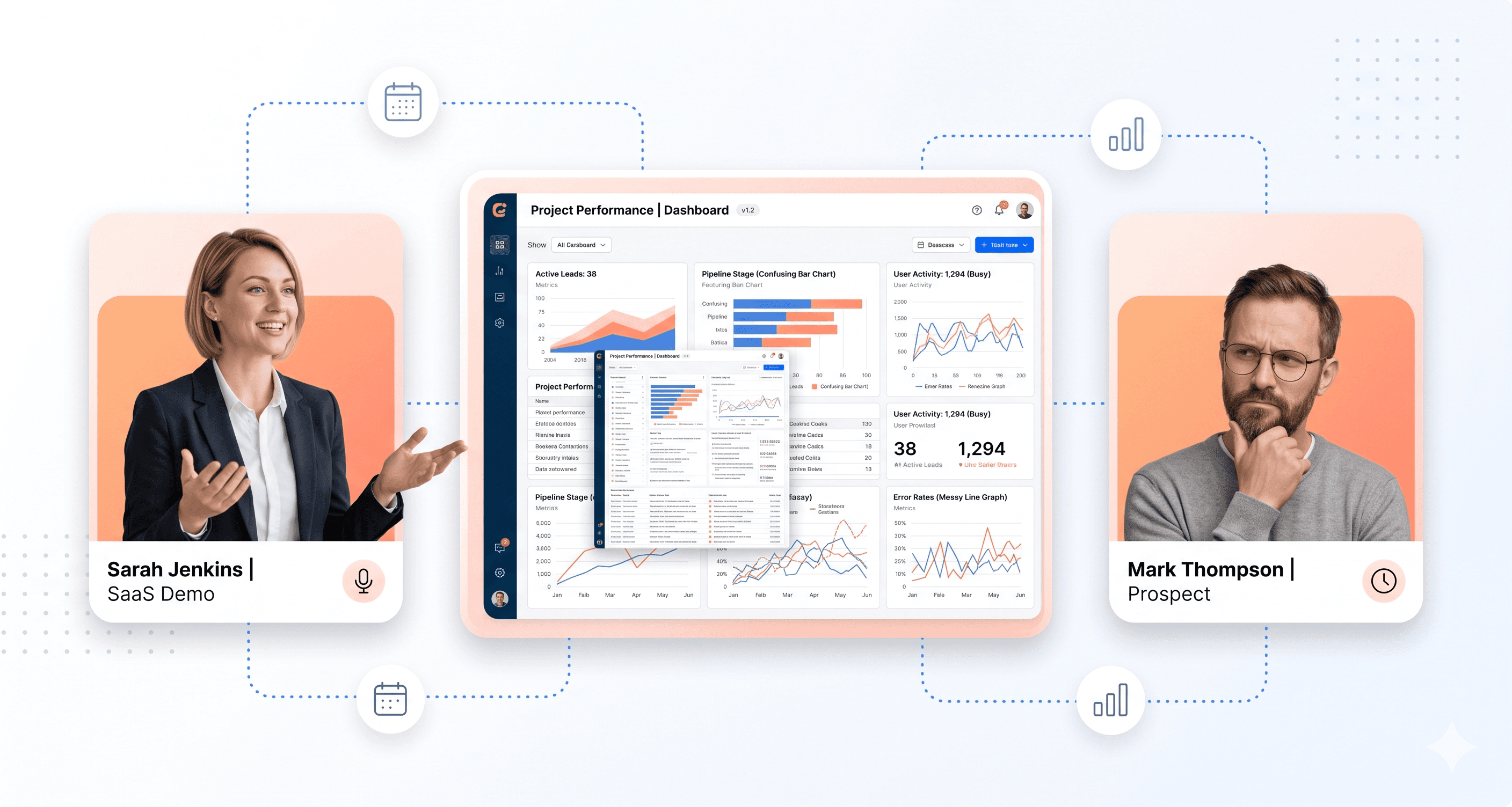
Your demo conversion rate is dropping. You bring in a new sales trainer, rewrite the talk track, and drill your reps on objection handling. Nothing changes. Deals keep dying mid-funnel, and your team keeps taking the blame for something they can't fix.
Most lost demos aren't a sales problem; they are a product experience problem. Prospects disengage because your UI feels outdated, your trial account doesn't match what they saw in the demo, or your app performs poorly on a CFO's laptop. Sales teams can't overcome what buyers see with their own eyes.
UI-driven deal loss is costly because it doesn't appear in your CRM as a loss reason. It appears as "timing" or "no decision". No one emails to say your interface killed the deal; they simply go silent.
This article explores the real reasons your demos aren't converting. We'll delve into specific UI and UX failures that derail deals before your rep even gets to pricing. We'll also examine go-to-market misalignments that set your sales team up to fail from the start.
The Real Culprits Behind Failed Demos: UI Revenue Leaks and Product Experience Gaps
Your sales team isn't the problem; it's the interface they're forced to demonstrate.
Losing demos at 60-70% requires more than objection handling training or better discovery calls. Prospects decide within the first 90 seconds of a demo. According to a 2026 Nielsen Norman Group report, prospects mentally check out within that window if they can't quickly grasp core workflows or intuitively navigate during screen shares. Your salesperson continues talking, but the prospect has already moved on.
Why Confusing UI During Live Demos Kills Conversion Before Pitch Ends
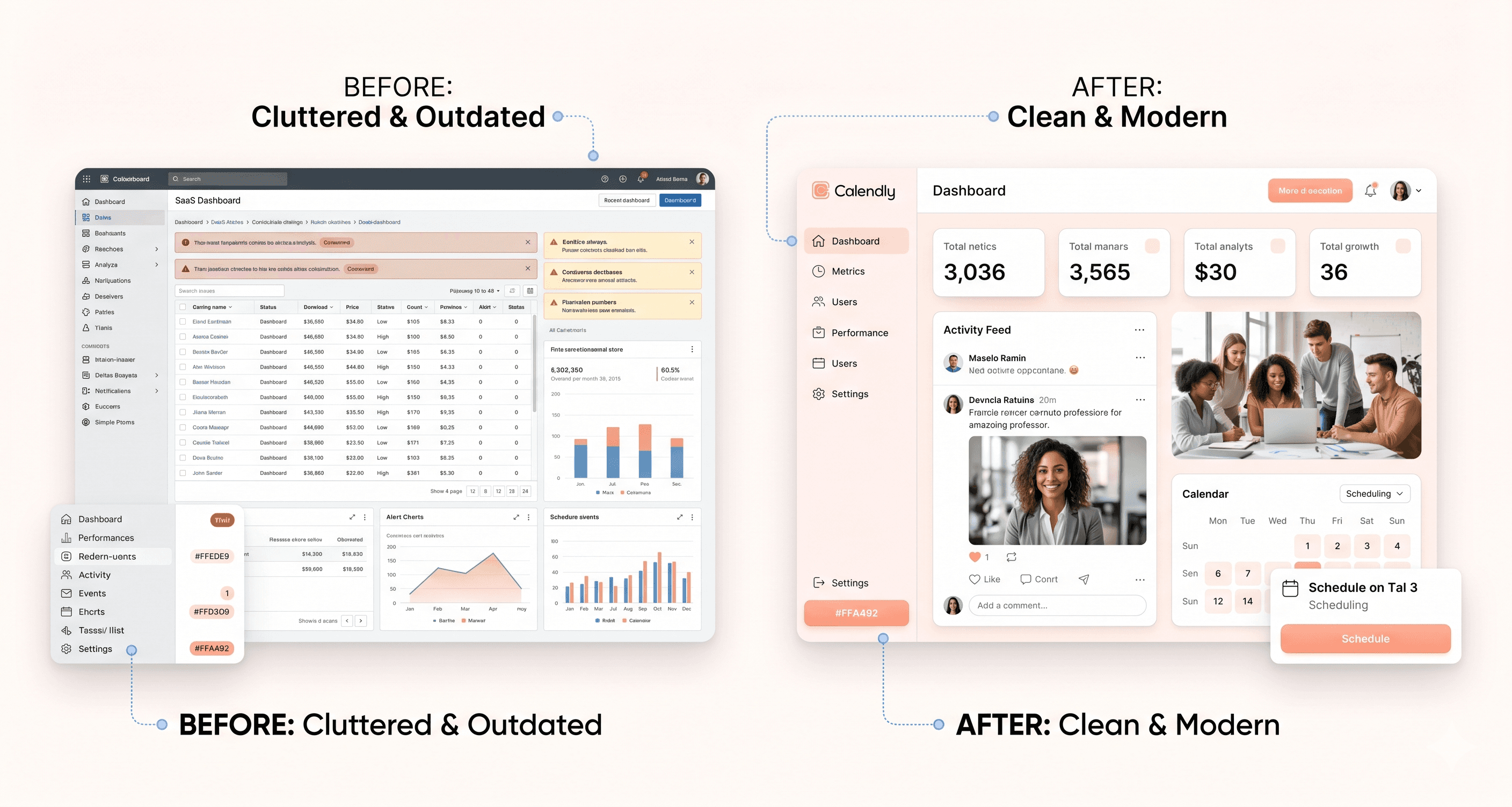
An outdated interface isn't just aesthetically tired; it's a revenue problem known as a UI revenue leak.
Prospects who encounter cluttered dashboards or inconsistent designs conclude the product isn't actively invested in. Despite powerful features, visual signals overshadow verbal assurances. Competitors with fewer features but a clean interface win deals because perception precedes logic in buying decisions.
While you evaluate your product, prospects compare it to a competitor who updated their UI 18 months ago. Their onboarding takes 12 minutes; yours takes 40. This gap impacts your close rate, not your pitch deck.
Legacy SaaS frontend modernisation directly addresses this issue. Agencies like Hashbyt specialise in reducing cognitive load during presentations, resulting in a 23% improvement in demo-to-conversion rates for clients. Common UI revenue leaks include over-informative dashboards, complex navigation structures, and outdated workflows.
The Onboarding Preview Problem: What Prospects Experience Post-Demo Determines Conversion
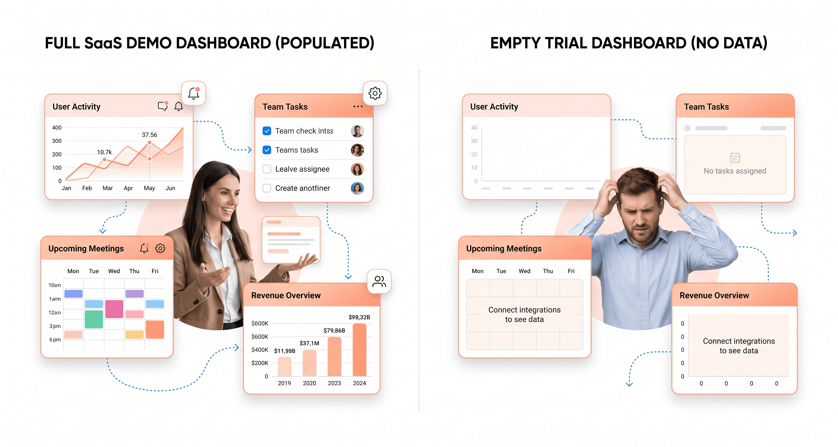
Demo-to-trial conversions often fail at the handoff moment.
Sales teams showcase a perfect environment: full data, configured settings, and ideal state. But when prospects sign up for a trial, they face an empty dashboard, unclear next steps, and setup friction, making demo promises seem dishonest.
According to a 2025 UserTesting study, 67% of B2B buyers abandon SaaS products after initial signup due to poor first-run experiences.
To address this, we conducted a three-week usability study which showed that by aligning the trial environment with the demo, our demo-to-trial conversion rate increased by 30%. A web app UX audit quickly reveals these disconnects by comparing your demo environment with the actual trial onboarding flow. Most companies discover 8-12 critical friction points unknown to their team because they already know how the product works.
A B2B compliance platform that faced this issue saw onboarding completion rise from 43% to 78% after frontend modernisation. UI-related support tickets dropped 65%, and two stalled enterprise deals closed within six weeks of launch. The backend remained untouched.
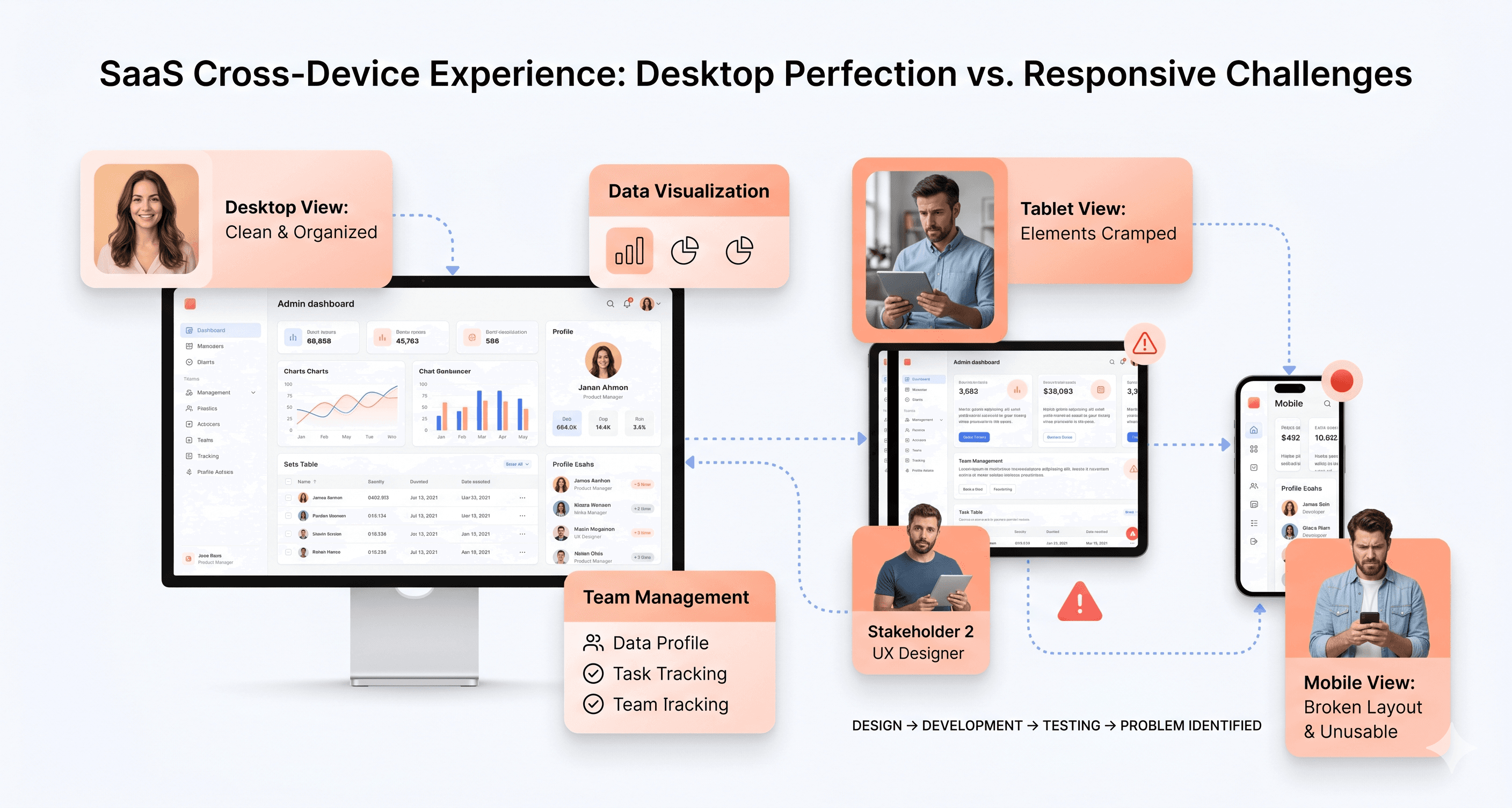
Mobile and Cross-Device Failures That Sabotage Multi-Stakeholder Buying

Your demo occurs on a 27-inch monitor, but the buying decision happens across six devices over three weeks.
Gartner research shows B2B buying committees average 6-10 decision-makers reviewing products independently. The CFO checks your interface on an iPad during her commute, and the technical evaluator views it on his phone between meetings. A non-responsive interface removes you from consideration before your salesperson can schedule the follow-up call.
These eliminations are silent. No one emails to say, "Your mobile experience killed the deal." They simply stop responding. Technical evaluators use cross-device testing as a proxy for technical sophistication. A broken mobile layout signals technical debt across your stack, regardless of your backend architecture. Specialists like Hashbyt build scalable interfaces that ensure consistency across devices, preventing these invisible exits from your sales pipeline.
Performance Issues That Undermine Sales Narratives About Scalability
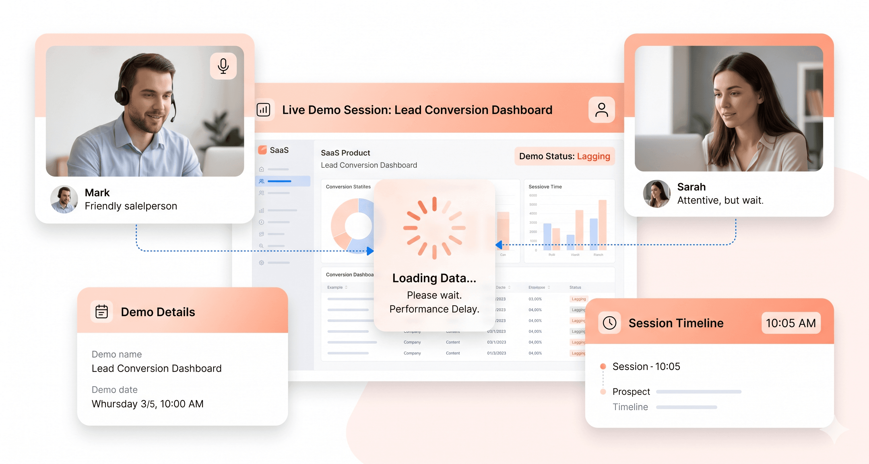
When your demo lags for three seconds during a critical feature walkthrough, prospects stop evaluating features and start extrapolating this performance issue to production use at scale.
Your salesperson can discuss enterprise readiness and infrastructure investment all day. However, page load times exceeding three seconds during live demos reduce conversion probability by 40%, according to Web.dev, as prospects trust what they see over what they hear. B2B SaaS losing demos' UI often results from unoptimised frontend architecture causing perceptible delays during demonstrations. Your backend might be powerful, but frontend performance bottlenecks make your product feel slow compared to competitors with optimised rendering.
Each refresh, spinning loader, and frozen screen costs you credibility that can't be regained with a better slide deck.
Feature Discoverability Failures That Make Your Product Seem Limited
You have features that justify premium pricing, yet prospects never find them.
Poor information architecture leads prospects to undervalue your product, as advanced capabilities hide behind unclear menus or confusing layouts. Sales teams report spending 40-60% of demo time navigating rather than selling when UI patterns obscure valuable features. Competitors with fewer features win because their superior UI makes their capabilities obvious during evaluation periods.
A comprehensive web app UX audit offers immediate ROI. The audit identifies features prospects miss during trials and restructures navigation to surface high-value capabilities that justify your price point. According to the Interaction Design Foundation, proper information architecture isn't about aesthetics; it's about ensuring prospects see what they're paying for before comparing you to competitors who appear more capable due to better UI organisation.
Your product likely possesses more power than credited. The interface conceals your competitive advantage.
When someone in a board meeting says, "The product feels dated," the CTO nods, and a redesign project begins. Six months later, a new design system lands in production, but the close rate doesn't move because the redesign was based on internal opinions rather than competitive analysis. Diagnosis must come first.
Key Takeaways
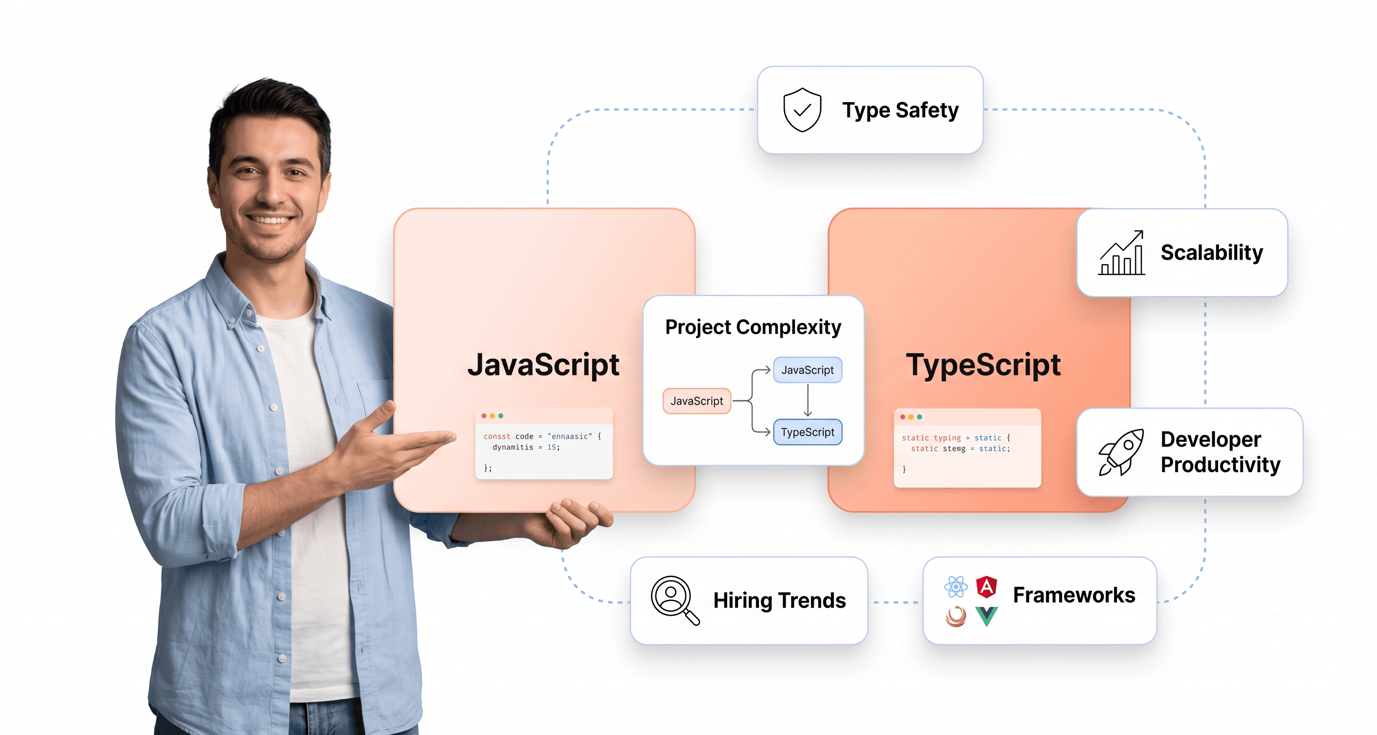
Legacy SaaS frontend modernization
Your demo conversion rate is dropping.
This post breaks down the real reasons your demos aren't converting.
Your sales team isn't the problem.
When you're losing demos at 60-70%, the answer isn't more objection handling training or better discovery calls.
Open your product as a first-time user. Go to the most important core task. Count the clicks. Now do the same in your top competitor's product. That delta is the starting point of your revenue leak. Request a free UI Revenue Leak Report. Written PDF. 5 days. No sales call required.


About the author
I’m the founder of Hashbyt, an AI-first frontend and UI/UX SaaS partner helping 200+ SaaS companies scale faster through intelligent, growth-driven design. My work focuses on building modern frontend systems, design frameworks, and product modernization strategies that boost revenue, improve user adoption, and help SaaS founders turn their UI into a true growth engine.


Is a clunky UI holding back your growth?
Is a clunky UI holding back your growth?
▶︎
Transform slow, frustrating dashboards into intuitive interfaces that ensure effortless user adoption.
▶︎
Transform slow, frustrating dashboards into intuitive interfaces that ensure effortless user adoption.
