Menu
Menu
Menu
Build 2.5× Faster
Build Scalable UI Component Libraries That Accelerate Product Development
Build Scalable UI Component Libraries That Accelerate Product Development
Custom Shadcn, Material UI, and AG Grid libraries that cut development time 50% and reduce bugs 70%
Custom Shadcn, Material UI, and AG Grid libraries that cut development time 50% and reduce bugs 70%

Schedule Discovery Call
Schedule Discovery Call
Schedule Discovery Call

Build 2.5× Faster
Build Scalable UI Component Libraries That Accelerate Product Development
Custom Shadcn, Material UI, and AG Grid libraries that cut development time 50% and reduce bugs 70%
Schedule Discovery Call
Schedule Discovery Call
Schedule Discovery Call
Trusted by 50+ SaaS Enterprises and Startups in USA and Europe
Trusted by 50+ SaaS Enterprises and Startups in USA and Europe


Our Proven Development Process
How We Build Enterprise Component Libraries in 5 Strategic Steps
How We Build Enterprise Component Libraries in 5 Strategic Steps
Waste elimination to strategic focus with systematic foundation

Step 1 - Stop Waste
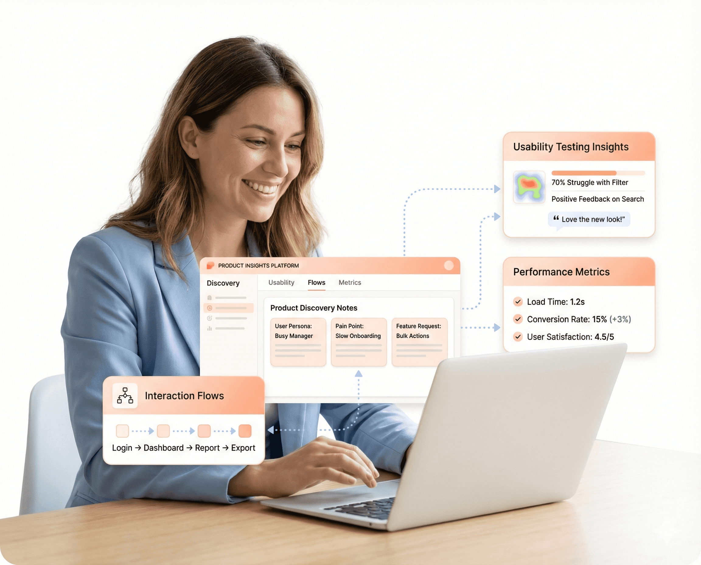
We identify where your team is burning money rebuilding common elements like buttons, forms, and tables. We analyze the repetitive cycles and UI inconsistencies that cause you to miss market opportunities and delay feature releases.
Step 2 - Systematic Foundation
We create systematic design token systems and build enterprise-grade libraries using Shadcn, Material UI, and AG Grid. We replace chaotic, scratch-built development with battle-tested building blocks that ensure consistency across your entire application.
Step 3 - Seamless Integration
We develop TypeScript-first, accessible components that integrate seamlessly with your existing tech stack. Your team stops reinventing the wheel and starts snapping components together, ensuring every interface element works perfectly across devices.
Step 4 - 2.5× Acceleration
We empower you to cut feature development time in half. You see a 70% reduction in UI inconsistencies and a 50% decrease in bug rates and QA time thanks to our pre-built, thoroughly tested component foundations.
Step 5 - Strategic Focus
Finally, we enable you to focus on what makes your product unique. You reduce technical debt and maintenance overhead by 30-40%, allowing you to satisfy user expectations for polish and investor expectations for rapid delivery.
Proven Impact
The Frontend Engine Behind Growing SaaS
The Frontend Engine Behind Growing SaaS
We turn complex requirements into intuitive, AI-driven interfaces that drive user adoption.
200+
SaaS Partners Served
95%
Client Retention Rate
3x
AI-Fast Delivery
10M+
End-Users Impacted
Our Technology Stack
Built on a Foundation of Modern Tech
From Figma prototypes to Cypress testing, our stack ensures speed and quality.
Frontend
Angular
React
Vue.js
Next.js
Vite
Webpack
Micro-Frontends
UI Libraries
Material UI
Tailwind
Bootstrap
Shadcn
Design Tool
Figma
Framer
Sketch
Adobe Creative Suite
Testing & QA Tools
Jest
React Testing Library
Cypress
State Management
Redux Toolkit
Zustand
TanStack Query
NGRX
Design Systems
Storybook
Design Tokens
CSS Variables
Monorepos
Performance
Lighthouse
Web Vitals
Sentry
LogRocket
New Relic
Compliance
WCAG 2.1 AA
ARIA
axe DevTools
Accessibility Audits
CI/CD & DevOps
GitHub Actions
Vercel
Netlify
Docker
Enterprise Security
OWASP
RBAC / Permission UI
Audit Logs UI
HIPAA / GDPR
Why Build Custom Component Libraries
Stop Rebuilding Common UI Elements. Ship Features 2.5× Faster.
Stop Rebuilding Common UI Elements. Ship Features 2.5× Faster.
Enterprise-grade components, TypeScript-first, accessibility built-in, and seamless integration
Enterprise-grade components, TypeScript-first, accessibility built-in, and seamless integration
Scale Seamlessly
Unify Stacks
Guarantee Access
Simplify Onboarding
Maximize ROI

As product complexity increases, poorly planned design systems often break or become a heavy maintenance burden for the team.
We build professional libraries that grow with your business through systematic versioning and token management. Your system becomes more valuable as you scale, with design tokens that adapt automatically and documentation that stays current.
Keep your workspace spotless with our Office Cleaning Service. Our team ensures a hygienic environment.
Restore shine with our Floor Polishing Service. Our team uses advanced techniques for a sleek, polished finish.
Breathe cleaner with our Dust Removal Service. Our team ensures a dust-free space for a healthier environment.
Scale Seamlessly
Unify Stacks
Guarantee Access
Simplify Onboarding
Maximize ROI
As product complexity increases, poorly planned design systems often break or become a heavy maintenance burden for the team.
We build professional libraries that grow with your business through systematic versioning and token management. Your system becomes more valuable as you scale, with design tokens that adapt automatically and documentation that stays current.
Keep your workspace spotless with our Office Cleaning Service. Our team ensures a hygienic environment.
Restore shine with our Floor Polishing Service. Our team uses advanced techniques for a sleek, polished finish.
Breathe cleaner with our Dust Removal Service. Our team ensures a dust-free space for a healthier environment.
Systematic Quality
Why Build a Component Library?
Why Build a Component Library?
Move beyond copy-paste code to a systematic, scalable, and accessible UI foundation.

WCAG Compliance

Living Documentation

Type Safety

Theme Engine

Data Grid Power
Robust Infrastructure
The Component Ecosystem
The Component Ecosystem
A unified toolchain leveraging Storybook, Shadcn, and TypeScript to build enterprise-grade, accessible UI libraries.


Complete Component Library Development
From Design Tokens to Production-Ready Component Systems
From Design Tokens to Production-Ready Component Systems
Shadcn UI, Material UI, AG Grid, SurveyJS, and custom component development
Shadcn Components
We provide your team with unmatched flexibility and no vendor lock-in. Our Shadcn UI solutions ensure complete code ownership, allowing you to copy, paste, and tailor components to fit your product's needs. Your bundle remains lightweight (10-15KB for core components), and we deliver brand-specific changes in hours, not weeks, enhancing your development experience with TypeScript.
Material UI
Optimize your development by utilizing Material UI's extensive library of over 100 ready-to-use components, designed for every SaaS interface pattern. This approach boosts your development speed by 50%, leveraging proven enterprise foundations. Our theming systems seamlessly support multi-tenant needs, while TypeScript integration ensures issues are identified before production, delivering polished data displays and workflows efficiently.
AG Grid
We eliminate user frustration with cumbersome data tables for millions of records. By integrating AG Grid, we create Excel-like interfaces that users love. Our solutions support seamless infinite scrolling, advanced filtering, and real-time updates. This boosts customer satisfaction as users manage large datasets efficiently. Enterprise features, such as grouping and aggregation, are ready to use, significantly reducing development time.
SurveyJS Integration
Creating surveys from the ground up can be daunting. With SurveyJS, you can launch intricate surveys featuring conditional logic in just days. Our responsive designs enhance mobile completion rates by 25-35%. Non-technical team members can easily build and adjust surveys using visual tools, allowing developers to concentrate on essential product features without getting bogged down by validation issues.
TypeScript First
JavaScript errors must not appear in production. Our TypeScript-first approach identifies issues early in development, not during user interactions. We make your component APIs self-documenting, speeding up onboarding for new developers by 60%. IDE autocomplete aids in coding, making refactoring safe. As your design system grows, our strict typing guarantees accurate updates, reducing QA cycles by removing entire bug categories.
Accessibility First
Accessibility compliance should not start with lawsuits. We design every component with built-in keyboard navigation, screen reader compatibility, and appropriate ARIA labels. This approach broadens your user base by ensuring interfaces are accessible to all. Compliance audits become standard practice as we integrate accessibility into our architecture, making inclusive experiences a default priority for your development team.
Shadcn Components
We provide your team with unmatched flexibility and no vendor lock-in. Our Shadcn UI solutions ensure complete code ownership, allowing you to copy, paste, and tailor components to fit your product's needs. Your bundle remains lightweight (10-15KB for core components), and we deliver brand-specific changes in hours, not weeks, enhancing your development experience with TypeScript.
AG Grid
We eliminate user frustration with cumbersome data tables for millions of records. By integrating AG Grid, we create Excel-like interfaces that users love. Our solutions support seamless infinite scrolling, advanced filtering, and real-time updates. This boosts customer satisfaction as users manage large datasets efficiently. Enterprise features, such as grouping and aggregation, are ready to use, significantly reducing development time.
TypeScript First
JavaScript errors must not appear in production. Our TypeScript-first approach identifies issues early in development, not during user interactions. We make your component APIs self-documenting, speeding up onboarding for new developers by 60%. IDE autocomplete aids in coding, making refactoring safe. As your design system grows, our strict typing guarantees accurate updates, reducing QA cycles by removing entire bug categories.
Material UI
Optimize your development by utilizing Material UI's extensive library of over 100 ready-to-use components, designed for every SaaS interface pattern. This approach boosts your development speed by 50%, leveraging proven enterprise foundations. Our theming systems seamlessly support multi-tenant needs, while TypeScript integration ensures issues are identified before production, delivering polished data displays and workflows efficiently.
SurveyJS Integration
Creating surveys from the ground up can be daunting. With SurveyJS, you can launch intricate surveys featuring conditional logic in just days. Our responsive designs enhance mobile completion rates by 25-35%. Non-technical team members can easily build and adjust surveys using visual tools, allowing developers to concentrate on essential product features without getting bogged down by validation issues.
Accessibility First
Accessibility compliance should not start with lawsuits. We design every component with built-in keyboard navigation, screen reader compatibility, and appropriate ARIA labels. This approach broadens your user base by ensuring interfaces are accessible to all. Compliance audits become standard practice as we integrate accessibility into our architecture, making inclusive experiences a default priority for your development team.
Why Build Component Libraries Now
Cut Development Time 50% and Reduce QA Time 50%
Cut Development Time 50% and Reduce QA Time 50%
Eliminate code duplication, ensure consistency, and accelerate feature delivery
Design Token Systems & Theme Management
It shouldn't take several adjustments to update colors. We use design token systems so that a single update is reflected globally.
Guarantees developers and designers speak the same language
Enables effortless dark mode and organized multi-tenant theming

Design Token Systems & Theme Management
It shouldn't take several adjustments to update colors. We use design token systems so that a single update is reflected globally.
Guarantees developers and designers speak the same language
Enables effortless dark mode and organized multi-tenant theming
Design Token Systems & Theme Management
It shouldn't take several adjustments to update colors. We use design token systems so that a single update is reflected globally.
Guarantees developers and designers speak the same language
Enables effortless dark mode and organized multi-tenant theming

Storybook Integration & Documentation
Your components shouldn't exist in a vacuum. We create living documentation where every variant lives and breathes with real examples.
Catch UI changes early with visual regression testing
Improves design-development handoffs dramatically
Storybook Integration & Documentation
Your components shouldn't exist in a vacuum. We create living documentation where every variant lives and breathes with real examples.
Catch UI changes early with visual regression testing
Improves design-development handoffs dramatically
Storybook Integration & Documentation
Your components shouldn't exist in a vacuum. We create living documentation where every variant lives and breathes with real examples.
Catch UI changes early with visual regression testing
Improves design-development handoffs dramatically
Build Component Libraries That Grow With Your Business
▶︎
Systematic versioning and token management that adapts automatically

Clients' Pov
From Our Clients' Perspective
Where Great Ideas Become Big Wins and Real Results
Where Great Ideas Become Big Wins and Real Results
Hashbyt delivered beyond our expectations. Their frontend architecture transformed our product's performance and measurably boosted our conversion rates. A strategic technical partner.

Murli Sid
CTO, Forwood

The UI/UX compliance expertise was crucial. They ensured our complex FinTech platform achieved WCAG 2.1 AA accessibility standards. We also saw a 65% reduction in UI-related support tickets.

Sarah Sparre
Director of R&D, 3Shape

They are more than an agency—they are partners. Hashbyt re-thought our entire user flow to be more compliant and efficient. Their strategic design decisions saved us significant iteration time later on.

Tim Hansan
Head of IT, Disney Cruise Line

Hashbyt delivered beyond our expectations. Their frontend architecture transformed our product's performance and measurably boosted our conversion rates. A strategic technical partner.
Murli Sid
CTO, Forwood
The UI/UX compliance expertise was crucial. They ensured our complex FinTech platform achieved WCAG 2.1 AA accessibility standards. We also saw a 65% reduction in UI-related support tickets.
Sarah Sparre
Director of R&D, 3Shape
They are more than an agency—they are partners. Hashbyt re-thought our entire user flow to be more compliant and efficient. Their strategic design decisions saved us significant iteration time later on.
Tim Hansan
Head of IT, Disney Cruise Line
Hashbyt delivered beyond our expectations. Their frontend architecture transformed our product's performance and measurably boosted our conversion rates. A strategic technical partner.
Murli Sid
CTO, Forwood
The UI/UX compliance expertise was crucial. They ensured our complex FinTech platform achieved WCAG 2.1 AA accessibility standards. We also saw a 65% reduction in UI-related support tickets.

Sarah Sparre
Director of R&D, 3Shape

“They are more than an agency—they are partners. Hashbyt re-thought our entire user flow to be more compliant and efficient. Their strategic design decisions saved us significant iteration time later on.”
Tim Hansan
Head of IT, Disney Cruise Line
FAQ
Everything You Need to Know About Enterprise Component Libraries
Most enterprise component libraries take 8-12 weeks for initial development, depending on complexity and component count. We structure the process so you see usable components within the first 2-3 weeks, with full library completion and documentation following. The timeline varies based on your specific requirements and existing design system maturity.
Answer
How long does it take to build a custom component library?
Question
Shadcn UI offers maximum customization flexibility with complete code ownership—perfect if you need unique branding. Material UI provides a comprehensive component ecosystem that accelerates development by 50% but with less customization flexibility. We help you choose the right path based on whether you prioritize maximum speed or granular design control.
Answer
What's the difference between Shadcn UI and Material UI for our business?
Question
Yes, we offer maintenance options that include monthly updates, security patches, new component development, and design system evolution support. Most clients choose our quarterly maintenance packages, which include minor updates, documentation improvements, and consultation for new feature planning.
Answer
Do you provide ongoing maintenance after library completion?
Question
We design component libraries to integrate incrementally—you don't need to rewrite your entire application. You can adopt components gradually, starting with new features and replacing existing components during natural development cycles. We provide migration guides, compatibility layers, and technical support to ensure smooth transitions.
Answer
How do component libraries integrate with our existing codebase?
Question
We recommend starting with a technical deep-dive session where we review your specific UI challenges and existing tech stack. Instead of generic solutions, you'll receive a custom implementation roadmap, architecture recommendations, and timeline estimates. We also provide a comprehensive planning guide to help you align stakeholders and avoid common mistakes, ensuring you can transform your development velocity and start seeing results within weeks, not months.
Answer
How do we get started with a custom component library project?
Question
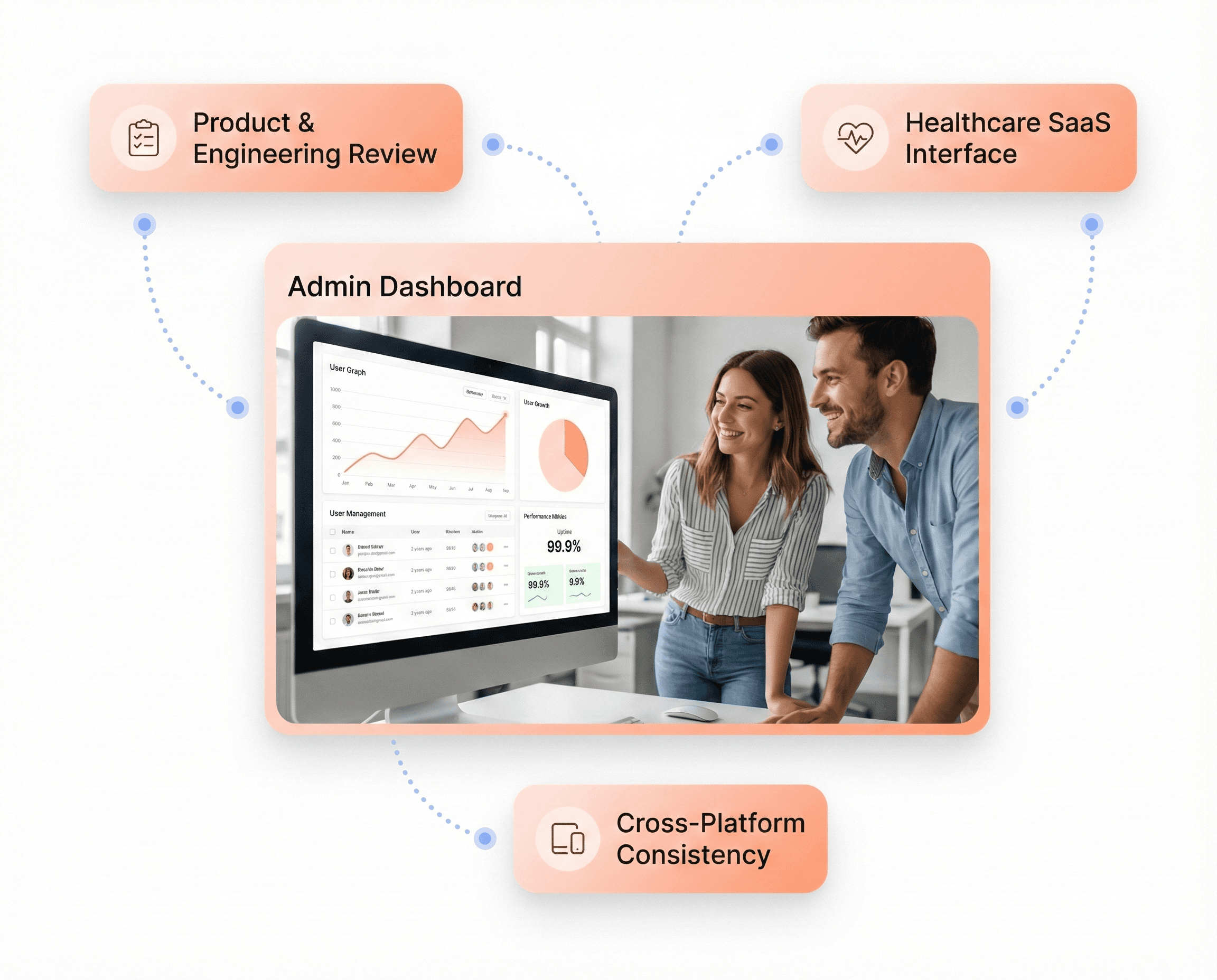
Consistent UI Across React, Angular, and Vue Applications
Framework-agnostic components for unified user experiences
Consistent UI Across React, Angular, and Vue Applications
Framework-agnostic components for unified user experiences
Our Development Stack
Modern Frontend Technology for Scalable SaaS
Modern Frontend Technology for Scalable SaaS
Modern Frontend Technology for Scalable SaaS
Built with modern frameworks to deliver fast, scalable, and maintainable SaaS frontends.

Angular Development Services
Build specialized Angular applications using AI-driven development workflows and proprietary frameworks
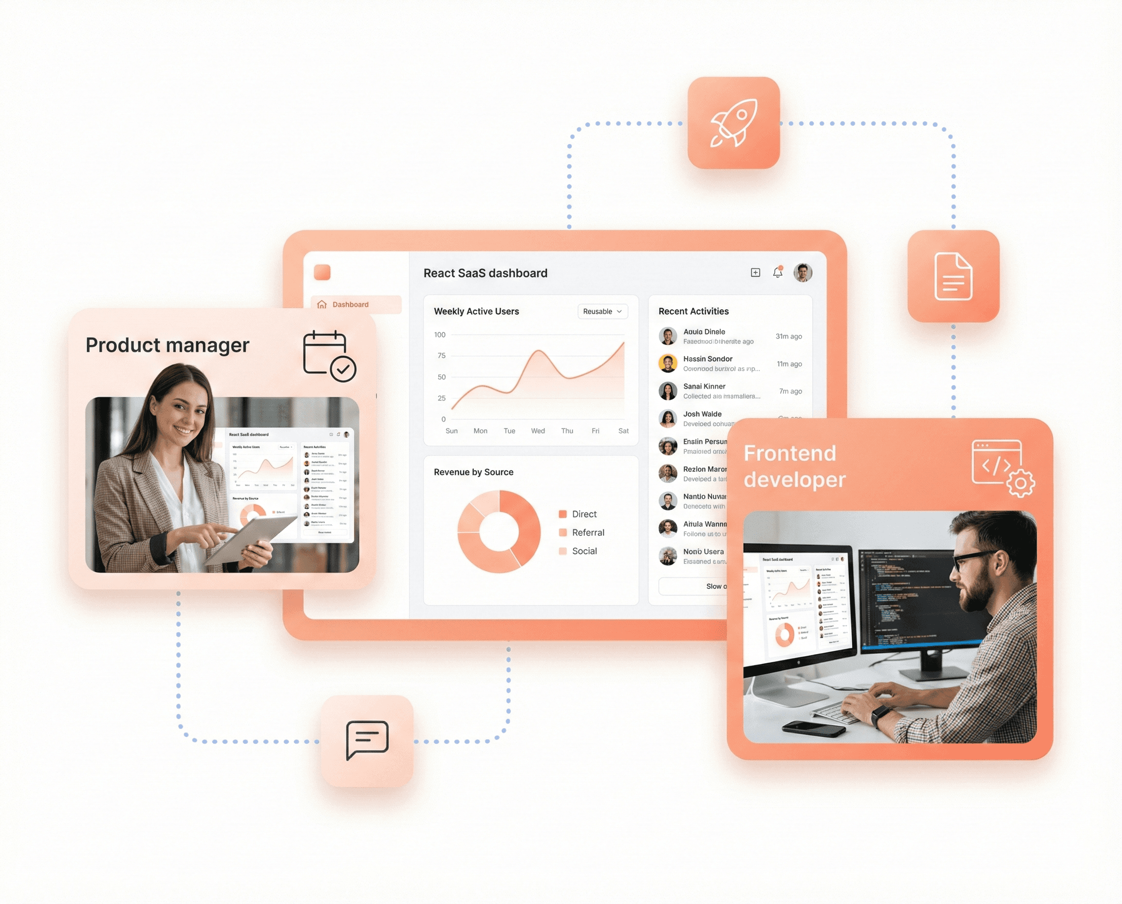
React Development Services
Hashbyt delivers fast, production-ready React development services with scalable UI that users love and teams can maintain.
Admin Dashboard Customization
Professional theme customization that delivers enterprise-grade results in weeks, not months
Built on a Foundation of Modern Tech
Built on a Foundation of Modern Tech
From Figma prototypes to Cypress testing, our stack ensures speed and quality.
Our Technology Stack
Frontend
Angular
React
Vue.js
Next.js
Vite
Webpack
Micro-Frontends
UI Libraries
Material UI
Tailwind
Bootstrap
Shadcn
Design Tool
Figma
Framer
Sketch
Adobe Creative Suite
Testing & QA Tools
Jest
React Testing Library
Cypress
State Management
Redux Toolkit
Zustand
TanStack Query
NGRX
Design Systems
Storybook
Design Tokens
CSS Variables
Monorepos
Performance
Lighthouse
Web Vitals
Sentry
LogRocket
New Relic
Compliance
WCAG 2.1 AA
ARIA
axe DevTools
Accessibility Audits
CI/CD & DevOps
GitHub Actions
Vercel
Netlify
Docker
Enterprise Security
OWASP
RBAC / Permission UI
Audit Logs UI
HIPAA / GDPR
SaaS Experience. Built on Data, Driven by AI.
SaaS Experience. Built on Data, Driven by AI.
We turn your vision into high-performance, user-loved SaaS products.
Our services